Badge It Like a Pro! Get To Know the New RadBadge for WPF

Summarize with AI:
Make sure users see important updates—notify them with the intuitive and stylish RadBadge control in UI for WPF.
Are you tired of all the intrusive notifications that surround your everyday life? You still want to be notified, though. And—need to be. 🤓 Otherwise, you can and surely will miss important news, updates and events. Cool, but let that happen in a more intuitive, discreet and stylish way. For example, with one of the latest additions to the UI for WPF suite—the R3 2021 Release’s tiniest but meaningful RadBadge control. 👶
Let’s get to know it together.
Badging Essentials
Badge notifications are useful and, therefore, wanted and wide-used in many apps—be it desktop, web or mobile. And for sure they are not limited to representing notifications only (e.g., a new message). Badging can also be used to alert (e.g., for available updates), indicate new content (e.g., in a news app) and so forth.
At least in my head, a badge should be perceived as a stamp which can be stuck to any piece of UI (of course where applicable and reasonable to do so). Yes, it is a standalone entity, yet it fits better in a duet, and I would personally not use it solo. Its power is to integrate into a huge number of controls and control items to provide a wide variety of use cases. 💪
Badge Scenarios
There are lots of situations and controls in which a Badge control could be useful. Thank God (and the development team 😅) it is flexible enough to fit into lots of different templates!
Here are the top three of the most popular scenarios in which a badge can be spotted:
- ListBox/NavigationView—perhaps the most popular scenario—displaying alerts/indicators related to the respective item and its contents.
- Menu/ToolBar—indicating new menu/command options and/or encountered problems.
- TabControl—informing the user about unread content, notifications or alerts that come up on a tab which is currently not active, for example.
RadBadge Capabilities
As this is only your first date with our RadBadge, I will not overshare. But if you are eager to learn every bit about it—be more than welcome to check its documentation article.
Here are the main things you should know.
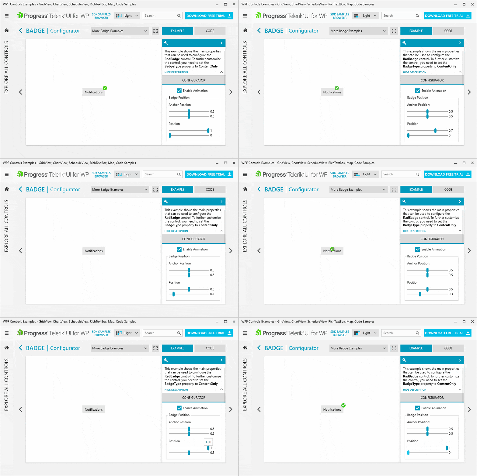
It allows for controlling the Position—you can specify it relative to the element that you wish to attach it to.

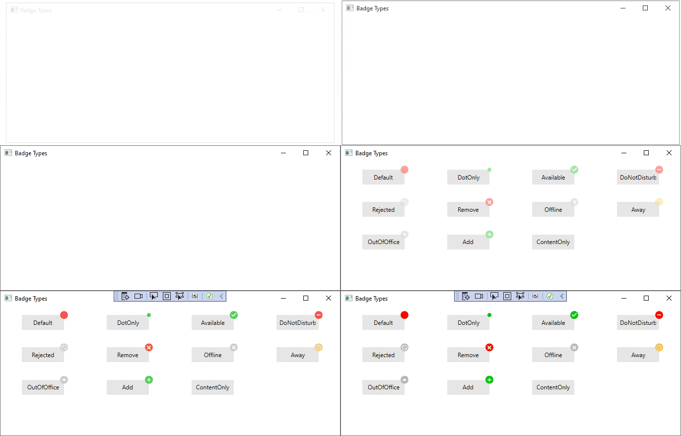
You can define its look by either choosing from the various predefined BadgeTypes and Geometry options or creating the ideal one for you.

Oh, here are the geometries—be sure to check the Key Properties section in the control’s documentation article for a ready-to-copy code snippets.

So far, so good. Let us not forget that the first impression often lasts and a crucial part of it is the entrance that something or someone makes. In the context of badges, I mean the Animation and the choice you are given to play one while displaying the control.
The Badge control also comes with styling flexibility through the various overrides controlling the background and border colors, the text alignment and so on.
Get the Badging Started
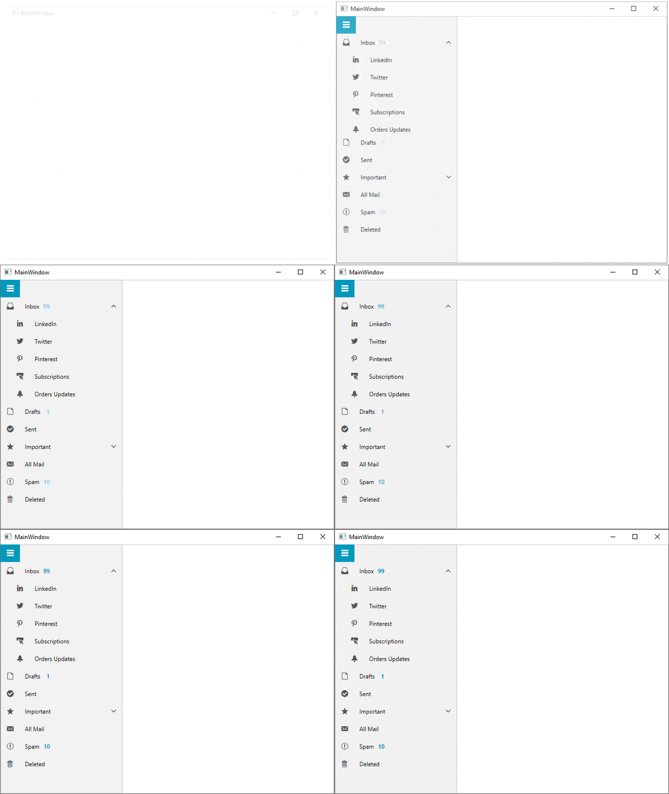
Here is a little something I cooked up for you—a special recipe with RadBadge and RadNavigationView. I took the base from the RadNavigationView’s Sub Items example in the demos application. The secret ingredient that I added was the RadBadge as part of the modified ContentTemplate in the ItemStyle.
Oh, I also extended the NavigationViewItemModel to contain an int property NotificationsCount.
Here are the steps:
- Add an int property for the notifications count:
publicclassNavigationViewItemModel{publicstringIcon {get;set; }publicstringTitle {get;set; }publicintNotificationsCount {get;set; }publicObservableCollection<NavigationViewItemModel> SubItems {get;set; }} - Update some of the ViewModel’s Items with the above in the GetItems() method:
privateList<NavigationViewItemModel> GetItems(){var inboxItem =newNavigationViewItemModel() { Icon ="", Title ="Inbox", NotificationsCount = 99 };// The rest is cut out to save some space 😊} - Modify the ItemStyle to provide new ContentTemplate which includes the RadBadge control:
<Stylex:Key="ItemStyle"TargetType="telerik:RadNavigationViewItem"BasedOn="{StaticResource ItemBaseStyle}"><SetterProperty="Content"Value="{Binding}"/><SetterProperty="ItemContainerStyle"Value="{StaticResource ItemBaseStyle}"/><SetterProperty="ContentTemplate"><Setter.Value><DataTemplate><TextBlockx:Name="TextBlock"Text="{Binding Title}"><telerik:RadBadge.Badge><telerik:RadBadgex:Name="Badge"Content="{Binding NotificationsCount}"Foreground="{telerik:FluentResource ResourceKey=AccentBrush}"FontWeight="Bold"BadgeType="ContentOnly"Position="1.5,0.5"/></telerik:RadBadge.Badge></TextBlock><DataTemplate.Triggers><DataTriggerBinding="{Binding NotificationsCount}"Value="0"><SetterTargetName="TextBlock"Property="telerik:RadBadge.Badge"Value="{x:Null}"/></DataTrigger></DataTemplate.Triggers></DataTemplate></Setter.Value></Setter></Style>
Now, seat yourself comfortably and enjoy the meal.

Follow me for more recipes. 😆
Save Room for Dessert and Feedback
I hope you enjoyed this read and saved some room for dessert—and that you will not be shy to share some. Okay, I am not that mean. Save your dessert all for yourself, but drop your thoughts and impressions in the comment section below or head to the Feedback Portal for WPF.
Oh, and don’t forget to dream, explore and discover. And in this train of thought, be sure to:

Viktoria Grozdancheva
Viktoria is a Senior Front-end Developer with 5+ years of experience designing and building modern UI for desktop and mobile platforms on Microsoft/Telerik technology stacks. Her spare time is dedicated to friends and family and discovering new pieces of the world. Find her on Twitter and LinkedIn.
