How to Build a Stepper Form in KendoReact

Summarize with AI:
Simplify your complex form by splitting it into less overwhelming steps. Follow this post to create an effective and user-friendly stepper form with KendoReact.
Forms are one of the best methods to collect information from users. Whether a website has a simple form with only a few fields or a complex one with dozens of input types, user-friendly forms are crucial for providing a great experience.
This can be much harder to achieve when dealing with complex forms that require users to enter a lot of information. One effective solution to this problem is a stepper form. Instead of having one big form, users can be presented with a multi-step form that guides them through a sequence of inputs.
In this article, we will cover how to build such a stepper form using Progress KendoReact.
Project Setup
You can find the full code for this tutorial in this GitHub repo and in the interactive Stackblitz example below.
Let’s start by setting up a new React project. We will use Vite for that. Run the following commands in your terminal.
$ npm create vite@latest react-stepper-form -- --template react
$ cd react-stepper-form
$ npm install @progress/kendo-react-layout @progress/kendo-react-inputs @progress/kendo-react-form @progress/kendo-react-common @progress/kendo-react-labels @progress/kendo-svg-icons @progress/kendo-theme-material
$ npm run dev
After creating the project, remove all the styles from src/index.css and src/App.css files. Next, let’s modify the App component to remove the initial code that is included when scaffolding a React project.
src/App.jsx
import "./App.css";

function App() {
  return (
    <>
      <div></div>
    </>
  );
}

export default App;
Lastly, let’s add the Kendo UI Material theme to the project. We will do so by importing it in the main.jsx file.
src/main.jsx
import React from "react";
import ReactDOM from "react-dom/client";
import App from "./App.jsx";
import "@progress/kendo-theme-material";
import "./index.css";
ReactDOM.createRoot(document.getElementById("root")).render(
  <React.StrictMode>
    <App />
  </React.StrictMode>
);
That’s it for the setup. In the next section, we will add stepper functionality.
Setting Up the Stepper
KendoReact consists of a number of libraries that provide various UI elements and components, such as grids, form fields, date pickers, and more. The @progress/kendo-react-layout library offers a nice-looking Stepper component, which we will use to indicate which step of the form a user is on. What’s more, we will take advantage of the @progress/kendo-svg-icons library and use SVG icons it provides in the stepper form.
Let’s create a component called ProfileSetupForm. We will utilize the Stepper component to show three steps:
- Personal details – Collect name and surname
- Interests – Collect information about the user’s hobbies
- Account – Collect email and password
src/components/ProfileSetupForm.jsx
import { useState } from "react";
import { Stepper } from "@progress/kendo-react-layout";
import { userIcon, linkIcon, lockIcon } from "@progress/kendo-svg-icons";

const steps = [
  {
    label: "Personal Details",
    svgIcon: userIcon,
  },
  {
    label: "Interests",
    svgIcon: linkIcon,
  },
  {
    label: "Account",
    svgIcon: lockIcon,
  },
];

const ProfileSetupForm = () => {
  const [step, setStep] = useState(0);
  return (
    <div>
      <Stepper value={step} onChange={e => setStep(e.value)} items={steps} />
    </div>
  );
};

export default ProfileSetupForm;
The main props that the Stepper component requires are:
value– Current steponChange– Handler, which is called when the step changes; it should update the state that holds thevalueitems– An array of objects that comprise the steps
Next, let’s import and render the ProfileSetupForm component in the App.jsx file.
src/App.jsx
import "./App.css";
import ProfileSetupForm from "./components/ProfileSetupForm";

function App() {
  return (
    <div className="app">
      <ProfileSetupForm />
    </div>
  );
}

export default App;
Finally, we need to add some CSS.
src/App.css
.app {
  max-width: 50rem;
  margin: 2rem auto;
}
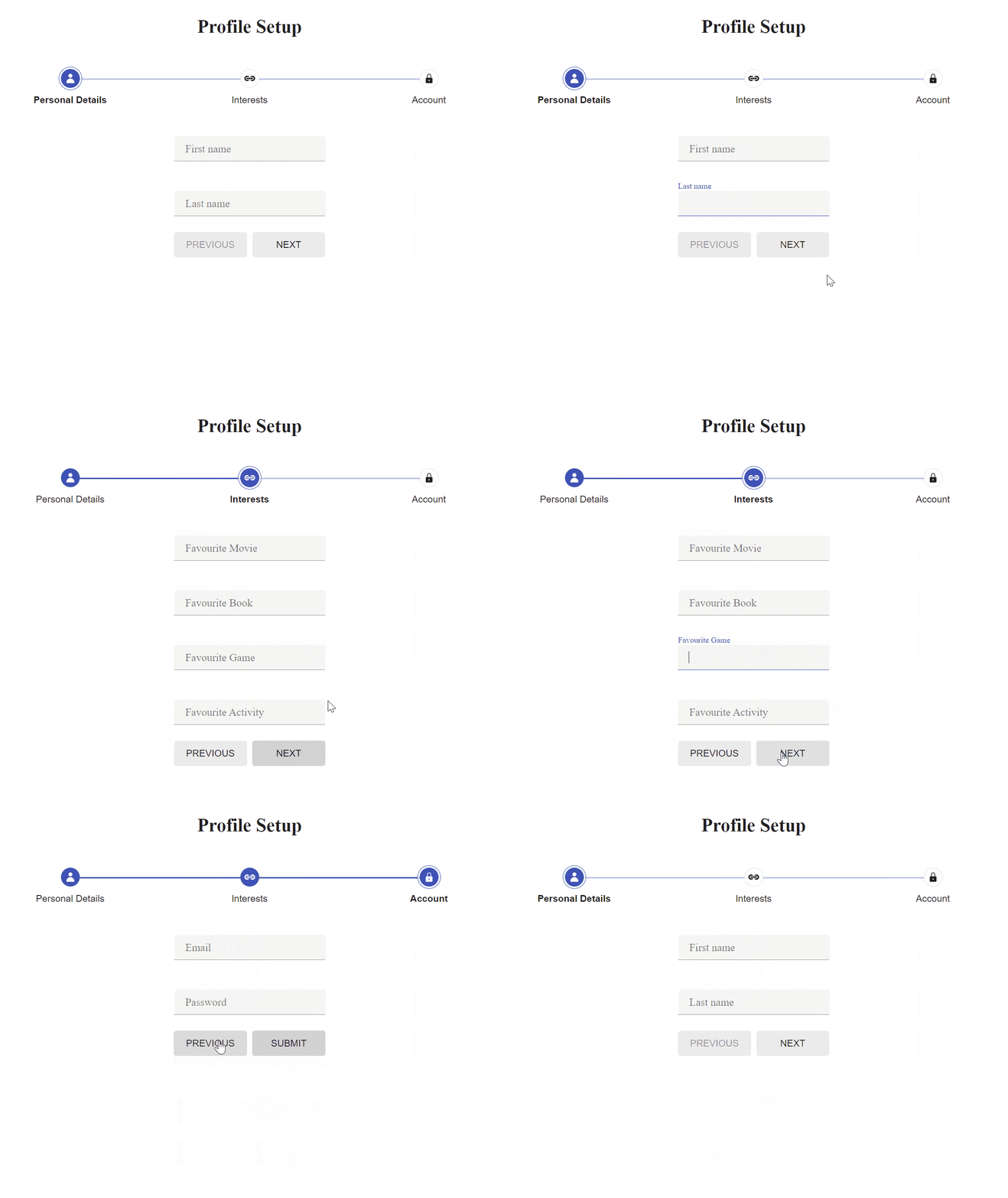
The GIF below shows what the stepper should look like.

Implementing Form Steps
Implementing a stepper to show the form’s progress was a breeze with KendoReact’s Stepper component. Next, let’s create components for each step.
Our form will consist of three steps—personal details, interests and account details—so let’s create component files for each. We will take advantage of Field and FieldWrapper components offered by the @progress/kendo-react-form package and Input component from @progress/kendo-react-inputs. First, let’s create the PersonalDetails.jsx file.
src/components/form-steps/PersonalDetails.jsx
import { Field, FieldWrapper } from "@progress/kendo-react-form";
import { Input } from "@progress/kendo-react-inputs";
const PersonalDetails = () => {
  return (
    <div>
      <FieldWrapper>
        <div className="k-form-field-wrap">
          <Field
            name={"firstName"}
            component={Input}
            labelClassName={"k-form-label"}
            label={"First name"}
          />
        </div>
      </FieldWrapper>
      <FieldWrapper>
        <div className="k-form-field-wrap">
          <Field
            name={"lastName"}
            component={Input}
            labelClassName={"k-form-label"}
            label={"Last name"}
          />
        </div>
      </FieldWrapper>
    </div>
  );
};

export default PersonalDetails;
In the PersonalDetails component, we have two inputs to collect the user’s first and last name. Next, let’s create the Interests component.
src/components/form-steps/Interests.jsx
import { Field, FieldWrapper } from "@progress/kendo-react-form";
import { Input } from "@progress/kendo-react-inputs";

const Interests = () => {
  return (
    <div>
      <FieldWrapper>
        <div className="k-form-field-wrap">
          <Field
            name="interests.movies"
            component={Input}
            labelClassName={"k-form-label"}
            label="Favourite Movie"
          />
        </div>
      </FieldWrapper>
      <FieldWrapper>
        <div className="k-form-field-wrap">
          <Field
            name="interests.books"
            component={Input}
            labelClassName={"k-form-label"}
            label="Favourite Book"
          />
        </div>
      </FieldWrapper>
      <FieldWrapper>
        <div className="k-form-field-wrap">
          <Field
            name="interests.games"
            component={Input}
            labelClassName={"k-form-label"}
            label="Favourite Game"
          />
        </div>
      </FieldWrapper>
      <FieldWrapper>
        <div className="k-form-field-wrap">
          <Field
            name="interests.activity"
            component={Input}
            labelClassName={"k-form-label"}
            label="Favourite Activity"
          />
        </div>
      </FieldWrapper>
    </div>
  );
};

export default Interests;
This component has four fields, as we want to know the user’s favorite movie, book, game and activity. Now, it’s time to handle the last of the steps—AccountDetails.
src/components/form-steps/AccountDetails.jsx
import { Field, FieldWrapper } from "@progress/kendo-react-form";
import { Input } from "@progress/kendo-react-inputs";

const AccountDetails = () => {
  return (
    <div>
      <FieldWrapper>
        <div className="k-form-field-wrap">
          <Field
            name="email"
            type="email"
            component={Input}
            labelClassName={"k-form-label"}
            label="Email"
          />
        </div>
      </FieldWrapper>
      <FieldWrapper>
        <div className="k-form-field-wrap">
          <Field
            name="password"
            type="password"
            component={Input}
            labelClassName={"k-form-label"}
            label="Password"
          />
        </div>
      </FieldWrapper>
    </div>
  );
};

export default AccountDetails;
The AccountDetails component is comprised of inputs for email and password.
The step components are ready, so let’s update the ProfileSetupForm component. You might have spotted that we did not use any props in the step components. The reason for this is quite simple. KendoReact provides Form and FormElement components that work in combination with the Field component to manage the form state. Here’s the updated ProfileSetupForm.jsx file.
src/components/ProfileSetupForm.jsx
import { useState } from "react";
import { Stepper } from "@progress/kendo-react-layout";
import { Form, FormElement } from "@progress/kendo-react-form";
import PersonalDetails from "./form-steps/PersonalDetails";
import Interests from "./form-steps/Interests";
import AccountDetails from "./form-steps/AccountDetails";
import { userIcon, linkIcon, lockIcon } from "@progress/kendo-svg-icons";

const steps = [
  {
    label: "Personal Details",
    svgIcon: userIcon,
  },
  {
    label: "Interests",
    svgIcon: linkIcon,
  },
  {
    label: "Account",
    svgIcon: lockIcon,
  },
];

const formStepComponent = {
  0: PersonalDetails,
  1: Interests,
  2: AccountDetails,
};

const ProfileSetupForm = () => {
  const [step, setStep] = useState(0);
  const FormStepComponent = formStepComponent[step];
  const isFirstStep = step === 0;
  const isLastStep = step === steps.length - 1;

  const onSubmitHandler = data => {
    console.log("SUBMIT", data);
    if (!isLastStep) {
      setStep(step => step + 1);
      return;
    }
    // Handle form submission
  };

  return (
    <div>
      <h1 className="k-text-center k-mb-8">Profile Setup</h1>
      <Stepper value={step} onChange={e => setStep(e.value)} items={steps} />

      <Form
        onSubmit={onSubmitHandler}
        render={formRenderProps => {
          return (
            <FormElement
              className="k-display-flex k-flex-column k-justify-content-center k-ml-auto k-mr-auto k-mt-12"
              style={{
                width: "225px",
              }}
            >
              <FormStepComponent />
              <div className="k-form-buttons k-mt-8 k-w-full">
                <button
                  type="button"
                  className="k-button k-button-md k-rounded-md k-button-solid k-button-solid-base k-w-full"
                  disabled={isFirstStep}
                  onClick={() => {
                    setStep(step => step - 1);
                  }}
                >
                  Previous
                </button>
<button
                    type="submit"
                    className="k-button k-button-md k-rounded-md k-button-solid k-button-solid-base k-w-full"
                  >
                    {isLastStep ? "Submit" : "Next"}
                  </button>
              </div>
            </FormElement>
          );
        }}
      />
    </div>
  );
};

export default ProfileSetupForm;
The step components must be rendered via the Form component’s render prop. This allows KendoReact to handle the form state for us. Besides rendering the appropriate step component, we also have two buttons—“Previous” and “Next/Submit.” The latter changes the text based on the current step. If it’s the last step, then the button will display the “Submit” text. Otherwise, it will display “Next.” The GIF below shows the working stepper form.

Stepper Form Validation
We have a working stepper form, but we should improve it by adding validation. We will make first name, last name, email and password fields required.
First, let’s create a custom input component that will wrap the Input from the @progress/kendo-react-inputs package. Our custom component will check if there is an error and display a message if one is present.
src/components/form-steps/TextField.jsx
import { Input } from "@progress/kendo-react-inputs";
import { Error } from "@progress/kendo-react-labels";

const TextField = props => {
  const { validationMessage, visited, ...fieldProps } = props;
  return (
    <div className="k-form-field-wrap">
      <Input {...fieldProps} />
      {visited && validationMessage ? <Error>{validationMessage}</Error> : null}
    </div>
  );
};

export default TextField;
Next, let’s update the PersonalDetails and AccountDetails components to utilize the newly created TextField component.
src/components/form-steps/PersonalDetails.jsx
import { Field, FieldWrapper } from "@progress/kendo-react-form";
import TextField from "./TextField";

const isRequired = message => value => value ? "" : message;

const PersonalDetails = () => {
  return (
    <div>
      <FieldWrapper>
        <div className="k-form-field-wrap">
          <Field
            name={"firstName"}
            component={TextField}
            labelClassName={"k-form-label"}
            label={"First name"}
            validator={isRequired("First name is required")}
          />
        </div>
      </FieldWrapper>
      <FieldWrapper>
        <div className="k-form-field-wrap">
          <Field
            name={"lastName"}
            component={TextField}
            labelClassName={"k-form-label"}
            label={"Last name"}
            validator={isRequired("Last name is required")}
          />
        </div>
      </FieldWrapper>
    </div>
  );
};

export default PersonalDetails;
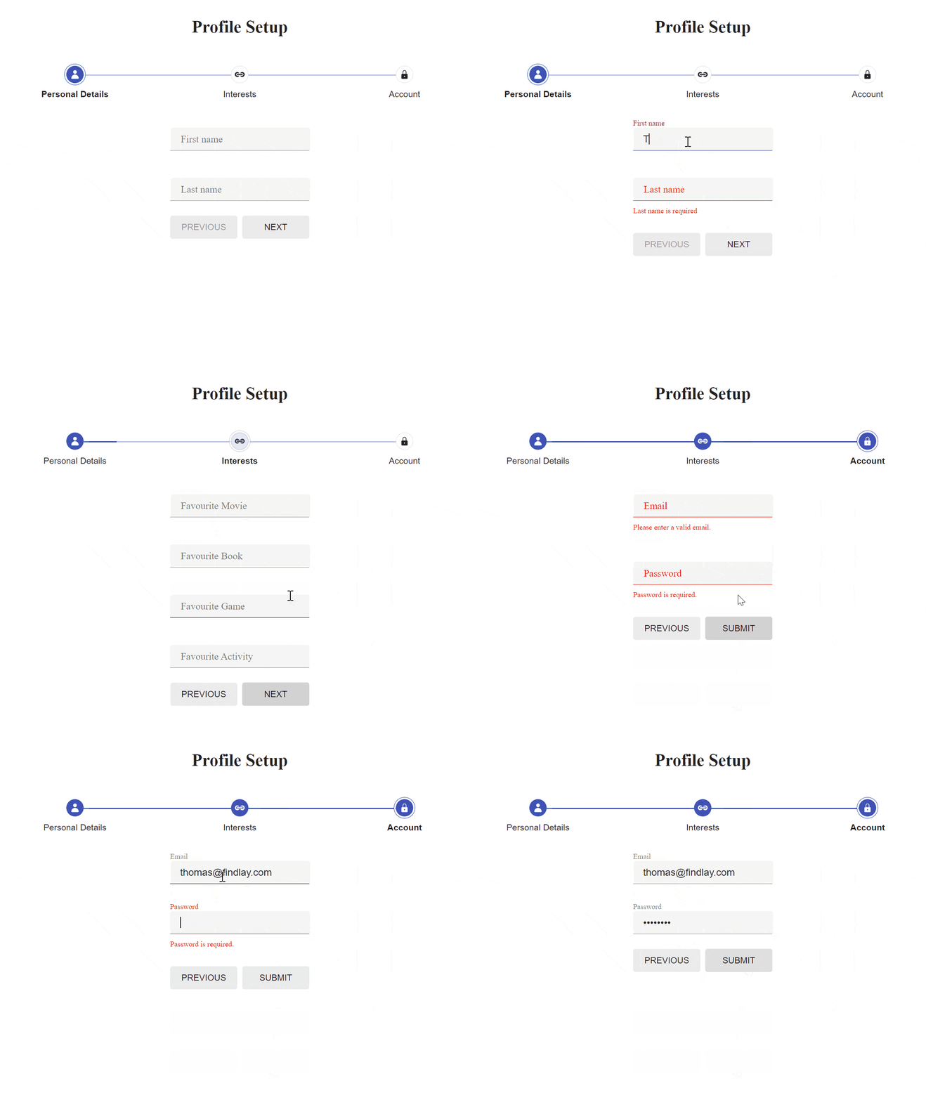
Besides changing the component, we also added the validator prop. Now, when a user tries to go to the next step without fulfilling the validation requirements, error messages will be shown until the user fixes the issues.
Let’s also update the AccountDetails component and add validators for email and password fields.
src/components/form-steps/AccountDetails.jsx
import { Field, FieldWrapper } from "@progress/kendo-react-form";
import TextField from "./TextField";
const emailRegex = new RegExp(/\S+@\S+\.\S+/);
const emailValidator = value =>
  emailRegex.test(value) ? "" : "Please enter a valid email.";

const passwordValidator = value => {
  if (!value) {
    return "Password is required.";
  }

  if (value.length < 8) {
    return "Password must have minimum 8 characters";
  }

  return "";
};

const AccountDetails = () => {
  return (
    <div>
      <FieldWrapper>
        <div className="k-form-field-wrap">
          <Field
            name="email"
            type="email"
            component={TextField}
            labelClassName={"k-form-label"}
            label="Email"
            validator={emailValidator}
          />
        </div>
      </FieldWrapper>
      <FieldWrapper>
        <div className="k-form-field-wrap">
          <Field
            name="password"
            type="password"
            component={TextField}
            labelClassName={"k-form-label"}
            label="Password"
            validator={passwordValidator}
          />
        </div>
      </FieldWrapper>
    </div>
  );
};

export default AccountDetails;
That’s it. The GIF below shows how the stepper form should look with the validation logic.

Conclusion
In this article, we explored how to build a stepper form in React using the KendoReact library. This approach simplifies complex forms and improves user experience by splitting large forms into smaller and easier to follow sections that are less likely to overwhelm users. By following these steps you can create an effective and user-friendly stepper form for your web applications.

Thomas Findlay
Thomas Findlay is a 5-star rated mentor, full-stack developer, consultant, technical writer and the author of “React - The Road To Enterprise” and “Vue - The Road To Enterprise.” He works with many different technologies such as JavaScript, Vue, React, React Native, Node.js, Python, PHP and more. Thomas has worked with developers and teams from beginner to advanced and helped them build and scale their applications and products. Check out his Codementor page, and you can also find him on Twitter.

