
Getting Started with the BottomSheet Component for .NET MAUI

Summarize with AI:
If your mobile app needs a slide-up section to appear from the bottom of the screen, check out the .NET MAUI BottomSheet component.
In some modern mobile applications, we can see a component called Bottom Sheet in action, which allows the user to slide a section up from the bottom of the application to display actions or information without changing the screen.
This type of component does not exist as part of the native .NET MAUI controls. Fortunately, the Progress Telerik suite of controls for .NET MAUI offers the .NET MAUI BottomSheet component, which we will analyze during this post. Let’s get started!
Discovering the Telerik .NET MAUI BottomSheet Component for .NET MAUI
We will explore different features of the Bottom Sheet component, for which I will show you a window created with XAML code that could well represent a section of a real application. Next, I will show you how to implement the Bottom Sheet control to display selection options to users in the same window.
Creating an Example Project
Suppose we have a project that allows users to order food from restaurants through an application. For the creation of the XAML page, I have used different controls from the Telerik UI for .NET MAUI suite, which enable the quick creation of custom graphical interfaces:
<Grid>
<Grid.RowDefinitions>
<RowDefinition Height=".2*" />
<RowDefinition Height=".8*" />
</Grid.RowDefinitions>
<!-- Header Section -->
<VerticalStackLayout Padding="25,25,25,0" Spacing="10">
<Label
FontAttributes="Bold"
FontSize="12"
Text="DELIVERY ADDRESS"
TextColor="White" />
<Grid>
<Grid.ColumnDefinitions>
<ColumnDefinition Width="*" />
<ColumnDefinition Width="Auto" />
</Grid.ColumnDefinitions>
<Grid.GestureRecognizers>
<TapGestureRecognizer Tapped="OnAddressTapped" />
</Grid.GestureRecognizers>
<Label
x:Name="CurrentAddressLabel"
FontSize="16"
Text="123 Main Street, City"
TextColor="White"
VerticalOptions="Center" />
<Label
Grid.Column="1"
Margin="10,0,0,0"
FontSize="14"
Text="▼"
TextColor="White"
VerticalOptions="Center" />
</Grid>
<!-- Search Bar -->
<telerik:RadBorder
Padding="10"
BackgroundColor="#6B5BAF"
CornerRadius="10">
<Grid ColumnDefinitions="Auto,*">
<Label
Margin="0,0,10,0"
FontSize="16"
Text="🔍"
VerticalOptions="Center" />
<telerik:RadEntry
x:Name="StoreSearchEntry"
Grid.Column="1"
BackgroundColor="Transparent"
BorderThickness="0"
ClearButtonVisibility="WhileEditing"
Placeholder="Search a restaurant or dish"
PlaceholderColor="#B8B0D0"
TextColor="White" />
</Grid>
</telerik:RadBorder>
</VerticalStackLayout>
<!-- Store List -->
<telerik:RadBorder
Grid.Row="1"
Margin="0,10,0,0"
BackgroundColor="#F2F1F6"
CornerRadius="25,25,0,0">
<telerik:RadCollectionView
x:Name="StoresCollection"
Margin="15"
SelectionChanged="OnStoreSelected"
SelectionMode="Single">
<telerik:RadCollectionView.ItemsLayout>
<telerik:CollectionViewLinearLayout ItemSpacing="15" />
</telerik:RadCollectionView.ItemsLayout>
<telerik:RadCollectionView.ItemTemplate>
<DataTemplate>
<Border
Padding="0"
BackgroundColor="White"
StrokeShape="RoundRectangle 15"
StrokeThickness="0">
<Border.Shadow>
<Shadow
Brush="#CFD0D4"
Opacity="0.5"
Radius="10"
Offset="5,5" />
</Border.Shadow>
<Grid Padding="0" RowDefinitions="150,Auto">
<!-- Store Header Image -->
<Grid>
<Grid.RowDefinitions>
<RowDefinition Height=".6*" />
<RowDefinition Height=".4*" />
</Grid.RowDefinitions>
<Grid.ColumnDefinitions>
<ColumnDefinition Width=".4*" />
<ColumnDefinition Width=".2*" />
<ColumnDefinition Width=".4*" />
</Grid.ColumnDefinitions>
<!-- Header Image -->
<Image
Grid.RowSpan="2"
Grid.ColumnSpan="3"
Aspect="AspectFill"
Source="{Binding Header}" />
<!-- Logo with gradient border -->
<Grid
Grid.Row="1"
Grid.Column="0"
Margin="10,0,0,0"
HeightRequest="70"
HorizontalOptions="Start"
VerticalOptions="End"
WidthRequest="70">
<Border
HeightRequest="65"
HorizontalOptions="Center"
StrokeShape="Ellipse"
StrokeThickness="3"
WidthRequest="65">
<Border.Stroke>
<LinearGradientBrush EndPoint="0,1">
<GradientStop Offset="0.0" Color="#FEFEEF" />
<GradientStop Offset="0.25" Color="#EBD570" />
<GradientStop Offset="0.5" Color="#FF94C3" />
<GradientStop Offset="0.75" Color="#A573E4" />
<GradientStop Offset="1.0" Color="#A9E2EE" />
</LinearGradientBrush>
</Border.Stroke>
<Image
Aspect="AspectFill"
HorizontalOptions="Center"
Source="{Binding Logo}" />
</Border>
</Grid>
<!-- Rating Badge -->
<Border
Grid.Row="1"
Grid.Column="2"
Margin="0,0,10,10"
Padding="10,5"
BackgroundColor="#F8F8F7"
HeightRequest="35"
HorizontalOptions="Center"
StrokeShape="RoundRectangle 10"
StrokeThickness="0"
VerticalOptions="End"
WidthRequest="70">
<HorizontalStackLayout
HorizontalOptions="Center"
Spacing="8"
VerticalOptions="Center">
<Label
FontSize="14"
Text="⭐"
VerticalOptions="Center" />
<Label
FontAttributes="Bold"
FontSize="14"
Text="{Binding Rating}"
TextColor="Black"
VerticalOptions="Center" />
</HorizontalStackLayout>
</Border>
</Grid>
<!-- Store Info -->
<VerticalStackLayout
Grid.Row="1"
Padding="15"
Spacing="8">
<Label
FontAttributes="Bold"
FontSize="18"
Text="{Binding Name}"
TextColor="Black" />
<Grid ColumnDefinitions="*,*,*">
<Label
FontSize="13"
Text="{Binding Minimum, StringFormat='${0} min'}"
TextColor="#666666" />
<Label
Grid.Column="1"
FontSize="13"
HorizontalOptions="Center"
Text="{Binding ServiceFee, StringFormat='Fee: ${0}'}"
TextColor="#666666" />
<Label
Grid.Column="2"
FontSize="13"
HorizontalOptions="End"
Text="{Binding DeliveryTime}"
TextColor="#666666" />
</Grid>
</VerticalStackLayout>
</Grid>
</Border>
</DataTemplate>
</telerik:RadCollectionView.ItemTemplate>
</telerik:RadCollectionView>
</telerik:RadBorder>
</Grid>
The result is a beautiful graphical interface that showcases some fictional restaurants, along with additional controls like a search bar and a physical address selector:
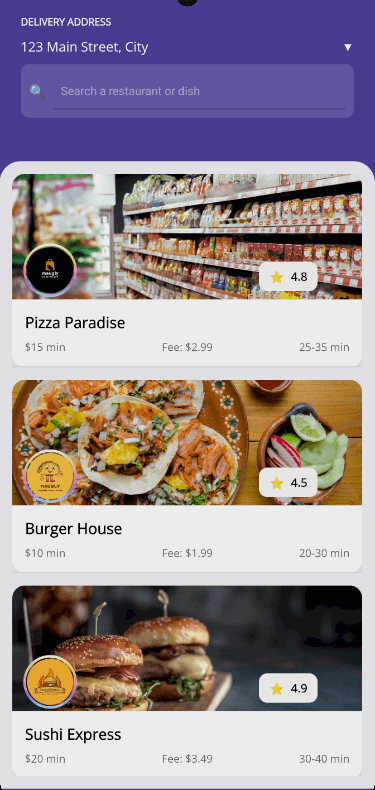
In the screenshot above, you can see some Telerik components used, such as the following:
RadEntry: For the store search barRadBorder: To enhance the appearance of the search bar and list itemsRadCollection: To display the list of stores
At the top of the app, I have placed a fictional address below the text Delivery Address. Ideally, users should be able to select a different delivery address if needed without leaving the current screen. This is an excellent use case for a Bottom Sheet.
Getting to Know the Telerik BottomSheet Component
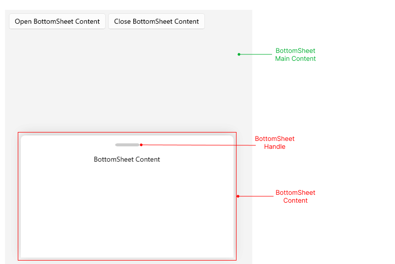
To implement the Bottom Sheet component, it’s essential to understand that it consists of three parts that we can configure:
- BottomSheet Main Content: Container for the graphic content that will be visible before displaying the Bottom Sheet.
- BottomSheet Content: Content that fills the Bottom Sheet and that we will show as options or additional information to the user.
- BottomSheet Handle: A visual cue that indicates to the user that they can drag the Bottom Sheet.
You can see the location of each of these parts graphically below:
Now that we have this information, let’s proceed to add a Bottom Sheet to the project.
Adding the BottomSheet Component to a .NET MAUI Project
Once we are familiar with the main parts of the Bottom Sheet control, the next step is to migrate the existing UI content into the BottomSheet Main Content section, using the Content property as follows:
<telerik:RadBottomSheet x:Name="AddressBottomSheet">
    <telerik:RadBottomSheet.Content>
        <Grid>
            ...
        </Grid>
     </telerik:RadBottomSheet.Content>
</telerik:RadBottomSheet>
The above will determine the content over which the Bottom Sheet will appear. Next, we need to specify the BottomSheetContent tag, where we will define the content that will be shown to the user when the Bottom Sheet appears:
    <telerik:RadBottomSheet x:Name="AddressBottomSheet">
        ...
        <telerik:RadBottomSheet.BottomSheetContent>
            <Grid
                Padding="20,20,20,60"
                RowDefinitions="Auto,Auto,*,Auto"
                RowSpacing="15">

                <!--  Header  -->
                <Grid ColumnDefinitions="*,Auto">
                    <VerticalStackLayout>
                        <Label
                            FontAttributes="Bold"
                            FontSize="22"
                            Text="📍 Delivery Address"
                            TextColor="#333333" />
                        <Label
                            Margin="0,5,0,0"
                            FontSize="13"
                            Text="Select or add a new delivery address"
                            TextColor="#888888" />
                    </VerticalStackLayout>
                    <telerik:RadTemplatedButton
                        Grid.Column="1"
                        BackgroundColor="Transparent"
                        Clicked="OnCloseBottomSheet"
                        Content="✕"
                        CornerRadius="20"
                        FontSize="20"
                        HeightRequest="40"
                        TextColor="#666666"
                        WidthRequest="40" />
                </Grid>

                <!--  Search Address  -->
                <telerik:RadBorder
                    Grid.Row="1"
                    Padding="12"
                    BackgroundColor="#EAEAEA"
                    CornerRadius="12">
                    <Grid ColumnDefinitions="Auto,*">
                        <Label
                            Margin="0,0,10,0"
                            FontSize="16"
                            Text="🔍"
                            VerticalOptions="Center" />
                        <telerik:RadEntry
                            x:Name="AddressSearchEntry"
                            Grid.Column="1"
                            BackgroundColor="Transparent"
                            Placeholder="Search your addresses..."
                            PlaceholderColor="#999999"
                            BorderThickness="0"
                            ClearButtonVisibility="WhileEditing"
                            TextChanged="OnAddressSearchTextChanged" />
                    </Grid>
                </telerik:RadBorder>

                <!--  Address List -->
                <telerik:RadCollectionView
                    x:Name="AddressesCollectionView"
                    Grid.Row="2"
                    SelectionChanged="OnAddressSelectionChanged"
                    SelectionMode="Single">
                    <telerik:RadCollectionView.ItemsLayout>
                        <telerik:CollectionViewLinearLayout ItemSpacing="10" />
                    </telerik:RadCollectionView.ItemsLayout>
                    <telerik:RadCollectionView.ItemTemplate>
                        <DataTemplate>
                            <Border Style="{StaticResource AddressItemStyle}">
                                <Grid ColumnDefinitions="*,Auto" ColumnSpacing="12">
                                    <!--  Address Details  -->
                                    <VerticalStackLayout Spacing="2" VerticalOptions="Center">
                                        <Label
                                            FontAttributes="Bold"
                                            FontSize="15"
                                            Text="{Binding Label}"
                                            TextColor="#333333" />
                                        <Label
                                            FontSize="13"
                                            LineBreakMode="TailTruncation"
                                            Text="{Binding FullAddress}"
                                            TextColor="#888888" />
                                    </VerticalStackLayout>

                                    <!--  Selection Indicator  -->
                                    <Border
                                        Grid.Column="1"
                                        BackgroundColor="{Binding SelectionColor}"
                                        HeightRequest="24"
                                        Stroke="{Binding SelectionBorderColor}"
                                        StrokeShape="RoundRectangle 12"
                                        StrokeThickness="2"
                                        VerticalOptions="Center"
                                        WidthRequest="24">
                                        <Label
                                            FontSize="14"
                                            HorizontalOptions="Center"
                                            Text="{Binding CheckMark}"
                                            TextColor="White"
                                            VerticalOptions="Center" />
                                    </Border>
                                </Grid>
                            </Border>
                        </DataTemplate>
                    </telerik:RadCollectionView.ItemTemplate>
                </telerik:RadCollectionView>

                <!--  Action Buttons  -->
                <VerticalStackLayout Grid.Row="3" Spacing="12">
                    <telerik:RadButton
                        x:Name="SelectAddressButton"
                        BackgroundColor="#FB7647"
                        Clicked="OnSelectAddressClicked"
                        CornerRadius="12"
                        FontAttributes="Bold"
                        HeightRequest="54"
                        IsEnabled="False"
                        Text="Select Address"
                        TextColor="White" />
                    <telerik:RadButton
                        BackgroundColor="#4F3F9B"
                        Clicked="OnAddNewAddressClicked"
                        CornerRadius="12"
                        FontAttributes="Bold"
                        HeightRequest="54"
                        Text="Add new address"
                        TextColor="White" />
                </VerticalStackLayout>
            </Grid>
        </telerik:RadBottomSheet.BottomSheetContent>
    </telerik:RadBottomSheet>
With the above code, we have prepared the Bottom Sheet content to be displayed to the user when we indicate it.
Showing the BottomSheet to the User
Once we have the content of the Bottom Sheet ready, the next step is to display it.
There are several ways to achieve this; we will use the method GoToBottomSheetState, which allows for transitioning to a specific state. A state refers to how much screen space the Bottom Sheet will occupy, with possible values being Hidden (default), Minimal (25%), Partial (50%) and Full (90%). It is also possible to create custom states.
Knowing the above, in my example I will use the TapGestureRecognizer, which is part of the container that displays the current address, to show the Bottom Sheet from there:
private void OnAddressTapped(object sender, EventArgs e)
{
   AddressBottomSheet.GoToBottomSheetState(BottomSheetState.FullState);
}
In the same way that the Bottom Sheet can be shown at will, it can also be hidden using the same method, GoToBottomSheetState:
private void OnCloseBottomSheet(object sender, EventArgs e)
{
   AddressBottomSheet.GoToBottomSheetState(BottomSheetState.HiddenState);
}
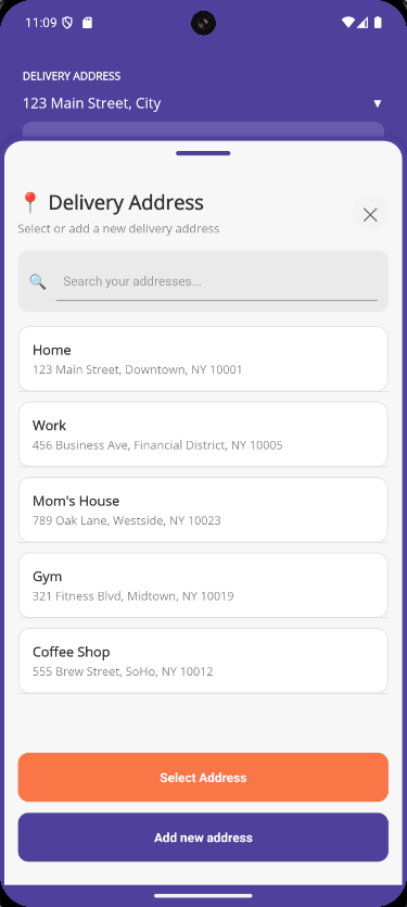
The execution of the above changes results in the following:

In the image above, you can see how it is possible to select a different address thanks to the use of the Bottom Sheet, with a spectacular appearance, all without leaving the current window.
Customizing the Bottom Sheet
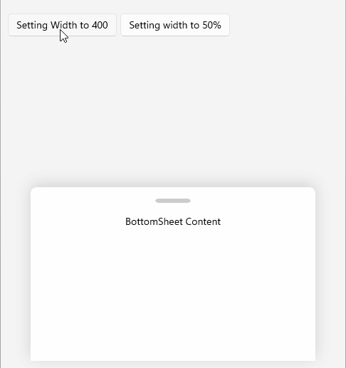
The Telerik BottomSheet control for .NET MAUI offers several properties that allow for the customization of the control. For example, the property Width allows you to specify the horizontal space that the Bottom Sheet will occupy, either through an absolute value or a percentage:
Similarly, if you want to prevent the user from dragging up or down on the BottomSheet Handle, you can configure the property IsSwipeEnabled with a value false.
In addition, it is also possible to modify the animation of the Bottom Sheet, enabling or disabling it with the property IsAnimationEnabled, and adjusting both the duration of the animation and the easing function used through the properties AnimationDuration and AnimationEasing.
You can also change features such as the border, corner radius and background color of the Bottom Sheet through the property BottomSheetContentStyle. Additionally, you can modify the properties of the BottomSheet Handle using the property HandleStyle.
Below, I show you an example of the aforementioned properties applied to the Bottom Sheet:
<ContentPage...>

    <ContentPage.Resources>
        <!--  BottomSheet Content Style  -->
        <Style x:Key="BottomSheetContentStyle" TargetType="telerik:BottomSheetContentView">
            <Setter Property="BackgroundColor" Value="#F7F7F7" />
            <Setter Property="CornerRadius" Value="25,25,0,0" />
            <Setter Property="BorderColor" Value="#4F3F9B" />
            <Setter Property="BorderThickness" Value="5" />
        </Style>

        <!--  BottomSheet Handle Style  -->
        <Style x:Key="HandleStyle" TargetType="telerik:BottomSheetHandle">
            <Setter Property="BackgroundColor" Value="#4F3F9B" />
            <Setter Property="HeightRequest" Value="5" />
            <Setter Property="WidthRequest" Value="60" />
            <Setter Property="CornerRadius" Value="3" />
        </Style>
        ...
    </ContentPage.Resources>

    <telerik:RadBottomSheet
        x:Name="AddressBottomSheet"
        AnimationDuration="300"
        AnimationEasing="{x:Static Easing.CubicOut}"
        BottomSheetContentStyle="{StaticResource BottomSheetContentStyle}"
        BottomSheetContentWidth="100%"
        HandleStyle="{StaticResource HandleStyle}"
        IsAnimationEnabled="True"
        IsSwipeEnabled="True"
        State="Hidden"
        StateChanging="OnBottomSheetStateChanging">
        ...
    </telerik:RadBottomSheet>
</ContentPage>
The result of executing with the previous changes applied provides greater customization of the Bottom Sheet:
With this, we achieve a visual improvement that better centers the user on the content of the Bottom Sheet.
Conclusion
Throughout this article, you have learned about the BottomSheet component of the Telerik UI for .NET MAUI control suite, understanding its purpose and how to customize it to show users additional options without leaving the current screen.
Undoubtedly, adding this type of component to your applications can enhance the user experience by allowing them to perform quick actions or obtain information easily.
Want to try this out for yourself? Telerik UI for Blazor comes with a free 30-day trial.

Héctor Pérez
Héctor Pérez is a Microsoft MVP with more than 10 years of experience in software development. He is an independent consultant, working with business and government clients to achieve their goals. Additionally, he is an author of books and an instructor at El Camino Dev and Devs School.
Related Posts
Comments
All articles
Topics
Web MobileMobile
Desktop
Design
Productivity
People
