
Accessibility (A11y) in .NET MAUI: What It Is and How to Implement It

Summarize with AI:
It’s time to add accessibility into the early stages of your .NET MAUI development cycle. The POUR principles can help.
Developing applications that can be used by everyone is a goal that any app should keep in mind. When I say “for everyone,” I mean that our applications should be able to communicate a clear and understandable purpose, so that people with or without disabilities can use them without issues. In other words, it’s not just about “making it work,” nor about limiting it to a single way of use (such as only being understandable if you can read the buttons).
You’ve probably heard the term A11y, and maybe you’ve stopped to think… What does it mean? 🤔 A11y refers to the accessibility of our applications. While it’s much more common to hear this term in the web space, mobile applications should also take it into account to offer a better product.
In this article, you’ll learn more about accessibility, some guidelines you can follow to apply it correctly in .NET MAUI, the aspects you should start paying attention to and why A11y is not an extra, but a fundamental part of the quality of a well-built application.
Let’s Talk More About A11y
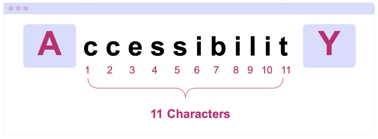
A11y is an abbreviated form of the word accessibility, and its goal is to allow people with or without visual, auditory, motor or cognitive disabilities to use your apps. A11Y is a type of abbreviation very common in technology, and it is known as a numeronym.
It works as follows:
- A: is the first letter of the word.
- 11: is the number of characters that come after the first letter and before the last one. In Accessibility, specifically in “ccessibilit,” there are 11 letters.
- Y: is the last letter of the word.
That’s why it is abbreviated as: A11y. This method makes it much more convenient to write long terms in a faster way and helps standardize lengthy terminology.
How Can We Apply A11y in Our Apps?
To implement this in our applications, there are accessibility guidelines such as WCAG, which instruct us on how to adapt the tools that mobile devices already provide so they can work together with our apps.
The Web Content Accessibility Guidelines (WCAG) are a set of international guidelines created by the World Wide Web Consortium (W3C). Although web is part of their name, I always recommend applying these practices to all types of applications, including mobile. Our users will thank us for it.
In fact, the official documentation states the following:
“These guidelines address accessibility of web content on any kind of device (including desktops, laptops, kiosks, and mobile devices).”
The WCAG are built on four fundamental principles, known as POUR. WCAG defines what an application must comply with to be accessible, while POUR helps us understand how to think about accessibility from a development perspective.
These four criteria that make up POUR are:
- Perceivable
- Operable
- Understandable
- Robust
Let’s take a closer look at POUR—what each principle means and some examples of how we can translate them into our .NET MAUI applications:
Perceivable
This principle indicates that all the information in the app (including text and UI components) must be perceivable by the user, regardless of how they interact with the device. In other words, our app should not be based solely on visual information.
This is especially important for users who:
- Use screen readers such as TalkBack or VoiceOver
- Have low vision or use larger text sizes
In .NET MAUI, we have SemanticProperties, which help us a lot with this aspect.
📝 Semantic properties are the Microsoft-recommended approach in .NET MAUI to provide accessibility values in applications. This allows us to add a description to our visual elements so that they can be read by the screen reader.
Additionally, I recommend exploring SemanticOrderView. While the individual reading of each visual element is important, being able to provide the user with a reading order so that this reading is coherent greatly enhances a good user experience. For this, we can use SemanticOrderView from the .NET MAUI Community Toolkit.
Let’s explore some examples of implementing the Percievable principle in .NET MAUI:
Alternative Text for Images and Icons
Images and icons are very common in mobile apps, but for a screen reader, an image without a description is 100% invisible. That’s why it’s recommended to tell the screen reader that there is something there and what it should read.
In the following example, you can see the warning.png image used in the UI. When navigating the app with VoiceOver or TalkBack, this image will be announced as “Warning icon.” For this reason, I recommend being as specific as possible when defining its description.
<Image Source="warning.png"
 SemanticProperties.Description="Warning icon" />
What About Decorative Images?
Not all images provide information. In these cases, we can remove them from the accessibility tree so the screen reader ignores them (meaning it won’t read them):
<Image Source="divider.png"
 AutomationProperties.IsInAccessibleTree="False" />
This helps keep the experience cleaner and prevents the screen reader from reading unnecessary elements.
Headings
Screen readers don’t just “read in order” and stop there; they also allow users to navigate by sections. For this reason, it’s important to mark titles or main sections as semantic headings.
<Label Text="Payment Settings"
 FontSize="24"
 SemanticProperties.HeadingLevel="Level1" />
This way, the screen reader recognizes this element as a heading and makes navigation within the screen much easier.
Supporting Scalable Text
In addition to screen readers, there is also a significant number of users with low vision. You may have noticed that some people use very large text on their phones; that’s probably why.
As developers, we can contribute to making our app more accessible by allowing it to adapt to the text size users feel most comfortable with.
For this, in .NET MAUI we have FontAutoScalingEnabled, a property that allows the text in our app to automatically scale according to the system preferences.
<Label Text="Payment Settings"
 FontSize="24"
 FontAutoScalingEnabled="True" />
With this, if the user increases the text size from the device settings, the Label will scale accordingly, improving readability and aligning with the Perceivable principle.
Operable
The Operable principle states that users must be able to interact with the app without difficulty, regardless of the way they use the device.
In other words, not all users interact in the same way. Some use screen readers, others use a keyboard or assisted navigation. For this reason, the app should not rely solely on complex gestures or interactions that do not provide a clear alternative.
In mobile applications, this principle basically translates into:
- Easy-to-tap controls
- Clear and predictable navigation
- Avoiding interactions that require extreme precision
In .NET MAUI, many of these best practices can be applied directly using the components we already work with. Let’s see NET MAUI some Operable examples we can apply:
Appropriate Size for Interactive Elements
A very common problem is having icons or buttons that are too small, which limits interaction and can make the app difficult—or even impossible—to use for some users.
For this reason, it is recommended to respect minimum sizes for interactive elements:
iOS: minimum 44 × 44 pt
This recommendation comes from Apple’s Human Interface Guidelines, where this minimum size is established for interactive elements such as buttons or tappable icons.Android: minimum 48 × 48 dp
On Android, this recommendation comes from the Android Accessibility Guidelines and Material Design.
In .NET MAUI, we can apply this easily, for example:
<Button Text="Continue"
 HeightRequest="48"
 Padding="16,12" />
Or for icon ImageButton:
<ImageButton Source="close.png"
 WidthRequest="48"
 HeightRequest="48"
 Padding="12"
 SemanticProperties.Description="Close" />
Understandable
This principle states that the information and interactions within our app must be easy to understand.
Why is this important?
- Not all users have the same technical level.
- Some may have cognitive difficulties.
- Others are simply using the app for the first time.
In mobile applications, this principle mainly translates into:
- Clear and direct text
- Consistent navigation
- Predictable actions
- Error messages that explain what happened and what to do next
Some examples of Understandable in .NET MAUI:
Clear Language in Text and Labels
Avoid ambiguous or overly technical texts (I’ve literally seen “state error” in apps … that should not happen), especially in buttons and important messages.
For example, for a save button, use text that clearly describes the action:
<Button Text="Save changes" />
Once the save action is executed, if an error occurs, don’t leave the user guessing or hanging. Tell them exactly what happened.
❌ Saving changes failed
✅ The name field cannot contain special characters
The idea is for the user to understand what happened and what the next step is, without having to interpret technical messages.
Robust
This principle states that the app must be robust enough to work correctly across different environments or devices. In other words, the app should continue to work when:
- It runs on different versions of the operating system
- It is used with screen readers such as TalkBack or VoiceOver
- It is used across different platforms
- It adapts to different screen sizes (small, medium and large) without affecting usability or content clarity
An example of the Robust principle in .NET MAUI is the use of OnPlatform.
OnPlatform
Although .NET MAUI abstracts many platform differences—and personally, I try to use OnPlatform as little as possible to keep maintenance easier across Android and iOS, always looking for visual elements that give me the same result—in some cases, Android and iOS behave differently, and using it becomes necessary.
If you run into that situation, you can use OnPlatform to keep the behavior on both platforms exactly how you want it:
<Button Text="Continue"
 HeightRequest="{OnPlatform iOS=44, Android=48}"
 Padding="{OnPlatform iOS='16,12', Android='16,14'}" />
This way, you respect each platform’s recommendations while keeping an accessible and consistent experience, aligned with the Robust principle.
Conclusion
And that’s it! 🎉 In this article, we talked about A11y and why accessibility should be part of how we build mobile apps with .NET MAUI, not something added at the end. By understanding the POUR principles we saw how accessibility can be applied through small, intentional UI decisions.
From making content perceivable and interactions operable, to keeping things understandable and keeping our apps robust across platforms, each choice helps create a better experience for more users.
Remember: users may not know what A11Y is, but they definitely feel it when an app is accessible. 💚
See you in the next article! 🙋♀️✨

Leomaris Reyes
Leomaris Reyes is a software engineer from the Dominican Republic specializing in mobile development. She is a 7-time Microsoft MVP and actively builds mobile applications while sharing practical knowledge through technical articles and developer-focused content.
Through her work, she explains programming concepts, developer tools and real-world development practices to help developers grow in their careers.
You can follow her on Instagram and TikTok at @leomarisreyes.dev, read her articles on AskXammy, and connect with her on LinkedIn, where she shares tutorials, insights and resources for developers.
Related Posts
Comments
All articles
Topics
Web MobileMobile
Desktop
Design
Productivity
People
