
First Look: Forms and Validation in Razor Components
 by Chris Sainty

Summarize with AI:
Let's look at the new forms and validation feature just added to Razor Components. We'll start with an overview of the forms and validation implementation, then look at what is included out of the box. We'll finish with an example of how to use it all.
It's been another great release for Blazor/Razor Components fans. We've had some cool new additions including pre-rendering and improved event handling, but I think the big one is forms and validation.
In this post, I'm going to give you a first look at this new feature. We'll start with an overview of how everything works, then take a look at the new components we have available to us, and finished up by looking at an example of their usage.
Overview of Forms and Validation
Many of you may be glad to hear, that, out of the box, validation is based on data annotation, similar to MVC. This is a great starting point, as it's already such a well-established pattern in ASP.NET (MVC, Razor Pages).
Again, for anyone who's had experience with forms and validation in ASP.NET previously, there are a couple of familiar components. There's a validation summary component and a validation message component, which work in the same way as their namesakes in MVC.
But what if you're not a fan of data annotations? Well, that's ok too. As has been the case with Blazor since the start, the team has been very good at giving developers options where they can. Forms and validation are no different.
Although out of the box data annotations are included, you are free to swap them out for another validation system of your choice and fluent validations perhaps? If you don't like the default behavior of the new input controls, you can create your own. You can pretty much tailor the forms and validation system to your liking.
What's in the Box?
Let's have a quick look over the new components that are included with forms and validation. As I said before, if you have any experience with ASP.NET MVC applications, then some of the names are probably going to look familiar to you.
EditForm
This is your starting point when creating a form. This component wraps all form controls, it provides the infrastructure for managing form validation, and it provides some useful events to hook into when submitting the form: OnValidSubmit, OnInvalidSubmit and OnSubmit.
You can use OnValidSubmit and OnInvalidSubmit together, but OnSubmit can only be used alone. When using OnValidSubmit the framework will trigger validation for you, but when using OnSubmit you are responsible for making sure the form is valid.
The other important parameter to know about is the Model parameter. This is the top level model object for the form. It's in this object where you would specify your data annotations that the form will use for validation.
DataAnnotationsValidator
The DataAnnotationsValidator component enables data annotations support for the form. If you wanted to use a different method for validation, then you could swap this component out and replace it with another implementation.
ValidationSummary
This component will list out the validation errors in your form as a simple list. You would usually place this at the top of your form. Again, this will sound very familiar if you've had previous experience with data annotations validation.
ValidationMessage
Very similar to the ValidationSummary component, the ValidationMessage component differs by showing the validation errors for a specific input field, specified using the For parameter. You would usually place this component close to the field it's validating.
Input Components
There are now six new components covering various input types. These are designed to work seamlessly with the components above to handle validation.
InputTextInputTextAreaInputNumberInputCheckboxInputSelectInputDate
The names are pretty self-explanatory, but it's worth pointing out that InputData and InputNumber have some basic value parsing so an invalid date or a non-number value will automatically show as a validation error, which is neat. You may have also noticed that there is no radio button component out of the box. If you need to validate radio buttons, for now, you will need to write your own.
Usage Example
Now that we know what the building blocks are, let's have a look at how we can use them. We'll set up a simple form using the following model.
public class Film
{
  [Required, StringLength(50, ErrorMessage = "Title must be 50 characters or less")]
  public string Title { get; set; }

  [Required]
  public DateTime ReleaseDate { get; set; }

  [Range(1, 5, ErrorMessage = "Rating must be from 1 to 5")]
  public int Rating { get; set; }

  [Required]
  public string Genre { get; set; }

  public bool IsWatched { get; set; }

  [StringLength(500, ErrorMessage ="Comments must be 500 characters or less")]
  public string Comments { get; set; }
}
I'm going to add the code for the form and then we can break it down to make sure it all makes sense.
<EditForm Model="@film" OnValidSubmit="@HandleFormSubmit">
  <DataAnnotationsValidator />
  <ValidationSummary />
  <div>
    <label for="title">Title: </label>
    <InputText Id="title" bind-Value="@film.Title" />
  </div>
  <div>
    <label for="release-date">Release Date: </label>
    <InputDate Id="release-date" bind-Value="@film.ReleaseDate" />
  </div>
  <div>
    <label for="rating">Rating</label>
    <InputNumber Id="rating" bind-Value="@film.Rating" />
  </div>
  <div>
    <label for="genre">Genre</label>
    <InputSelect bind-Value="@film.Genre">
      <option value="horror">Horror</option>
      <option value="thriller">Thriller</option>
      <option value="comedy">Comedy</option>
      <option value="action">Action</option>
      <option value="romance">Romance</option>
    </InputSelect>
  </div>
  <div>
    <label for="watched">Watched</label>
    <InputCheckbox Id="watched" bind-Value="@film.IsWatched" />
  </div>
  <div>
    <label for="comments">Comments</label>
    <InputTextArea Id="comments" bind-Value="@film.Comments" />
  </div>
  <button type="submit">Submit</button>
</EditForm>

@functions {
  Film film = new Film();

  void HandleFormSubmit()
  {
    Console.WriteLine("Form is valid! Send the data.");
  }
}
To start with, we're using the EditForm component to define the form. The Model parameter is set to the film instance declared in the functions block, and the HandleFormSubmit method is registered to the OnValidSubmit event.
Next is the DataAnnotationsValidator. This tells the form that we want to use data annotations to validate our fields. Then we have a ValidationSummary component, which will display any validation errors our form has.
The rest of the form is declaring the various input controls for the properties on our film object. Notice that they use the bind-Value syntax. If you've not seen this before, it is two-way binding. There are other options for binding values that offer greater control, but they are out of the scope of this post.
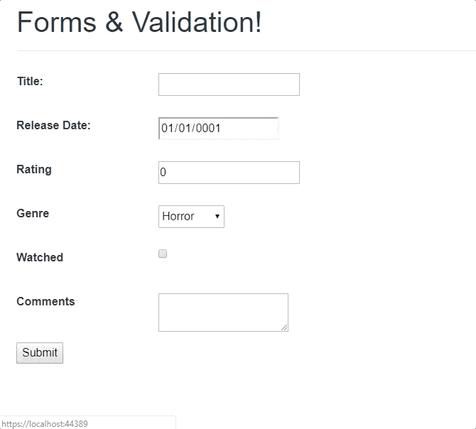
If we run the above code, it will look something like this:
Summary
In this post we had a first look at the new forms and validation feature in Razor Components. We did an overview of how forms and validation works, looked at what's included out of the box, as well as covered a simple usage example.
For More on Building Apps with Blazor
Want to learn about creating great user interfaces with Blazor? Check out Telerik UI for Blazor. It's currently in public preview, so give it a try and please let us know what you think. You can learn about the latest release (at time of writing that's 0.3) here.
Chris Sainty
Chris is a Microsoft MVP, software engineer and blogger with over 15 years experience working with ASP.NET. He is passionate about sharing his knowledge with the community and is an avid blogger and speaker. A strong believer in open source, he maintains several projects under the GitHub organisation, Blazored. He also contributes to other projects as much as possible. Chris is a proud member of the .NET Foundation. You can find Chris online at his blog chrissainty.com and on Twitter as @chris_sainty.