
Expanding and Collapsing a Crosstab in the Web Report Designer

Summarize with AI:
The Web Report Designer’s Crosstab component lets you drill down into detail data when you need it—all you have to do is turn it on.
You can create interactive reports using Progress Telerik Report Designers, including a crosstab report that lets you expand and collapse your detail data as you need it. If you’re using the Web Report Designer embedded in an application, you can even create those reports right in the application where you’ll use them.
In a previous post I showed how to add a crosstab to a report. In this post, I’ll show how to expand and display the groups in that crosstab so you can have the detail data when you need it and hide it the rest of the time.
The good news is that the interactivity you want is built into the crosstab component—you just need to do two things: activate the interactivity and set the crosstab’s initial display.
Activating Crosstab Interactivity
To activate the built-in interactivity provided by the crosstab you need to set two things:
- The site for your interactivity: Where you’ll click to trigger expanding/collapsing your detail
- The target: What part of your crosstab you want to expand/collapse
Typically, the site where you’ll tie your interactivity is the field you added to your crosstab’s Row Group or Column Group (in my case, I added the CategoryName field to the crosstab’s Row Group). In a Row Group, that field will be in the leftmost column of the crosstab (in a Column Group, it will be in the top row of the crosstab).
For the sample crosstab report I’m using for my case study, that means that I want to be able to click on the Category textbox in my crosstab’s leftmost column to trigger expanding/collapsing data.
Typically (again) the target—the fields you want to expand and collapse—will be the fields you added to the crosstab’s Detail Values. In my case, that’s my ProductName, UnitPrice, UnitsInStock and UnitsOnOrder fields. In a Row Group, only the subtotals for the fields will be displayed when the group is collapsed but all the detail rows will be displayed when the group is expanded (in a Column Group, the columns will be hidden or displayed). For my case study, when I click on the CategoryName column, I want to display the detail data for each product in the category.
That takes longer to explain than to do. First, you need to select the textbox in your crosstab that you want to click on to expand/collapse your data (for me, that’s the CategoryName textbox in the crosstab’s leftmost column). Then, in the panel on the right, you need to expand the Action section and, then, in the Type dropdown list at the top of the section, select the Toggle visibility option.
Your final step is to specify that you want to make the details section of the crosstab visible/invisible. That’s a two-step process:
- In the Toggle targets dropdown list, select the option labeled “detail (TableGroup)”.
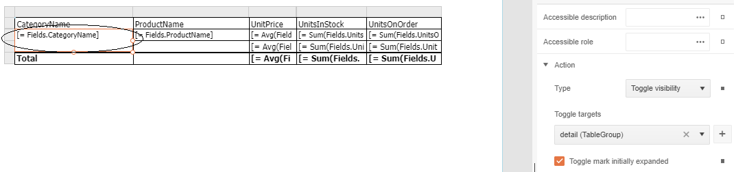
- Click the plus sign to the right of the dropdown list to add that detail section to your list of toggled targets.
Hint: As that implies, you can have make as many groups visible or invisible as you want: Just add more groups to your list of targets.
You’ve now enabled your crosstab’s interactivity … but you’re probably not done yet.
Setting the Initial State
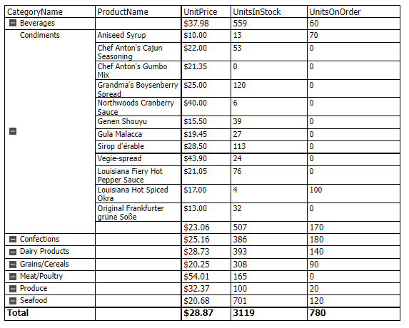
If your goal is, initially, to have a big-picture view of your data that you can use to determine what detail you want to see … well, then you’ll probably be disappointed if you preview your report at this stage. By default, the initial view of your report displays the detail data for all the rows in your crosstab.
While you can collapse the groups you’re not interested in, the rest of the groups will still be showing all their detail rows (in the following screenshot, for example, the Condiments group has been collapsed but all the other groups are still expanded).
To meet your goal, all you have to do is change the default, initial view of the crosstab from “detail expanded” to “detail collapsed.”
Hint: You don’t have to keep closing the tab in your browser that’s displaying your report in order to make changes to your report. If you want, you can just return to the tab where you’re editing the report in the report designer to make your changes, leaving your preview tab open. When you’re done making changes, click on the Save option in the hamburger menu in the upper left corner of the report designer before switching back to your preview tab. When you get back to your preview, press F5 to refresh the report and see your changes.
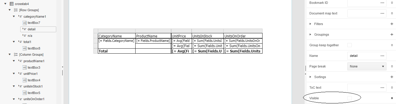
To change the initial view of your crosstab, switch to the Explorer tab on the left side of the designer and find your crosstab (it will be called something like “crosstabn”—e.g., crosstab1).
Under Row Groups for your crosstab, find the field you dropped in the Row Group section back when you created your crosstab (in my case, that’s the CategoryName field). Under that field, select the group called detail (the process is similar if you used a Column Group instead of or in addition to a Row Group).
Now, in the panel on the right, uncheck the Visible checkbox.
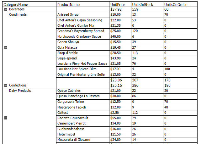
You’re done—if you now preview your report, you’ll see that all the detail sections are collapsed by default (in this screenshot, you can see that I’ve only got the Condiments group expanded).

Hint: And, if you do add multiple groups to your targets, they don’t all need to have the same “initial state.” By default, any other group you add to your list of targets will have its Visibility setting checked. As a result, when the user clicks on the textbox you chose, that second group will have its visibility toggled off—it will disappear while the detail section appears. Effectively, you’ve given the user the ability to switch between two different views.
Cleaning up
There’s more you can do but, regardless of what additional changes you make, you’ve now got a report that will let you see the big picture when the report first displays while letting you dive into the detail when you need to. And, if you’ve created this from the Web Report Designer embedded in your application then this report will be waiting for you when you come back to your application.
Embedded Reporting?
Progress Telerik Reporting provides all the tools you need to embed the rich, interactive reports your users need in order to analyze and understand their data right into your users’ applications (including letting your users export the results into more than 15 formats, either to distribute or integrate with other analysis tools). Telerik Reporting then lets you go further and empower your users with a fully functional Web Report Designer to create the reports they want without ever leaving the applications where they’ll use their reports.
You can leverage these easy-to-use tools in both any client-side web application environment (HTML5/JS, Angular, React, Vue or Blazor) and any .NET application (web or desktop: ASP.NET Core, ASP.NET MVC, ASP.NET AJAX, WinForms and UWP).
If you still have not tried it, you can start a free trial to take a closer look. A renowned support service and an array of resources will help you along the way.

Peter Vogel
Peter Vogel is both the author of the Coding Azure series and the instructor for Coding Azure in the Classroom. Peter’s company provides full-stack development from UX design through object modeling to database design. Peter holds multiple certifications in Azure administration, architecture, development and security and is a Microsoft Certified Trainer.
Related Posts
Comments
All articles
Topics
Web MobileMobile
Desktop
Design
Productivity
People
