
Embedded Reporting: Hands-on Experience with Telerik Reporting Web Report Designer

Summarize with AI:
You are a developer and wonder what your end users will get with the Web Report Designer. Can they add a new column? Can they highlight the outlier data? Can they even create a report from scratch? Let’s put on our business users’ shoes and see what it is all about.
Progress Telerik Reporting Web Designer is a versatile and user-friendly web-based tool that empowers business users to easily create fully functional embedded reports. It’s designed to help businesses streamline their reporting process by providing an intuitive interface, powerful data binding capabilities, advanced report layout, interactive features and support for shared data sources.
Let’s demonstrate the hands-on embedded reporting experience by creating a simplified analytical report from scratch.
First Look
We will focus on test-driving the designer, so I will not demonstrate how easily a developer can embed the tool into a web app. Let’s start the demo projects coming with the product installation and take the Web Report Designer for a ride.
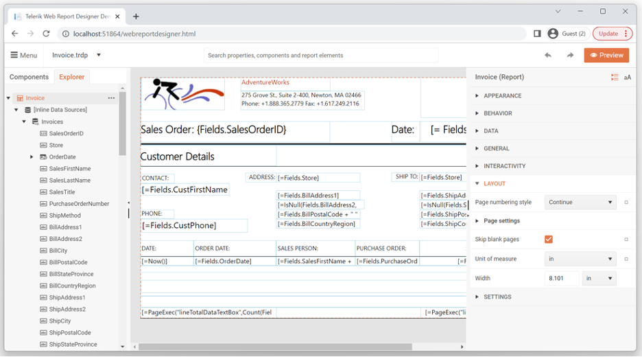
First, the designer will open the Onboarding Guide. It subsequently presents the main areas and tools that compose the designer:
The Design Surface is the main area, and it visually represents the report being designed with the layout of each visual item composing the report. The area provides tools for selecting, moving, resizing and editing these report items.
The Components tab on the left contains all the kinds of items that can be added to a report, like TextBox, Table, Graph and many more. All the supported data sources also reside here, ready to be used.
The Explorer tab also on the left offers a tree representation of the designed report’s structure exposing the container-content relation between the visual items. On top of that, it lists the data sources, parameters and styles defined in the report. Use it to select and configure all these report items, both visual and non-visual.
The Properties Area is located on the right and as the name suggests lists all the properties and their values of the currently selected report item. Use it to change and reset those values.
The Main Menu allows you to open or create and then save reports, combined reports and shared data sources. It also gives access to the next stop of our guide.
The Assets Manager tool keeps all the resource files on the server that can be reused in different reports, like images, data files and shared data source definitions.
Lastly, the guide presents the Preview button in the top-right corner which switches the whole designer to a report preview mode, enabling the user to examine the result of their creation.
The guide can be started at any time using the Search box by typing “Start onboarding.” This simple input is a universal tool to find and access any property of the currently selected item, discover any item on the report and to add items. Just read on.
Create a New Report
Let’s create a new analytical report from scratch. Use the Main Menu and choose New report. Use the opened dialog to name the report MyVeryFirstReport (clever, eh?).
The designer allows organizing the reports into nested folders so that each report can be later found in a meaningful location. Let’s use the button next to the Location field to open the extended dialog (pssst, it’s the Assets Manager shaped for “Reports” only, which are the most precious assets, after all). There, let’s create a new folder Playground, select and Save it.
We now have a blank report ready to play with.
Effectiveness to the Max
Now, before diving into the report design, I want to reiterate the Universal Search box. This is a simplistic, but very powerful tool to do various tasks, but first, let’s see how to exercise it: Hit Ctrl + F to focus the Search box. Start typing whatever you need. The matches appear as a dropped list off of the Search box. You can use the pointing device to trigger the needed one or the Enter key if the first match is the one you are looking for. Arrow keys + Enter work as well.
Use it to select an item that is already part of the report definition, including the report itself and the nonvisual items like the data sources. As expected, start typing the name of the item, e.g., graph1, and it will appear in the results list.
Once the desired item is selected, use the tool to locate any setting (property) of the current item to change its value. Writing some letters and locating a setting is much more optimal than visually searching for it in the Properties Area on the right. All properties are grouped in meaningful categories, but still typing part of the property name is much more optimal. Recall how often you use the search functionality in your phone’s app drawer. Once the items we need to search through number more than 10, it’s easier to type three letters. And reporting is powerful because of its customizability achieved by dedicated, meaningful properties.
Also use it to add new items like graphs (our take on charts), tables or picture box, for example. A new data source can also be created from there. Once you get familiar with the available components, start typing the name of the needed one in the magic box.
To summarize, the Search box is your smart friend. And it gets smarter with each release.
Brand the Report
Back to our report. Let’s strive to design our reports so that they convey not only the data-carved message but also the brand identity. As a minimum effort, let’s add the brand logo on each report page.
Select the page header section of the report. Use the Search box (Ctrl + F) to locate the PictureBox item. Once located, double-click it. This will add it to the page header and select it.
Returning to the Search box, search and go to the Value property to choose the image to use. Let’s apply my favorite rule: I want to make the life of tomorrow even easier than today.
For that, we will upload the logo of the company to our assets on the server to reuse it in all our future reports: Click the  button on the PictureBox Value property editor. This opens the previously introduced Assets Manager tool with the Images folder selected. It
offers upload functionality (the Upload button), so use it and upload the image of your choice. Confirm your choice with the Save button, and your image is uploaded there for reuse and applied to your PictureBox. Done.
button on the PictureBox Value property editor. This opens the previously introduced Assets Manager tool with the Images folder selected. It
offers upload functionality (the Upload button), so use it and upload the image of your choice. Confirm your choice with the Save button, and your image is uploaded there for reuse and applied to your PictureBox. Done.
Adding a Title
Let’s quickly add a title to the report. The idea is to visualize the sales of a bike shop sliced by product category and distributed in the year’s quarters.
Search (Ctrl + F) TextBox, and drag it to the center of the Page Header. Double-click the item content to enter edit mode. Type “Product Sales for Quarters by Category” and confirm with Enter key. The font size is a bit small for a title, so Search Font and trigger Style->Font. Set the Size property to 16pt. Resize and position the TextBox item if needed. Done.
A small note here in favor of report design best practices. If this were a multipage report, I would put the Title in a Report Header section, so that it gets rendered once, at the beginning of the report. The Page Header section gets rendered at the beginning of each page, but this will not make a difference in this one-pager.
We Need Data
What would a report be without data? Something like pizza with no mozzarella, I guess. Using the designer, you can pull data from any SQL relation database, web services or static files like CSV or JSON.
In this case, we will use “ProductSales” dataset, consisting of more than 26k rows of raw data returned in JSON format from our online demos web service. To do that, start typing Web Service Data Source in the Search box and trigger it. This starts a wizard to set up the new data source component. You only need to fill in one thing—the URL of the service, which is https://demos.telerik.com/reporting/api/data/productsales.min and hit Next three times and then Finish. We have data!
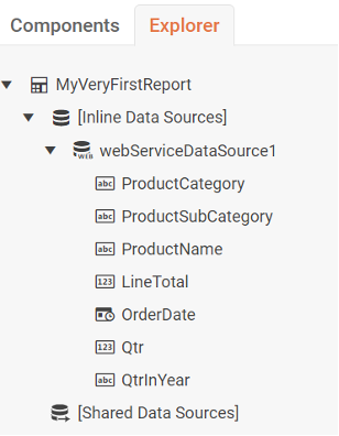
Go to the Explorer tab. The new data source is currently selected and its fields are listed. We need to add one additional calculated field we will need in our visualization. On the right, in the Properties Area, there is the Calculated fields property. Hit the plus button to add a new calc field. Set its Type to String, For Expression put:
= Fields.OrderDate.Year + “/” + Fields.Qtr
And as a Name, use QtrInYear. Confirm the editors and we are done!
Web Service Data Source exposes multiple settings to authenticate and parameterize the request and take a particular part of the resulting JSON and whatnot, but we do not need these now. Here is the place to mention the Shared Data Source feature, allowing a data source, once defined, to be reused among different reports. This feature helps delegate the data sources handling to a data-centric specialist, allowing the business user to focus on the data visualization. Let’s do that now.
Make It Visual
Let’s give the brain what it loves and present the data in a visual manner. Select the Detail Report section as we want to put our chart there. Resize its bottom to be able to accommodate a decently sized chart. Now, Search Column and trigger it. This opens a simplified one-page wizard on top of the Properties Area to set up the dimensions and the measure of our chart.
First, let’s make it clear which data source it should utilize. Choose the only available data source from the Data Source dropdown property editor. On my machine, it is named webServiceDataSource1. Now its fields get populated in the wizard. You need to drag:
- QtrInYear field as Category
- ProductCategory field as Series
- LineTotal as Value
Hit Create on the bottom. There you have it—the distribution of the sales in time, sliced by product category.
Customization
Before we try to find some insight from the data, let’s make the X-axis a bit more readable by flipping the axis labels. Search Coordinate systems property and trigger. Then expand this property in the Properties area and click on the first and only system to fine-tune its properties.
Expand the XAxis and set the LabelAngle property to 270 degrees. Confirm. Oh, I also expanded the chart to accommodate the whole horizontal space.
Data Insight
Hit the Preview button in the top-right corner of the designer and enjoy. This is what I ended up with and it makes me happy:
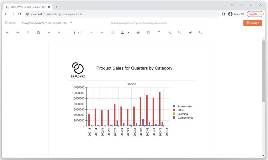
Three things stand out from this fairly old sample data:
- Bikes bring the most money to our business
- Our sales are growing
- And the most interesting to me: There definitely is seasonality in the sales with Q3 and Q4 being the strongest. Well Q3 can be easily explained—it is the summer. But Q4? Probably end-of-season discounts? I would dig deeper …
What We Learned
I used a lot of words to introduce multiple concepts like report items and layout, data sources, including shared ones, report assets like images, configuration wizards, (my favorite) universal Search box and the list goes on. Thank you for reading down to this point. Although it took time to explain it, all these operations are easy and fast to perform. Once you get familiar with the tool, building this visualization will take about three minutes.
In Conclusion
End users are the ones who know what data they need and how they need it presented. Telerik Reporting Web Designer enables end users to become creators, empowering them to easily take control of their reporting needs and create fully functional reports. The resulting reports can then be shared using a report viewer control with colleagues, stakeholders and customers, ensuring that everyone has access to the information they need, when they need it. That said, Telerik Reporting, with its mature embedded reporting engine, embeddable Web Report Designer and embeddable Report Viewer controls greatly streamlines your organization’s reporting process and improves its efficiency.
Progress Telerik Reporting provides all the tools you need to embed the rich, interactive reports your users need in order to analyze and understand their data right into your users’ applications (including letting your users export the results into more than 15 formats, either to distribute or integrate with other analysis tools). Telerik Reporting then lets you go further and empower your users with a fully functional Web Report Designer to create the reports they want without ever leaving the applications where they’ll use their reports.
You can leverage these easy-to-use tools in both any client-side web application environment (HTML5/JS, Angular, React, Vue or Blazor) and any .NET application (web or desktop: ASP.NET Core, ASP.NET MVC, ASP.NET AJAX, WinForms and UWP).
If you still have not tried it, you can start a free trial to take a closer look. A renowned support service and an array of resources will help you along the way.
Stay tuned for more practical tips.

Milen Elkin
Milen Elkin is Product Manager of Telerik Reporting & Telerik Report Server. It’s been a while since he joined the company back in 2007. What drives his work is the belief that handling data should be easy. Besides his work, he likes running and cycling in the city of Sofia and enjoys the countless shapes and shades of green color up in the Bulgarian mountains.
Related Posts
Comments
All articles
Topics
Web MobileMobile
Desktop
Design
Productivity
People
