
Drag and Drop Grouping and Sorting with Angular 2

Drag and Drop functionality is a familiar and intuitive user interface (UI) behavior allowing users to directly manipulate data on the screen. Building a drag and drop interface on the web can be challenging since only the most basic drag and drop features are available in HTML5. More robust UI scenarios that include state management, item templates, and Angular 2 integration could quickly become a daunting task with plain JavaScript.
Telerik Kendo UI for Angular 2 provides the features needed to create a smooth drag and drop UI experience for Angular 2 in its Sortable component. In this article, we'll see how the Kendo UI for Angular 2 Sortable component easily tackles a complex scenario with little or no code.
What we're building
For this demo we'll be building a drag and drop UI used to organize contacts into groups. We'll learn how to bind data to a Sortable component. Templates will be used to display the data and images. We'll also use the Sortable's active and empty class states to provide clear visual indicators enhancing the user experience.
Prerequisites
Before we begin we'll need a Kendo UI for Angular 2 enabled project. To keep things simple, we'll start with the Angular CLI template and assume that the Progress npm registry was added per the instructions on the Kendo UI for Angular 2 getting started page. Please note that it is important to use --style=sass for .scss compilation as we will be using Sass code to style our component.
The Kendo UI for Angular 2 Sortable component dependency should be installed as well. Add the component using npm.
npm install -S @progress/kendo-angular-sortableTo easily layout the page and component templates we'll use Bootstrap 4. Add the Bootstrap 4 dependency using npm.
npm install -S bootstrap@nextSetup
So far all of our dependencies have been added to the project, but we haven't actually made use of them. Let's begin by utilizing Bootstrap's scss code in the project.
Add a reference the Bootstrap dependency by opening styles.scss and adding @import "~bootstrap/scss/bootstrap";. For simplicity, all styles we create in this demo will be written in styles.scss.
/* You can add global styles to this file, and also import other style files */
@import "~@telerik/kendo-theme-default/styles/packages/all";
@import "~bootstrap/scss/bootstrap";
We'll start with a simple Bootstrap layout in app.component.html, this will be our work space. Create a layout with two panels, each will hold our contact lists as grouped and ungrouped items.
<div class="container">
  <div class="row">
    <!-- wrapper -->
    <h1 class="col-sm-12">
      {{title}}
    </h1>

    <section class="group-panel col-md-6">
      <!-- Grouped items -->
      <h3>Groups</h3>

    </section>
    <section class="group-panel col-md-6">
      <!-- Ungrouped items -->
      <h3>Ungrouped</h3>

    </section>

    <!-- /wrapper -->
  </div>
</div>
Sortable
Adding the kendo-sortable component to the layout will be easy, but first we need a reference to the Sortable dependency. In app.module.ts add the component directive and reference SortableModule.
import { SortableModule } from '@progress/kendo-angular-sortable';

imports: [
    ...
    SortableModule
  ],
With the proper references in place we can return to app.component.html and create our UI. Add two kendo-sortable components to represent grouped and ungrouped contacts. We'll bind these lists to something tangible later, but for now set the data property to an array of strings [data]="['one','two', 'three'] and [data]="['four','five', 'six'].
<!-- Grouped items -->
<h3>Groups</h3>
<kendo-sortable [navigatable]="true" [data]="['one','two', 'three']">
</kendo-sortable>

<!-- Ungrouped items -->
<h3>Ungrouped</h3>
<kendo-sortable [navigatable]="true" [data]="['four','five', 'six']">
</kendo-sortable>
Run the application using ng serve (or allow the page to refresh). Notice that each group of strings is displayed on the page and they can be dragged and dropped within the list. While drag and drop sorting is enabled, items cannot be moved from the Grouped list to Ungrouped list, let's fix that.
In this scenario, we would like to allow users to drag items to and from the Grouped and Ungrouped lists. By adding zones to the kendo-sortable component we can enable this behavior. Use the zone property to add [zone]="'contacts'" to each kendo-sortable. Zones tell the kendo-sortable it can accept items from other kendo-sortable components of the same zone.
<!-- Grouped items -->
<h3>Groups</h3>
<kendo-sortable [navigatable]="true" [data]="['one','two', 'three']" [zone]="'contacts'">
</kendo-sortable>

<!-- Ungrouped items -->
<h3>Ungrouped</h3>
<kendo-sortable [navigatable]="true" [data]="['four','five', 'six']" [zone]="'contacts'">
</kendo-sortable>
Working with simple strings shows us the basic concepts of the kendo-sortable component, next we'll add complex data and create a rich UI using templates.
Databinding
Using data binding and templates, the kendo-sortable component is capable of displaying data and other components. Let's bind JSON that contains an object hierarchy or groups and people. Each object contains a string representing the group name, and an array of people belonging to that group.
[{
    group: string,
    people: [{
                id: number,
                name: string,
                location: string
            }]
}]
In app.component.ts add a private function called getContacts() that returns sample JSON data. Next, in the constructor we'll filter the data into a groups property by taking everything except the Ungrouped items. We'll also need just the Ungrouped people from the remaining items, we'll filter them into a second property ungroupedContacts.
groups = [];
ungroupedContacts = [];

constructor() {

  this.groups = this.getContacts()
                      .filter(c => c.group != "Ungrouped");

  this.ungroupedContacts = this.getContacts()
                               .filter(c => c.group == "Ungrouped")[0].people;
}

private getContacts() {
return [...]}
The completed code including sample data can be copied from here.
Now we have two data sources available in to our kendo-sortable components we'll create one for the Ungrouped items. Find the Ungrouped items placeholder and remove the kendo-sortable from the following code.
<!-- Ungrouped items -->
<h3>Ungrouped</h3>
<kendo-sortable [navigatable]="true" [data]="['four','five', 'six']">
</kendo-sortable>
Add a kendo-sortable component that binds to the ungroupedContacts property. The data is bound to people, which is a complex object so we'll need specify a template to display its properties. Setting the let-item attribute will name the data that is represented by the template. Set let-item to item and write out values in the template using <h5>{{ item.name }}</h5>.
<!-- Ungrouped items -->
<h3>Ungrouped</h3>
<kendo-sortable [zone]="'contacts'" [navigatable]="true" [data]="ungroupedContacts">

    <template let-item="item">
        <h5>{{ item.name }}</h5>
    </template>

</kendo-sortable>
Similar to how we created the Grouped items let's replace the Grouped items placeholder with a kendo-sortable component that binds to groups. Find and remove the kendo-sortable from the following code.`
<!-- Grouped items -->
<h3>Groups</h3>
<kendo-sortable [navigatable]="true" [data]="['one','two', 'three']">
</kendo-sortable>
We'll iterate over the groups in a list using *ngFor on a <li>. In each item display the group text in an <h4> and bind the people array to its own kendo-sortable component. Create a template with the let-item to attribute set to item and write out values in the template using <h5>{{ item.name }}</h5>.
<!-- Grouped items -->
<h3>Groups</h3>
<ul class="groups">
<li *ngFor="let g of groups">
  <h4>{{ g.group }}</h4>
  <kendo-sortable [zone]="'contacts'" [navigatable]="true" [data]="g.people">

    <template let-item="item">
        <h5>{{ item.name }}</h5>
    </template>

  </kendo-sortable>
</li>

</ul>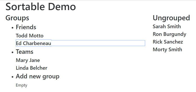
There's still more data we can display, let's update the templates to include an image and location for each contact. Replace both templates with the following code. Since both templates are identical, this would be a great opportunity to refactor the contact-info block to an Angular 2 component, we'll leave it like this to stay within the scope of the article.
<template let-item="item">
  <div class="contact-info">
    <div class="row">
      <div class="col-sm-3">
        <img src="/assets/img/{{ item.id }}.png" class="avatar" />
      </div>
      <div class="col-sm-9">
        <h5>{{ item.name }}</h5>
        <p>{{ item.location }}</p>
      </div>
    </div>
  </div>
</template>Styling
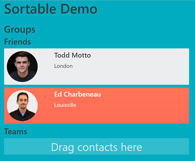
In addition to templates, the kendo-sortable has properties that control the rendered output of the component. Right now the component renders the text Empty when no data is present. Change the empty text by setting the [emptyText] property to [emptyText]="'Drag contacts here'".
Another property we can take advantage of is activeItemClass. The activeItemClass will be applied to the parent element of the template. Let's add [activeItemClass]="'active'" to each of the kendo-sortable components.
To make use of the activeItemClass we'll need some styling. Open styles.scss from root of the project and add the following styles.
.group-panel {

    padding-top:1em;

    h2,h3,h4 {
        color: $gray-lightest;
    }

    ul {
        padding: 0;
        list-style-type: none;
    }
}

.contact-info {
    background-color: $gray-lighter;
    margin-bottom: .5em;
    padding: .5em .5em;
    border-radius: .1em;
}

.active .contact-info {
 @extend .k-primary;
}

.avatar {
    border-radius:50%;
}
Clicking an item on the page now shows the active item highlighted in the list.
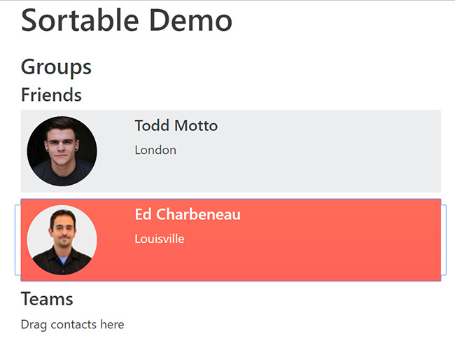
Because an empty kendo-sortable doesn't actually contain an item, it still renders the line of text Drag contacts here. We can improve the empty state by adding an emptyItemClass. Update both kendo-sortable components with the property [emptyItemClass]="'contact-info--empty'".
.container {
    background-color:  #00acc1;
    border-radius:.1em;
}

.contact-info {
    background-color: $gray-lighter;
    margin-bottom: .5em;
    padding: .5em .5em;
    border-radius: .1em;

        &--empty {
        color:rgba($gray-lightest, .8);
        background-color:rgba($gray-lightest, .2);
        text-align: center;
        font-size:2em;
        }
}
Handling events
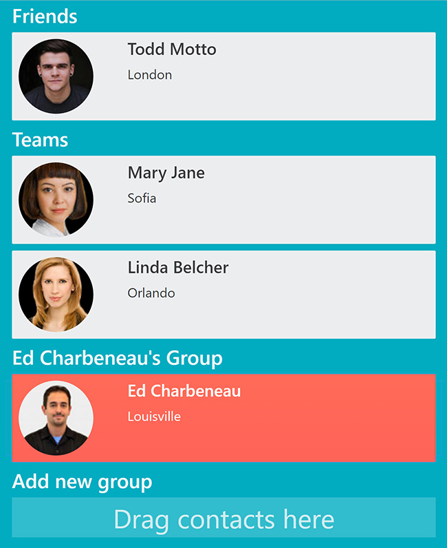
Now that the UI looks polished, let's add some interactivity. We'll add the ability to create new groups by dragging an item into an empty group.
In app.component.ts use array.push() to add an empty object group into groups with the text "Add new group". We'll use this item to trigger additional groups to be created when it's populated.
constructor() {
  this.groups = this.getContacts()
                  .filter(c => c.group != "Ungrouped");

  this.groups.push({
    group: "Add new group",
    people: []
  })
}
The kendo-sortable component's dataAdd event handler is triggered each time an item is added to a kendo-sortable. The dataAdd event passes an argument that includes the dataItem, which is the object being added to the kendo-sortable. We'll handle the event and pass in an additional argument with the group that is bound to the component (dataAdd)="onAdd($event, g).
In app.component.ts we'll handle the event in the function onAdd. Using the arguments we can update the group text to include the person's name and push a new empty object into the array so another group can be created.
public onAdd(args, item) {
    console.log("Added")

    if (item.group == "Add new group") {

      item.group = item.people + args.dataItem.name + "'s Group"

      this.groups.push({
        group: "Add new group",
        people: []
      })
    }
}
Conclusion
Kendo UI for Angular 2's Sortable component is a flexible tool for creating drag and drop UIs. The component's data binding, templates, and events are simple enough to allow for customization yet robust enough to handle a variety of scenarios.
Fine Tuning
The sample project in this solution can be found on GitHub including extra features that were beyond the scope of this article.

Ed Charbeneau
Ed