
Displaying Related Information with the Kendo UI for Angular Grid
 by Peter Vogel

Summarize with AI:
Grids are great, but the Kendo UI for Angular Grid lets you go beyond the single row to let the user (or you) display additional, related information.
A grid is a terrific tool for displaying rows of some repeatable data. But “data” only becomes “information” when you provide context—i.e., related “data.”
The Progress Kendo UI for Angular Grid lets you associate a “data card” with the rows in your grid which you can use to hold “additional” or “related” information. You users can choose to expand or collapse the rows they’re interested in, but you can also control which rows have their data card displayed to integrate the grid with the rest of your UI.
Displaying Additional Detail
Implementing a data card is easy with the Angular Data Grid—it just requires just three steps:
- Inside the
kendo-gridelement, add anng-templateelement that references thekendoGridDetailTemplate. - Access the object displayed in the row by adding the
let-dataItemmicrosyntax to theng-templateelement. - Insert your HTML inside the template.
You can put the ng-template element anywhere you want inside the kendo-grid element, but it probably makes sense to put it after your last kendo-grid-column element.
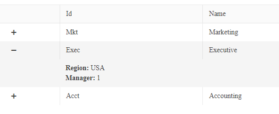
As a case study, for a grid that’s displaying a list of Department objects, you could display the department’s name and id in the row (the object’s deptName and id properties).
You could then use the ng-template data card to display other properties from the Department object.
This markup, for example, displays the department’s region and the employee id for the department manager:
    <kendo-grid-column title="Name" field="deptName" …></kendo-grid-column>
    <ng-template kendoGridDetailTemplate let-dataItem>
       <strong>Region:</strong> {{ dataItem.region }} <br/>
       <strong>Manager:</strong> {{ dataItem.id }}
    </ng-template>
 </kendo-grid>
The resulting grid (with one row expanded) would look like this:
Getting Related Data
By default, you only have access to the properties of the object tied to the row that’s being expanded. However, there’s nothing stopping you from calling methods inside your template to retrieve additional or related data, driven by the “row object’s” properties.
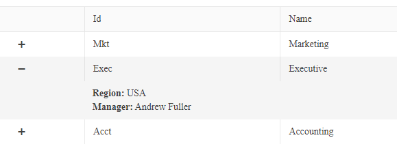
In my previous data card, for example, displaying just the manager’s employee id isn’t a very satisfactory solution. Instead, this example uses a method called getManagerName that, when passed the manager’s
id, returns the manager’s name:
<ng-template kendoGridDetailTemplate let-dataItem>
   <p><strong>Region:</strong> {{ dataItem.region }} <br/>
   <strong>Manager:</strong> {{ getManagerName(dataItem.id }}
</ng-template>
If you want to retrieve an entire related object so that you can display multiple properties in your template, you can leverage the ng-if directive to call a method that retrieves an object you want. While you can’t put the ng-if directive on the ng-template element (the dataItem object associated
with the expanded row isn’t available to ng-template element), that isn’t really a problem: Just add an element to enclose all the data card markup where you want to use the returned object and put the
ng-if directive on that element.
This sample encloses part of my data card in a section element that uses ng-if to call a method named getManagerInfo. This sample also assigns the object returned by the method the name
“manager” by using the as keyword. The card then displays the properties of that object (as a bonus, using ng-if also suppresses the display of the manager information if
the method doesn’t find a manager object and returns null):
<ng-template kendoGridDetailTemplate let-dataItem>
   <strong>Region:</strong> {{ dataItem.region }} <br/>
   <section *ngIf="getManagerInfo(dataItem.id) as manager" >
       <strong>Manager:</strong><br/>
       Id: {{manager.id}} <br/>
       Name: {{manager.empName}}
   </section>
</ng-template>
With this change, the display looks considerably better:

You could also, of course, use the same technique to call functions from you template to update other parts of your UI when the user expands a row.
Controlling the Expanded Items
If you want to support your user in selecting which rows are expanded, you can do that too. The first step is to add two directives to your kendo-grid element:
- expandedDetailKeys: This must point to an array of keys that identify the expanded rows.
- kendoGridExpandDetailsBy: This must point to a function that returns the key property of the row object.
The grid will automatically call the kendoGridExpandDetailsBy function whenever a row is expanded and add the returned key property to the expandedDetailKeys array (and remove keys as rows
are collapsed).
Adding the directives to the grid and tying them to a function (expandDepartments) and an array (expaneddDepartments) gives something like this:
<kendo-grid
   [kendoGridExpandDetailsBy]="this.expandDepartments"
   [(expandedDetailKeys)]="this.expandedDepartments"
   …
A basic implementation of the corresponding function and array would look like this:
expandDepartments = (dataItem: Department): string => {
    return dataItem.id;
};
expandedDepartments:string[] = [];
So far adding these directives hasn’t added any functionality to your grid. However, with these directives in place you can, for example, let users save a list of expanded rows, expand/collapse other rows, and then return to their original saved lists. These two methods, for example, save the current array of expanded items to a property on the component and then restore that list by resetting the grid’s array from the saved array:
savedExpandedList:string[] = [];

saveExpandedList()
  {
    this.savedExpandedList = this.expandedDepartments;
  }
  restoreExpandedList()
  {
    this.expandedDepartments = [];
    this.savedExpandedList.forEach(d => this.expandedDepartments.push(d));
  }
Using these directives also allows you to expand the rows of your choice to integrate the grid’s display with whatever else is going on in your UI. The following function, for example, adds the department id that’s passed to it to the array of expanded rows which, in turn, causes the corresponding row in the grid to be expanded.
This implementation assumes that you want to keep any open any already expanded rows. To maintain existing expanded rows, the code copies all the existing items from the expandedDepartments array to a new array, adds the
passed key to the new array, and then resets the expandedDepartments array:
expandSpecifiedDepartment(deptId:string) {
    let depts:string[] = [];
    this.expandedDepartments.forEach(d => depts.push(d));
    depts.push(deptId);
    this.expandedDepartments = depts;
}
If you wanted to close all the existing expanded items and just display the passed item, you just need to omit the second line in the function.
It is, of course, up to you to decide how you want to use this functionality. But you can now not only display additional information for any grid item but integrate that functionality with the rest of your UI.
Peter Vogel
Peter Vogel is both the author of the Coding Azure series and the instructor for Coding Azure in the Classroom. Peter’s company provides full-stack development from UX design through object modeling to database design. Peter holds multiple certifications in Azure administration, architecture, development and security and is a Microsoft Certified Trainer.
Related Posts
Comments
All articles
Topics
Web MobileMobile
Desktop
Design
Productivity
People
