Client-Side Filtering with the Kendo UI for Angular Data Grid

Summarize with AI:
There’s a strategy for using a grid effectively in your application and it absolutely depends on how effectively you support client-side filtering. The Kendo UI for Angular Data Grid gives you the power to do whatever you need.
Grids are great … as long as the user has some control over what’s displayed in the grid (a grid that always displays 200+ rows probably isn’t useful to anyone—too much time lost scrolling up and down, looking for what you want).
So, if you have a sizable amount of data to put in your grid, the key question is what you will provide to filter the grid to get to the data the user needs. Fortunately, the Angular Data Grid from Progress Kendo UI gives you all the flexibility you need to give your users (and you) as much or as little control over what’s displayed in the grid as you need.
To enable this functionality for your users, you may just need to add the GridModule from @progress/kendo-angular-grid to your application and then set some configuration options on the Angular Data Grid. If that doesn’t give you
what you want out of the box, the grid has multiple customization options, including writing your own code to fully integrate the grid with your application.
Understanding the Problem
Of course, you’d prefer to filter the data coming to your grid when you retrieve the data from the web service—doing that delegates the filtering work to the data source behind the service. Not only does that make retrieving the right data someone else’s problem (always a good idea), but the infrastructure behind the web service is probably more efficient at extracting just the data your user wants than your client-side code is.
However, the two slowest things you can do in data processing are issue a call to another computer and read or write your hard disk … and you’re doing both when you call your web service. Web service calls aren’t going to be fast.
Which leads to the standard strategy: When the page is first displayed, go to your web service to download all (and only) the data the user needs. While that won’t be fast, that download time is offset by the users’ expectation that the initial page display will take longer than refreshing the page (and the Data Grid’s support for virtualization can help with getting that first page up quickly).
After that initial load, use client-side filtering to quickly load the grid with the data the user needs at any moment (this is the response time that the user will remember when judging your application). Where the volume of data and/or the unpredictability of the user’s needs makes that strategy impossible, the Data Grid also supports server-side filtering.
In this post, I’m going to focus on client-side filtering and defer server-side filtering to another post.
Empowering the User
With the Data Grid, you can turn on its built-in filtering capability just by adding the filterable property to the kendo-grid element that defines the Data Grid and setting that property to “row.” You then bind the grid to an array
of objects to display using the element’s kendoGridBinding property.
This example binds to an array called currentCustomers (set up as a property on the component) and turns on filtering:
<kendo-grid
          [kendoGridBinding]="currentCustomers"
          filterable="row">
…column definitions…
        </kendo-grid>
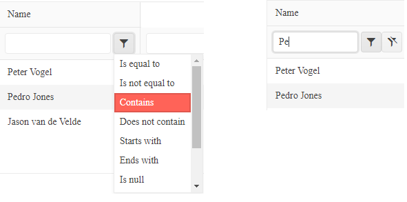
With the right column settings (more later), the Grid ends up looking like the following, with a filter tool added underneath each column header to let users get the data they want.

The user can filter any column in two steps:
- Click on the filter/funnel icon to pick an operator.
- Enter the value to filter on. As the user types, the grid filters its rows, based on the filter. The column also acquires a new icon that lets the user clear the filter.

The user might not need the first step: Every column has a default operator. The default operator for text columns, for example, is “Contains” which causes the grid to filter rows by matching text. As a result, the grid starts limiting rows as the user types into the column’s filtering textbox—effectively, the column’s default operator causes the grid to mimic the “searching” feature of a combobox.
Obviously, much depends on data type of each column. The grid in this case study is displaying these four fields (each with a different data type) from the Customer objects in the currentCustomers array:
- custName: String
- amountPurchased: Numeric
- signupDate: Date
- inLoyaltyProgram: Boolean
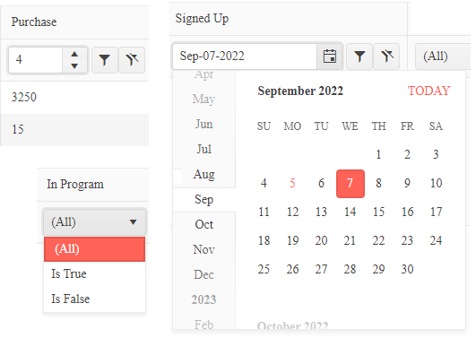
You can configure the selector used at the top of the column so that text/string columns get a filtering textbox, numeric columns get a number spinner, date columns get a date picker, and Boolean columns get a True/False dropdown list.

You specify each column’s data type by setting the filter property on the kendo-grid-column elements (these elements tie the grid’s columns to the object’s fields). The default type for a column is text, so you can skip the setting the filter property for text columns.
For this case study, the filter settings on the kendo-grid-column elements look like this:
          filterable="row">
            <kendo-grid-column
                  field="custName"
                  …other settings…></kendo-grid-column>
            <kendo-grid-column
                 field="amountPurchased"
                 filter="numeric"
                 …other settings…></kendo-grid-column>
            <kendo-grid-column
                 field="signUpDate"
                 filter="date"
                …other settings…></kendo-grid-column>
            <kendo-grid-column
                field="inLoyaltyProgram"
                filter="boolean"
                …other settings…></kendo-grid-column>
        </kendo-grid>
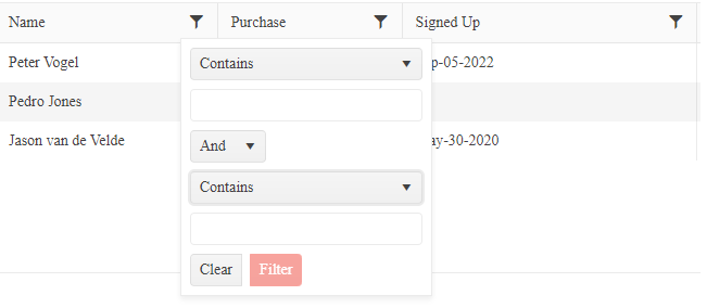
If you’re not happy with the layout of your headers, you can set the grid’s filterable property to “menu” to move the filter button up into the column header (or to “menu, row” to get a combination of the other two layouts).

There are more customization options available to you. For example, you can supply your own templates to control layout of the filtering tools in the column headers (you can, for example insert a dropdown list of acceptable filter values rather than let the user type in whatever they want). Other options include letting you change the default operator for a column, remove operators, or display the list of operators in a different order.
Integrating the Grid with Code
While the filterable property certainly empowers the user, it also means that you have to include every potentially filterable field as a column in the grid to fully support the user. You may also want the surrounding UI to set the grid’s filters—as the user selects a country somewhere else in the component, for example, you may want to filter the grid to display just that country’s customers. In either of those cases, you can use your own code to filter the grid.
To integrate your own code, you first need to import two datatypes and a function from the Kendo UI modules:
import { CompositeFilterDescriptor, FilterDescriptor } from "@progress/kendo-data-query";
import { filterBy } from "@progress/kendo-data-query";
You’ll also need to set up two arrays: One array to hold all the objects you’ve retrieved from your web service and another array to hold the array of filtered object (that array will be bound to the grid).
This code sets those two arrays up as properties of the component: The customers array will hold all the retrieved data, while the currentCustomers array will be bound to the grid and hold just the filtered rows (this
sample code also hardcodes three customer objects into the customers array):
public customers: Customer[];
public currentCustomers: Customer[] = [];
  …
  this.customers = [new Customer(1, "Peter Vogel", "USA", new Date(), 3250, true),
                                  new Customer(2, "Pedro Jones", "Canada", null, 15, false),
                                  new Customer(3, "Jason van de Velde", "USA", new Date("2020-05-31"), 200, false)];
Your last setup step is to bind the grid to the array that will hold the filtered data:
        <kendo-grid
          [kendoGridBinding]="currentCustomers">
Now you need to create the method that will filter your rows. You can leverage the filterBy function you imported earlier to create this method. The filterBy function expects to be passed an array of objects and a CompositeFilterDescriptor that describes the filters to be applied. The function returns an array of objects that matches the filters.
A first cut at a general-purpose version of this method might accept either a CompositeFilterDescriptor (to be used when filtering rows) or null (to signal that all the rows should be displayed).
This version of the method uses the filterBy function when a CompositeFilterDescriptor is passed and filters the customers array into the currentCustomers array using the descriptor; if no CompositeFilterDescriptor is passed, the code just loads the whole
customers array into currentCustomers:
public filterCustomers(filter: CompositeFilterDescriptor | null): void
{
    if (filter != null)
    {
       this.currentCustomers = filterBy(this.customers, filter);
    }
    else
    {
      this.currentCustomers = this.customers;
    }
}
A CompositeFilterDescriptor has two properties:
- filters: An array of FilterDescriptors, each of which specifies how rows are to be filtered
- logic: An operator (“or” or “and”) that specifies, if there’s more than one FilterDescriptor, how those FilterDescriptors are to be combined.
A FilterDescriptor object has four properties (all of which are optional):
- field: The name of the field on the object to use for filtering.
- operator: The comparison operator. Operators include ones that work with most data types ( “eq,” “neq,” “gt,” etc.) and some operators just for comparing strings (“startswith,” “contains,” “isempty,” etc.).
- value: The value to be used in the comparison.
- ignoreCase: Whether string comparisons are case insensitive.
The following code first defines a CompositeFilterDescriptor property called custFilter. The code then sets that property to a CompositeFilterDescriptor that limits customers to those in the company’s
loyalty program who also have their country property set to “USA” (while the country field isn’t part of the grid, you can still filter on it). Finally, the filter is passed to the filterCustomers method shown
earlier to load the grid with filtered rows:
public custFilter:CompositeFilterDescriptor = {logic:"or", filters:[]};
 …
this.custFilter =
 {
  logic: "and",
  filters: [
    {field: "country", operator: "eq", value: "usa", ignoreCase: true },
    {field: "inLoyaltyProgram", operator: "eq", value: false}
  ]
 }
this.filterCustomers(this.custFilter);
…
To initially load the array, you can call your method from the component’s constructor without passing a `CompositeFilterDescriptor`:
```typescript
constructor(http: HttpClient) {
  this.filterCustomers(null);
  …rest of constructor…
And this is actually a simplification of what you can do with the filterBy method because the CompositeFilterDescriptor’s filters array can also hold CompositeFilterDescriptors. This allows you to create
nested filters with different operators (the equivalent of using parentheses to group logical ANDs and ORs in an if condition).
Merging User and Code Filtering
If you want, you can use your filtering method to extend or modify the default filtering process carried out when the user selects filter options in the grid’s column headers. First, you need to attach your method to the grid’s filterChange event, like this:
<kendo-grid
          [kendoGridBinding]="currentCustomers"
          [filterable]="true"
          (filterChange)= "this.filterCustomers($event)"
          …other properties…>
When called as part of the user’s filtering, your method will always be passed a CompositeFilterDescriptor. This allows you to integrate your own code into the grid’s filtering process to modify the user’s filters.
This “first-cut” example adds a new filter to any existing filters set by the user to limit the user to seeing only customers from the USA:
public filterCustomers(filter: CompositeFilterDescriptor | null): void
{
    let countryFilter: FilterDescriptor = {field: "country", operator: "eq", value: "USA"}
    if (filter != null)
    {
      filter.filters.push(countryFilter);
      filter.logic = “and”;
      this.currentCustomers = filterBy(this.customers, filter);
    }
    else
    {
      let countryComposite: CompositeFilterDescriptor = {logic:"and", filters:[countryFilter]};
      this.currentCustomers = filterBy(this.customers, countryComposite);
    }
}
Of course, this last example circles back to the original filtering strategy: If you’re not going to let the user see customers from anywhere but the USA, why did you download those customer objects from the web service? The good news, though, is that whatever your application is doing, the Data Grid gives you the tools for you to get to what you really want.
Next up:

Peter Vogel
Peter Vogel is both the author of the Coding Azure series and the instructor for Coding Azure in the Classroom. Peter’s company provides full-stack development from UX design through object modeling to database design. Peter holds multiple certifications in Azure administration, architecture, development and security and is a Microsoft Certified Trainer.

