
Creating Progress Bars with KendoReact

Summarize with AI:
Learn how to create dynamic progress bars in your React applications with the KendoReact ProgressBar and ChunkProgressBar components.
Progress bars are essential UI elements that provide visual feedback to users about the status of ongoing processes. They are widely used in applications to indicate the progress of an operation, such as file uploads, downloads or data processing tasks.
In this article, we’ll explore how to create dynamic progress bars in your React applications using the Progress KendoReact ProgressBar and ChunkProgressBar components.
The KendoReact ProgressBar Component
The KendoReact ProgressBar component displays the progress of a task as a percentage of completion. It’s distributed through the kendo-react-progressbars npm package and can be imported directly from this package.
import { ProgressBar } from '@progress/kendo-react-progressbars';
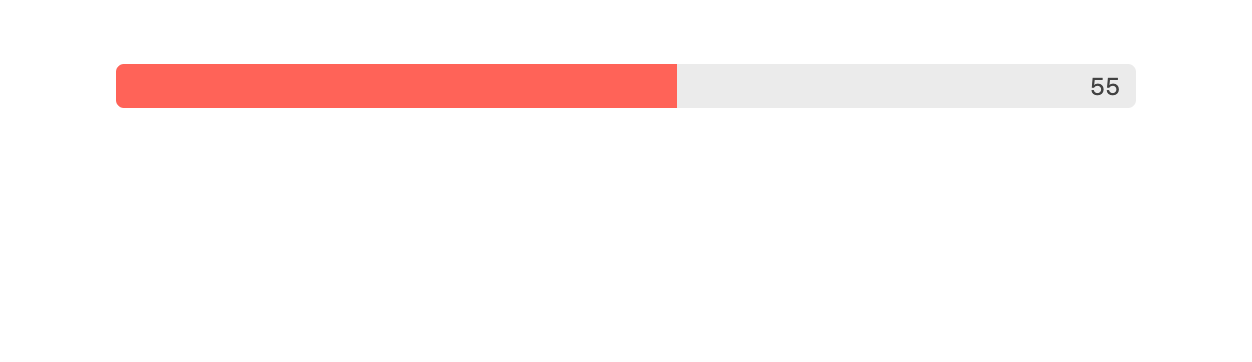
To create a simple progress bar, we can specify the value prop, which represents the current progress. The max and min props define the range of the progress bar, with max defaulting to 100 and min defaulting to 0.
import * as React from "react";
import { createRoot } from "react-dom/client";
import { ProgressBar } from "@progress/kendo-react-progressbars";

const App = () => {
  const value = 55; // Current progress value

  return (
    <div className="container">
      <ProgressBar value={value} />
    </div>
  );
};

const domNode = document.querySelector("my-app");
const root = createRoot(domNode);
root.render(<App />);
The above will render a progress bar that is 55% complete.
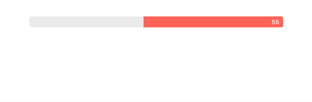
We can customize the appearance and behavior of the progress bar using various props. For example, to reverse the direction of the progress, we can set the reverse prop to true.
const App = () => {
  const value = 55;

  return (
    <div className="container">
      <ProgressBar value={value} reverse={true} />
    </div>
  );
};
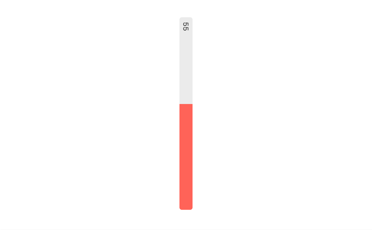
To display the progress bar in a vertical orientation, we can set the orientation prop to "vertical".
const App = () => {
  const value = 55;

  return (
    <div className="container">
      <ProgressBar value={value} orientation="vertical" />
    </div>
  );
};
The animation prop allows for the customization of the progress bar’s animation. We can enable or customize the animation by setting this prop to a boolean value or an object with a customizable duration option. For instance, to enable a default animation, we can simply set animation to true.
We’ll set the animation prop to true and we’ll also render a button that when clicked updates the value that is to be shown in the progress bar from 0 to 55. This change in progress bar value will help trigger the animation.
const App = () => {
  const [progressBarValue, setProgressBarValue] = React.useState(0);

  return (
    <div className="container">
      <ProgressBar value={progressBarValue} animation={true} />
      <button onClick={() => setProgressBarValue(55)}>Trigger animation</button>
    </div>
  );
};
When the Trigger animation button is clicked, the progress bar will animate to 55%.
To customize the animation duration, we can instead provide a duration value. Here’s an example of providing a duration value of 1000 ms.
const App = () => {
  const [progressBarValue, setProgressBarValue] = React.useState(0);

  return (
    <div className="container">
      <ProgressBar value={progressBarValue} animation={{ duration: 1000 }} />
      <button onClick={() => setProgressBarValue(55)}>Trigger animation</button>
    </div>
  );
};
The above will lead to a progress bar animation with a custom and slower duration.
The KendoReact ChunkProgressBar Component
The ChunkProgressBar component is similar to the ProgressBar component in that it visually represents the progress of a task to the user. Like the ProgessBar component, the ChunkProgressBar component can be imported from the kendo-react-progressbars npm package.
import { ChunkProgressBar } from '@progress/kendo-react-progressbars';
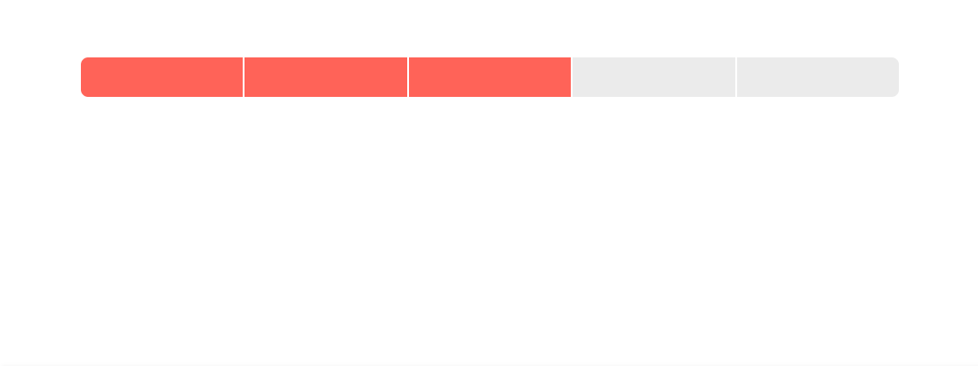
The unique feature of the ChunkProgressBar component is its ability to display the progress in distinct chunks, making it especially suitable for scenarios where progress can be segmented into clear stages or steps. This is achieved through the chunkCount property, which allows us to specify the number of chunks into which the progress bar will be split.
Here’s a basic example of how to use the ChunkProgressBar component in your React application:
import * as React from "react";
import { createRoot } from "react-dom/client";
import { ChunkProgressBar } from "@progress/kendo-react-progressbars";

const App = () => {
  const value = 60;

  return (
    <div className="container">
      <ChunkProgressBar chunkCount={5} value={value} />
    </div>
  );
};

const domNode = document.querySelector("my-app");
const root = createRoot(domNode);
root.render(<App />);
The above code will render a progress bar that is divided into five chunks, with the progress visually filled up to the proportionate value of 60%. Given the default behavior and assuming a maximum value of 100, this means that the progress bar will show more than half of its chunks as filled.
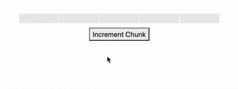
To simulate the progress of a task being completed in chunks, we can introduce a button that, when clicked, updates the value of the progress bar.
const App = () => {
  const [progressBarValue, setProgressBarValue] = React.useState(0);

  const incrementValue = () => {
    setProgressBarValue((prevValue) => prevValue + 20);
  };

  return (
    <div className="container">
      <ChunkProgressBar chunkCount={5} value={progressBarValue} />
      <button onClick={incrementValue}>Increment Chunk</button>
    </div>
  );
};
The above example simulates the task progression in real time. Each click on the button fills one additional chunk of the progress bar, demonstrating a common use case where tasks progress in discrete increments rather than continuously.
Wrap-up
In conclusion, the KendoReact ProgressBar and ChunkProgressBar components provide developers with helpful tools for displaying task progress in React applications. Whether you need a traditional progress bar or a segmented progress indicator, these components offer the flexibility and customization options to meet your application’s requirements.
For more details, be sure to check out the official component documentation!
And if you haven’t tried it yet, download a trial, free for 30 days.

Hassan Djirdeh
Hassan is a senior frontend engineer and has helped build large production applications at-scale at organizations like Doordash, Instacart and Shopify. Hassan is also a published author and course instructor where he’s helped thousands of students learn in-depth frontend engineering skills like React, Vue, TypeScript, and GraphQL.
Related Posts
Comments
All articles
Topics
Web MobileMobile
Desktop
Design
Productivity
People
