
Pagination with the KendoReact Pager Component

Summarize with AI:
The KendoReact Pager component can be used to create intuitive and customizable pagination elements, helping to improve usability and performance.
In modern web applications, managing and displaying large datasets in a user-friendly way is a common challenge. Pagination is a widely adopted solution that divides content into separate pages, improving usability and performance.
The Progress KendoReact library offers a comprehensive solution for implementing pagination through the KendoReact Pager component.
The KendoReact Pager Component
The KendoReact Pager component is part of the rich set of UI components provided by KendoReact. It is designed to offer intuitive pagination functionalities. The component is available through the @progress/kendo-react-data-tools package and can be imported directly into a React project.
import { Pager } from '@progress/kendo-react-data-tools';
After importing the Pager component, we can initiate a dataset to work with, simulating a scenario with a list of products. This setup is helpful for demonstrating the Pager component’s functionality without needing to have a large actual dataset.
import * as React from "react";
import * as ReactDOM from "react-dom";
import { Pager } from "@progress/kendo-react-data-tools";

const products = new Array(200)
  .fill()
  .map((_, index) => ({ ProductId: index, ProductName: "Product " + index }));
The Pager component comes with several properties allowing for detailed customization. To get started, let’s initialize our pagination state, specifying how many items we want to skip (skip), how many items to display per page (take) and the number of pagination buttons (buttonCount):
import * as React from "react";
import * as ReactDOM from "react-dom";
import { Pager } from "@progress/kendo-react-data-tools";

const products = new Array(200)
  .fill()
  .map((_, index) => ({ ProductId: index, ProductName: "Product " + index }));
const total = products.length;
const initialPageState = {
  skip: 0,
  take: 5,
  buttonCount: 5,
};
To incorporate the Pager component into our application, we’ll first construct a parent React component called App. This component will maintain the current page state and render the Pager component with the configured properties. Initially, we’ll have the Pager component set up to display the pagination UI without being able to handle page changes:
import * as React from 'react';
import { createRoot } from 'react-dom/client';
import { Pager } from '@progress/kendo-react-data-tools';

const products = new Array(200)
  .fill()
  .map((_, index) => ({ ProductId: index, ProductName: 'Product ' + index }));
const total = products.length;
const initialPageState = {
  skip: 0,
  take: 5,
  buttonCount: 5,
};

const App = () => {
  const [pageState, setPageState] = React.useState(initialPageState);
  const { skip, take, buttonCount } = pageState;

  return (
    <Pager
      skip={skip}
      take={take}
      total={total}
      buttonCount={buttonCount}
    />
  );
};

const container = document.querySelector('#app');
const root = createRoot(container!);

root.render(<App />);
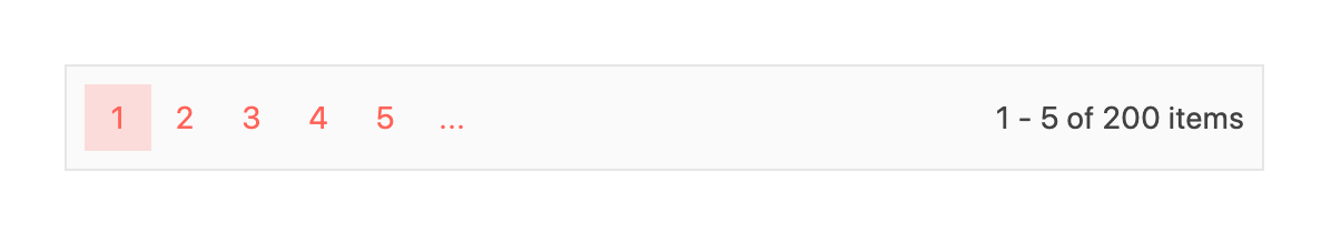
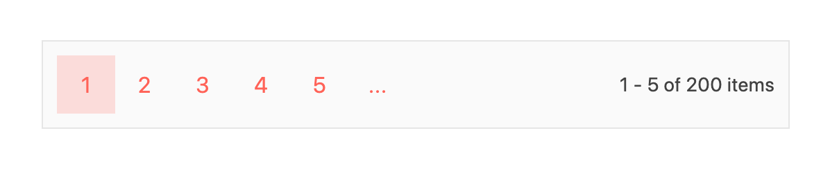
With these changes, our pagination UI will appear like the following:
To make our pagination fully interactive, we can create a handler function handlePageChange() that, when triggered, will update the page state based on user interactions, ensuring that the displayed content corresponds to the current pagination settings:
const App = () => {
  const [pageState, setPageState] = React.useState(initialPageState);
  const { skip, take, buttonCount } = pageState;

  const handlePageChange = (event) => {
    const { skip, take } = event;
    setPageState({
      ...pageState,
      skip: skip,
      take: take,
    });
  };

  return (
    <Pager
      skip={skip}
      take={take}
      total={total}
      buttonCount={buttonCount}
      onPageChange={handlePageChange}
    />
  );
};
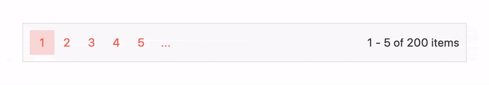
With this change, our Pager component is interactive, and a user will be able to navigate between pages:
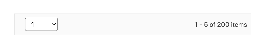
As mentioned earlier, the Pager component allows for extensive customization. For example, we can use the type prop to specify how users navigate between pages. It accepts two values: numeric (default) and input.
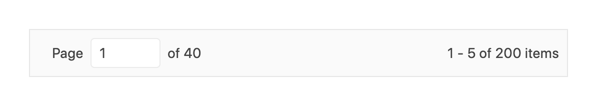
Setting the type to input allows users to navigate by entering a page number directly into an input field, offering an alternative to the default numeric button navigation. This can be useful for applications requiring quick navigation to a specific page.
const App = () => {
  // ...

  return (
    <Pager
      // ...
      type="input"
    />
  );
};
With the type set to input, the pagination interface changes to include an input field, enabling users to type the page number they wish to navigate to directly.
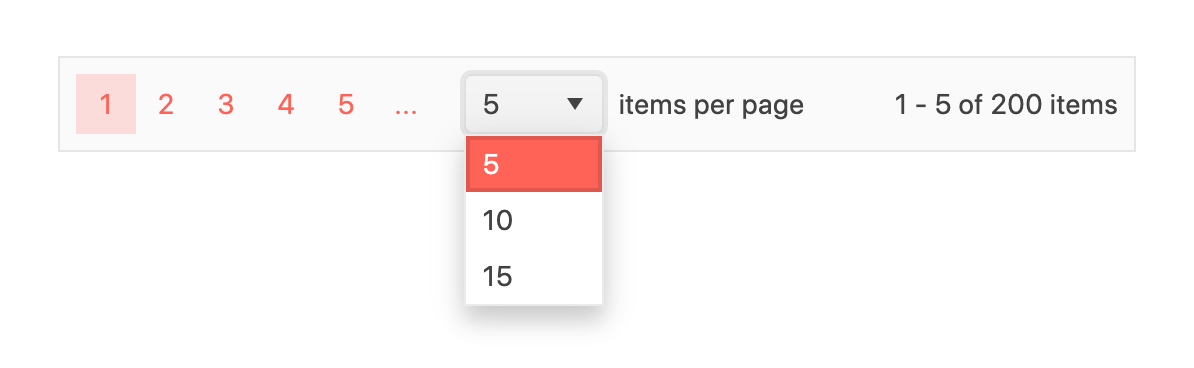
The pageSizes property allows users to select how many items they want to view per page. This feature adds a dropdown to the Pager component, allowing users to choose their preferred number of items per page. It’s a great way to give the user control, enhancing usability, especially in scenarios where the amount of data can be overwhelming.
const App = () => {
  // ...

  return (
    <Pager
      // ...
      pageSizes={[5, 10, 15]}
    />
  );
};
Enabling pageSizes provides a dropdown menu in the pagination UI, allowing users to select from predefined page sizes. This addition significantly improves user experience by providing flexibility in data consumption.
The Pager component also supports a size property, which adjusts its overall size. This can be particularly useful for making the pager more accessible or fitting it into different sections of a UI more harmonically.
const App = () => {
  // ...

  return (
    <Pager
      // ...
      size="large"
    />
  );
};
Setting the size prop to large increases the pager’s size, making it more prominent and easier to interact with, especially on touch devices.
The responsive prop enables the Pager component to adjust its layout based on the screen size, ensuring optimal usability across different devices.
const App = () => {
  // ...

  return (
    <Pager
      // ...
      responsive
    />
  );
};
By enabling the responsive prop, the Pager component dynamically adapts its presentation for optimal viewing, ensuring that pagination controls remain accessible and visually coherent across various devices, from desktop monitors to mobile screens. This adaptability is crucial for maintaining a consistent user experience in responsive web applications.
For a list of all the customization properties the Pager component accepts, refer to the PagerProps API documentation.
Wrap-up
In conclusion, the KendoReact Pager component provides a powerful solution for implementing effective pagination strategies in React applications. By leveraging the different suite of properties offered by the KendoReact Pager component, developers can create a customizable pagination experience that enhances user interaction and data presentation within their applications.
For more details, be sure to check out the official component documentation!
And don’t forget: KendoReact comes with a free 30-day trial if you’re ready to give it a spin!

Hassan Djirdeh
Hassan is a senior frontend engineer and has helped build large production applications at-scale at organizations like Doordash, Instacart and Shopify. Hassan is also a published author and course instructor where he’s helped thousands of students learn in-depth frontend engineering skills like React, Vue, TypeScript, and GraphQL.
Related Posts
Comments
All articles
Topics
Web MobileMobile
Desktop
Design
Productivity
People
