How to Use a jQuery PanelBar UI Component in Your Web App

Summarize with AI:
Explore how Kendo UI takes the pain out of creating a fully functional and styled PanelBar.
If you read the previous article in this series, you now know how TabStrip components are used in navigation to display related but different content on a page. The next component for you to conquer is the PanelBar.
A PanelBar is a container with sections stacked vertically on top of each other that can be expanded or collapsed. One use for a PanelBar is to organize a deep navigational hierarchy. In an earlier blog, you saw how to achieve a nested navigation using cascading dropdowns in the Menu component. That is fine when you have only a few links in the dropdown. However, when the dropdown becomes too deep, it is better to put those child links in a PanelBar.
Next, I will show you how Kendo UI takes the pain out of creating a fully functional and styled PanelBar.
Basic PanelBar for Navigation
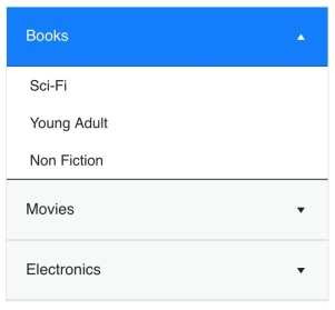
First, let's take a look at the minimal code needed to implement a PanelBar. The markup is similar to creating a menu. You will use a <ul> element for the root of the component. Each <li> element acts as a panel. Any <ul> element nested inside of a <li> element is the content that will be shown when the panel is expanded. This is an example of a PanelBar that has been styled using the Kendo UI Bootstrap theme:

<!DOCTYPE html>
<html>
<head>
  <title>Kendo UI Panelbar Example</title>
  <link rel="stylesheet" href="https://kendo.cdn.telerik.com/2018.1.221/styles/kendo.common-bootstrap.min.css" />
  <link rel="stylesheet" href="https://kendo.cdn.telerik.com/2018.1.221/styles/kendo.bootstrap-v4.min.css" />
  <link rel="stylesheet" href="https://kendo.cdn.telerik.com/2018.1.221/styles/kendo.material.mobile.min.css" />
  <script src="https://kendo.cdn.telerik.com/2018.1.221/js/jquery.min.js"></script>
  <script src="https://kendo.cdn.telerik.com/2018.1.221/js/kendo.all.min.js"></script>
  <style>
    body { font-family: helvetica; }
  </style>
</head>
<body>
  <ul id="panelbar">
    <li>
      Books
      <ul>
        <li>Sci-Fi</li>
        <li>Young Adult</li>
        <li>Non Fiction</li>
      </ul>
    </li>
    <li>
      Movies
      <ul>
        <li>Comedy</li>
        <li>Action</li>
        <li>Sci-Fi</li>
      </ul>
    </li>
    <li>
      Electronics
      <ul>
        <li>Phones</li>
        <li>Computers</li>
        <li>TVs</li>
      </ul>
    </li>
  </ul>
  <script>
    $(document).ready(function() {
      $('#panelbar').kendoPanelBar();
    });
  </script>
</body>
</html>
In a PanelBar component, selecting a link pushes the content down beneath it to reveal the submenu. Whereas in a Menu component, selecting a link reveals a dropdown that lays over the content on the page.
Building a PanelBar from a Data Source
You can skip writing markup and configure your PanelBar through its options. Building your PanelBar from a data source as opposed to hardcoding the HTML gives you more flexibility. Instead of thinking of the component as HTML, you can think of it as data. When you want to change the component, you can change its data or use one of its methods. This is the refactored code for creating our navigation using the dataSource option:
<ul id="panelbar"></ul>
<script>
  $(document).ready(function() {
    $('#panelbar').kendoPanelBar({
      dataSource: [
        {
          text: 'Books',
          items: [
            { text: 'Sci-Fi' },
            { text: 'Young Adult' },
            { text: 'Non Fiction' }
          ]
        },
        {
          text: 'Movies',
          items: [
            { text: 'Comedy' },
            { text: 'Action' },
            { text: 'Sci-Fi' }
          ]
        },
        {
          text: 'Electronics',
          items: [
            { text: 'Phones' },
            { text: 'Computers' },
            { text: 'TVs' }
          ]
        }
      ]
    });
  });
</script>
Other Uses for a PanelBar
A PanelBar can also be used as a controller to edit content. If you were building a photo editing application, you could have a PanelBar with a layers panel, a colors panel, and a history panel. Selecting a panel would reveal the tool. The view for each tool may take up considerable space and hiding the content in panels keeps the user's workspace nicely organized.
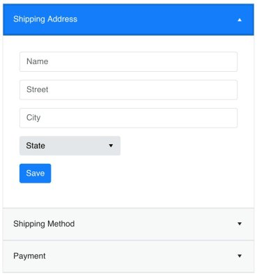
A PanelBar can also be used to direct a series of actions or steps. Say you have a checkout form and you need the user to provide their shipping address, shipping method, and payment method. You don't want to ask for all of the information up front, but you also don't want to put the information on different pages. Instead, you use a PanelBar to break the checkout flow into multiple parts. This is an example of what your checkout form would look like:

Comparison of Navigation Components
In this series, you have been introduced to several components for navigation. It might be confusing to know when to use each type. It may appear that they do the same thing but differ only in looks. That is not the case. Choosing the right component in the right place makes your app more usable. The main navigational components you have seen thus far are the ButtonGroup, Menu, TabStrip, and now the PanelBar.
Below is a summary with some basic information on each to keep in mind:

Conclusion
The PanelBar gives you another way to show and hide content. This information hiding is important to avoid overwhelming the user with too many choices. You have several choices for designing navigation, but you don't have to pick just one. You can, and should, combine components. You may have a menu with a few links fixed to the top of your page and a button that opens a navigation drawer made from a PanelBar. Experiment to see what works best for you.
I mentioned in the table above that button groups can be used for toolbars. Well, there is no need to use a button group to create a toolbar because Kendo UI has a toolbar component, which we also covered in this spotlight series. And it has many more features so you customize the behavior exactly how you want. If you have been following along, you have acquired more than enough knowledge to try out your Kendo UI skills on applications in the wild. See you on the web and make sure to check out the next blog in this series where we take on the TreeView.
Try out the PanelBar for yourself
Want to start taking advantage of the Kendo UI PanelBar, or any of the other 70+ ready-made Kendo UI components, like Grid or Scheduler? You can begin a free trial of Kendo UI today and start developing your apps faster.
Start My Kendo UI Trial
Angular, React, and Vue versions
Looking for UI component to support specific frameworks? Check out the PanelBar For Angular, the PanelBar for React, or the PanelBar for Vue.
Resources

Alberta Williams
Alberta is a software developer and writer from New Orleans. Learn more about Alberta at github.com/albertaw.
