
How to Use a jQuery Menu UI Component in Your Web App

Summarize with AI:
Now that you have added buttons and button groups to your Kendo UI arsenal, you are ready for your next tool—the Menu.
A Menu is a list of items that shows how your app’s content is structured. It acts as a guide for your users—a map they can use to navigate through your site.
How well your Menu is organized determines how well people can use your app. Have you ever visited a site and it was a struggle to find what you were looking for? Perhaps there were too many links hidden in submenus or the organization wasn't intuitive. When used correctly, the menu is a very powerful tool for the Kendo UI warrior to wield. In this lesson, you will learn how to transform a plain menu into a super-powered Kendo UI Menu.
HTML Menu
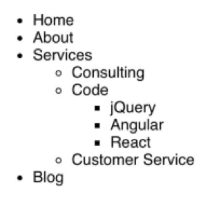
One way to create a menu is to use a nav element with links inside of it. This element doesn’t apply any special styling or behavior to the links, it just serves to make your code more readable. Another way to create a menu is to use unordered lists. Lists are particularly useful when you need to nest menus. This is an example of how to organize a menu that has a submenu using lists:
<ul id="menu">
  <li>Home</li>
  <li>About</li>
  <li>
    Services
    <ul>
      <li>Consulting</li>
      <li>
        Code
        <ul>
          <li>jQuery</li>
          <li>Angular</li>
          <li>React</li>
        </ul>
      </li>
      <li>Customer Service</li>
    </ul>
  </li>
  <li>Blog</li>
</ul>
Submenus are created by nesting a ul element inside of a li element. This is the default appearance for a menu that uses lists:
Kendo UI Menu
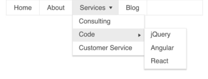
While this list shows how the content is structured, it doesn’t look inviting. We can use the HTML from our previous example and turn it into a Kendo UI menu by adding $('#menu').kendoMenu() to our code. This will give us a properly styled menu for both the main menu and the submenus. The nested lists turn into drop-down menus that are animated to slide into view when the mouse hovers over the menu items.
This is the full code to create the menu:
<!DOCTYPE html>
<html>
<head>
  <title>Kendo UI Example</title>
  <link rel="stylesheet" type="text/css" href="http://kendo.cdn.telerik.com/2018.1.221/styles/kendo.common.min.css">
  <link rel="stylesheet" type="text/css" href="http://kendo.cdn.telerik.com/2018.1.221/styles/kendo.material.min.css">
  <script src="https://ajax.googleapis.com/ajax/libs/jquery/3.3.1/jquery.min.js"></script>
  <script src="http://kendo.cdn.telerik.com/2018.1.221/js/kendo.all.min.js"></script>
  <style type="text/css">
    body {
      margin: 0;
      font-family: 'helvetica';
    }
  </style>
</head>
<body>
  <ul id="menu">
    <li>Home</li>
    <li>About</li>
    <li>
      Services
      <ul>
        <li>Consulting</li>
        <li>
          Code
          <ul>
            <li>jQuery</li>
            <li>Angular</li>
            <li>React</li>
          </ul>
        </li>
        <li>Customer Service</li>
      </ul>
    </li>
    <li>Blog</li>
  </ul>
  <script>
    $(document).ready(function(){
      $('#menu').kendoMenu();
    })
  </script>
</body>
</html>
Besides cascading menus, additional behaviors and configurations can be added to your menus. Kendo UI menus have methods to enable and disable menu items as well as dynamically change menu content by inserting and removing items. This is the same menu, but its orientation has changed:
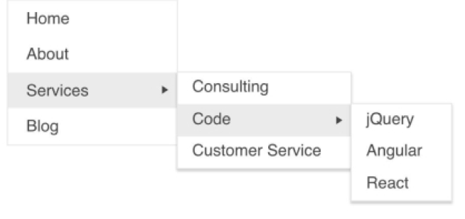
$('#menu').kendoMenu({
  orientation: 'vertical'
});
Kendo UI Context Menu
Kendo UI also provides support for creating context menus. A context menu is a menu that displays content relevant to the current state of the application. The menu by default is hidden and it appears when you right-click on the target. For example, when you right-click inside of your text editor you may be given the option to cut, copy and paste the item. A context menu for a music player may display the options to add or remove a song. This is an example of a Kendo UI context menu that has been opened:
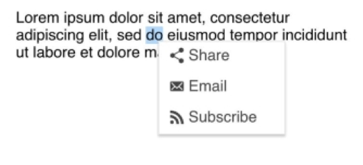
<p id="target">Lorem ipsum dolor sit amet, consectetur adipiscing elit, sed do eiusmod tempor incididunt ut labore et dolore magna aliqua.</p>
<ul id="context-menu">
  <li><span class="k-icon k-i-share"></span>Share</li>
  <li><span class="k-icon k-i-email"></span>Email</li>
  <li><span class="k-icon k-i-rss"></span>Subscribe</li>
</ul>
<script>
  $(document).ready(function(){
    $('#context-menu').kendoContextMenu({
      target: '#target'
    });
  });
</script>
Summary
The menu is the anchor for your app. Nested menus provide paths to take the user deeper into your app and context menus provide options to interact in different ways with your app. At its heart, menus are about choice. The items you put into your menu provide the choices the user can make. These choices create their experience. The choices you promote and the choices you hide reveal what content you prioritize.
Still, the menu isn’t the only way for users to navigate your app. A TabStrip is another option to organize your site’s content. On your journey to becoming a Kendo UI warrior, you will need to master using a TabStrip in order to take your sites to the next level. Stay tuned for the next blog in our component spotlight series where we cover the TabStrip.
Try out the Menu for Yourself
Want to start taking advantage of the Kendo UI Menu, or any of the other 70+ ready-made Kendo UI components, like Grid or Scheduler? You can begin a free trial of Kendo UI today and start developing your apps faster.
Angular, React, and Vue versions
Looking for UI component to support specific frameworks? Check out the Menu For Angular, the Menu for React, or the Menu for Vue.
Resources

Alberta Williams
Alberta is a software developer and writer from New Orleans. Learn more about Alberta at github.com/albertaw.