
How to Use a jQuery Button UI Component in Your Web App

Summarize with AI:
A well designed button can be a crucial step in taking your users on the journey through your site. Learn the difference between a basic HTML button and one themed with Kendo UI.
A button is an element that represents an action. It can be styled in different ways. You might see it as a border around some text or as an image. No matter what it looks like, its purpose is to communicate to the user that it is an interactive element that will do something.
That something might be to open a dialog, submit a form, go to another page, or any other action that you program the button to respond to. A button may look deceptively simple but there is quite some work that goes on behind the scenes to create one. With a default HTML button, you will have to add the styles and behavior to make it come to life. With a theme, most of this heavy lifting will be taken care of for you. In this post, I will show you the difference in using a basic HTML button and the Kendo UI button.
The HTML Button
One way you can create a button is using the <button> element. This will give you some default styling and you can specify the behavior of the element by adding a type attribute of reset, submit, or button. Type reset and submit have default behavior that works with forms. This is an example of how to implement it:
<button type="submit">Submit</button>
<button type="reset">Reset</button>
<button type="button">Button</button>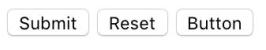
Other options for creating a button are using an <input> element or an <a> element. A submit button for a form can be created using the <input> element. A link button can be created using the <a> element. Additionally, you can use a <div> element or any other element to create a button. These options would have no styling and no behavior.
The Kendo UI Button
With Kendo UI, you get the styles and behavior for your button. You can customize the look of your button with the default theme for Kendo UI, another theme like Bootstrap and Material, or build your own with their theme builder. To get started using Kendo UI in your webpage, you will need to add a base stylesheet, a theme stylesheet, the jQuery library, and the Kendo UI JavaScript library. You can style your button by added classes to the element like this:
<!-- style and script dependencies -->
<link href="https://kendo.cdn.telerik.com/2018.1.221/styles/kendo.common.min.css" rel="stylesheet" type="text/css">
<link href="https://kendo.cdn.telerik.com/2018.1.221/styles/kendo.default.min.css" rel="stylesheet" type="text/css">
<script src="https://ajax.googleapis.com/ajax/libs/jquery/3.3.1/jquery.min.js"></script>
<script src="https://kendo.cdn.telerik.com/2018.1.221/js/kendo.all.min.js"></script>

<!-- in document body -->
<button class="k-button" type="button">Button</button>
<button class="k-button k-primary" type="button">Primary</button>
The button can be further customized using jQuery by configuring the button's options. You can add the option to enable or disable the button, add an image to the button, and add a click event handler. The following code disables the primary button, adds an inline image, and a click event:
<script>
function handleClick() {
  alert("Hello World");
}

$(document).ready(function() {
  $(".k-primary").kendoButton({
    enable: false,
    icon: "cancel",
    click: handleClick
  });
});
</script>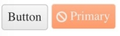
Basic Button versus Kendo UI Button
The following is a comparison of what the different buttons do:
| Basic Button | Kendo UI Button | |
|---|---|---|
| Styles | Default browser style | Theme styles |
| Customizing Styles | Add your own CSS | Modify theme stylesheet |
| Actions | Any mouse event | Click events |
| Customizing Actions | Define and attach event listeners | Add event handler via button options |
Using a default HTML button gives you the bare minimum required for a button to function. You are responsible for adding the CSS and JavaScript to enhance it. A Kendo UI button on the other hand comes with a set of styles you can use and an interface for customizing the behavior of your button. If you are already using the Kendo UI theme in a project, using Kendo UI's button component will integrate nicely because it will have the same look and feel as your other components.
Conclusion
The button is an important aspect of an app that should not be taken for granted. Buttons can take the user on a journey through your site to places they might never find on their own. They can communicate so much with color, shape, and images without saying a word. An image button of a right arrow at the end of a post tells you how to get to the next page. A button filled with bright red warns you the next action may do harm like deleting or canceling. How you use a button in your apps is important to the user experience and should be consistent with your overall branding.
Want to learn more? Come back for the next blog in this series where we will move on to ButtonGroups.
Want to Try Kendo UI?
Want to start taking advantage of the Kendo UI button, or any of the other 70+ ready-made Kendo UI components, like Grid or Scheduler? You can begin a free trial of Kendo UI today and start developing your apps faster.Start My Kendo UI Trial
Angular, React, and Vue versions
Looking for UI components to support specific frameworks? Check out the Button For Angular, the Button for React, or the Button for Vue.
Resources

Alberta Williams
Alberta is a software developer and writer from New Orleans. Learn more about Alberta at github.com/albertaw.