
Angular Visualizations: Create Data Visualization with Kendo UI Charts

Summarize with AI:
Make it easy to understand data at a glance in your Angular app with Kendo UI for Angular Charts.
Building apps with Angular and making the users understand the impact of the data is not an easy task. We often show the data in a table or list, but that’s not enough to understand the implications. Using charts with graphs to understand the data makes it easy for the user.
We will use the component from Kendo UI for Angular to show how to create a Bar, Line and Pie chart for elegant data visualization.
All three chart types we discussed—bar, line and pie—come out of the box with Kendo UI for Angular (plus more!). And they all deliver an impressive set of configuration options coming with excellent documentation and examples. We will use the power of Kendo UI for Angular Charts to build great charts in our app.
The following points focus on understanding Kendo UI Charts and how to use and play with the different types of Charts.
- What are Kendo UI Charts
- Add Kendo UI for Angular Charts
- Kendo UI Charts Components
- Add Pie Chart
- Change Dynamic Charts
- Benefits of Using Kendo UI Charts
- Conclusion
What are Kendo UI Charts?
The Angular Charts component from Kendo UI for Angular provides great graphical data visualization with various chart types with an easy configuration that allows the creation of charts for most business cases and a great UI.
The Angular Chart has an extensive list of Charts split into modules like ChartModule, SparklineModule and StockChartModule with theme support. Today we will cover the ChartModule options, but feel free to see the complete
list on the
official website.
More about Kendo UI for Angular Chart.
Add Kendo UI for Angular Charts
First, create a new Angular application and add some dependencies.
Open your terminal and use @angular/cli to create a new project running the following command:
ng new play-with-kendo-ui-charts
Next, install Kendo UI for Angular Charts in the app using the command ng add @progress/kendo-angular-charts in the terminal. It automatically installs and configures the ChartsModule into
the app.module.
play-with-kendo-ui-charts> ng add @progress/kendo-angular-charts
ℹ Using package manager: npm
✔ Found compatible package version: @progress/kendo-angular-charts@7.3.0.
✔ Package information loaded.

The package @progress/kendo-angular-charts@7.1.1 will be installed and executed.

Would you like to proceed? Yes
✔ Package successfully installed.
UPDATE src/app/app.module.ts (526 bytes)
UPDATE package.json (1515 bytes)
UPDATE angular.json (3552 bytes)
✔ Packages installed successfully.
Perfect, we’ve already installed and configured it, but before starting to play, let’s give an overview of the most common components from Kendo UI Charts.
Kendo UI for Angular Chart Components
The Kendo UI for Angular Chart relies on a list of components to provide an easy configuration for our charts:
<kendo-chart>: It is the base root element that helps to define a chart or use other components inside like<kendo-chart-legend>,<kendo-chart-title>and more.<kendo-chart-title>: Shows a title in the chart. Easy to customize color, font and more options.<kendo-chart-legend>: Shows a legend with the data in the series.<kendo-chart-series>: Controls the data with a different type of chart as an array of data.<kendo-chart-series-item>: It represents the item with color, line, space and more.
Read the complete list of Angular Chart Elements.
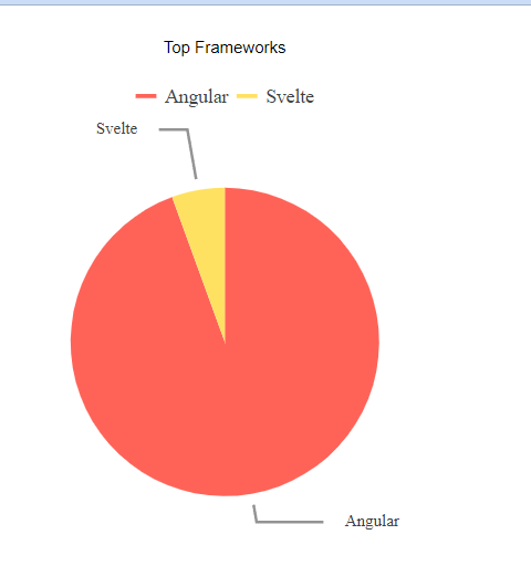
Add the Pie Chart
Create a new component, my-chart, running the following command:
ng g c my-chart
We need to configure three main points.
chartType: Defines which chart we use; using theSeriesType, assign the value “pie”.data: It is an array with a list of objects with name, value and color, to use in thechart-series-component.label: It returns the title for each data item in the series.
typeChart: SeriesType = "pie";
public data = [
    { name: "Angular", value: 75, color: "red" },
    { name: "React", value: 15, color: "blue" },
    { name: "Svelte", value: 5, color:"orange" },
];

public label(args: LegendLabelsContentArgs): string {
    return `${args.dataItem.name}`;
}
We start to use each component and configure the data and values:
<kendo-chart>
  <kendo-chart-title
    color="black"
    font="29pt sans-serif"
    text="Top Javascript Framework"
  >
  </kendo-chart-title>
  <kendo-chart-legend position="top"></kendo-chart-legend>
  <kendo-chart-series>
    <kendo-chart-series-item
      [data]="data"
      [labels]="{ visible: true, content: label}"
      [type]="typeChart"
      categoryField="name"
      colorField="color"
      field="value">
    </kendo-chart-series-item>
  </kendo-chart-series>
</kendo-chart>
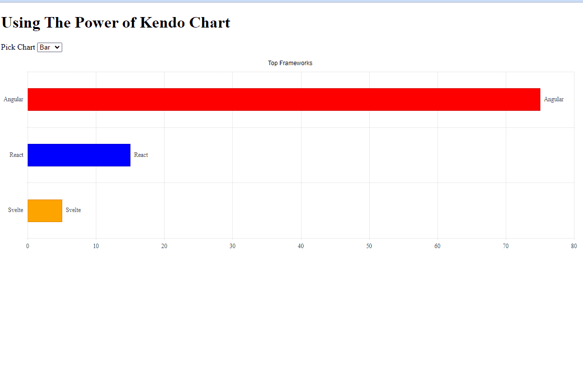
Change Dynamic Charts
To demonstrate the flexibility and power of the Kendo UI for Angular Chart, we will show our data in other types of charts like bars or lines. For example, we don’t need the structure of components or data (in most cases) to convert the pie to Bar or Line chart.
To make it fun, we create a dropdown with some chart types (line, pie, bar) to change it dynamically. We are using the power of Angular two-way binding
and ngModel directive to change the value of typeChart.
First, create the selection with the list of values and, using the [(ngModel)], set the property typeChart. It updates type input property of <kendo-chart-series-item> when you change the selection, and it updates the chart type visualization.
<div>
  <h1>Using The Power of Kendo Chart</h1>
  <label for="typeChartSelector">Pick Chart
    <select [(ngModel)]="typeChart" id="typeChartSelector">
      <option value="line">Line</option>
      <option value="pie">Pie</option>
      <option value="bar">Bar</option>
    </select>
  </label>
</div>
Now our Chart changes dynamically and looks like this:
Learn more: NgModel and two-way binding.
Benefits of Using Kendo UI for Angular Charts
- Choose from a massive list of Chart layouts.
- Excellent documentation for components and internal APIs.
- Versatile Kendo UI themes.
- Fantastic examples for all Charts ready to play.
- Ready to work with Angular 15.
- Support that is second to none, and customers drive development priorities.
Keep in mind these points as your team decides what library to use for your next Angular chart app.
Conclusion
We learned how to create a pie chart and change it to a bar or line chart dynamic and fast using the Angular power with Kendo UI. Kendo UI for Angular Charts makes you highly productive and delivers fancy, powerful and incredible visualization for your apps. Try the Angular Chart plus any of the 100+ components available in Kendo UI for Angular with the .
Feel free to play with the sample app or code at the following links:

Dany Paredes
Dany Paredes is a Google Developer Expert on Angular and Progress Champion. He loves sharing content and writing articles about Angular, TypeScript and testing on his blog and on Twitter (@danywalls).
Related Posts
Comments
All articles
Topics
Web MobileMobile
Desktop
Design
Productivity
People
