The 10 Best Angular UI Chart Libraries

Summarize with AI:
TL;DR Which Angular charts library is best? With the native build, 18+ styles of charts, accessibility and AI integrations, Kendo UI for Angular is hard to top.
It does not matter if you are building a static page, a dynamic dashboard, a landing page to show NBA results or an AI-powered application. The web needs charts. Data visualization is everywhere, and choosing the right chart library is a decision that affects every Angular project.
During these years, I have created charts with many libraries. I started with jQuery plugins, then moved to D3.js, Chart.js, Highcharts and many others. Each project brought a new challenge and a new library to learn. Some were easy to start with but hard to maintain. Others were powerful but difficult to integrate with Angular. Today, my go-to choice is Progress Kendo UI for Angular Charts because it solves most of the problems I found along the way.
Today, the options are better than ever. But the question remains the same: "Which chart library should I use?"
In this article, we are going to compare the 10 best Angular chart libraries available in 2026. For each one, I will share its strengths, its weaknesses and my honest recommendation. By the end, you will know exactly which library fits your next project.
The Scenario
Imagine you are building a financial dashboard for a fintech startup. The app needs real-time stock charts, interactive bar charts for monthly revenue, pie charts for portfolio distribution and heat maps for risk analysis. The deadline is in two weeks. Your team has three Angular developers and one designer who works in Figma.
In this situation, your chart library is not just about rendering bars and lines. It needs to integrate cleanly with Angular, support real-time data, look consistent with your brand and be easy to maintain over time. You also need your AI coding agents to understand the component API so they can help you build faster.
I have seen teams spend weeks trying to make a chart library work with Angular, only to switch to another one and start over. Making the right choice from the beginning saves you that pain.
Let’s look at the options.
1. Kendo UI for Angular Charts
The Kendo UI for Angular Charts are, in my experience, the most complete charting solution for Angular applications in 2026.
They are not just a wrapper around a JavaScript library. They are native Angular components built from the ground up for the framework. These charts use Angular’s template system, dependency injection and change detection natively. This means better performance and a developer experience that feels natural.
Why Kendo UI Charts Is the Best Choice IMO
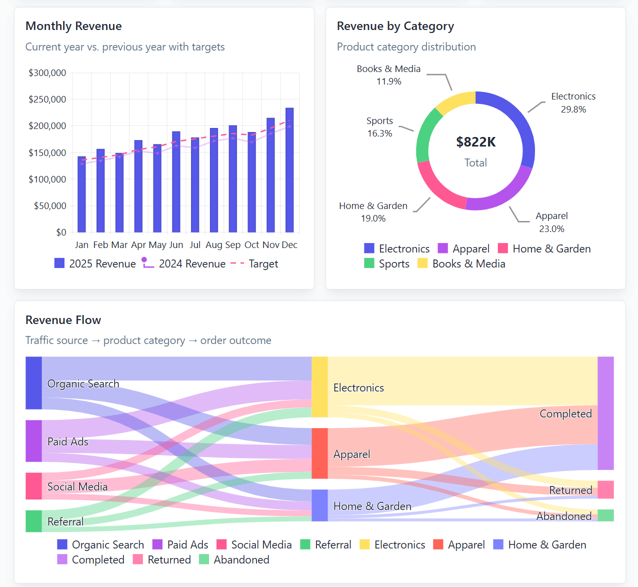
What makes Kendo UI charts stand out is the combination of completeness and Angular-native design. You get 18+ chart types across four categories: Categorical (Line, Bar, OHLC/Candlestick), Circular (Pie, Donut), Freeform (Funnel) and Scatter (Bubble, Scatter Plot). Plus dedicated components like Sparkline, StockChart and Sankey, and many more. Every one of these is a first-class Angular component with full TypeScript support.
And each type of chart comes with a wide range of functionality and customization:
- Dual configuration modes: You can configure charts using TypeScript objects (great for loading settings from an API) or Angular template components (great for IDE support and type checking). You can even mix both approaches in the same chart, using objects for global settings and components for series-specific configuration.
- Real-time data support: The StockChart component handles live data feeds with smooth animations. If you are building financial dashboards or monitoring tools, this is critical.
- Drilldown functionality: Explore data in a view hierarchy directly within your charts. Users can click to see details without leaving the component.
- Panning and Zooming: Simple interactions allow users to explore data by moving across categories or zooming into specific ranges. You can enable or disable these features per chart.
- Export options: Built-in export to PNG, PDF, SVG and the Kendo UI Drawing format for further processing. No extra libraries needed.
- Rendering modes: Choose between SVG (vector, default) and Canvas (bitmap) depending on your performance needs. Switching is a single configuration option.
- WCAG 2.2 AA accessibility: Full compliance with Section 508 and WAI-ARIA best practices. Tested against screen readers including JAWS and NVDA.
- Context Menu integration: Right-click on data points to trigger custom actions. Works well with the Kendo UI ContextMenu component.
- ThemeBuilder and Figma kits: Your designer creates the look in Figma, you apply it with ThemeBuilder. The new Meridian theme joins Bootstrap, Material and other popular options. No CSS customization problems.
- WebMCP support (2026 Q2): Kendo UI for Angular components are now agent-ready out of the box. AI agents can interact with your charts by calling structured tools directly, triggering actions like filtering data or updating values through natural language. This is the future of UI development.
- Agentic UI Generator: Build chart components and layouts using natural language prompts directly inside AI-powered IDEs like VS Code and Cursor. Get intelligent assistance powered by Kendo UI documentation and APIs.
- Codemods CLI: Upgrade to the latest Kendo UI version faster with AI-assisted migration. The tool automates code transformations, shows changes with diff-style output and provides a detailed migration report.
- Professional support: When your StockChart breaks at 2 AM before a demo, you have a team of engineers who built the component ready to help you. Not a forum post from 2019.
Pro tip: You can try Kendo UI for Angular Charts free for 30 days, no credit card required. The fastest way to prove to your team that this is the right choice is to build a small prototype and see how fast you can go.
But what if you prefer a simpler, open-source approach? That brings us to our next option.
2. Chart.js with ng2-charts
Chart.js with ng2-charts is the most popular lightweight option for Angular developers who need quick, simple charts without a difficult learning process.
- The Good: Very easy to set up. You can have a bar chart running in minutes. The library is lightweight and performs well for simple use cases. It supports the most common chart types: bar, line, pie, doughnut, radar, scatter and bubble.
- The Cons: Limited customization compared to enterprise libraries. The Angular wrapper (ng2-charts) is a community project, not an official Angular integration. When you need advanced features like real-time streaming, custom tooltips or complex animations, you will reach its limits quickly.
- My Feedback: Chart.js is perfect for a quick prototype or a small internal tool. But for a production dashboard with real-time data and brand customization, you will need more than it can offer. The Kendo UI library gives you the same simplicity for basic charts but grows with enterprise needs without switching libraries.
If you want something more powerful than Chart.js but still open-source, keep reading.
3. Apache ECharts
Apache ECharts is one of the most powerful open-source charting libraries available. It offers advanced visualization capabilities and strong performance with large datasets.
- The Good: 20+ built-in chart types with advanced components like heat maps, treemaps, Sankey diagrams and candlestick charts. It handles large datasets well and offers rich interactivity out of the box. The library is free under the Apache 2.0 license.
- The Cons: The Angular integration requires wrappers like
ngx-echarts, which are community-maintained. The API can feel overwhelming for developers coming from simpler libraries. The documentation is comprehensive but not always easy to navigate. - My Feedback: ECharts is a solid open-source choice, especially if budget is a concern. However, the Angular integration is not native. If you are building a production app where support and consistency matter, the Kendo UI library’s native Angular components and professional support make it a safer investment.
If your project has a lot of data and you need something more focused on dashboards, check out the next option.
4. Highcharts Angular
Highcharts is one of the most mature and well-known charting libraries in the market. It has been around since 2009 and offers an official Angular wrapper.
- The Good: Excellent documentation and a polished API. Highcharts offers specialized modules for stock charts, maps and Gantt charts. The visual quality is high and the library handles accessibility well with WCAG compliance.
- The Cons: Commercial license required for business use. The Angular wrapper is not a native Angular component, which means you lose some of Angular’s template features and type safety. Customization beyond the built-in options can be complex.
- My Feedback: Highcharts is a solid library, but the licensing model and the wrapper-based Angular integration are limitations. The Kendo UI library offers a similar level of visual quality with native Angular components, a more flexible licensing model and the added benefit of ThemeBuilder for design consistency.
For teams that need a large chart collection with commercial support, the next option is worth considering.
5. FusionCharts Angular
FusionCharts is an enterprise-focused charting library with over 95 chart types, 1,400+ maps and 20+ dashboard components.
- The Good: The variety of chart types is impressive, including specialized visualizations like funnel charts, gauges and Gantt charts. It handles medium to large datasets well and offers commercial support.
- The Cons: Commercial license required. The Angular integration uses a wrapper approach. The API can feel heavy for simple use cases. The learning curve is steeper than simpler alternatives.
- My Feedback: FusionCharts is powerful, but it can be too much for many projects. If you only need 5 or 6 chart types, you are paying for complexity you will never use. The Kendo UI library gives you a similar variety of chart types with a lighter API and native Angular integration.
If you want a modern, lightweight option with great interactivity, the next library might interest you.
6. ApexCharts Angular
ApexCharts is a modern, open-source charting library that focuses on beautiful, interactive charts with minimal configuration.
- The Good: Clean, modern design out of the box. Built-in interactivity like zooming, panning and tooltips without extra configuration. The Angular wrapper (
ng-apexcharts) is straightforward to use. Supports 20+ chart types. - The Cons: The Angular wrapper is community-maintained. Limited chart variety compared to enterprise libraries. No built-in maps or Gantt charts. The commercial license applies for business use.
- My Feedback: ApexCharts is great for modern dashboards where visual appeal matters. However, the community Angular wrapper means you depend on external maintainers. If your project needs long-term stability and professional support, the Kendo UI library’s native Angular components are a more reliable choice.
For developers who want maximum flexibility and are willing to write more code, the next option is worth exploring.
7. D3.js with Angular
D3.js is the most powerful and flexible data visualization library available. It gives you complete control over every pixel of your charts.
- The Good: Maximum flexibility. You can create any visualization you can imagine, from simple bar charts to complex custom interactive dashboards. The data-binding capabilities are unmatched.
- The Cons: Difficult learning process. D3 is not a charting library, it is a visualization toolkit. Even simple charts require significant code. There is no Angular-specific integration, so you need to handle all the Angular-D3 setup yourself.
- My Feedback: D3.js is incredible for custom visualizations that no other library can create. But for a business dashboard with standard chart types, it is too much work. You will spend weeks building what Kendo UI gives you in hours. Use D3 for the 5% of charts that need custom work, and use Kendo UI for the other 95%.
If your focus is on Angular-native solutions, the next option is worth a look.
8. ngx-charts
ngx-charts is a charting library built specifically for Angular, using D3.js internally.
- The Good: Angular-native design. The library uses Angular components and supports features like animation and interactivity. It covers the most common chart types: bar, line, pie, area, polar and heat maps.
- The Cons: The project has not been actively maintained in recent years. The chart variety is limited compared to enterprise libraries. Performance can decrease with large datasets.
- My Feedback: ngx-charts was a good option when it was actively maintained, but the lack of recent updates is a concern for production apps. If you want Angular-native charts with active development and professional support, Kendo UI for Angular is the clear choice.
For teams already invested in the Syncfusion ecosystem, the next option might be familiar.
9. Syncfusion Angular Charts
Syncfusion offers a comprehensive suite of Angular components including a powerful charting library.
- The Good: Wide variety of chart types. Good performance with large datasets. The components are well-integrated with other Syncfusion components.
- The Cons: The API does not always feel like standard Angular, which makes it harder to learn. Customizing charts to match a specific Figma design can be challenging. The styling system can feel overwhelming.
- My Feedback: Syncfusion charts are powerful, but the developer experience can feel heavy. If you want charts that integrate cleanly with Angular’s template system and offer ThemeBuilder for design consistency, the Kendo UI library provides a simpler experience for both developers and designers.
Finally, for developers who want a modern, modular approach, the last option is worth considering.
10. Plotly.js
Plotly.js is an open-source graphing library that supports over 20 chart types and offers an Angular wrapper.
The Good: Good for scientific and statistical visualizations. Supports 3D charts, which is rare among charting libraries. The library is open-source and well-documented.
The Cons: The Angular wrapper is not officially maintained by the Plotly team. The library can be heavy for simple use cases. The visual style is functional but not as polished as commercial alternatives.
My Feedback: Plotly.js is a good choice for scientific or research applications where 3D visualization is needed. For business dashboards and enterprise applications, the Kendo UI library offers a more polished look, better Angular integration and the consistency of a complete component suite.
Recap
Choosing the right Angular chart library in 2026 is about matching your project’s needs with the right tool. If you are building a serious Angular application in 2026, Kendo UI for Angular Charts is the strongest choice.
You get production-ready native Angular components, 18+ chart types, real-time data, drilldown functionality, of course WCAG 2.2 AA accessibility, ThemeBuilder integration and AI-ready tools through WebMCP and the Agentic UI Generator. All backed by professional support from the team that built the software (so you never feel alone).
The best chart library is the one that lets you focus on your data, not on fighting with the tool. Kendo UI for Angular gives you that freedom.
Do You Want to Try It?
The Kendo UI for Angular Charts, plus 120 other components are all available to try free for 30 days.

Dany Paredes
Dany Paredes is a Google Developer Expert on Angular and Progress Champion. He loves sharing content and writing articles about Angular, TypeScript and testing on his blog and on Twitter (@danywalls).
Related Posts
Comments
All articles
Topics
Web MobileMobile
Desktop
Design
Productivity
People