Telerik UI for Blazor
What's New R3 2023
What's New HistoryIntroducing Telerik UI for Blazor ListBox Component
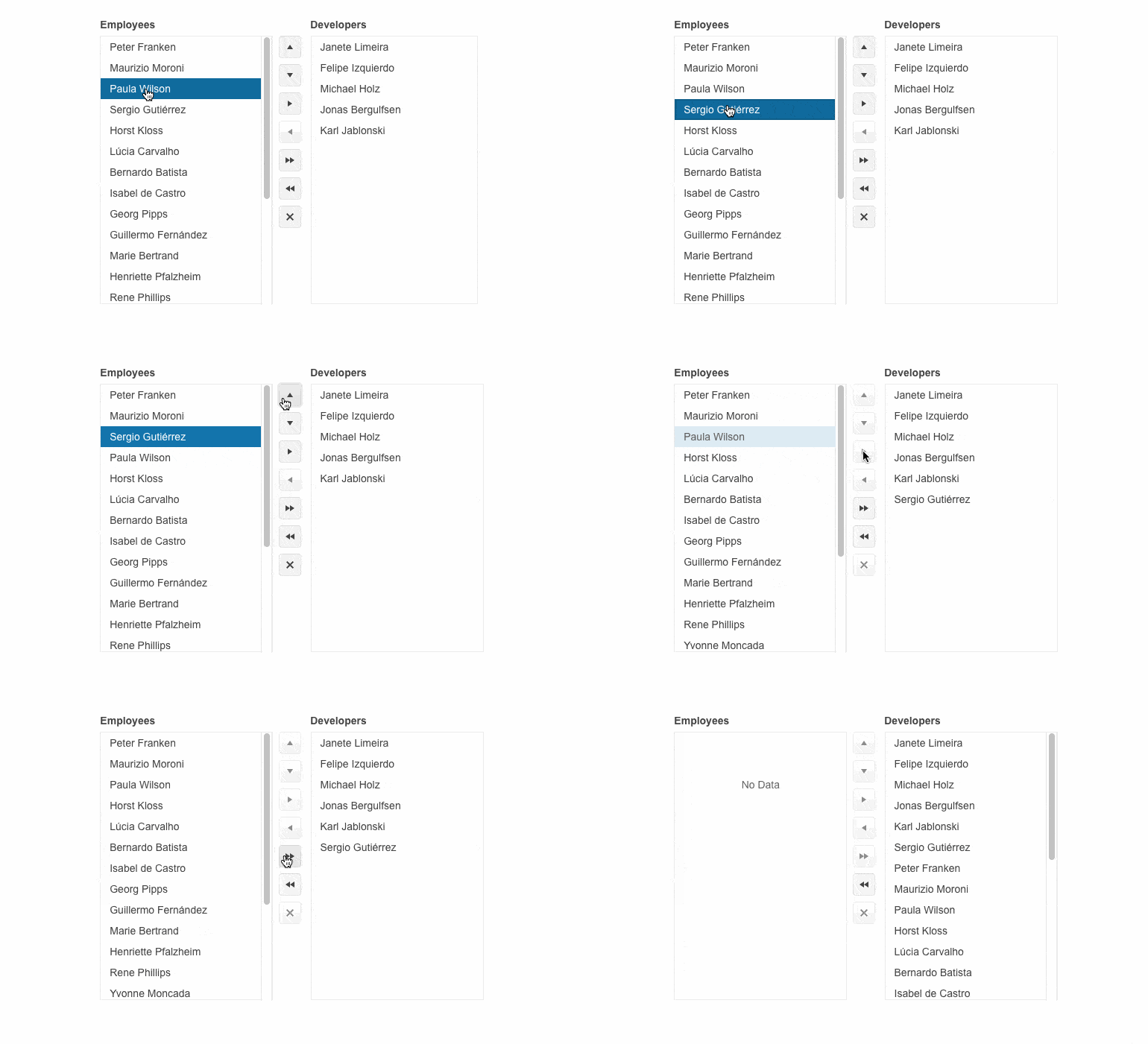
Displaying items in a dedicated area that can be scrolled through is a piece of cake with the brand-new Telerik UI for Blazor ListBox component. Your users are now equipped with the flexibility to select, reorder, delete and drag and drop items with ease. Additionally, you can combine multiple Blazor ListBoxes to enable users to move items between two or more lists thanks to the built-in capabilities for moving single or multiple items back and forth between various ListBox instances.
Customization options like changing the size or playing with the ListBox toolbar position are also available to ensure the component fits any app requirement.
See the Telerik UI for Blazor ListBox demo
Telerik UI for Blazor Welcomes a DropDownButton
Empower users to choose from an optimal number of options while saving screen space with the brand-new Telerik UI for Blazor DropDownButton. It combines a primary button and a dropdown popup with a list of additional action items that can be displayed as icons, text, or a mix of both. The DropDownButton component comes with multiple configuration and customization options to cover any app requirement.
See the Telerik UI for Blazor DropDownButton demo

Telerik UI for Blazor is Enriched with New Chart Types
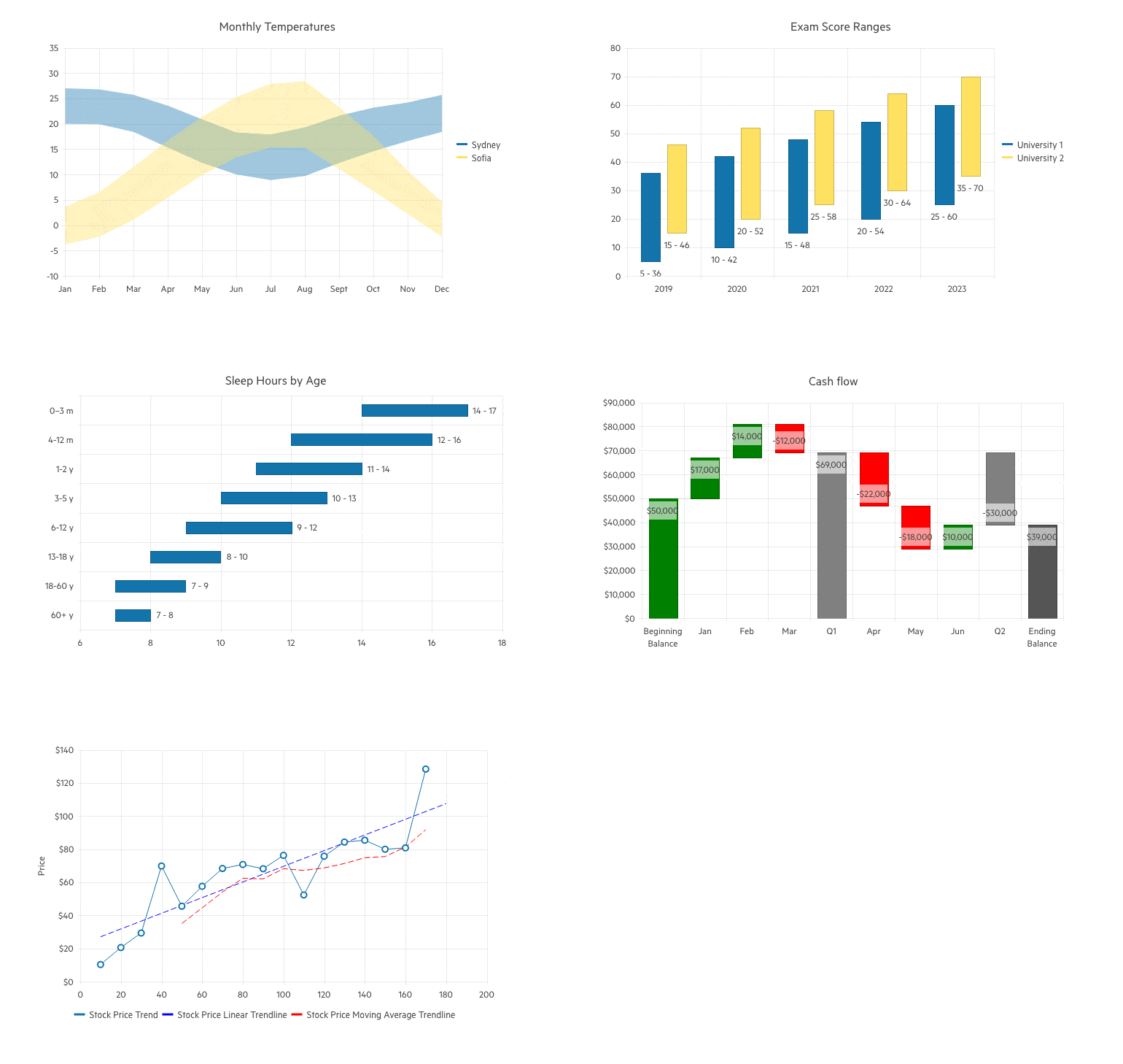
New Chart types are added to the Telerik UI for Blazor Chart family covering even more use case scenarios you can benefit from. Leverage the newly introduced:
- Range Area Chart, which allows you to output graphical representation of your quantitative data using continuous lines that pass through points defined by their items' values. It is suitable when comparing changes in values from several sets of similar data. Check out the Telerik UI for Blazor Range Area Chart demo.
- Range Column Chart, enabling you to visualize data as vertical bars, which is beneficial for scenarios where you want to showcase a comparison between several sets of data. Check out the Telerik UI for Blazor Range Column Chart demo.
- Range Bar Chart that displays data as horizontal bars and just like the Range Column Chart is useful when you want to visualize a comparison between several sets of data but in a horizontal way. Check out the Telerik UI for Blazor Range Bar Chart demo.
- Waterfall Chart which showcases how an initial value can be affected by the cumulative effect of sequential positive and negative values. This chart type uses a series of vertical or horizonal bars that show gains and losses, clearly demonstrating how an opening figure was changed by events and led to the closing figure. Check out the Telerik UI for Blazor Waterfall Chart demo.
- Trendline Chart visualizes data points in a time series or sequential order. It’s often used to represent and analyze trends, patterns and relationships in the data over time. Trendline charts are commonly used in fields like finance, economics, statistics and data analysis to identify and understand trends and facilitate the process of making informed decisions. Check out the Telerik UI for Blazor Trendline Chart demo.
DrillDown Capability in Telerik UI for Blazor Charts
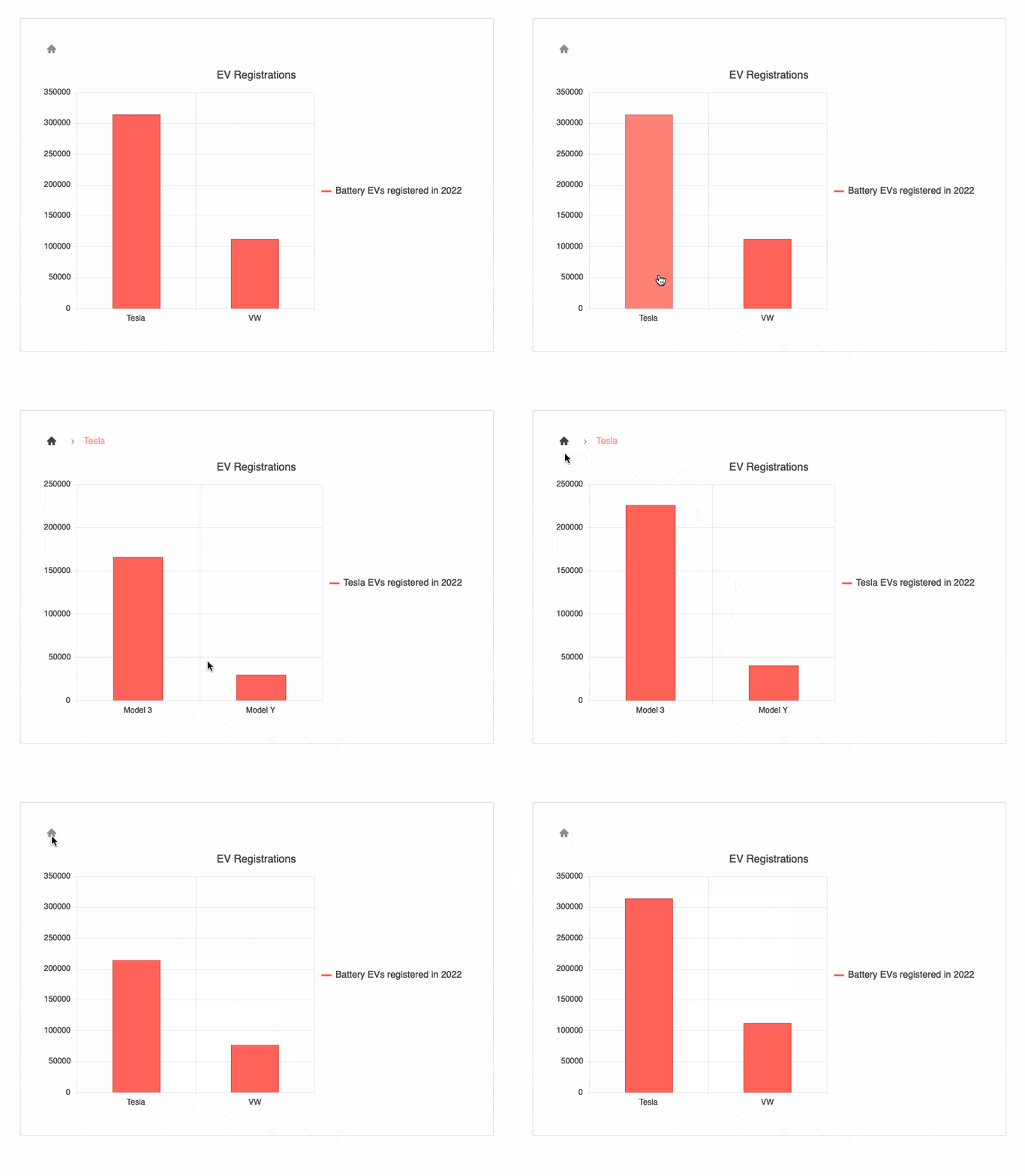
Users’ charting experience is enhanced thanks to the new DrillDown feature in Telerik UI for Blazor Charts. It allows them to gain instant knowledge of different depths of the data by clicking on any series of the Chart. Moreover, by only presenting one layer of data at a time, the drill down feature lightens the load, thus improving performance.
See the Telerik UI for Blazor Charts DrillDown demo
Pan and Zoom Capabilities Added to the Telerik UI for Blazor Charts
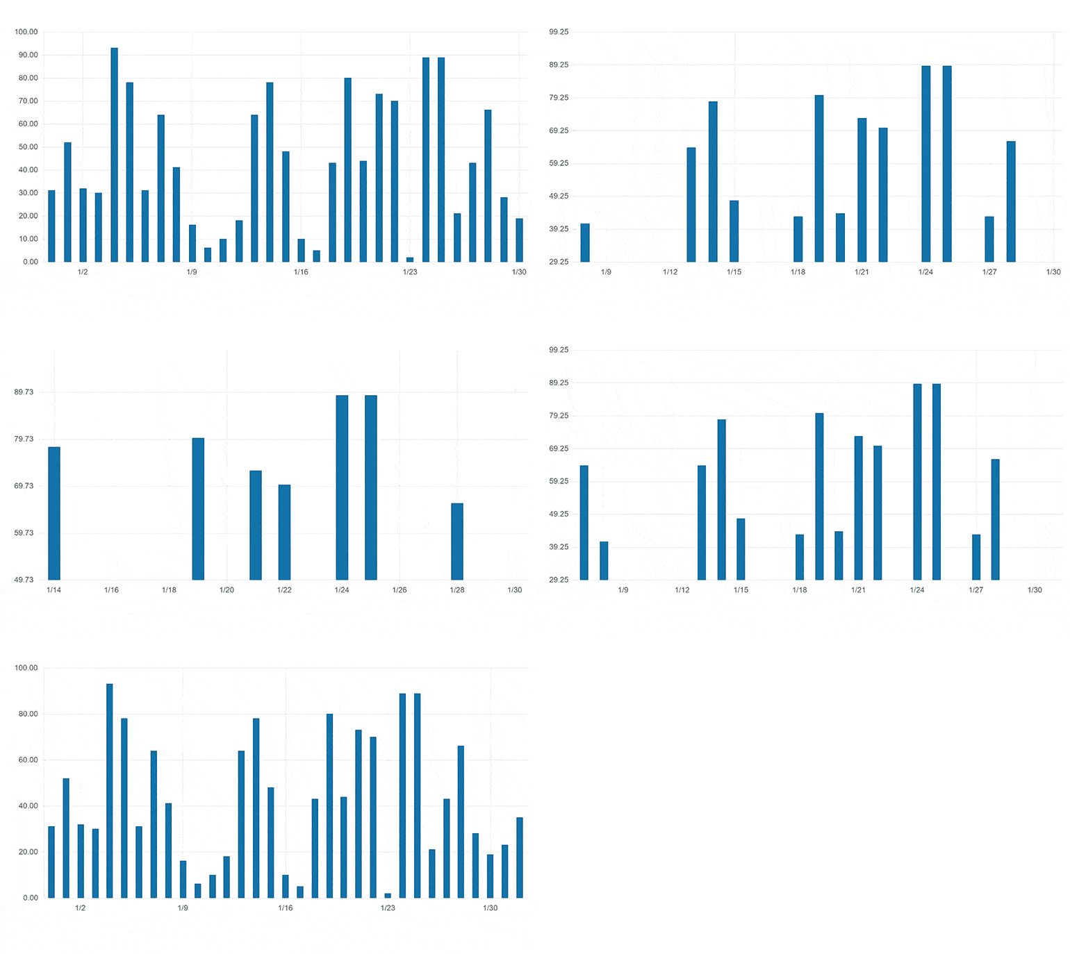
Leveraging the newly added panning and zooming capabilities of the Telerik UI for Blazor Chart users can effortlessly focus on the data they want to see. Elevate chart navigation and data analysis by allowing users to zoom into specific areas and focus on different parts within the plot area. Panning and zooming are extremely beneficial on small screens where the chart may be too large for the available screen space.
See the Telerik UI for Blazor Chart Pan and Zoom demo
New Blazor Chart Events Facilitate Interactions with Users
Telerik UI for Blazor Chart component exposes three new events that help you react to user actions, e.g., display additional related information if the case requires so. The already available OnSeriesClick event welcomes:
- OnAxisLabelClick which fires when the user clicks a label item on any of the Chart axes.
- OnLegendItemClick that is triggered upon clicking on any item in the Chart legend.
- OnDrilldown which fires when the drill-down functionality is executed.
Enriched Telerik UI for Blazor Gantt Chart Editing Options
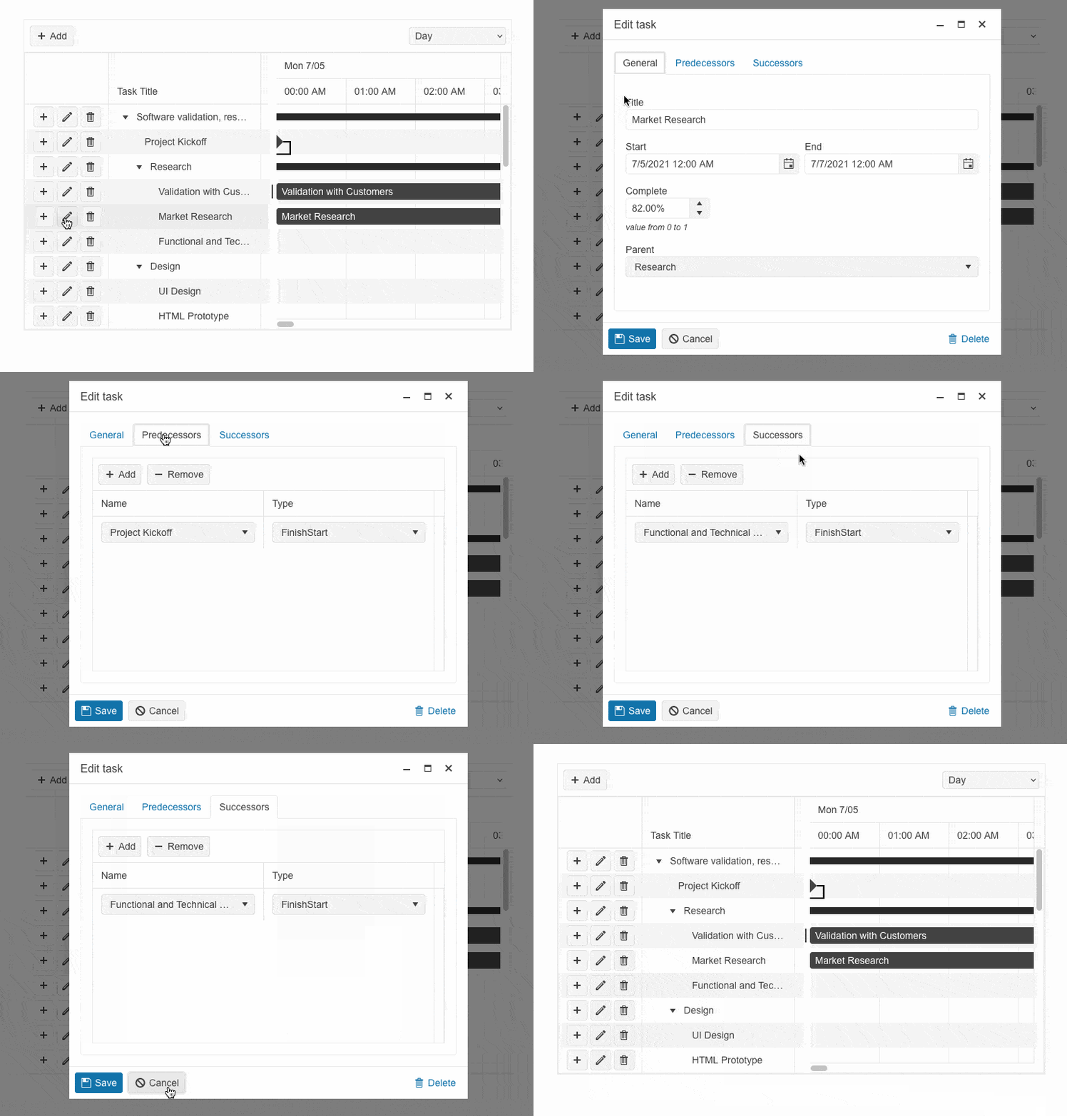
The built-in editing popup in Telerik UI for Blazor Gantt Chart now displays three different tabs—General, Predecessors and Successors—with editable task-related content. Empower users to effortlessly edit the task fields by providing them with a full-featured experience.
See the Telerik UI for Blazor Gantt popup editing demo
Multiple Enhancements in Telerik UI for Blazor PivotGrid
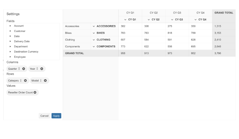
With R2 2023, we released Blazor PivotGrid component which is now enriched with four new parameters, elevating the component’s appearance and usability.
- Title parameter: You can now leverage a Title parameter, which would determine how columns, rows and measures will be named in the Pivot Grid configurator.
- ColumnHeadersWidth and RowHeadersWidth parameters: The PivotGrid component is enhanced with new customization options, including ability to set specific column and row headers width through the new parameters.
- HeaderClass parameter: To customize the appearance of any PivotGird column header, you can take advantage of the newly exposed HeaderClass parameter. This would allow you to define custom CSS classes for the column header cells and easily bold their text, change their alignment or style them to make them stand out.
See the updated Telerik UI for Blazor PivotGrid demo
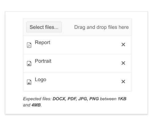
Setting Initial Files in Telerik UI for Blazor FileSelect and Upload Components Made Easy
The Telerik UI for Blazor FileSelect and Upload components are enhanced with a new functionality, enabling you to display specific files in the file select or upload lists. This allows you to conveniently present files that were previously uploaded to the remote endpoint, ensuring a user-friendly experience.
See the Telerik UI for Blazor FileSelect Initial Files demo for an example
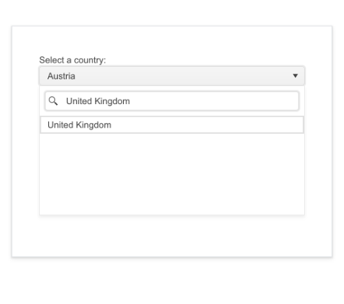
Introducing Filter Placeholder in Telerik UI for Blazor DropDownList
Facilitate users by setting a hint in the popup of the filter input in Telerik UI for Blazor DropDownList. By default, the filter input in the popup is empty. You can easily modify it through the new FilterPlaceholder parameter.
See Telerik UI for Blazor DropDownList filtering demo
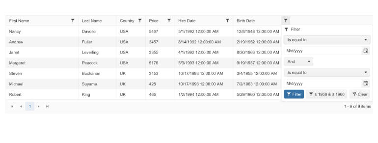
New Filter Menu Buttons Template in Telerik UI for Blazor Grid
Telerik UI for Blazor Grid Filter templates are enriched with a new member. Along with the Filter Row and Filter Menu templates you can now elevate and personalize user experience thanks to the new Filter Menu Buttons template which enables you to adjust or completely remove the default Clear and Filter buttons.
See the Telerik UI for Blazor Grid Filter Menu Buttons Template demo
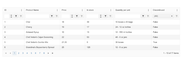
Telerik UI for Blazor DataGrid: Leveraging FilterRow and Column Menu All Together
The Telerik UI for Blazor Grid Column Menu is equipped with a new configuration option that toggles both FilterRow and Column Menu. Cover any use case scenarios even those where the end-user prefers the FilterRow experience but still requires specific functionalities available in the Column Menu.
See the Telerik UI for Blazor DataGrid Column Menu and FilterRow configuration demo
New ThemeColor Parameter in Telerik UI for Blazor Grid, Gantt, TreeList and Scheduler Popup Edit Settings
The Telerik UI for Blazor Grid, Gantt, TreeList and Scheduler popup editing configurations are enhanced with a brand-new ThemeColor parameter. It allows users to customize the components’ title bars even further and respond to any app requirement with ease.
See the Telerik UI for Blazor Grid ThemeColor documentation as an example
Tag Mode Parameter Added to Telerik UI for Blazor MultiSelect
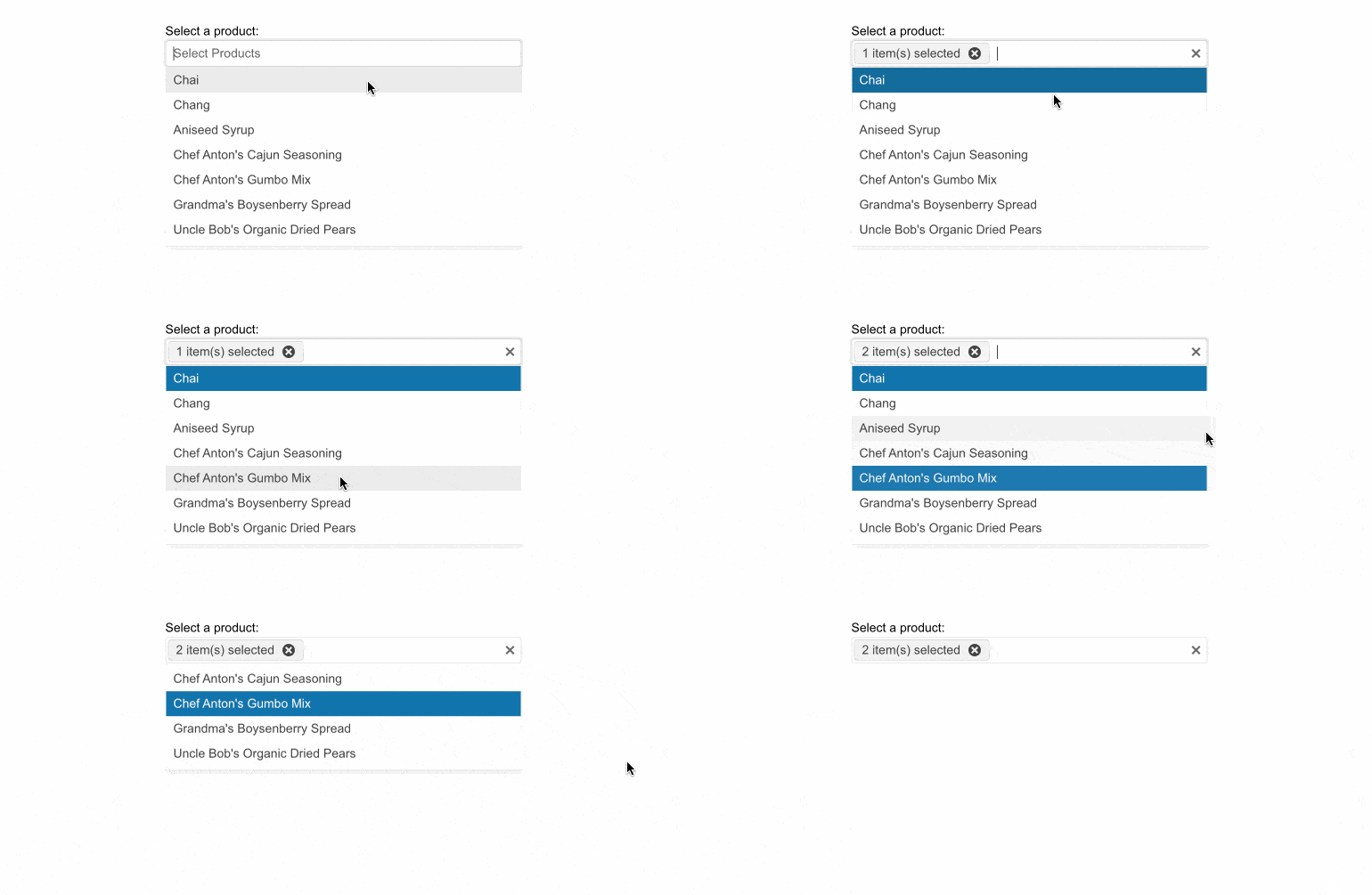
Effortlessly configure how the selected items or tags in the Telerik UI for Blazor MultiSelect will be visualized in the input element, leveraging the TagMode parameter. Display them as multiple or individual tags, or as a single, summary tag.
See Telerik UI for Blazor MultiSelect Tag Mode demo
Brand-New Rows and Columns Parameters in Telerik UI for Blazor TextArea
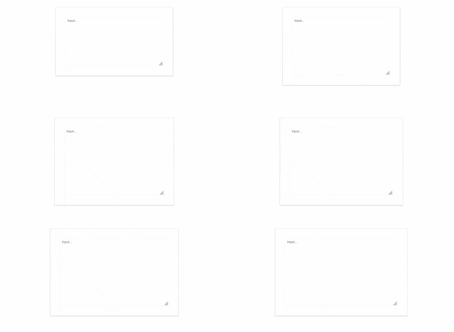
Control the initial size of the Telerik UI for Blazor TextArea component leveraging the newly introduced Rows and Columns parameters. Effortlessly adjust the size of the text area as you wish – the parameters will map to the rows and columns attributes of the inner textarea element and if such are not set, the size of the TextArea will be the auto one.
See the Telerik UI for Blazor TextArea Rows and Columns demo
Telerik UI for Blazor Splitter Enhanced with a Visible Parameter
A brand-new parameter that controls the visibility of the Splitter pane has been added to the Telerik UI for Blazor Splitter. When toggled at runtime, the order of the pane remains unchanged. The visible parameter is different from Collapsed ones, which manages content visibility and keeps action buttons (expand, collapse, resize) permanently visible.
See the Telerik UI for Blazor Splitter parameters documentation
Multiple Telerik UI for Blazor Input Components are Enriched with a Read-Only Parameter
ontrol user interactions with the Telerik UI for Blazor input components. Simply set the newly added ReadOnly parameter to true and user input will be restricted. The ReadOnly parameter is now present in Telerik UI for Blazor AutoComplete, ComboBox, DateInput, DatePicker, DateRangePicker, DateTimePicker, DropDownList, MaskedTextBox, MultiColumnComboBox, MultiSelect, NumericTextBox, TextArea, TextBox and TimePicker.
Check the Telerik UI for Blazor TextBox Parameters documentation for more information.
Telerik UI for Blazor: Compatibility with .NET 8 Release Candidate 2 (RC2)
With the purpose of continuing to provide industry leading support for Microsoft’s newest frameworks and following the evolution of .NET 8, the Telerik UI for Blazor library now features compatibility with .NET 8 RC2. Reap the benefits of .NET 8 RC2 performance improvements in Blazor and .NET apps.

Strict Content Security Policy (CSP) Compliance in Telerik UI for Blazor
One of our goals in 2023 was to improve the Telerik and Kendo UI products quality, theming mechanism and Content Security Policy (CSP) compliance. What strict CSP app settings do is prevent hackers from using HTML injection flaws to force the browser to execute a malicious script. This policy is especially effective against cross-site scripting attacks. Here is what we did so far to ensure strict CSP compliance in Telerik UI for Blazor:
- With R1 2023, we introduced and started incorporating SVG icons into Telerik and Kendo UI products.
- With R2 2023, we changed the default type of icons in Telerik and Kendo UI libraries and components from font to SVG.
- Now with R3 2023, we’re extracting the Font icons as a separate package and detaching the inline font declaration from the Telerik and Kendo UI themes.
The themes will continue to support both font and SVG icons in components, thus allowing you to decide which type of icons to take advantage of. However, using the font icons will require a separate stylesheet to be referenced by clients.
This third and last step allows us to provide customers with a more secure and efficient icon system and the option to load and reference only needed resources.
Check out the dedicated blog post to find more information on the strategy for improving Telerik and Kendo UI web component libraries by moving from font to SVG icons.
WCAG 2.2 Compliant Telerik UI for Blazor Apps
We continue our efforts to improve the overall accessibility of Telerik UI for Blazor components, now ensuring compliance with WAI-ARIA, Section 508and WCAG, including the just released WCAG 2.2 standard.
Being compliant with the new WCAG 2.2 standard means that Telerik and Kendo UI products have covered the mandatory requirements for Minimum Target Size and Navigable Guidelines through default theme accessibility swatch and the large size of our components. To meet the Dragging Movement Criteria, we have flexible APIs or built-in functionality. Check out the blog post highlighting what’s new in WCAG 2.2.

Enhanced Design System Documentation
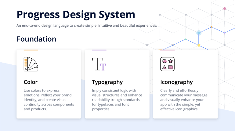
One of the key release items in R2 2023 was the launch of a dedicated Design System documentation site, which offers a wide range of resources, design assets and front-end documentation specifically tailored for the Telerik and Kendo UI libraries. With R3 2023, we have expanded Design System Support by having more components like MultiSelectTree, DateInput, ChipList, Window, Dialog, Editor, ListView, ListBox, MultiColumnComboBox, Filter, etc. meticulously detailed in the Design System documentation.
Our ongoing dedication is to expand this site further, aiming to provide you with all the necessary tools to craft seamless and visually captivating digital experiences and design systems utilizing the power of Telerik and Kendo UI component libraries.
Telerik UI for Blazor - R3 2023
- Introducing Telerik UI for Blazor ListBox Component
- Telerik UI for Blazor Welcomes a DropDownButton
- Telerik UI for Blazor is Enriched with New Chart Types
- DrillDown Capability in Telerik UI for Blazor Charts
- Pan and Zoom Capabilities Added to the Telerik UI for Blazor Charts
- New Blazor Chart Events Facilitate Interactions with Users
- Enriched Telerik UI for Blazor Gantt Chart Editing Options
- Multiple Enhancements in Telerik UI for Blazor PivotGrid
- Setting Initial Files in Telerik UI for Blazor FileSelect and Upload Components Made Easy
- Introducing Filter Placeholder in Telerik UI for Blazor DropDownList
- New Filter Menu Buttons Template in Telerik UI for Blazor Grid
- Telerik UI for Blazor DataGrid: Leveraging FilterRow and Column Menu All Together
- New ThemeColor Parameter in Telerik UI for Blazor Grid, Gantt, TreeList and Scheduler Popup Edit Settings
- Tag Mode Parameter Added to Telerik UI for Blazor MultiSelect
- Brand-New Rows and Columns Parameters in Telerik UI for Blazor TextArea
- Telerik UI for Blazor Splitter Enhanced with a Visible Parameter
- Multiple Telerik UI for Blazor Input Components are Enriched with a Read-Only Parameter
- Telerik UI for Blazor: Compatibility with .NET 8 Release Candidate 2 (RC2)
- Strict Content Security Policy (CSP) Compliance in Telerik UI for Blazor
- WCAG 2.2 Compliant Telerik UI for Blazor Apps
- Enhanced Design System Documentation
New features & Roadmap
Have a feature request?
Post your feedback via the Blazor UserVoice portal or the Public forums
What's new across all Telerik products?

Next Steps
See Telerik UI for Blazor in action and check out how much it can do out-of-the-box.
Check out the offers. Purchase an individual suite, or treat yourself to one of our bundles.
Try Telerik UI for Blazor with dedicated technical support.

