Telerik UI for Blazor
What's New R1 2023
What's New HistoryNew Telerik UI for Blazor Signature Component
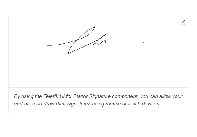
The Telerik UI for Blazor Signature component enables end-users to draw a signature using a mouse or hand gesture on touch devices. Blazor app users can benefit from multiple features to customize their signatures and adapt them to their needs, including size, border radius, line and background color and fill mode.
Learn more in the Telerik UI for Blazor Signature component demo
New Telerik UI for Blazor Avatar Component
Easily display a graphical representation of a profile or online avatar, including people or entities, with initials, custom icons and images with the brand-new Telerik UI for Blazor Avatar component. Integrate forms, profile pages or navigation bar menus as smoothly as possible, leveraging simple and customizable profile avatars that support various shapes.
Learn more in the Telerik UI for Blazor Avatar component demo
New Telerik UI for Blazor Chip Component
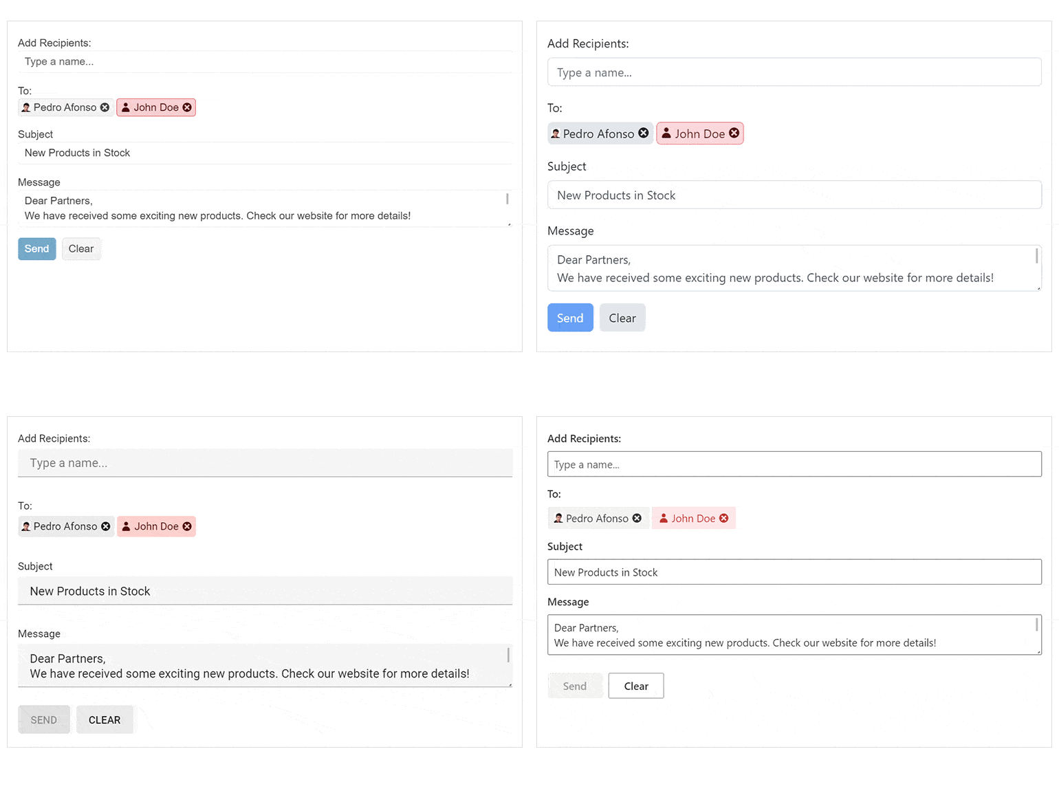
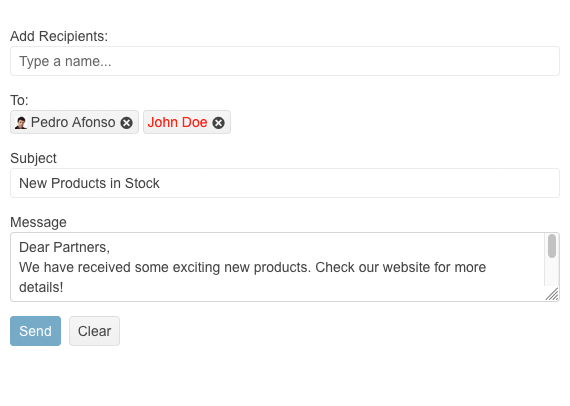
Create compelling UX by listing items in stylish containers called chips or pills with the Telerik UI for Blazor Chip component. This small building block component can contain text, an image or a close/delete icon to indicate an optional call to action. You can leverage the Chip individually or alongside other components to showcase unique values selected by the user.
Learn more in the Telerik UI for Blazor Chip component demo
Introducing Telerik UI for Blazor ChipList
Organize a collection of individual Blazor Chip components in a list and manage it with actions for adding and removing items. The Telerik UI for Blazor ChipList component is mostly used for single or multiple selections, e.g., including additions to an ordered meal.
Learn more in the Telerik UI for Blazor ChipList component demo
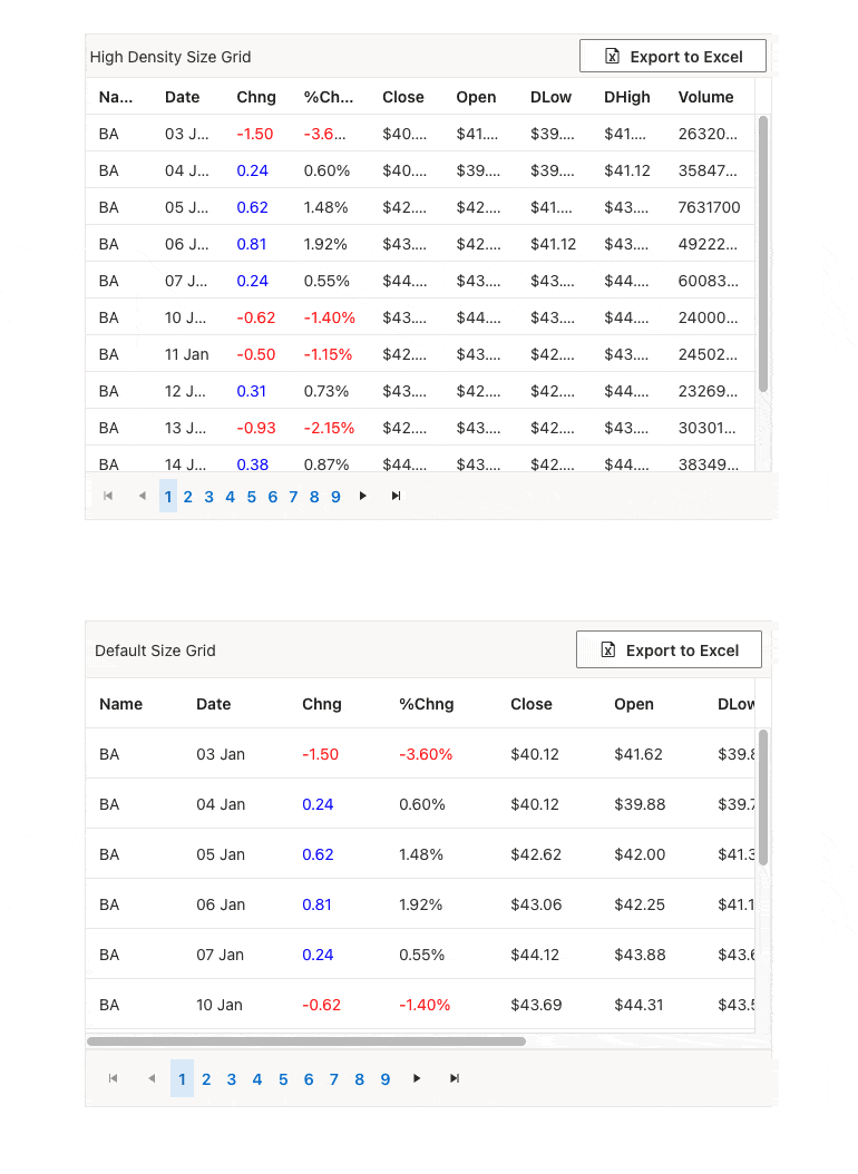
Brand-New Compact Grid feature in Telerik UI for Blazor Grid
You can now benefit from the new Compact Grid feature, implemented via the Size parameter configuration, also known as a High-Density Grid, to effortlessly remove all the extra white space, margins and paddings from the elements that build up the component. This gives as much screen real-estate as possible to the actual data bound within the Blazor Grid and is perfect for scenarios when user requirements call for displaying as much data as possible on a single screen.
See the Telerik UI for Blazor Compact Grid demo
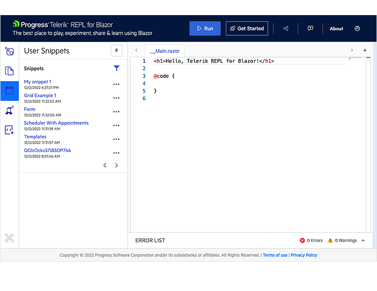
Telerik REPL for Blazor: Save your own list of code snippets
The browser-based code runner Telerik REPL for Blazor has been enhanced with a handy feature which allows you to save code snippets and easily reference them for future usage. To add a snippet to “User Snippets” list, you need to either login with your Telerik account or register and create a new one. Saving a snippet to your list occurs automatically once you are ready creating it and hit the share button. You can then give it a meaningful name, search, sort or remove it from the list.
Check out the Telerik REPL for Blazor
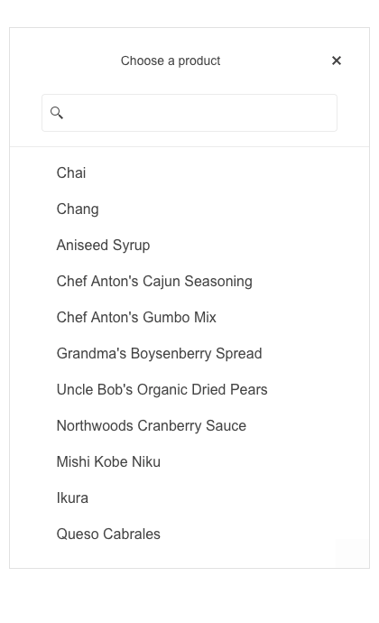
Telerik UI for Blazor Select-Type Components: Adaptive Rendering
Enable a mobile-friendly rendering of the suggestion list popups within the AutoComplete, ComboBox, DropDownList, MultiColumnComboBox and MultiSelect components. The Blazor select-type components automatically adapt to the current screen size and change their rendering accordingly.
Check out the Telerik UI for Blazor AutoComplete adaptive rendering demo as an example
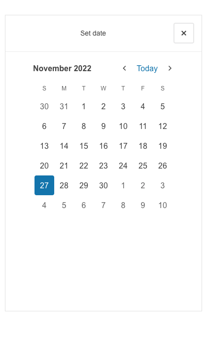
New Adaptive Rendering in Telerik UI for Blazor Date Picker Components
The date picker components now include adaptive configuration options that automatically resize the component based on the screen size to fit any device. The responsive feature can be enabled for calendar popups within the DatePicker, DateRangePicker, DateTimePicker and TimePicker components.
See the Telerik UI for Blazor DatePicker adaptive rendering demo as an example
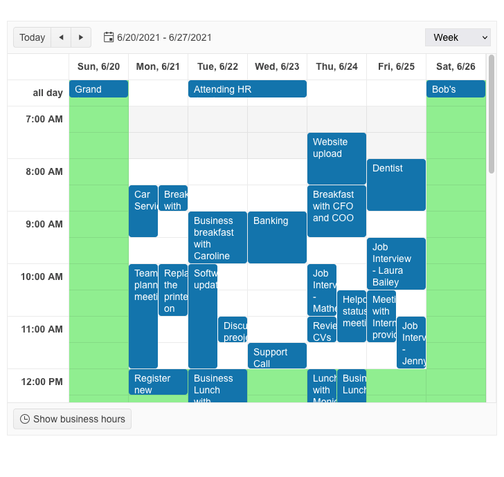
New SlotTemplate in Telerik UI for Blazor Scheduler Templates
Adding custom content (i.e., formatted text or icons) to the slot cells is now possible with the new SlotTemplate feature. It can be used in conjunction with the OnCellRender event to give you full control over the appearance of the Scheduler content.
See the Telerik UI for Blazor Scheduler Templates documentation
OnCellRender Event in Telerik UI for Blazor Scheduler
The multiple events fired by the Telerik UI for Blazor Scheduler components are enhanced with a brand-new OnCellRender event, which allows you to add styles to the underlying slot cells. You can for example grey out the weekends or indicate the slots between 12 p.m. and 1 p.m. as a lunch break.
Learn more in Telerik UI for Blazor Scheduler Events documentation
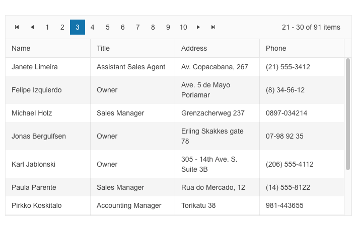
Change Pager Position in DataGrid, TreeList and ListView Components
The DataGrid, TreeList and ListView components built-in paging feature is enhanced with a new configuration option. You can now define the pager position by selecting one of the two available options—bottom or top of the component.
See the Telerik UI for Blazor DataGrid paging demo as an example
New Sizing Options in Multiple Telerik UI for Blazor components
Customize the look and feel of the Telerik UI for Blazor Toolbar, Pager and Form components using the new Size parameter. It enables you to configure the dimensions to “Small”, “Medium”, or “Large”.
See example of Telerik UI for Blazor Toolbar Sizing options

Blazor Form Component Enhanced with OnUpdate Event
The Telerik UI for Blazor Form set of events is enriched with an OnUpdate event, triggered when a change in any of the editors is initiated. The new event gives developers the flexibility to determine and control the logic when users interact with the component.
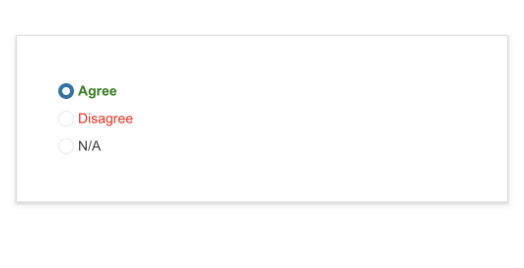
New Item Template in Telerik UI for Blazor RadioGroup Component
Customize the radio button item content, rendering and appearance, leveraging the brand-new ItemTemplate feature in the Telerik UI for Blazor RadioGroup component. You can add icons, styles and special formatting in the radio buttons of your Blazor apps.
See the RadioGroup Item Template demo
Enhanced Date and Time Editing UX in Multiple UI for Blazor Date and Time Components
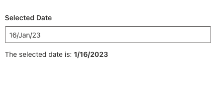
With R1 2023, multiple Telerik UI for Blazor components, including DateInput, DatePicker, DateRangePicker, DateTimePicker and TimePicker, are enriched with new features and configuration options.
Auto-tabbing enhancements: Leverage the auto-tabbing improvements when editing year, month, date and time values thanks to the new AutoSwitchParts and AutoSwitchKeys properties.
Copy and paste functionality: With R1 2023 we’ve also introduced a handy option to copy and paste a specific date or time format into the components without the need to manually type it.
TwoDigitYearMax property: The date and time UI components now support a TwoDigitYearMax property, which makes it easy for users to enter dates in two-digit year format.
AutoCorrectParts property: Benefit from a better control over the date and time auto-correction UX.
AllowCaretMode property: We’ve also introduced an AllowCaretMode property, allowing users to input date and time values using a caret to move through separate segments.
See the DateInput Configuration demo as an example
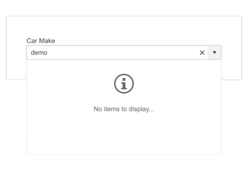
New No Data Template in Telerik UI for Blazor Select-Type Components
In scenarios where there are no items to be displayed in your Blazor select-type components, you can easily customize the dropdown message with the help of the new NoData template, available in AutoComplete, ComboBox, DropDownList, MultiColumnComboBox and MultiSelect.
See the Blazor MultiSelect No Data Template demo as an example
Telerik UI for Blazor Themes Now Support SVG Icons
Up until now, the Telerik UI for Blazor themes (Default, Material, Bootstrap and Fluent) have only supported font icons. With the R1 2023 release, SVG icons are also supported, giving you more freedom to choose your icons format.
Telerik UI for Blazor also provides a global icon type setting allowing you to set at application level whether to use font or SVG icons. The default icon type is Font. We plan to switch it to SVG in mid 2023 to ensure better display.
Telerik UI for Blazor: Introducing a Brand-New FontIcon Component
Easily display built-in Blazor font icons or leverage custom ones with the new Telerik UI for Blazor FontIcon component. Benefit from the available configuration parameters to render a predefined Blazor font icon or enable a custom CSS class for a third-party icon. Additionally, you can play with the FontIcon appearance options to customize the component based on your style guidelines or visual preferences. These appearance options include size, color and flip direction.
Learn more in the Telerik UI for Blazor FontIcon component demo
New Telerik UI for Blazor SVGIcon Component
Displaying one or several of the built-in Blazor SVG icons or choosing to visualize a custom one is a breeze with the brand-new Telerik UI for Blazor SVGIcon component. The component’s configuration parameters allow you to either implement a predefined Blazor icon from the list by assigning a property of the SVGIcon static class or to display a custom SVG Icon class. You can also customize the component to match your style guidelines or personal preferences by leveraging the available appearance options, including size, color, and flip direction.
Learn more in the Telerik UI for Blazor SVGIcon component demo
Telerik UI for Blazor TreeView Component Enriched with OnItemRender Event
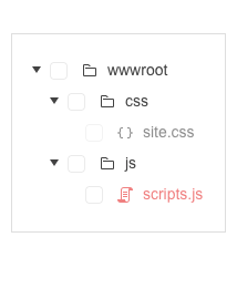
The set of events within the Telerik UI for Blazor TreeView is enhanced with a new OnItemRender event that is triggered upon rendering the nodes of the component. This new event allows you to have full control over the content and the way it is displayed in the TreeView items, including their read-only state.
See the Blazor TreeView Events demo
Accessibility Improvements in Telerik UI for Blazor
To ensure the highest level of accessibility compliance of the Telerik UI for Blazor library, with R1 2023 we improved the WAI-ARIA attributes and keyboard navigation in the Data Grid filter and column menus, as well as the TreeList filter menu. We have also added AriaLabel parameter across all input-based components.
To raise the level of AY11 compliance even higher we shipped a new color swatch called Ocean Blue A11Y (an enhanced version of the already existing Ocean Blue) which addresses corner cases for color contrast in several UI components.
In addition to the A11Y features, we also ensured we provide detailed documentation for the WAI-ARIA attributes of each UI for Blazor component allowing you to easily reference the available attributes.

Introducing a Week Number Column in Telerik UI for Blazor Calendar and Date-Picker Components
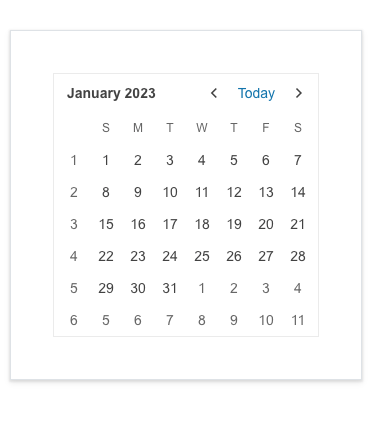
Leverage the new Week Number Column feature in the Telerik UI for Blazor Calendar, DatePicker and DateTimePicker components to quickly add the corresponding week number (one through 52) to any date or date range. You can easily hide the column if the case requires you to.
See the Telerik UI for Blazor Calendar Week Number demo
Telerik UI for Blazor: Day-Zero Support for .NET 7
Earlier in November we announced day-zero support for .NET 7 for all Telerik .NET products, including UI for Blazor, and their respective Visual Studio extensions. In addition, we’ve updated the demos and project templates to .NET 7 and launched new components and improvements. With this instant support, you can either upgrade your existing projects, start a new project using .NET 7 and Telerik UI for Blazor right away or do both.

Telerik UI for Blazor: Document Processing Libraries Enhancements
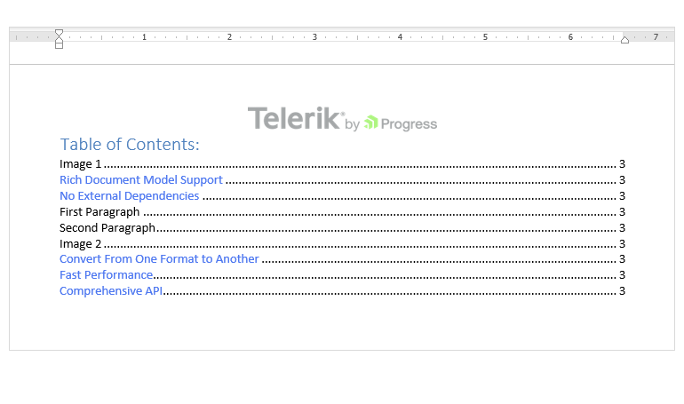
Table of Contents in RadWordsProcessing: With R1 2023, the Telerik WordsProcessing library gets a brand-new addition: Table of Contents. Enable end users to quickly add a table of contents to the RadFlowDocument document and use heading styles, other specified styles, outline levels, captions or entries specified by the TC (Table of Contents Entry) fields. To learn more, check out the documentation.
New Search API in the RadPdfProcessing library: The updated search API offers the capability to search for specific text within PDF files, utilizing various methods to tailor search criteria and even searching using regular expressions. The search results provide the page and location of the searched text. For more information on this feature, please refer to the Document Processing Search section in the documentation.
New Encryption mode supported in the RadPdfProcessing library: With the R1 2023 developer tools release, the Telerik PdfProcessing library supports the following encryption algorithms:
- For import: RC4 (V2), AES-128 (AESV2), AES-256 (AESV3)
- For export: RC4 (V2), AES-256 (AESV3)
Refer to the PDF Processing Export Settings for more information.
Telerik UI for Blazor - R1 2023
- New Telerik UI for Blazor Signature Component
- New Telerik UI for Blazor Avatar Component
- New Telerik UI for Blazor Chip Component
- Introducing Telerik UI for Blazor ChipList
- Brand-New Compact Grid feature in Telerik UI for Blazor Grid
- Telerik REPL for Blazor: Save your own list of code snippets
- Telerik UI for Blazor Select-Type Components: Adaptive Rendering
- New Adaptive Rendering in Telerik UI for Blazor Date Picker Components
- New SlotTemplate in Telerik UI for Blazor Scheduler Templates
- OnCellRender Event in Telerik UI for Blazor Scheduler
- Change Pager Position in DataGrid, TreeList and ListView Components
- New Sizing Options in Multiple Telerik UI for Blazor components
- Blazor Form Component Enhanced with OnUpdate Event
- New Item Template in Telerik UI for Blazor RadioGroup Component
- Enhanced Date and Time Editing UX in Multiple UI for Blazor Date and Time Components
- New No Data Template in Telerik UI for Blazor Select-Type Components
- Telerik UI for Blazor Themes Now Support SVG Icons
- Telerik UI for Blazor: Introducing a Brand-New FontIcon Component
- New Telerik UI for Blazor SVGIcon Component
- Telerik UI for Blazor TreeView Component Enriched with OnItemRender Event
- Accessibility Improvements in Telerik UI for Blazor
- Introducing a Week Number Column in Telerik UI for Blazor Calendar and Date-Picker Components
- Telerik UI for Blazor: Day-Zero Support for .NET 7
- Telerik UI for Blazor: Document Processing Libraries Enhancements
New features & Roadmap
Have a feature request?
Post your feedback via the Blazor UserVoice portal or the Public forums
What's new across all Telerik products?

Next Steps
See Telerik UI for Blazor in action and check out how much it can do out-of-the-box.
Check out the offers. Purchase an individual suite, or treat yourself to one of our bundles.
Try Telerik UI for Blazor with dedicated technical support.
