
Telerik UI for Blazor
What's New 2026 Q2
What's New HistoryWhat's New 2026 Q2
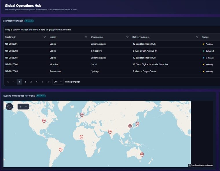
WebMCP in Preview: Let AI Interact with Your Telerik UI for Blazor UI
The Telerik UI for Blazor library now includes WebMCP integration, enabling your applications to work directly with AI agents in the browser.
WebMCP is an emerging browser standard that allows components to expose their functionality as structured tools. Instead of relying on DOM scraping or simulated clicks, AI agents can interact with your Telerik UI for Blazor components by calling these tools directly, triggering actions like filtering data, navigating views, or updating values through natural language.
This addition brings AI closer to your application logic, turning your UI into a set of actionable capabilities that intelligent agents can understand and use.
See the Telerik UI for Blazor WebMCP tools documentation
Get Started in Mere Minutes with the New Telerik UI for Blazor CLI Setup
A new CLI-based setup experience streamlines how you install and configure Telerik UI for Blazor, so you can go from zero to a fully working environment with less manual effort.
With a single guided workflow, the setup handles key steps such as adding packages, configuring your project, setting up the license key file, and enabling MCP servers. This reduces the need for manual configuration and helps ensure everything is set up correctly from the start.
Beyond setup, the CLI accelerates the development process itself, enabling teams to quickly scaffold and build their first Telerik UI for Blazor application with minimal effort.
Telerik UI for Blazor Public NuGet Distribution
The move to public NuGet distribution improves package restore reliability and makes Telerik UI for Blazor components easier to discover and adopt. By reducing dependence on a private feed and introducing a phased hybrid rollout for Blazor, .NET MAUI and Document Processing Libraries, the update strengthens the developer experience, expands accessibility for new users, and establishes a more scalable distribution model while minimizing customer risk.
See the Telerik UI for Blazor public NuGet distribution documentation
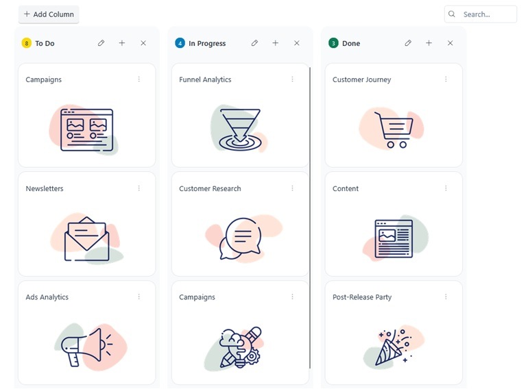
Visualize and Manage Workflows with the new Blazor TaskBoard
The brand-new Blazor TaskBoard component lets you manage tasks in a Kanban-style interface with ease. Cards are organized into columns based on status and can be moved via drag and drop for quick updates. A built-in toolbar provides search functionality for filtering by title or description, along with an option to add new columns, helping you maintain clear and flexible work tasks.
The component is well suited for scenarios such as task tracking, project management, issue tracking, and workflow visualization across teams.
See the Telerik UI for Blazor TaskBoard component demo
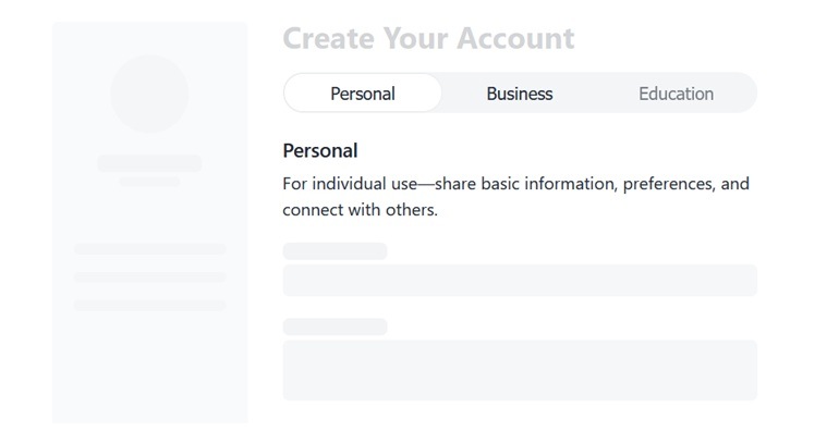
Compact Choice Selection with the Telerik UI for Blazor Segmented Control
The new Telerik UI for Blazor Segmented Control is a sleek, space-efficient component for fast, mutually exclusive selection between related options. Designed as a modern alternative to radio buttons and tabs, it improves usability by surfacing key choices in a single, intuitive control. With built-in support for icons, customization, accessibility, and responsive behavior, it fits seamlessly into any Blazor application.
See the Telerik UI for Blazor Segmented Control demo
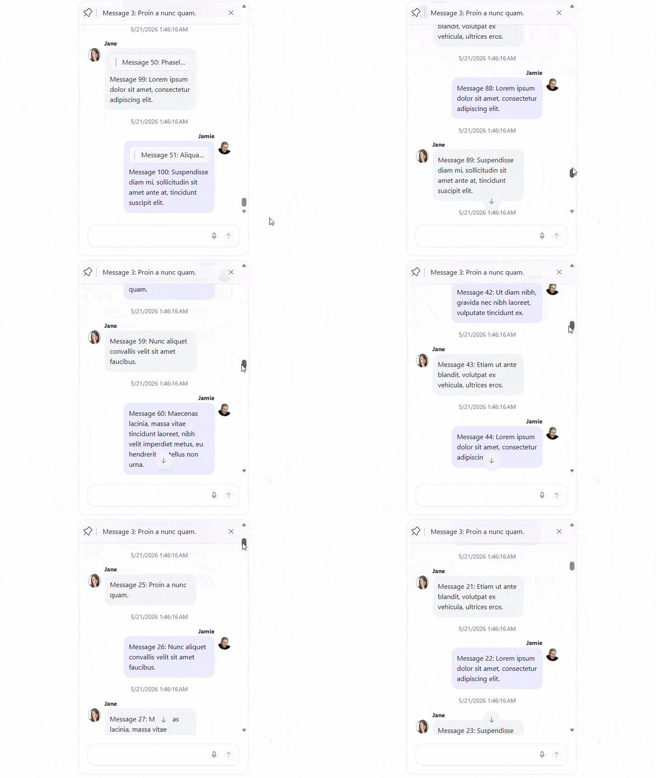
Improve Telerik UI for Blazor Chat Performance with Endless Scrolling
Improve performance in the Telerik UI for Blazor Chat with the new built-in endless scrolling. Messages are loaded on demand as users scroll through the conversation, reducing the number of rendered items and optimizing resource usage for large message histories.
See the Telerik UI for Blazor Chat endless scrolling demo
Build Smart Conversations with New AI Chat Features in Telerik UI for Blazor
Enhance conversational experiences in the Telerik UI for Blazor Chat with new built-in AI capabilities that support rich content rendering and seamless bot interaction.
- AI Integration: Connect the Chat component to AI services to generate dynamic, context-aware responses and power intelligent conversational scenarios.
- Person-to-Bot Conversations: Support structured communication between users and automated assistants, enabling chatbot and virtual assistant implementations.
- Charts Visualization: Render data-driven insights directly in messages by displaying chart components such as line, column, and pie charts.
- Code Snippets and Tables: Display formatted code blocks, syntax-highlighted content, and tabular data within messages for clear and structured communication.
These capabilities enable advanced, AI-powered chat experiences that combine conversational interaction with rich, data-driven content.

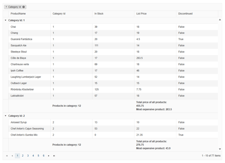
Maintain Context with Sticky Group Headers and Footers in the Blazor Grid
The Telerik UI for Blazor Grid introduces sticky group headers and footers to improve navigation in grouped data. When enabled, group headers and footers remain visible while scrolling within a group, ensuring users always have clear context about the data they are viewing.
Telerik UI for Blazor: Define Diagram Elements with Declarative Shapes
Define diagram structures more easily in the Telerik UI for Blazor Diagram by using declarative shapes. This approach allows you to configure shapes directly in markup rather than creating them programmatically, simplifying setup and improving readability. Declarative shapes are especially useful for static or predefined diagrams, enabling faster development and clearer component structure.
See the Telerik UI for Blazor Diagram declarative shapes demo
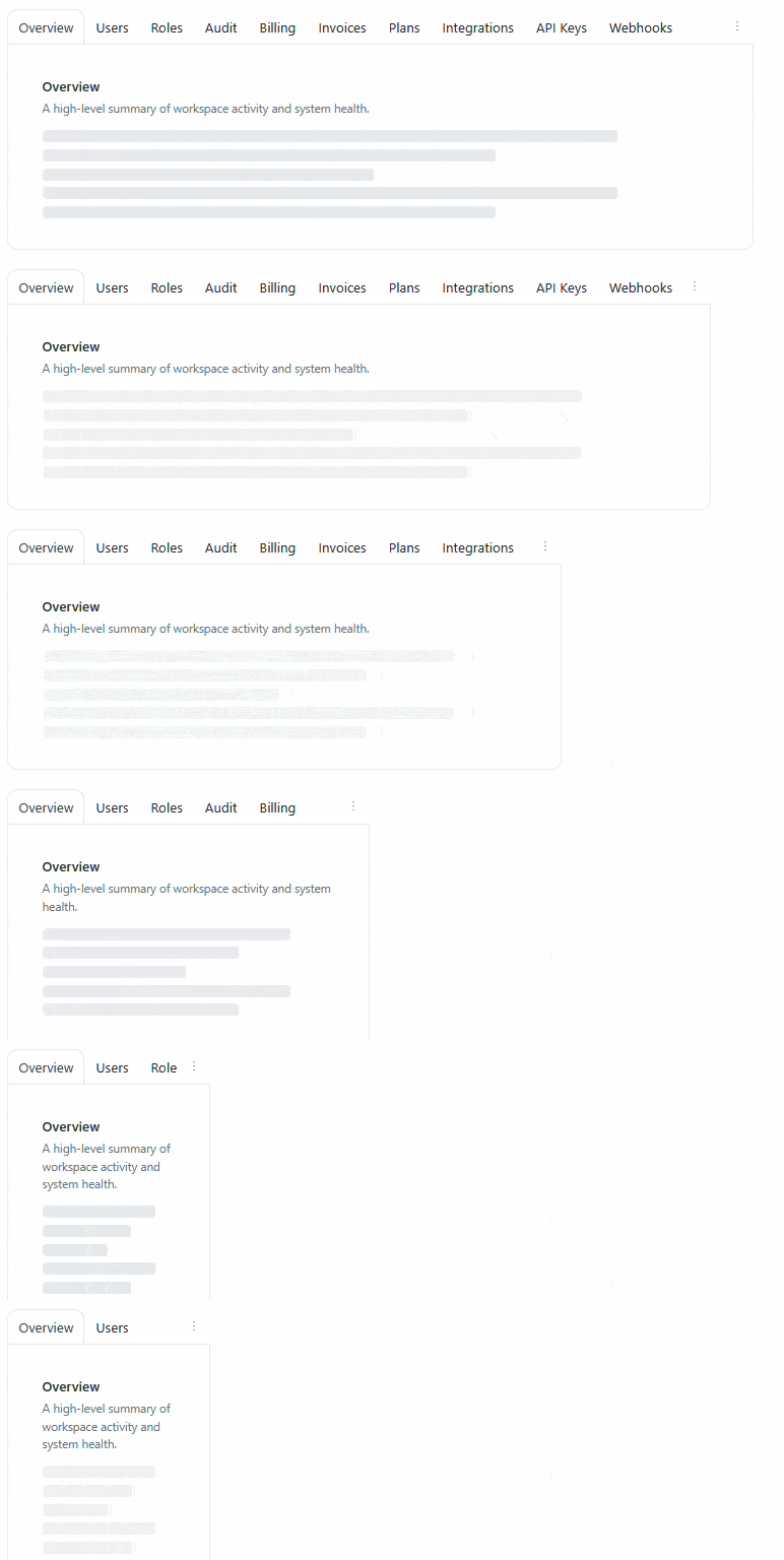
Enhanced Blazor TabStrip: Tab Overflow, Reordering, Pinning, and State Management
Improve flexibility, usability, and personalization in the Telerik UI for Blazor TabStrip with new built-in features for handling dynamic tab scenarios and user-driven layouts.
- Tab Overflow: Automatically moves excess tabs into an overflow menu when space is limited, keeping the layout clean and responsive while ensuring easy access to hidden tabs.
- Tab Reorder: Enables drag-and-drop tab reordering, allowing users to quickly rearrange tabs to match their workflow.
- Tab Pinning: Lets users pin important tabs to the beginning of the list, keeping them always visible and organized separately from unpinned tabs.
- State Management: Provides APIs and events to save, restore, and programmatically control tab state, enabling scenarios such as layout persistence across sessions and reacting to state changes.
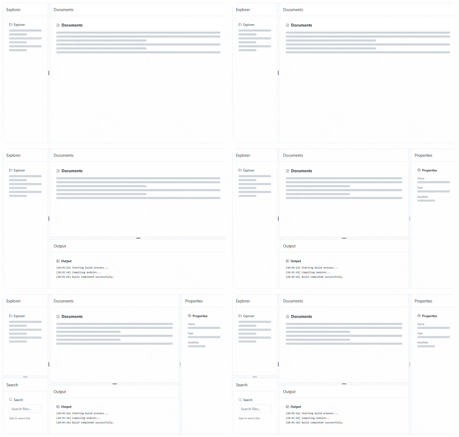
Blazor DockManager: Dynamic Layout, State Persistence and Keyboard Navigation
Improve layout flexibility, personalization, and accessibility in the Telerik UI for Blazor DockManager with built-in capabilities that adapt to user needs.
- Dynamic Panes: Show or hide panes at runtime using the Visible parameter, with layouts automatically adjusting and AllowEmpty controlling how empty regions behave.
- State Persistence: Save and restore full layout configuration (positions, sizes, visibility, and tab selection) using GetState, SetState, OnStateInit, and OnStateChanged events.
- Keyboard Navigation: Navigate between panes and interact with layout elements using standard keyboard shortcuts for improved accessibility.
Blazor PDF Viewer: Enable Intuitive Zooming with Pinch-to-Zoom Support
Enable pinch-to-zoom in the Telerik UI for Blazor PDF Viewer for a natural, touch-friendly document viewing experience. The feature is available out of the box and allows users to zoom in and out using standard touch gestures, complementing the existing toolbar controls. Pinch zoom respects the configured MinZoom and MaxZoom limits, ensuring consistent scaling behavior across all interaction methods.
See the Telerik UI for Blazor PDFViewer pinch-to-zoom demo
Customize AI Output with Templates in Telerik UI for Blazor Inline AI Prompt
Customize the rendering of AI responses in the Telerik UI for Blazor Inline AI Prompt using the built-in OutputTemplate. This template allows you to fully control the layout and styling of the generated content, replacing the default plain-text output with custom markup, structured layouts, and branded UI elements.
See the Telerik UI for Blazor Inline AI Prompt templates demo
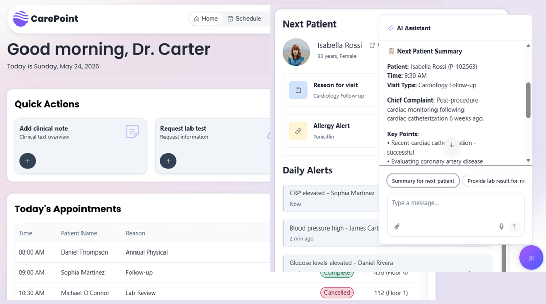
Telerik UI for Blazor: Healthcare Sample App with Built-In AI Assistant
A new Healthcare Management sample application is now available, showcasing how to build a complete, real-world Blazor app with Telerik UI components, enhanced with an integrated AI chat assistant.
The app brings together dashboards, scheduling, patient data, and real-time alerts in a cohesive interface, while also demonstrating how AI can assist users directly.
See the Telerik UI for Blazor healthcare sample app
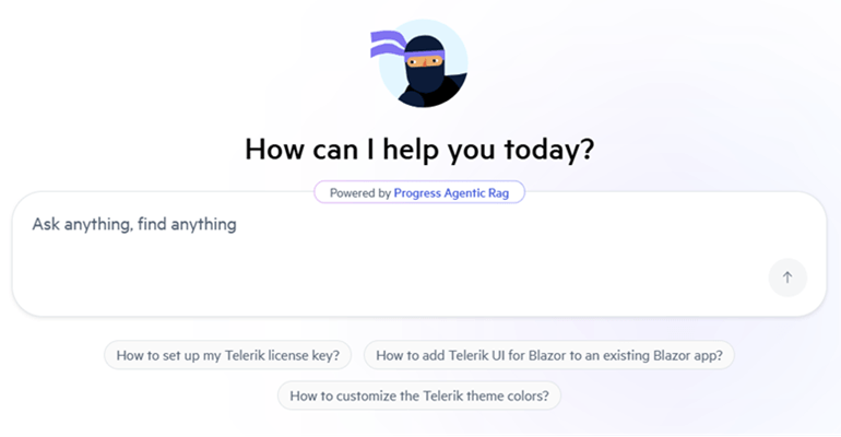
Integrated AI Chat in Telerik and Kendo UI Documentation
Telerik and Kendo UI documentation pages now support an integrated AI Chat, allowing you to easily ask questions and receive instant, context-aware answers directly within the page. The assistant helps you quickly locate relevant information, understand features, and explore related topics without interrupting your workflow. By combining search and conversational guidance, it streamlines navigation and improves productivity when working with components and APIs.
Telerik UI for Blazor Supports .NET 11 Preview 4
Telerik UI for Blazor library is compatible with .NET 11 Preview 4 (the latest one), allowing early adopters to start experimenting with the latest .NET platform updates.

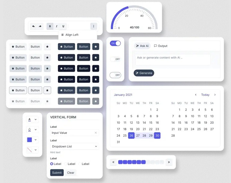
Build Modern UI with a New Meridian Theme and Updated Icons
This release brings a refreshed visual foundation by combining the new Meridian theme with an updated and streamlined icons set, helping you create cleaner, more consistent, and modern user interfaces.
The Meridian theme introduces a refined design language with improved colors, spacing, and visual hierarchy, while the updated icons complement it with a more cohesive and flexible set of visuals.
What's New 2026 Q1
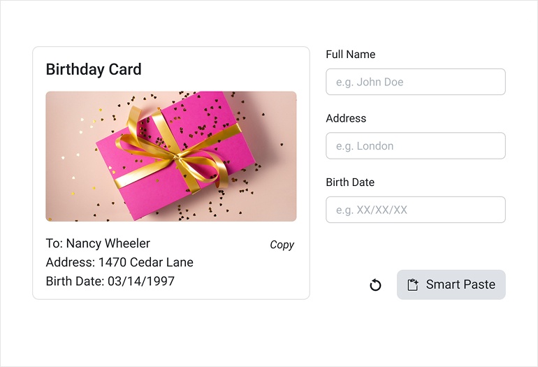
Blazor SmartPaste Button: Paste Once, Populate Everything
The new Blazor Smart Paste Button turns unstructured text into ready‑to‑use form data instantly. Instead of manually copying and pasting information into multiple fields, the component uses AI to understand raw text and map it to the right inputs for your form. It works seamlessly with the Telerik UI for Blazor Form, Blazor EditForm, and standard HTML forms, making it easy to embed into your existing projects.
See the Telerik UI for Blazor SmartPasteButton demo
Blazor PromptBox: Smarter Input Experience for AI or Chat Apps
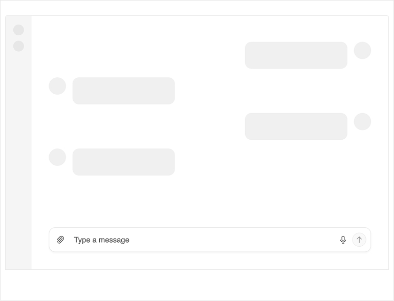
The new Telerik UI for Blazor PromptBox delivers a modern, unified interface for composing messages in chat and AI‑powered applications. It brings together text input, speech‑to‑text, file attachments, and integrated action buttons, creating a streamlined entry point for any AI workflow. With smart layout adaptation, automatic mode switching, and support for customizable adornments, the PromptBox makes human‑AI interaction more intuitive and efficient.
See the Telerik UI for Blazor PromptBox demo
Blazor DropDownTree: Hierarchical Selection Made Easy
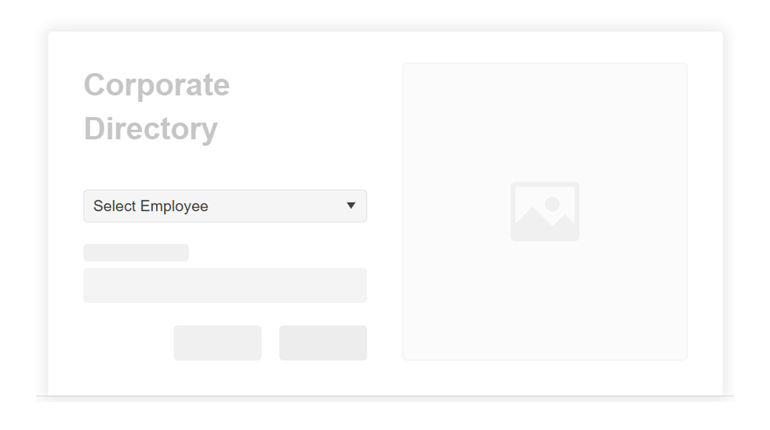
The new Telerik UI for Blazor DropDownTree lets users choose a single value from a structured, hierarchical list by combining the familiar DropDownList experience with the clarity of a TreeView. It supports both flat data and nested collections, giving you flexibility in how you bind your data. To keep your app responsive, the DropDownTree can also load child nodes on demand as users expand parent items, which is ideal for large datasets.
See the Telerik UI for Blazor DropDownTree demo
Blazor Smart Grid: Semantic Search Now Built into a Smart AI Box
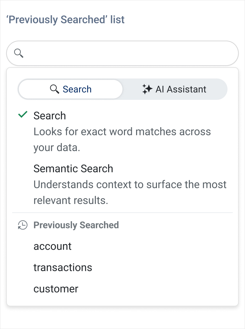
The Telerik UI for Blazor DataGrid introduces AI Semantic Search – a meaning‑based way to find what you need, even when keywords don’t match exactly. Instead of relying on exact text, Semantic Search understands intent and context, surfacing the most relevant rows across columns and related fields. It’s ideal for large datasets where users might not know the precise terms or spelling.
Complementing this, the new AI Smart Box provides a single, streamlined place to run Semantic Search and ask AI‑assisted questions…no more switching between features. Users can search by meaning, then immediately refine, filter, or ask follow‑up questions within the same interface.
Blazor Smart Grid – AI Chat Integration
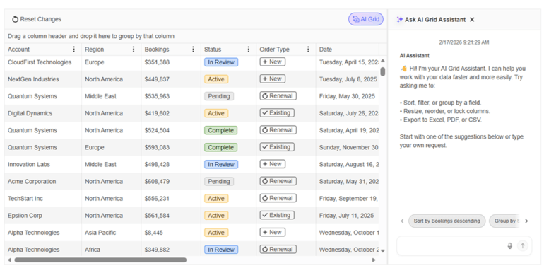
The Telerik Ui for Blazor Grid now integrates seamlessly with the Blazor AI Chat capabilities, giving users a conversational way to explore and interact with Grid data. Instead of relying on manual filtering and navigation only, users can ask natural‑language questions that the Chat Assistant interprets using the Grid’s schema, context, and current view. This makes data discovery faster, more intuitive, and accessible even to users who are unfamiliar with the underlying structure of the dataset.
See the Telerik Ui for Blazor Grid-Chat integration demo
More Control and Faster Navigation in the Blazor Grid
The latest Blazor Grid update brings powerful enhancements to the classic, non‑AI set of features:
- Group sorting: You can now sort entire groups, not just the rows inside them. This allows users to reorder group headers, ascending or descending, based on the grouped field.
- Customizable keyboard shortcuts: The Blazor DataGrid now supports custom keyboard shortcuts, enabling you to map your own key combinations for actions like selection, navigation, and editing.
Improved Message Flow and Usability in the Blazor Chat
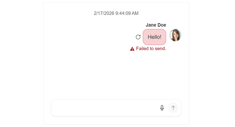
The Telerik UI for Blazor Chat adds several enhancements that make conversations smoother and more reliable. A new retry for failed messages flow lets users easily resend messages that didn’t go through. A scroll‑to‑bottom floating button now appears when new messages arrive, helping users jump back to the latest content instantly. The message input area also gains more customization options, including placeholder text and flexible text area settings, giving apps more control over how users compose messages.
See the Telerik UI for Blazor Chat retry failed messages demo
Blazor Chat AI Capabilities Powered by Microsoft.Extensions.AI
With native Microsoft.Extensions.AI integration, the Telerik UI for Blazor Chat now delivers an AI‑ready experience out of the box, automatically sending messages to a configured IChatClient and returning responses through the built‑in AI pipeline.
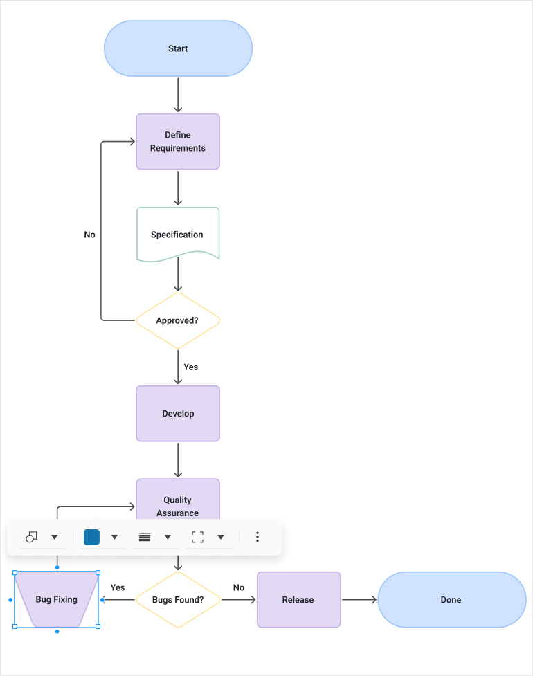
Richer Diagramming Experience in Telerik UI for Blazor
The Telerik UI for Blazor Diagram now supports richer, more expressive, and data‑driven visualizations. Enhanced data binding is among the main highlights along with the ability to display text on connectors, giving users clearer context about relationships, flows, and decision paths without relying on node labels only. Additionally, built‑in tooltips for both shapes and connections provide on‑hover detail and insights, helping users understand complex diagrams at a glance.
See the updated Telerik UI for Blazor Diagram demo
MCP Tools Updates for Continued Productivity Gains
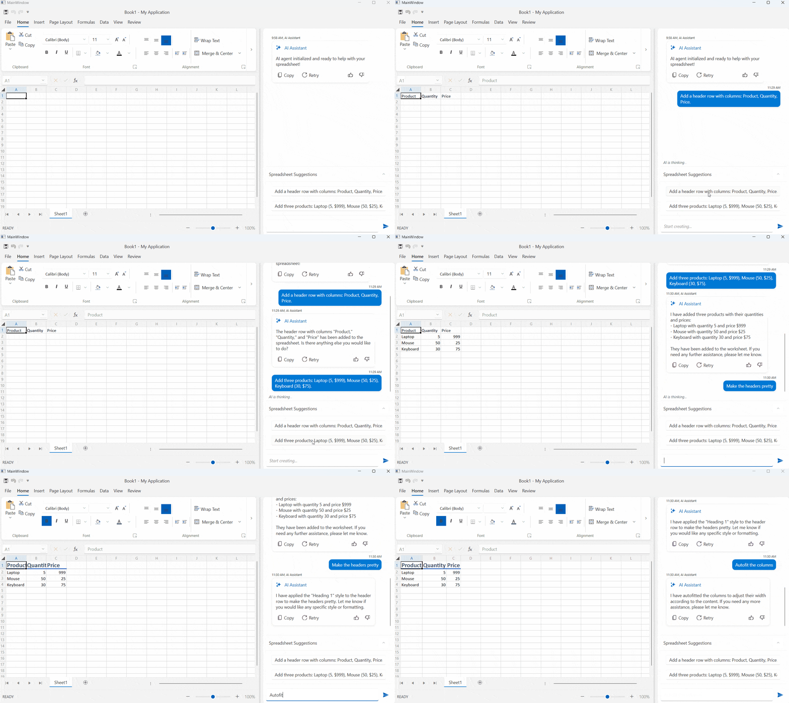
The Agentic UI Generator* now emphasizes the Telerik and Kendo UI component‑specific accessibility implementation details. It helps you apply these patterns consistently across your UI and surfaces relevant accessibility API references for the specific components you’re using.
The Telerik UI for Blazor AI Coding Assistant* now includes a validator tool that reduces hallucinations and improves code reliability, plus a new icon generator for both built‑in and custom icons. It also transitions to native .NET NuGet packages, making setup and enterprise adoption easier than ever.
* Available with a subscription license
Telerik UI for Blazor Supports .NET 11 Preview 1
Telerik UI for Blazor library is compatible with .NET 11 Preview 1, allowing early adopters to start experimenting with the latest .NET platform updates.
Telerik UI for Blazor: Theme‑Driven Default Component Appearance
Telerik UI for Blazor component styling now inherits its defaults from the theme, ensuring a consistent look and feel across your app (e.g., Material 3 shapes and sizes) without extra setup. Design teams get unified, on‑brand visuals out of the box, while developers can still override any appearance at the component level whenever customization is needed.
Document Processing Libraries 2026 Q1 Enhancements
- [Preview] Agentic tools: Build intelligent document processing workflows with ease. The DPL Agentic Tools let users extract structured data, edit content, convert formats, generate new Excel or PDF files and perform analysis on Excel documents directly inside your .NET app with no separate services required.
- Core enhancements: New MIME type support for embedded files allows you to explicitly define how attachments like XML, JSON, or CSV payloads are represented inside PDFs, while automatic file‑format detection makes it easier to load documents from byte arrays. Compliance is further improved through EU DSS‑aligned digital signing, ensuring PDFs meet official European Commission validation standards. Additionally, Timestamp Server support in PdfStreamSigner enables trusted, verifiable timestamps for long‑term signature validity.



Next Steps
See Telerik UI for Blazor in action and check out how much it can do out-of-the-box.
Check out the offers. Purchase an individual suite, or treat yourself to one of our bundles.
Try Telerik UI for Blazor with dedicated technical support.