Telerik UI for Blazor
What's New 2024 Q1
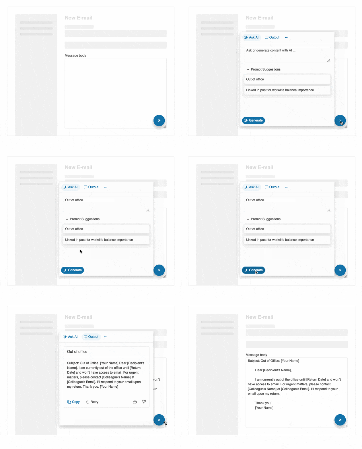
What's New HistoryTelerik UI for Blazor AI Prompt: Blending AI with UI
The AI Prompt allows you to align digital experiences with natural human behavior. Devised to streamline the integration of your favorite GenAI services into your Telerik UI for Blazor applications, this new component sends prompts and then maps the response.
The Telerik UI for Blazor AI Prompt is focused on providing users with a modern interface to interact with AI services, while enhancing usability for developers by offering smooth customization. It enables three predefined views to interact with: Prompt, Output and Command, each featuring specific functionality.
Effortless customization is also available. From configuring the button design to playing with the layout and footer template, you can adjust any AI Prompt feature to suit your needs.
Check out the Telerik UI for Blazor AI Prompt demo
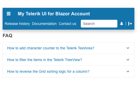
Meet the AppBar: New Navigation Control in Telerik UI for Blazor
Welcome the new member in Telerik UI for Blazor Navigation family – the AppBar. Also known as Navigation Bar or NavBar, the AppBar component empowers users to effortlessly navigate through your Blazor application, while providing information and actions related to a screen.
Designed with consistency in mind, the Telerik UI for Blazor AppBar is most commonly used as the main navigation element for an app or page. It also comes equipped with convenient properties allowing you to set content, position, color, and more.
See Telerik UI for Blazor AppBar demo
Introducing Telerik UI for Blazor Popover and Popup
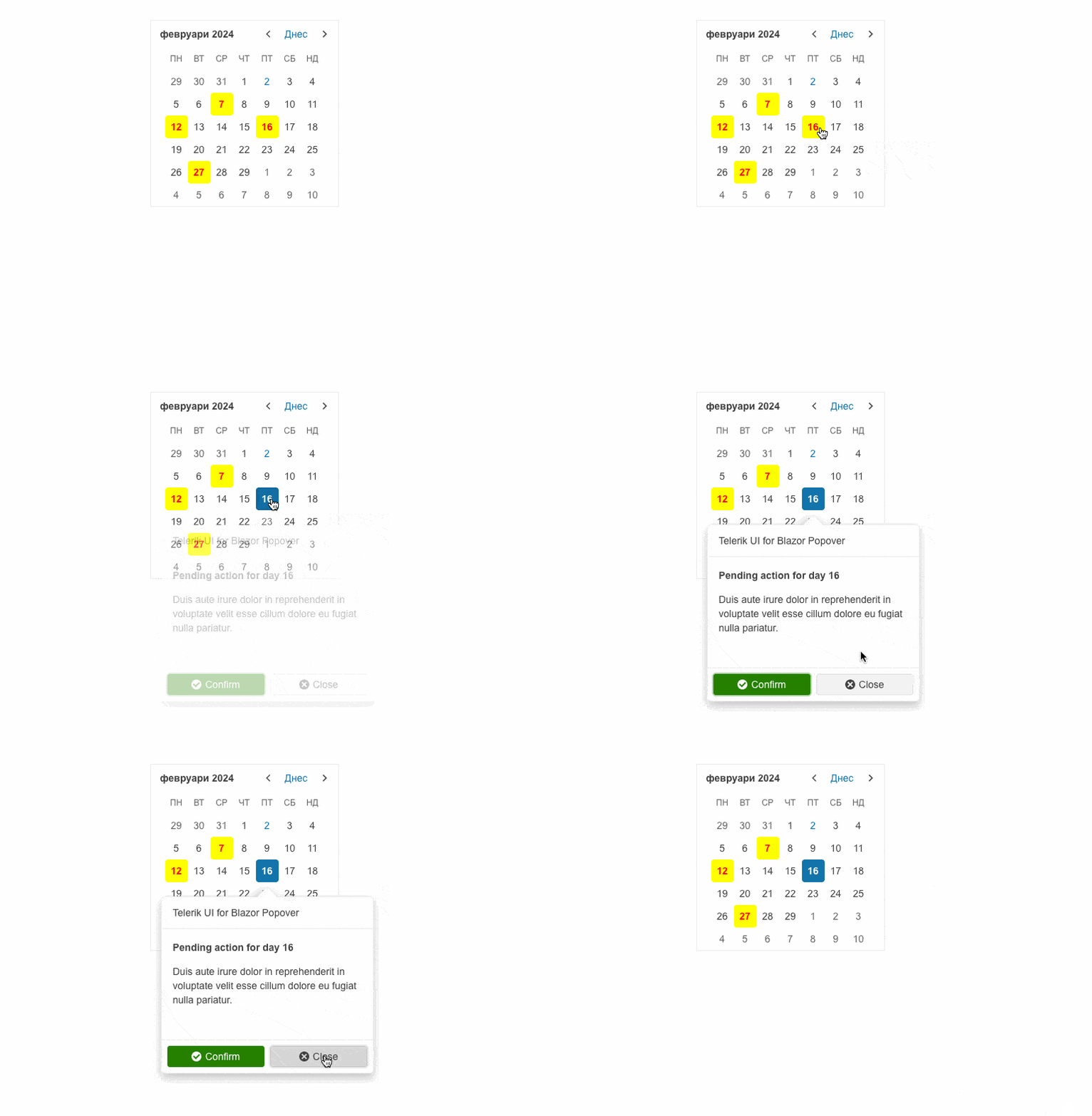
Providing additional context to users without interrupting their current workflow is possible with the new Telerik UI for Blazor Popover and Popup controls.
While Telerik UI for Blazor Popover displays additional information or options when the anchor element is hovered, clicked, or focused, the Popup appears on top of the main content in the form of a small window or dialog box and provides supplementary content or functionality.
Telerik UI for Blazor Popover can be leveraged to elevate user interaction and provide quick access to additional details or actions within an application. Telerik UI for Blazor Popup is often used as a part of more complex components that have a popup window, such as dropdowns, pickers, inputs, etc.
Both UI components can be easily customized to match the desired look and feel. Simply play with the available configuration options and see what works best for your app requirement.
Upgrading Telerik UI for Blazor Trendline Chart
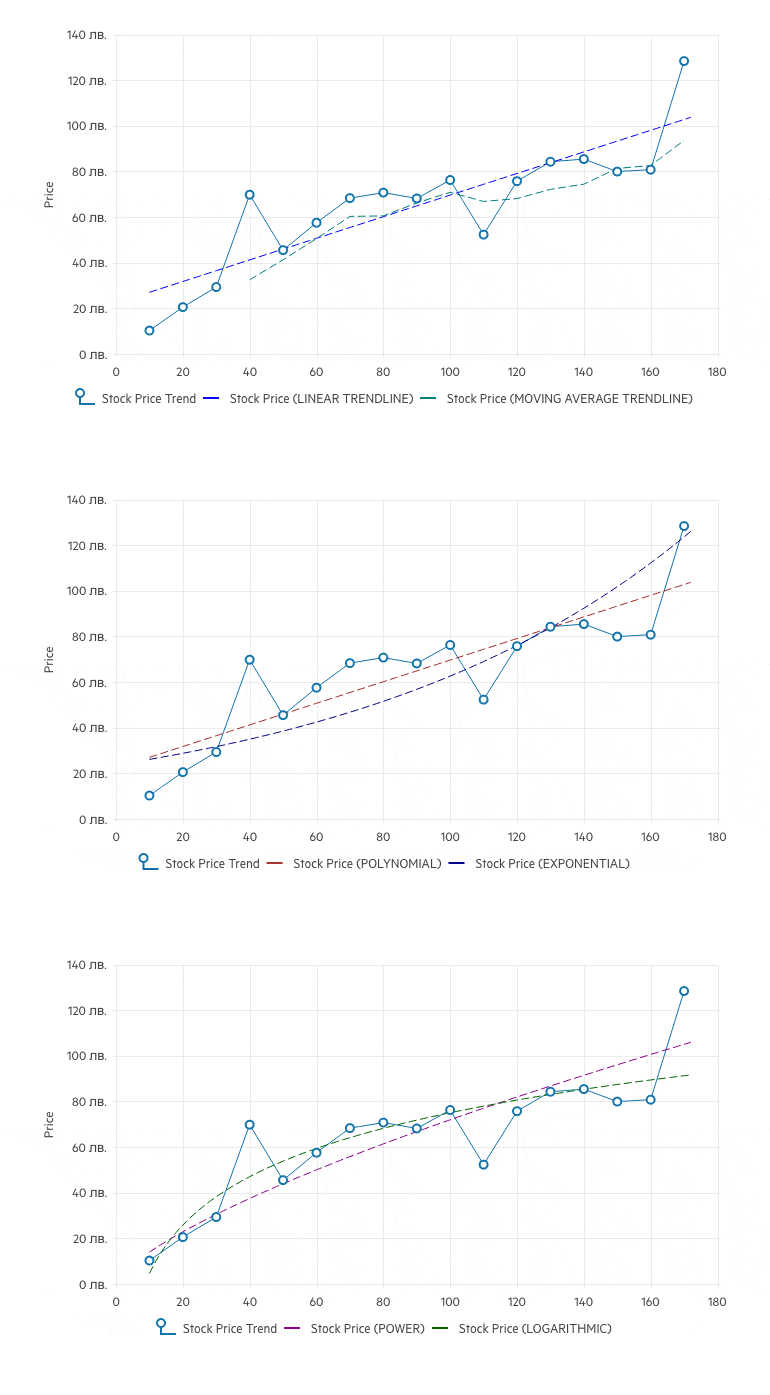
The last release of 2023 introduced a brand-new Telerik UI for Blazor chart type—the Trendline, which is used to visualize data points in a time series or sequential order.
The first release of 2024 comes with a new version of the Telerik UI for Blazor Trendline. It now supports multiple new trendline options to cover any scenario. Welcome the new Polynomial, Exponential, Power, and Logarithmic Trendline types which complement the already available Linear and Moving Average types.
See the updated Telerik UI for Blazor Trendline Chart demo
Legend Customization in Telerik UI for Blazor Charts for Consistent Apps
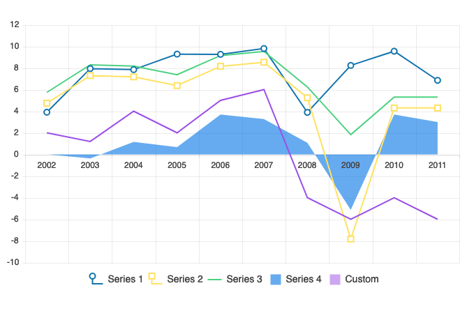
Mix and match different parameters to align the look and feel of Telerik UI for Blazor Charts with the desired outcome. Leveraging the new legend customization options, you can add text as Legend title, thus providing additional information to users. Additionally, you can modify the Legend and Legend Series type and add different colors if needed.
See Telerik UI for Blazor Charts legend customization demo
Column and Custom Column Menus in Telerik UI for Blazor Gantt Chart
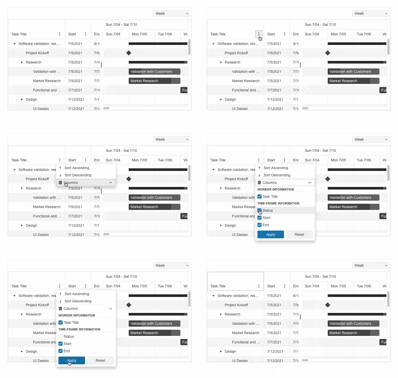
Configuring a menu for Telerik UI for Blazor Gantt columns has never been easier with the brand-new Column Menu and Custom Column Menu options. The Column Menu enables you to perform high-level customizations like sorting, filtering, and showing or hiding different columns. While the Custom Column Menu provides a column menu chooser template that enables quick and easy customization of the column list.
See Telerik UI for Blazor Gantt column menu and custom column menu demos
Keyboard Navigation in Telerik UI for Blazor Charts and Gantt Chart
Pursuing the goal to comply with accessibility standards and empower you to build inclusive UI, the Telerik UI for Blazor Charts and Gantt Chart components now support Keyboard Navigation. Additionally, these two UI controls provide extensive accessibility support and enables users with disabilities to acquire complete control over Telerik UI for Blazor Chart and Gantt chart features.
To learn more about Telerik UI for Blazor Charts accessibility and keyboard navigation check the documentation or play with the demo.
The Telerik UI for Blazor Gantt accessibility and keyboard navigation documentation is available here, while the demo can be seen here.

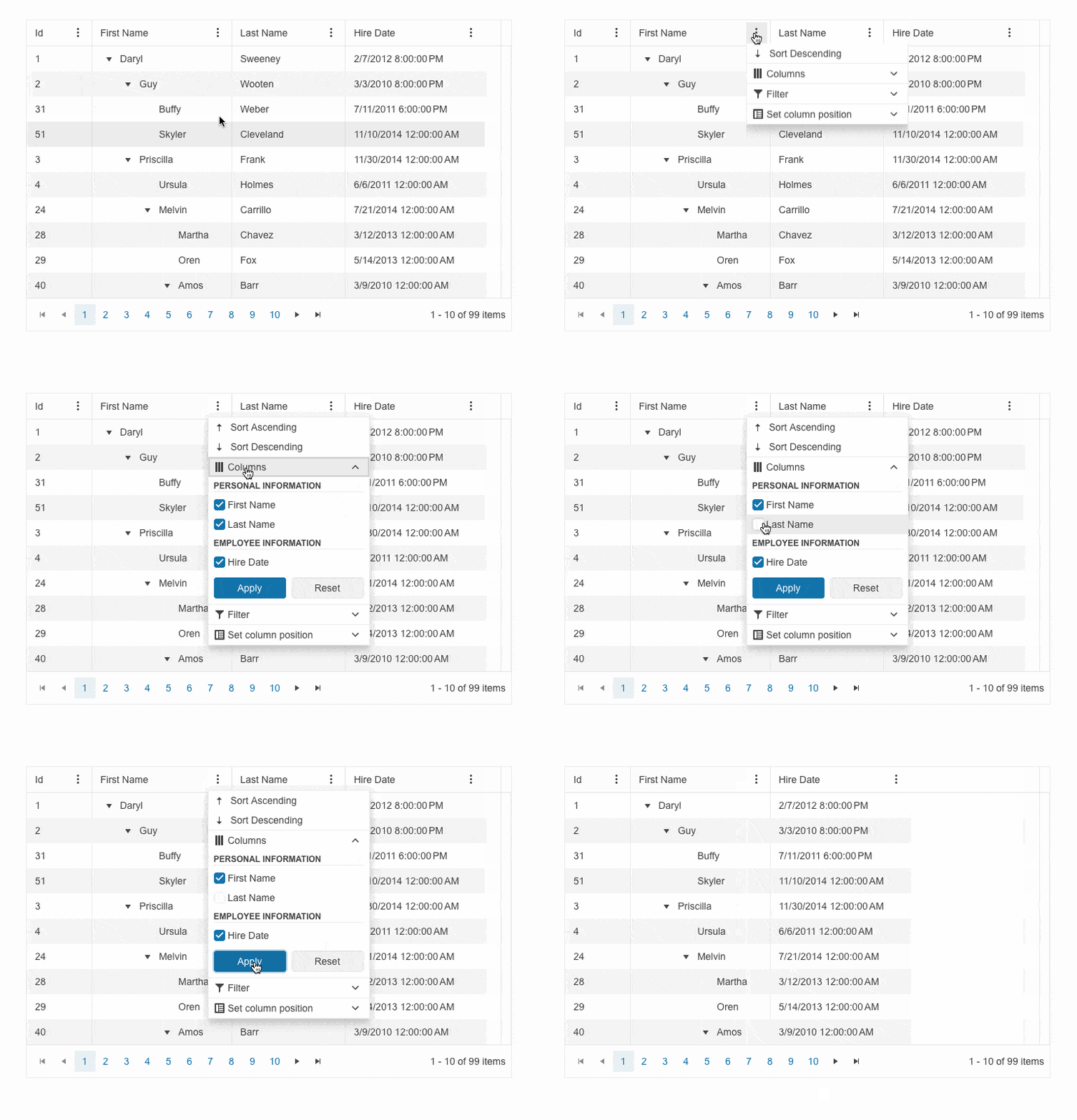
Telerik UI for Blazor TreeList with Column and Custom Column Menus
Displaying a customizable menu for Telerik UI for Blazor TreeList columns has never been easier with the brand-new Column Menu and Custom Column Menu options. The Column Menu enables you to perform high-level customizations like sorting, filtering, showing or hiding columns and freezing or unfreezing them. While the Custom Column Menu provides a column menu chooser template that enables quick and easy customization of the column list.
See Telerik UI for Blazor TreeList column menu and custom column menu demos
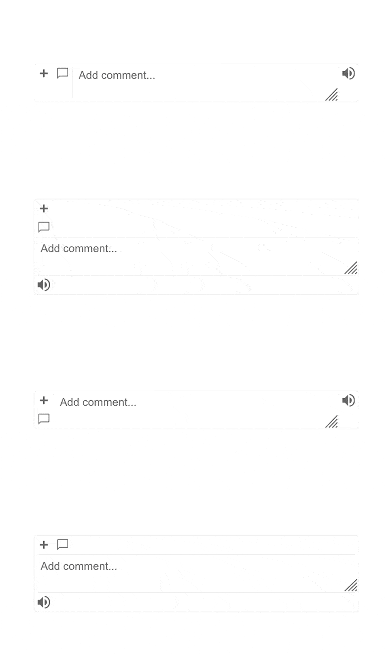
Multiple Components Enhanced with Prefix and Suffix Adornments
Telerik UI for Blazor AutoComplete, ComboBox, MaskedTextBox, MultiColumn ComboBox, MultiSelect, NumericTextBox, TextArea and TextBox now include options for adding custom items/ornaments as prefix and suffix adornments.
A prefix input adornment is an element placed before the user input field and is typically used to give clarity on the expected data in the input such as currency symbols or unit indicators.
A suffix input adornment is an element positioned after the user input field and usually serves to provide direct functionality for the entered data like password visibility toggles, formatting or clearing the input.
See Telerik UI for Blazor TextArea adornments demo for an example
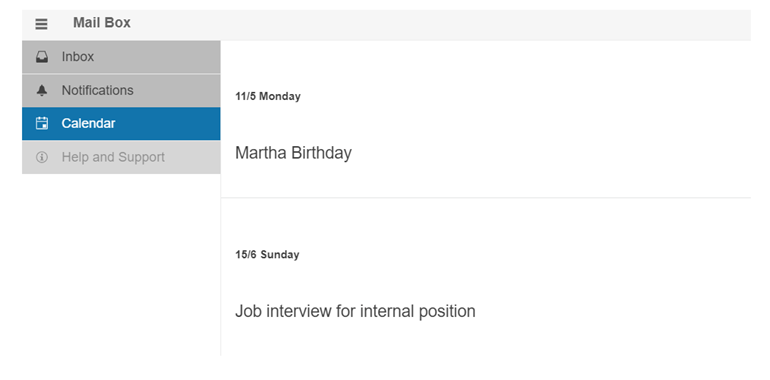
Modify the Appearance of the ContextMenu, Drawer and Menu
Customize the appearance of the Telerik UI for Blazor ContextMenu, Drawer and Menu controls, leveraging the new OnItemRender event. It enables you to apply conditional styling on the items based on specific criteria.
See Telerik UI for Blazor Drawer appearance demo for an example
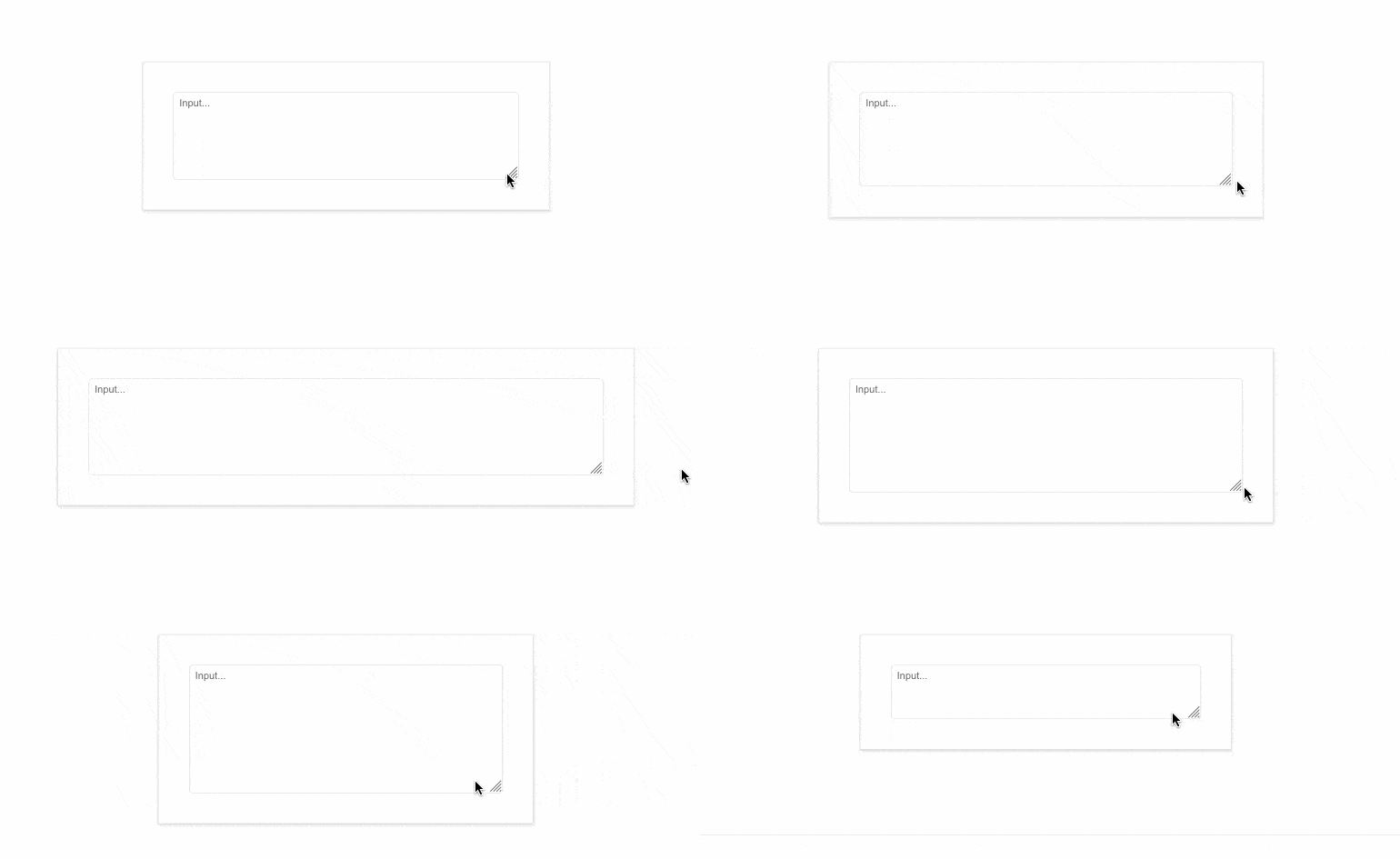
Configure the Resizing Behavior of Telerik UI for Blazor TextArea
Controlling the size of the Telerik UI for Blazor TextArea has never been easier with the new ResizeMode parameter. It enables you to play with the component’s resize behavior using the available options:
- Vertical, which resizes the TextArea in vertical direction.
- Horizontal, which resizes the UI component in horizontal direction.
- Both, meaning that Blazor TextArea can be resized horizontally and vertically.
- Auto, which results in automatic vertical resize during keyboard input.
- None, which would freeze the TextArea resizing option.
See Telerik UI for Blazor TextArea resize mode demos
Customizing Telerik UI for Blazor Chip with Selectable Parameter
A brand-new selectable parameter is added to the Telerik UI for Blazor Chip component, further enhancing its appearance options. Effortlessly configure whether a specific item should be displayed as selected or not.
New Draggable Events Added to Telerik UI for Blazor TreeView
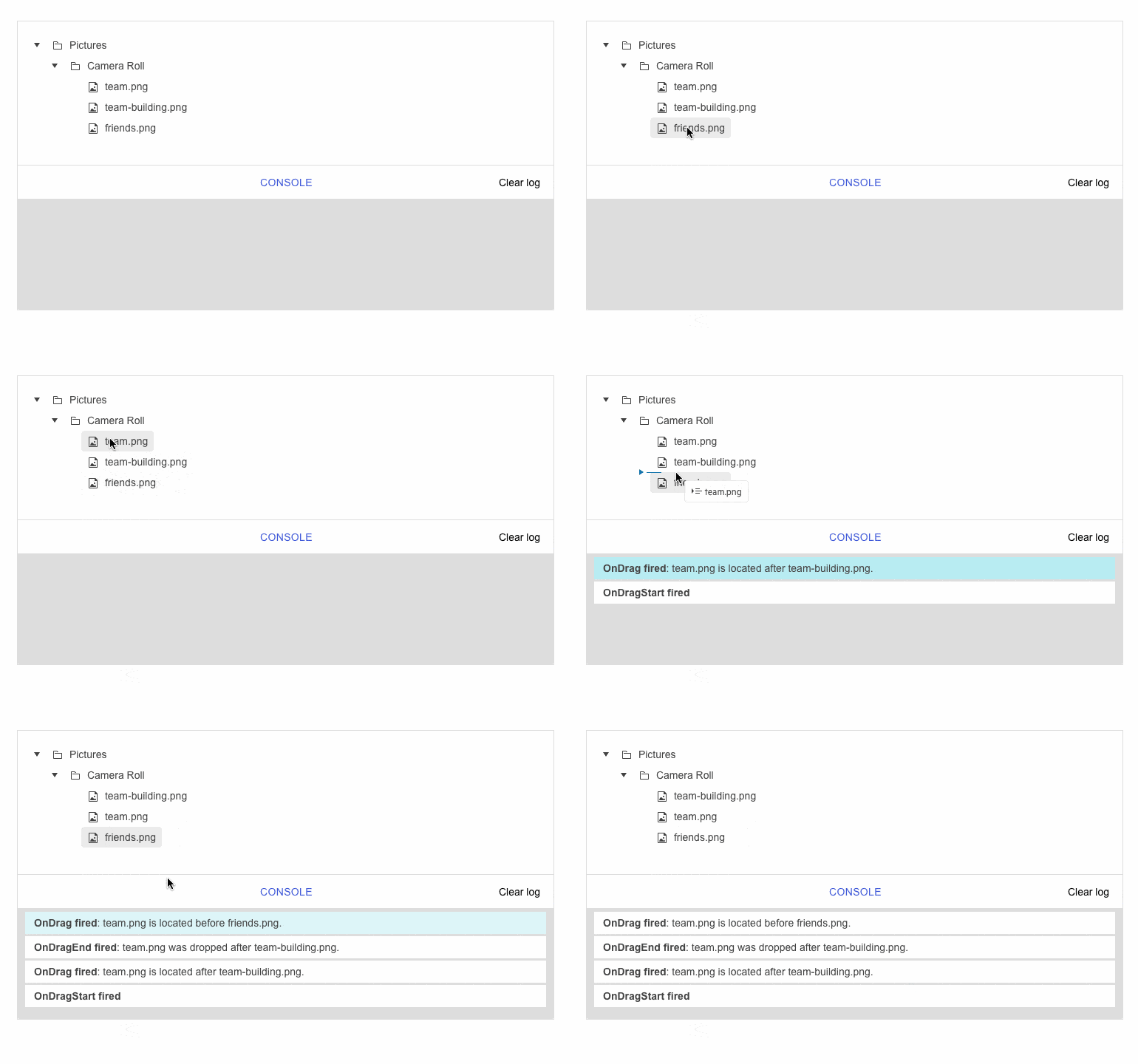
The Telerik UI for Blazor TreView is enhanced with new draggable events, triggered when leveraging the component’s drag and drop functionality.
- DragStart event – fires when the user starts dragging a node. It provides details for the dragged items and allows you to cancel the event.
- OnDrag event – fires continuously while the user is dragging a node.
- DragEnd event – fires when a drag operation is ended by releasing the mouse button.
- OnDrop event – fires when dropping a node into a new location. That allows you to manipulate the data collection based on where the user dropped the element.
See Telerik UI for Blazor TreeView draggable events demo
Telerik UI for Blazor: Compatibility with .NET 8 Official
With the purpose of continuing to provide industry leading support for Microsoft’s newest frameworks and following the evolution of .NET 8, the Telerik UI for Blazor library now features compatibility with .NET 8 official. Reap the benefits of .NET 8 performance improvements in Blazor and .NET apps, check out the blog post to learn more.

Enhanced Design System Documentation
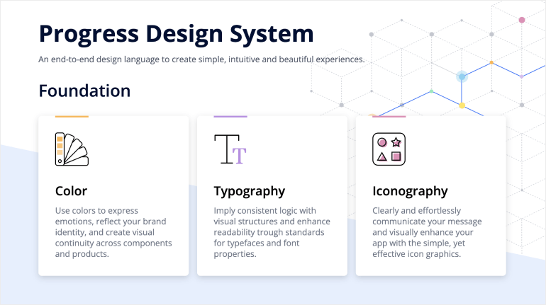
One of the key milestones in 2023 was the launch of a dedicated Design System documentation site, which offers a wide range of resources, design assets and front-end documentation specifically tailored for the Telerik and Kendo UI libraries.
With 2024 Q1, we have expanded the Design System Support by having more components like PDFViewer, FileManager, Rating, Chat (Conversational UI), Wizard, Splitter, Stepper, Tooltip, Slider, Timeline, Card, etc. covered in the Design System documentation.
Our ongoing dedication is to enrich this site further, aiming to provide you with all the necessary tools to craft seamless and visually appealing digital experiences and design systems utilizing the power of Telerik and Kendo UI component libraries.
Multiple Document Processing Libraries (DPL) Improvements
PDF Processing: Embedding File Streams: With the 2024 Q1 the PDF Processing allows embedding file streams into documents. Therefore, the content of the referenced files is embedded directly within the body of the PDF file. See the PDF Processing documentation: Embedded File Streams.
PDF Processing: Support for Embedding ZUGFeRD Invoices: Another PDF Processing enhancement is the support for adding embedded ZUGFeRD invoices into documents. This invoice consists of two formats – PDF and XML and it is a hybrid file, which has a visual component with the PDF and a data-based offshoot for further, automated processing with the XML. See the Document Processing PDF Processing docs: EmbeddedFilesCollection.
Zip Library: Strong AES Encryption Algorithm: We’ve introduced a new encryption algorithm in the Zip Library – AES encryption. It is best suited to secure sensitive information, such as credit card numbers, passwords, and personal data. You can read and extract AES-protected archives with ease. See the Document Processing Zip Library docs: Protected Zip Archive.
Telerik UI for Blazor - 2024 Q1
- Telerik UI for Blazor AI Prompt: Blending AI with UI
- Meet the AppBar: New Navigation Control in Telerik UI for Blazor
- Introducing Telerik UI for Blazor Popover and Popup
- Upgrading Telerik UI for Blazor Trendline Chart
- Legend Customization in Telerik UI for Blazor Charts for Consistent Apps
- Column and Custom Column Menus in Telerik UI for Blazor Gantt Chart
- Keyboard Navigation in Telerik UI for Blazor Charts and Gantt Chart
- Telerik UI for Blazor TreeList with Column and Custom Column Menus
- Multiple Components Enhanced with Prefix and Suffix Adornments
- Modify the Appearance of the ContextMenu, Drawer and Menu
- Configure the Resizing Behavior of Telerik UI for Blazor TextArea
- Customizing Telerik UI for Blazor Chip with Selectable Parameter
- New Draggable Events Added to Telerik UI for Blazor TreeView
- Telerik UI for Blazor: Compatibility with .NET 8 Official
- Enhanced Design System Documentation
- Multiple Document Processing Libraries (DPL) Improvements
New features & Roadmap
Have a feature request?
Post your feedback via the Blazor UserVoice portal or the Public forums
What's new across all Telerik products?

Next Steps
See Telerik UI for Blazor in action and check out how much it can do out-of-the-box.
Check out the offers. Purchase an individual suite, or treat yourself to one of our bundles.
Try Telerik UI for Blazor with dedicated technical support.
