RadGrid Structure Overview
The RadGrid control is composed of table views, rows, columns, and functional elements. Most rendered items derive from GridItem and can be retrieved with the GetItems() method of a GridTableView.
Grid Item Types
The following sections describe common RadGrid item types and show how to access them.
GridDataItem
The data rows of the grid are called items. Each data row is represented by a GridDataItem.
Figure 1: RadGrid data rows showing normal and alternating items
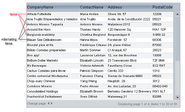
You can access data items through the Items collection of the RadGrid or GridTableView object.
Access the data rows through RadGrid and GridTableView
protected void Page_PreRender(object sender, EventArgs e)
{
    foreach (GridDataItem dataItem in RadGrid1.Items)
    {

    }
    foreach (GridDataItem dataItem in RadGrid1.MasterTableView.Items)
    {

    }
}Protected Sub Page_PreRender(sender As Object, e As EventArgs)
For Each dataItem As GridDataItem In RadGrid1.Items
Next
For Each dataItem As GridDataItem In RadGrid1.MasterTableView.Items
Next
End SubIf the grid uses different styles for odd- and even-numbered rows, the even-numbered rows are called AlternatingItems. The GridDataItem.ItemType property identifies the row type as Item or AlternatingItem. You can retrieve each type separately with GetItems().
Access normal and alternating items by their GridItemType values
protected void Page_PreRender(object sender, EventArgs e)
{
    foreach (GridDataItem item in RadGrid1.MasterTableView.GetItems(GridItemType.Item))
    {

    }

    foreach (GridDataItem alternatingItem in RadGrid1.MasterTableView.GetItems(GridItemType.AlternatingItem))
    {

    }
}Protected Sub Page_PreRender(sender As Object, e As EventArgs)
For Each item As GridDataItem In RadGrid1.MasterTableView.GetItems(GridItemType.Item)
Next
For Each alternatingItem As GridDataItem In RadGrid1.MasterTableView.GetItems(GridItemType.AlternatingItem)
Next
End SubIf there are no records to display, the grid displays a GridNoRecordsItem:
Figure 2: RadGrid no-records item displaying a message when the data source is empty
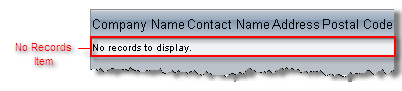
You can access the no-records item as follows:
Access the GridNoRecordsItem from the master table view
protected void Page_PreRender(object sender, EventArgs e)
{
    foreach (GridNoRecordsItem noRecordsItem in RadGrid1.MasterTableView.GetItems(GridItemType.NoRecordsItem))
    {
    }
}Protected Sub Page_PreRender(sender As Object, e As EventArgs)
For Each noRecordsItem As GridNoRecordsItem In RadGrid1.MasterTableView.GetItems(GridItemType.NoRecordsItem)
Next
End SubGridHeaderItem
The header appears above the data rows and is represented by a GridHeaderItem object:
Figure 3: RadGrid header item above the data rows

Accessing the Header Item
Access the GridHeaderItem from the master table view
protected void Page_PreRender(object sender, EventArgs e)
{
    GridHeaderItem headerItem = RadGrid1.MasterTableView.GetItems(GridItemType.Header)[0] as GridHeaderItem;
}Protected Sub Page_PreRender(sender As Object, e As EventArgs)
Dim headerItem As GridHeaderItem = TryCast(RadGrid1.MasterTableView.GetItems(GridItemType.Header)(0), GridHeaderItem)
End SubYou can hide or show the header by using the grid's ShowHeader property. For more information, see Using columns.
GridFooterItem
The footer appears below the data rows and is represented by the GridFooterItem object:
Figure 4: RadGrid footer item below the data rows
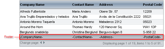
You can hide or show the footer using the grid's ShowFooter property. For more information about footers, see Using columns.
GridFilteringItem
The grid filtering item appears when you enable filtering through the RadGrid.AllowFilteringByColumn or GridTableView.AllowFilteringByColumn property.
Figure 5: RadGrid filtering item with filter inputs below the column headers

GridEditFormItem
The edit form item contains the controls used to edit a data item:
Figure 6: RadGrid edit form item with controls for editing a data row
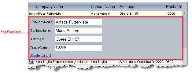
For information about edit forms, see Edit forms.
GridPagerItem
If paging is enabled, RadGrid renders a pager item (GridPagerItem) at the top, bottom, or both locations of the grid table view:
Figure 7: RadGrid pager item with page navigation controls
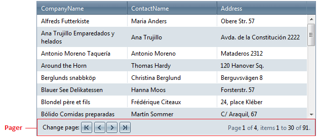
For information about GridPagerItem, see Pager item.
GridCommandItem
You can add a command item (GridCommandItem) to display command buttons in the grid.
Figure 8: RadGrid command item template with toolbar commands

The GridCommandItem object can appear at the top, bottom or top and bottom of the grid. You can specify the content of the command item using a template. GridCommandItem is commonly used for automatic database operations, but it can be used for executing any RadGrid commands. For more information, see Command Item.
GridRowIndicatorColumn
When row resizing is enabled, RadGrid automatically generates a column of type GridRowIndicatorColumn.
Figure 9: RadGrid row indicator column used to resize row height
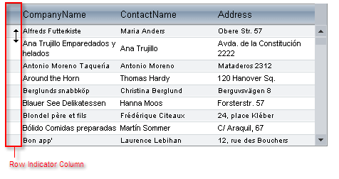
For information about resizable rows, see Resizing rows.
GridBoundColumn
If the grid auto-generates its columns (the AutoGenerateColumns property is True), the grid generates GridBoundColumn objects for each column that displays data:
Figure 10: RadGrid bound column highlighted in the first data column

You can also explicitly add columns to the grid of other types. For details, see Column types.
GridExpandColumn
The GridExpandColumn is an automatically generated and automatically placed column that appears when the grid has a hierarchical structure:
Figure 11: RadGrid expand column with controls for showing detail rows
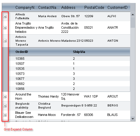
The expand column holds the expand and collapse buttons that show or hide detail tables. It is always placed in front of all other grid content columns and cannot be moved.
You can manually add additional instances of this column type.
MasterTableView
The MasterTableView is the GridTableView object for the topmost table in the hierarchical structure:
Figure 12: RadGrid master table view containing data rows and a detail table
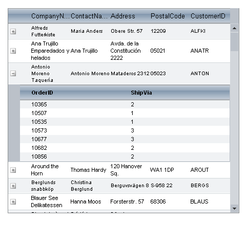
The MasterTableView contains all inner tables (DetailTables), which are available on demand (see Hierarchy Load). When there is no hierarchical structure, the MasterTableView coincides with RadGrid itself.
For more information about the relationship between the MasterTableView and the grid, see RadGrid and MasterTableView difference.
DetailTableView
The DetailTableView is the GridTableView object for an inner table of a hierarchical structure:
Figure 13: RadGrid detail table view showing orders for a selected customer
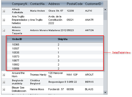
Detail table views can be nested inside a MasterTableView, or inside another Detail table view (when the hierarchy includes multiple levels).
NestedViewItem
Nested view items are Items of a parent table that contain a nested DetailTableView.
Figure 14: RadGrid nested view item containing a detail table
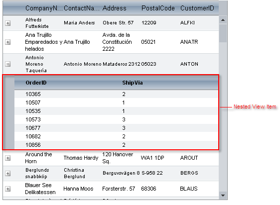
Each nested view item contains only a single GridTableView. If a master table has more than one detail table, each detail table has its own nested view item.
ScrollBars
Scroll bars appear when the scrolling is enabled and the grid cannot display all of its rows or the width of a GridTableView exceeds the width of the item in which it is nested (or, in the case of the MasterTableView, the width of the grid).
Figure 15: RadGrid horizontal and vertical scroll bars
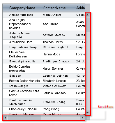
By default, scrolling is not enabled.
Grouping elements
When you set the grid's GroupingEnabled property to True, RadGrid generates several grouping elements:
Figure 16: RadGrid grouping elements including the group panel, splitter column, and group header
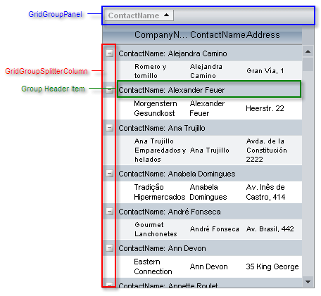
The GridGroupSplitterColumn appears on the far left of each GridTableView, and enables users to expand and collapse groups of records. The group splitter column is always placed first and cannot be moved. For more information about the GridGroupSplitterColumn, see Column types.
Each group of records in a GridTableView is preceded by a GroupHeaderItem, which indicates the grouping field.
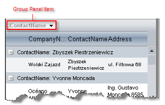
The GridGroupPanel is added to the top of the grid. This panel acts as a repository for panel items, which represent the columns on all table views in the grid that are used for grouping. You can optionally hide the GridGroupPanel using the grid's ShowGroupPanel property. You can access the panel using the grid's GroupPanel property.
For more information on grouping, see Basic grouping.
Panel Items
Each Panel item represents a column in one of the table views that the grid displays. Users can click on the panel items to change the sort direction of the corresponding group, drag items off the Grid group panel to remove grouping on that field, and drag header cells to the group panel to add new panel items (and corresponding groups).
Figure 17: RadGrid group panel item showing a grouped column