Pager Item
When paging is enabled, RadGrid renders a pager item (GridPagerItem) on the bottom and/or top of each table view (GridTableView) displayed in the hierarchy.

PagerStyle
The appearance of the pager item can be controlled using the PagerStyle property of the GridTableView object. As with most appearance options, the default PagerStyle for each GridTableView can specified using the PagerStyle property of the RadGrid control. You then only need to set the PagerStyle property of a GridTableView if you want it to differ from the default set in the RadGrid object.
In addition to the usual item style properties such as ForeColor, BackColor, BorderStyle, and so on, PagerStyle includes a number of properties that are unique to the pager item. These are described below:
Position
PagerStyle.Position lets you specify where the pager appears in the table view. You can set the Position sub-property to "Top", "Bottom" or "TopAndBottom".
Mode
PagerStyle.Mode lets you specify what controls appear in the pager item to help users navigate through the pages. The Mode sub-property can be set to "NextPrev", "NumericPages", "NextPrevAndNumeric", "Advanced", "NextPrevNumericAndAdvanced", or "Slider".
The Mode property, (or any other properties controlling paging behavior) can be set using either the RadGrid Property Builder, or programmatically in the code-behind. Values set programmatically are persisted into the ViewState , providing consistency in the grid's page navigation.
The default (NextPrevAndNumeric) and the advanced grid pagers require the viewstate of the control to be enabled.
The following screen shots show how the pager looks for each of the PagerStyle.Mode values:
NextPrev
When Mode is "NextPrev", the pager contains two buttons; a backward pointing arrow and a forward pointing arrow. These let the user move to the previous or next page:

NumericPages
When Mode is "NumericPages", the pager contains link buttons with page numbers:

The PagerStyle.PagebuttonCount property specifies the number of link buttons appear in this list.
NextPrevAndNumeric
When Mode is "NextPrevAndNumeric", the pager contains both the arrow buttons and the link buttons with page numbers:

Advanced
When Mode is "Advanced", the pager contains text boxes that let the user enter a page number or a new page size:

NextPrevNumericAndAdvanced
When Mode is "NextPrevNumericAndAdvanced", the pager contains all of the controls available in both the "NextPrevAndNumeric" and "Advanced" modes:

Slider
When Mode is "Slider", the pager contains a slider control for changing pages:

You can also customize the pager to provide an alphabetic mode.
Pager button images
By default, the appearance of the controls in the pager are taken from the current Skin. You can substitute your own images for these controls by setting one of the following sub-properties:
-
PagerStyle.NextPageImageUrl specifies the URL for the next page control.
-
PagerStyle.PrevPageImageUrl specifies the URL for the previous page control.
-
PagerStyle.FirstPageImageUrl specifies the URL for a first page control.
-
PagerStyle.LastPageImageUrl specifies the URL for a last page control.
Localizing GridPagerItem strings
When the pager's Mode is "NextPrev" or "NextPrevAndNumeric", you can localize the strings that appear in the pager.
To localize the tooltips that appear when the mouse hovers over a control in the pager, use the following sub-properties:
-
PagerStyle.PrevPageToolTip specifies the tooltip that is displayed for the previous page button.
-
PagerStyle.PrevPagesToolTip specifies the tooltip that is displayed for the previous pages button.
-
PagerStyle.NextPageToolTip specifies the tooltip that is displayed for the next page button.
-
PagerStyle.NextPagesToolTip specifies the tooltip that is displayed for the next pages button.
You can also localize the strings that appear as the "Change page" prompt and indicating the current page position by setting the PagerStyle.PagerTextFormat property. If you want to hide these strings altogether, set the PagerStyle.ShowPagerText property to False.
You can also add your own strings to the right of the Previous page button or the left of the NextPage button by setting the PagerStyle.PrevPageText and PagerStyle.NextPageText properties.
Custom Pager Buttons
You can add and use any command buttons to control grid paging. When using command buttons to control paging, set the CommandName to "Page", and the CommandArgument to "Next", "Prev", or the number of a page (e.g. "5").
If the built-in paging commands are not sufficient, you can also provide your own custom paging.
Controlling when the pager appears
You can have the grid (or table view) display the pager regardless of whether the number of records exceeds the page size by setting the PagerStyle.AlwaysVisibleproperty to True. (Its default value is False.)
Getting the total row count
You can get the exact numbers of rows in your RadGrid either directly from the DataSource or in an ItemDataBound event handler from the pager item:
protected void RadGrid1_ItemDataBound(object sender, GridItemEventArgs e)
{
    if (e.Item is GridPagerItem)
    {
        Label1.Text = (e.Item as GridPagerItem).Paging.DataSourceCount.ToString();
    }
}You can also get the row count from the pager in the ASPX file as follows:
<PagerTemplate>
  <%# (Container as GridPagerItem).Paging.DataSourceCount %>
</PagerTemplate>
Option to show all items in the pager dropdown
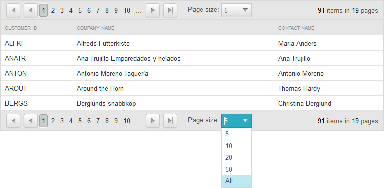
Since Q1 2015 version of UI for ASP.NET AJAX we introduced a new property named EnableAllOptionInPagerComboBox which will add a new item with text "All" in the pager dropdown. The item will be included in both RadComboBox and RadDropDown page size controls.When selecting this item all items will be displayed and the pager item will remain visible.
<PagerStyle EnableAllOptionInPagerComboBox="true" />