New to Telerik UI for ASP.NET AJAX? Start a free 30-day trial
Grouping
Updated on Oct 7, 2026
Basic Grouping
The grouping functionality of RadGrid in Mobile render mode has the following characteristics:
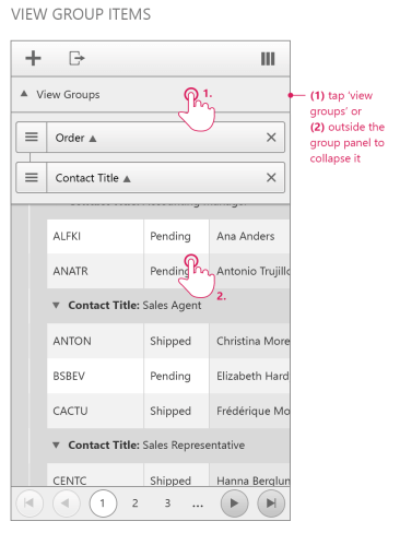
- The group panel item renders as part of the table header below the command item and above the column headers when RenderMode is Mobile. Tap the row with the View Groups pointer to expand the group view. Tap outside the group panel to collapse it. If GridGroupingSettings.ShowUnGroupButton is
True, a close button appears next to each group item.
Figure 1: RadGrid mobile group panel
-
The grid has a separate group panel item that you can access and modify on the server like other grid items.
-
The GroupPanel property is obsolete when RenderMode is Mobile and has no effect.
-
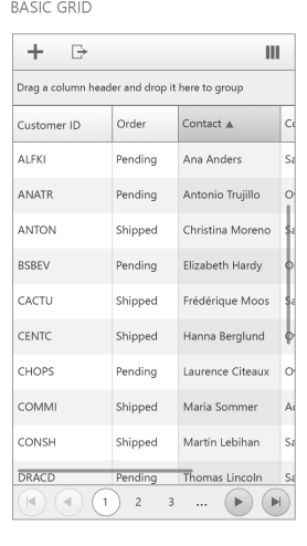
When the grid is not grouped, the default group panel text is Drag a column header and drop it here to group.
Figure 2: RadGrid mobile group panel before grouping
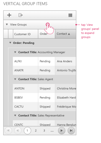
- When the grid is grouped, the group panel shows a down arrow and the text View Groups.
Figure 3: RadGrid mobile group panel after grouping
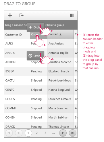
- To group data, drag a column header and drop it on the group panel item. The grouped column is not visible in the group panel item. Drag and reorder group items by using the icon on the left side of the item. Set AllowDragToReorder to
Falseto hide the icon.
Figure 4: Reordering group items in RadGrid Mobile render mode