Mobile Rendering Overview
Since the Q3 2014 beta release, RadGrid has included adaptive behavior for touch devices. In Mobile render mode, the grid adapts its layout to the device screen size and provides larger touch zones.
Figure 1: RadGrid adaptive mobile behavior
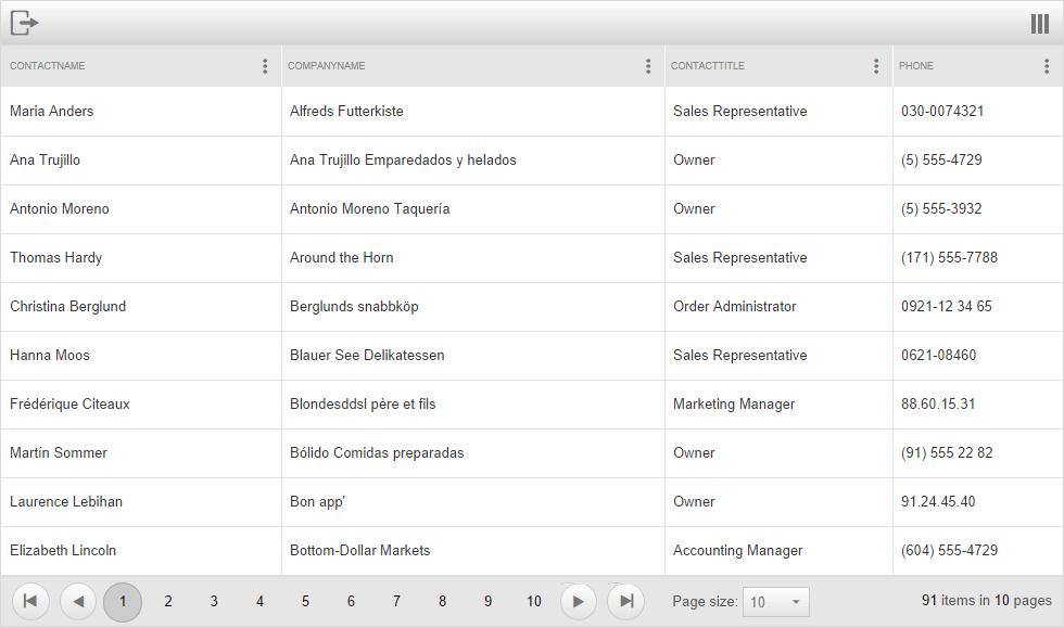
Mobile vs Auto render modes
Set the RenderMode property to Mobile to enable the mobile layout. Set it to Auto when the page must adapt between mobile and desktop devices.
Special Mobile rendering features
When you set RenderMode to Mobile or Auto, a context menu appears in the top-right corner of the grid. Use it to reduce the number of visible columns or rearrange them on the client.
When you set AllowFilteringByColumn, EnableHeaderContextMenu, and EnableHeaderContextFilterMenu to True, a column settings menu appears in each column header. Use the popup to group, sort, and filter the corresponding column.
RadGrid adaptive behavior supports editing on desktop and mobile devices. In PopUp edit mode, the edit form fills the RadGrid container and places the Save and Cancel buttons at the top. Enable this layout by setting RenderMode to Auto and GridTableView.EditMode to PopUp.
Only the
NextPrevNumericAndAdvancedpager mode is supported for mobile devices.