Phone Layout Getting Started
This article showcases the basic steps needed to get started with the Phone Layout of RadEditor in your project.
with Phone Layout under a mobile device.

of RadEditor with Phone Layout.

Phone Layout is supported only under browsers where Flex Model is available.
You can utilize the Phone Layout by following these steps:
-
Set up RadEditor on an ASP.NET page by following the general Getting Started article.
-
Set the RenderMode property of RadEditor either to Auto or Mobile (You can find out more about the differences of these two options in the Render Modes help article);
-
Adjust the viewport of your page by putting this meta tag in the
<head>element of the page:<meta name="viewport" content="width=device-width, initial-scale=1" />(You can read more about why this is needed in MDN's Using the viewport meta tag to control layout on mobile browsers article)
-
Run the created page under your phone's browser.
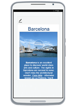
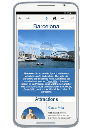
Initially, the RadEditor will load in Preview mode (Figure 1). Clicking the Edit Content button ( ) will enable editing and the Phone Layout will switch to full screen mode(Figure 2).
You can find further details about using the Phone Layout as end-user in the End User Experience article.
You can continue reading the Toolbar Configuration article to learn how to rearrange, add or remove tools regarding Phone Layout.