Phone Layout Elements Structure
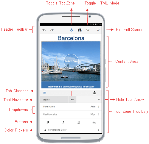
This article shows the default elements structure of a RadEditor with Phone Layout rendering in Figure 1 and offers details on the phone-specific elements below the figure.
Figure 1: Elements Structure of RadEditor with Phone-optimized Mobile rendering.


-
Header Toolbar - a basic toolbar, located on top of the editor.
-
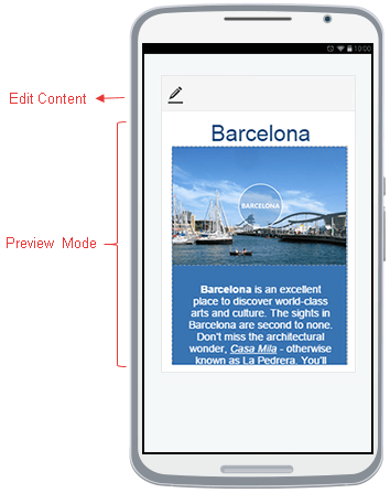
Edit Content - a button that lets you start editing the content.
-
Toggle ToolZone - a button that opens/closes the ToolZone (Toolbar). You can use it to start/end formatting the selection or inserting HTML elements (e.g., hyperlinks, images, tables).
-
Toggle HTML Mode - a button that toggles between Design and HTML view modes.
-
Exit Full Screen - a button that turns off the full screen mode. You can press it when finished with the content editing.
-
-
Content Area - the place which stores and displays the content to edit.
-
ToolZone (Toolbar) - the main toolbar used for formatting the selection and inserting HTML elements (e.g., hyperlinks, images, tables).
-
Tool Navigator
-
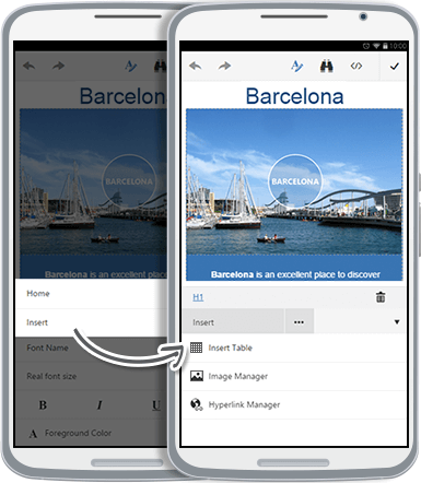
Tab Chooser - lets you navigate to different predefined set of tools (e.g., Home, Insert, Table, Link, Image). The Insert option (Figure 2) opens a list with the mobile dialogs. The Table, Link, Image options open mobile dialogs to configure attributes for the corresponding HTML element.
Figure 2: Navigation to the mobile Insert Dialogs of RadEditor with Phone Layout.

-
Hide Tool Arrow - closes the current ToolZone.
-
-
DropDowns - various dropdowns for selecting predefined font names/sizes, CSS classes, paragraph styles, etc.
-
Buttons - various buttons for creating lists, indent/outdent, align, bold, italic, underline, etc.
-
Color Pickers - mobile color pickers to control the foreground, background and border colors of HTML elements.
-
You can find the full description of all the tools from the toolbar in the Toolbars Overview article. You can also customize the default toolbar of the mobile editor as shown in the Phone Layout Toolbar Configuration article.