New to Telerik UI for .NET MAUI? Start a free 30-day trial
.NET MAUI DataGrid Row Height
Updated on Jul 15, 2026
The Telerik UI for .NET MAUI DataGrid provides full control over the way the content is accommodated inside the DataGrid by enabling you to manually set the height of its rows.
By default, the row height is calculated according to the cell content.
Setting the Row Height
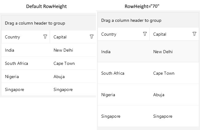
To set the row height, apply the RowHeight property of type double to the DataGrid instance.
XAML
<telerik:RadDataGrid x:Name="dataGrid"
							RowHeight="50"
							ItemsSource="{Binding Source}" />
The following image shows the difference in the way the DataGrid is rendered with and without RowHeight specifically set:
Styling the Row
For more information on styling the row, positioning the text inside the cells, setting the text margins, and defining the text alignment, see the topic about customizing the .NET MAUI DataGrid row.
Additional Resources
- .NET MAUI DataGrid Product Page
- .NET MAUI DataGrid Forum Page
- Telerik .NET MAUI Blogs
- Telerik .NET MAUI Roadmap