Style the .NET MAUI DataGrid
Use the .NET MAUI DataGrid styling properties to control the appearance of borders, rows, cells, grid lines, and the frozen columns splitter. This article helps you choose the correct styling surface for each area of the DataGrid and shows the most common properties for each task.
What Can You Style in the DataGrid
Use the following styling areas depending on the part of the DataGrid that you want to customize:
| Area | Main Properties | Use It When |
|---|---|---|
| Border | BorderBrush, BorderThickness | You want to change the outer frame of the DataGrid. |
| Rows and cells | RowBackgroundStyle, AlternateRowBackgroundStyle, SelectionStyle, CurrentCellStyle, MouseHoverStyle | You want to change row fills, selection state, the current cell, or desktop hover behavior. |
| Grid lines | GridLinesVisibility, GridLinesColor, GridLinesThickness | You want to control the separator lines between rows and columns. |
| Frozen columns splitter | FrozenColumnsSplitterStyle | You want to style the divider between frozen and scrollable columns. |
Border Brush and Thickness
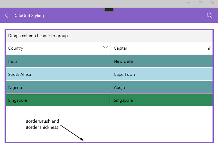
Use BorderBrush and BorderThickness when you want to emphasize the outer boundary of the DataGrid:
BorderBrush—Defines the brush of the border around the DataGrid.BorderThickness—Defines the thickness of that border.
The following example sets both properties:
<telerik:RadDataGrid x:Name="DataGrid"
					 BorderBrush="#8660C5"
					 BorderThickness="4" />
The following image shows a styled DataGrid border:
Cells and Rows
Use the following properties to style row backgrounds, selection state, the current cell, and hover behavior:
RowBackgroundStyle(Stylewith target typeDataGridRowBackgroundAppearance)—Defines the style of each row.AlternateRowBackgroundStyle(Stylewith target typeDataGridRowBackgroundAppearance)—Defines the style of alternating rows.SelectionStyle(Stylewith target typeDataGridSelectionAppearance)—Defines the appearance of the selected row.CurrentCellStyle(Stylewith target typeDataGridCurrentCellAppearance)—Defines the style of the current cell.MouseHoverStyle(Stylewith target typeDataGridMouseHoverAppearance)—Defines the style applied to rows and cells when the pointer moves over them on desktop platforms.
These appearance types derive from DataGridBorderAppearance, which exposes BackgroundColor, SearchMatchBackgroundColor, BorderColor, and BorderThickness.
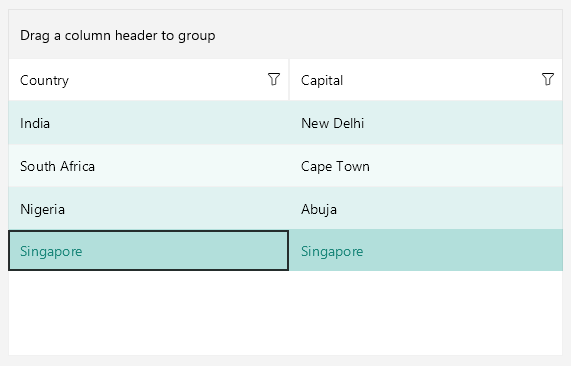
Use RowBackgroundStyle to define the default row appearance:
<telerik:RadDataGrid.RowBackgroundStyle>
    <Style TargetType="telerik:DataGridRowBackgroundAppearance">
        <Setter Property="BackgroundColor" Value="#E0F2F1" />
    </Style>
</telerik:RadDataGrid.RowBackgroundStyle>
Use AlternateRowBackgroundStyle when you want zebra-striping for easier scanning:
<telerik:RadDataGrid.AlternateRowBackgroundStyle>
    <Style TargetType="telerik:DataGridRowBackgroundAppearance">
        <Setter Property="BackgroundColor" Value="#F2FAF9" />
    </Style>
</telerik:RadDataGrid.AlternateRowBackgroundStyle>
Use SelectionStyle to make the selected row more visible:
<telerik:RadDataGrid.SelectionStyle>
    <Style TargetType="telerik:DataGridSelectionAppearance">
        <Setter Property="BackgroundColor" Value="#B2DFDB" />
        <Setter Property="BorderColor" Value="#198679" />
        <Setter Property="BorderThickness" Value="{OnIdiom Default=0, Phone=1}" />
    </Style>
</telerik:RadDataGrid.SelectionStyle>
For details about styling the current cell through CurrentCellStyle, see Style the current DataGrid cell.
The following image shows styled rows and selection state:
Lines
Use the following properties to control the grid lines between rows and columns:
GridLinesVisibility(Telerik.Maui.Controls.DataGrid.GridLinesVisibility)—Defines which DataGrid lines are visible. The supported values areBoth,Horizontal,None, andVertical.GridLinesColor(Color)—Defines the color of the horizontal and vertical grid lines.GridLinesThickness(double)—Defines the width of the vertical lines and the height of the horizontal lines.
The following example shows how to display and style the grid lines:
<telerik:RadDataGrid x:Name="dataGrid"
					 ItemsSource="{Binding GridSource}"
					 GridLinesVisibility="Both"
					 GridLinesThickness="5" />
Frozen Columns
When your DataGrid uses frozen columns, FrozenColumnsSplitterStyle lets you style the divider between the frozen and scrollable column areas.
Splitter UI
Use the Width, BackgroundColor, BorderColor, and BorderThickness properties to change the appearance of the splitter:
<telerik:RadDataGrid.FrozenColumnsSplitterStyle>
	<Style TargetType="telerik:DataGridFrozenColumnsSplitterAppearance">
		<Setter Property="Width" Value="20" />
		<Setter Property="BorderColor" Value="Gray" />
		<Setter Property="BorderThickness" Value="2" />
		<Setter Property="BackgroundColor" Value="LightBlue" />
	</Style>
</telerik:RadDataGrid.FrozenColumnsSplitterStyle>
Use this style when the default splitter is too subtle or when you want the frozen columns area to stand out more clearly.