.NET MAUI PieChart - Donut Series
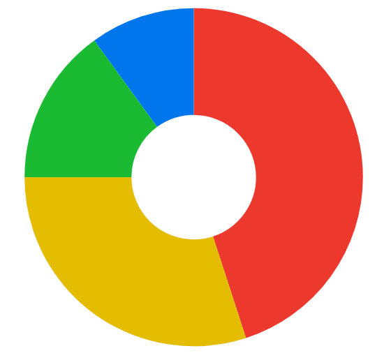
The Telerik UI for .NET MAUI PieChart exposes a donut series. The donut series is used to visualize data in a circular graph, where each slice represents a proportion of the whole. The donut series is similar to the pie series, but it has a hole in the center, which can be used to display additional information or to create a more visually appealing chart.
Data Binding
The donut series binds to data through the following properties:
ItemsSource(IEnumerable)—Defines the collection of data items that the series plots.ValueBinding(string)—Defines the name of the data-item member that provides the value of each slice.LabelBinding(string)—Defines the name of the data-item member that provides the label of each slice.IsVisible(bool)—Defines a value indicating whether the series is visible.
Radius Settings
Use the following properties to customize the appearance of the donut series:
RingGap(double)—Defines the spacing, in device-independent units, left between this ring and adjacent donut rings when multipleDonutSeriesinstances are layered in the same plot area. The default value is4.0InnerRadiusFraction(double)—Defines the fraction of the radius that is used for the inner hole of the donut series. The value is a fraction of the radius, where 0 is the center of the series and 1 is the edge of the series.OuterRadiusFraction(double)—Defines the fraction of the radius that is used for the outer edge of the donut series. The value is a fraction of the radius, where 0 is the center of the series and 1 is the edge of the series.RadiusWeight(double)—Defines the weight of the radius for the donut series. The default value is1.0, which means that the radius is equal to the size of the chart.
The PieChart allows you to nest multiple donut series. In this scenario, the
RadiusWeightproperty needs to be set.
Example
- Define the donut series in XAML:
<charts:RadPieChart>
    <charts:RadPieChart.BindingContext>
        <models:PieViewModel />
    </charts:RadPieChart.BindingContext>
    <charts:RadPieChart.Series>
        <charts:DonutSeries ValueBinding="Value"
                            LabelBinding="Label"
                            InnerRadiusFactor="0.35"
                            OuterRadiusFactor="0.95"
                            ItemsSource="{Binding Data}" />
    </charts:RadPieChart.Series>
</charts:RadPieChart>- Add the
chartsnamespace:
xmlns:charts="clr-namespace:Telerik.Maui.Controls.Charts;assembly=Telerik.Maui.Controls"- Define the data model:
public class PieData
{
    public string Label { get; set; }

    public double Value { get; set; }
}- Define the
ViewModel:
public class PieViewModel
{
    public ObservableCollection<PieData> Data { get; } = new ObservableCollection<PieData>
    {
        new PieData { Label = "Mobile", Value = 45 },
        new PieData { Label = "Desktop", Value = 30 },
        new PieData { Label = "Tablet", Value = 15 },
        new PieData { Label = "Other", Value = 10 },
    };
}
This is the result:
For runnable examples with the PieChart donut series, go to the SDKBrowser Demo Application and navigate to the Charts > Series category.