.NET MAUI Carousel Commands
The Carousel exposes navigation commands that move the highlighted item to the previous or next item. Bind these commands to buttons when you want to provide navigation in addition to swiping, for example, on desktop platforms.
Navigation Commands and Properties
The Carousel exposes the following read-only commands:
NavigatePreviousCommand(ICommand)—Navigates to the previous item.NavigateNextCommand(ICommand)—Navigates to the next item.
To allow or prevent navigation in a direction, use the following properties:
AllowPrevious(bool)—Specifies whether the Carousel allows navigation to the previous item. The default value istrue.AllowNext(bool)—Specifies whether the Carousel allows navigation to the next item. The default value istrue.
Navigate with Previous and Next Buttons
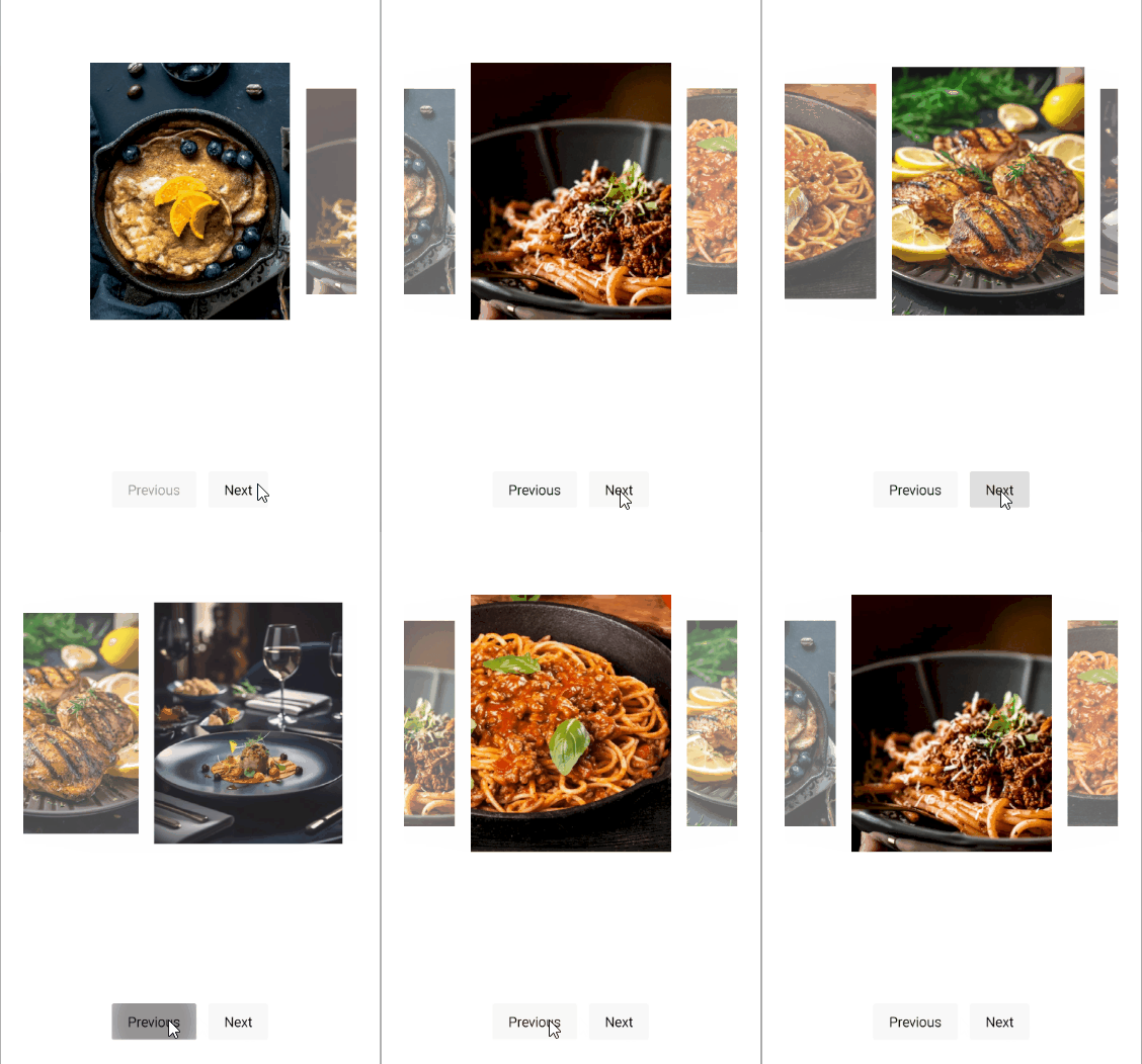
The following example binds two buttons to the navigation commands of the Carousel and uses checkboxes to toggle the AllowPrevious and AllowNext properties.
-
Define the Carousel and the buttons in XAML:
XAML<telerik:RadCarousel x:Name="carousel" Grid.Row="2" MaximumHeightRequest="260" ItemsSource="{Binding Items}"> <telerik:RadCarousel.ItemTemplate> <DataTemplate x:DataType="local:CarouselItem"> <Image Source="{Binding Image}" Aspect="AspectFill" /> </DataTemplate> </telerik:RadCarousel.ItemTemplate> </telerik:RadCarousel> <HorizontalStackLayout Grid.Row="3" Spacing="12" HorizontalOptions="Center"> <telerik:RadButton Text="Previous" Command="{Binding NavigatePreviousCommand, Source={x:Reference carousel}}" /> <telerik:RadButton Text="Next" Command="{Binding NavigateNextCommand, Source={x:Reference carousel}}" /> </HorizontalStackLayout> </Grid> -
Add the
teleriknamespace:XAMLxmlns:telerik="http://schemas.telerik.com/2022/xaml/maui" -
Define the business object:
C#public class CarouselItem { public string Title { get; set; } public string Description { get; set; } public string Image { get; set; } public bool IsNewDish { get; set; } } -
Define the
ViewModel:C#public class CarouselViewModel { public ObservableCollection<CarouselItem> Items { get; } = new() { new CarouselItem { Title = "Blueberry Pancakes", Description = "Dutch baby pancake with fresh blueberries, orange zest, and a drizzle of maple syrup.", Image = "carousel_firstlook_1.jpg", IsNewDish = true }, new CarouselItem { Title = "Bolognese", Description = "Slow-simmered ragù with hand-pulled spaghetti, topped with micro herbs.", Image = "carousel_firstlook_2.jpg", IsNewDish = false }, new CarouselItem { Title = "Spaghetti", Description = "Fresh spaghetti with San Marzano tomato sauce and garden basil.", Image = "carousel_firstlook_3.jpg", IsNewDish = false }, new CarouselItem { Title = "Lemon Herb Chicken", Description = "Herb-crusted chicken with lemon butter sauce and roasted vegetables.", Image = "carousel_firstlook_4.jpg", IsNewDish = true }, new CarouselItem { Title = "Fine Dining", Description = "Delicate tartare with edible flowers, micro greens, and golden carrot purée.", Image = "carousel_firstlook_5.jpg", IsNewDish = false }, new CarouselItem { Title = "Raspberry Cake", Description = "Raspberry coulis over a rich cheesecake with fresh berries.", Image = "carousel_firstlook_6.jpg", IsNewDish = true }, new CarouselItem { Title = "Salmon Canapues", Description = "Smoked salmon on crispy toasts with cream cheese and dill.", Image = "carousel_firstlook_7.jpg", IsNewDish = false }, new CarouselItem { Title = "Shrimp Fettuccine", Description = "Tiger prawns tossed with fettuccine in a light garlic cream sauce.", Image = "carousel_firstlook_8.jpg", IsNewDish = true } }; }
This is the result:
For a runnable example demonstrating the Carousel commands, see the SDKBrowser Demo Application and go to the Carousel > Commands category.