.NET MAUI Carousel Styling
The Carousel wraps each item in a RadCarouselItemView container. RadCarouselItemView derives from RadBorder, so you can style properties such as BackgroundColor, BorderColor, BorderThickness, CornerRadius, and Padding.
Carousel Styling Properties
To style the item containers, use the following properties of the RadCarousel:
ItemViewStyle(Stylewith target typeRadCarouselItemView)—Specifies the style applied to each item container.ItemViewStyleSelector(IStyleSelector)—Specifies a selector that chooses a style for each item container. When the selector returnsnull, the Carousel uses theItemViewStyle.
Visual States of the Item Container
The RadCarouselItemView supports visual states in the CommonStates visual state group, such as Normal, Highlighted, Previous, Next, and their MouseOver and Pressed variants. For the full list, see the Carousel Visual States article.
In addition, the RadCarouselItemView exposes the following read-only properties that indicate the current state of the item container:
IsHighlighted(bool)—Indicates whether the item is the highlighted item of the Carousel.IsPressed(bool)—Indicates whether the user is currently pressing the item.IsMouseOver(bool)—Indicates whether the mouse pointer is over the item.
Apply a Custom Item View Style
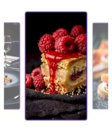
The following example sets rounded borders and a custom background to all item containers and changes the colors of the highlighted item.
-
Add the style to the page resources:
XAML<Style x:Key="CarouselItemViewStyle" TargetType="telerik:RadCarouselItemView"> <Setter Property="CornerRadius" Value="8" /> <Setter Property="BorderThickness" Value="3" /> <Setter Property="BorderColor" Value="#B39DDB" /> <Setter Property="BackgroundColor" Value="#EDE7F6" /> <Setter Property="VisualStateManager.VisualStateGroups"> <VisualStateGroupList> <VisualStateGroup x:Name="CommonStates"> <VisualState x:Name="Normal" /> <VisualState x:Name="Highlighted"> <VisualState.Setters> <Setter Property="BorderColor" Value="#673AB7" /> <Setter Property="BackgroundColor" Value="#D1C4E9" /> <Setter Property="BorderThickness" Value="3" /> </VisualState.Setters> </VisualState> </VisualStateGroup> </VisualStateGroupList> </Setter> </Style> -
Apply the style to the Carousel:
XAML<Grid MaximumHeightRequest="{OnPlatform Android=400, iOS=400, MacCatalyst=550, WinUI=550}"> <telerik:RadCarousel ItemsSource="{Binding Items}" ItemViewStyle="{StaticResource CarouselItemViewStyle}" VerticalOptions="Start" Margin="0, 24, 0, 0"> <telerik:RadCarousel.ItemTemplate> <DataTemplate x:DataType="local:CarouselItem"> <Image Source="{Binding Image}" Aspect="AspectFill"/> </DataTemplate> </telerik:RadCarousel.ItemTemplate> </telerik:RadCarousel> -
Add the
teleriknamespace:XAMLxmlns:telerik="http://schemas.telerik.com/2022/xaml/maui" -
Add the business object:
C#public class CarouselItem { public string Title { get; set; } public string Description { get; set; } public string Image { get; set; } public bool IsNewDish { get; set; } } -
Define the
ViewModel:C#public class CarouselViewModel { public ObservableCollection<CarouselItem> Items { get; } = new() { new CarouselItem { Title = "Blueberry Pancakes", Description = "Dutch baby pancake with fresh blueberries, orange zest, and a drizzle of maple syrup.", Image = "carousel_firstlook_1.jpg", IsNewDish = true }, new CarouselItem { Title = "Bolognese", Description = "Slow-simmered ragù with hand-pulled spaghetti, topped with micro herbs.", Image = "carousel_firstlook_2.jpg", IsNewDish = false }, new CarouselItem { Title = "Spaghetti", Description = "Fresh spaghetti with San Marzano tomato sauce and garden basil.", Image = "carousel_firstlook_3.jpg", IsNewDish = false }, new CarouselItem { Title = "Lemon Herb Chicken", Description = "Herb-crusted chicken with lemon butter sauce and roasted vegetables.", Image = "carousel_firstlook_4.jpg", IsNewDish = true }, new CarouselItem { Title = "Fine Dining", Description = "Delicate tartare with edible flowers, micro greens, and golden carrot purée.", Image = "carousel_firstlook_5.jpg", IsNewDish = false }, new CarouselItem { Title = "Raspberry Cake", Description = "Raspberry coulis over a rich cheesecake with fresh berries.", Image = "carousel_firstlook_6.jpg", IsNewDish = true }, new CarouselItem { Title = "Salmon Canapues", Description = "Smoked salmon on crispy toasts with cream cheese and dill.", Image = "carousel_firstlook_7.jpg", IsNewDish = false }, new CarouselItem { Title = "Shrimp Fettuccine", Description = "Tiger prawns tossed with fettuccine in a light garlic cream sauce.", Image = "carousel_firstlook_8.jpg", IsNewDish = true } }; }
This is the result:
For a runnable example demonstrating the Carousel styling scenario, see the SDKBrowser Demo Application and go to the Carousel > Styling category.
Apply Styles with a Style Selector
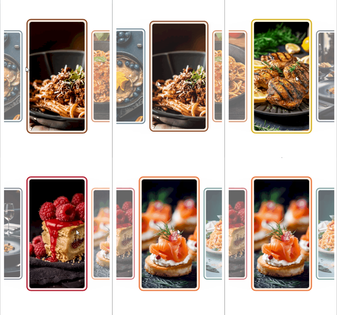
Use a style selector when different items need different styles, for example, to emphasize featured items.
-
Create a class that implements
IStyleSelector:C#public class DishItemStyleSelector : IStyleSelector { public Style BlueberryPancakesStyle { get; set; } public Style BologneseStyle { get; set; } public Style SpaghettiStyle { get; set; } public Style LemonHerbChickenStyle { get; set; } public Style FineDiningStyle { get; set; } public Style RaspberryCakeStyle { get; set; } public Style SalmonCanapesStyle { get; set; } public Style ShrimpFettuccineStyle { get; set; } public Style SelectStyle(object item, BindableObject bindable) { return item switch { CarouselItem { Image: "carousel_firstlook_1.jpg" } => this.BlueberryPancakesStyle, CarouselItem { Image: "carousel_firstlook_2.jpg" } => this.BologneseStyle, CarouselItem { Image: "carousel_firstlook_3.jpg" } => this.SpaghettiStyle, CarouselItem { Image: "carousel_firstlook_4.jpg" } => this.LemonHerbChickenStyle, CarouselItem { Image: "carousel_firstlook_5.jpg" } => this.FineDiningStyle, CarouselItem { Image: "carousel_firstlook_6.jpg" } => this.RaspberryCakeStyle, CarouselItem { Image: "carousel_firstlook_7.jpg" } => this.SalmonCanapesStyle, CarouselItem { Image: "carousel_firstlook_8.jpg" } => this.ShrimpFettuccineStyle, _ => throw new ArgumentException("The item must have a supported carousel image.", nameof(item)) }; } } -
Define the selector and its styles in the page resources:
XAML<Style x:Key="DishItemStyle" TargetType="telerik:RadCarouselItemView"> <Setter Property="CornerRadius" Value="16" /> <Setter Property="Margin" Value="4" /> <Setter Property="BorderThickness" Value="4" /> </Style> <example:DishItemStyleSelector x:Key="DishItemStyleSelector"> <example:DishItemStyleSelector.BlueberryPancakesStyle> <Style TargetType="telerik:RadCarouselItemView" BasedOn="{StaticResource DishItemStyle}"> <Setter Property="BorderColor" Value="#24485C" /> <Setter Property="BackgroundColor" Value="#E3ECF1" /> </Style> </example:DishItemStyleSelector.BlueberryPancakesStyle> <example:DishItemStyleSelector.BologneseStyle> <Style TargetType="telerik:RadCarouselItemView" BasedOn="{StaticResource DishItemStyle}"> <Setter Property="BorderColor" Value="#8B4A28" /> <Setter Property="BackgroundColor" Value="#F3E6DC" /> </Style> </example:DishItemStyleSelector.BologneseStyle> <example:DishItemStyleSelector.SpaghettiStyle> <Style TargetType="telerik:RadCarouselItemView" BasedOn="{StaticResource DishItemStyle}"> <Setter Property="BorderColor" Value="#C45120" /> <Setter Property="BackgroundColor" Value="#FBE8DC" /> </Style> </example:DishItemStyleSelector.SpaghettiStyle> <example:DishItemStyleSelector.LemonHerbChickenStyle> <Style TargetType="telerik:RadCarouselItemView" BasedOn="{StaticResource DishItemStyle}"> <Setter Property="BorderColor" Value="#D7B72C" /> <Setter Property="BackgroundColor" Value="#FCF5D7" /> </Style> </example:DishItemStyleSelector.LemonHerbChickenStyle> <example:DishItemStyleSelector.FineDiningStyle> <Style TargetType="telerik:RadCarouselItemView" BasedOn="{StaticResource DishItemStyle}"> <Setter Property="BorderColor" Value="#354253" /> <Setter Property="BackgroundColor" Value="#E6E9EE" /> </Style> </example:DishItemStyleSelector.FineDiningStyle> <example:DishItemStyleSelector.RaspberryCakeStyle> <Style TargetType="telerik:RadCarouselItemView" BasedOn="{StaticResource DishItemStyle}"> <Setter Property="BorderColor" Value="#B51F35" /> <Setter Property="BackgroundColor" Value="#F9E1E5" /> </Style> </example:DishItemStyleSelector.RaspberryCakeStyle> <example:DishItemStyleSelector.SalmonCanapesStyle> <Style TargetType="telerik:RadCarouselItemView" BasedOn="{StaticResource DishItemStyle}"> <Setter Property="BorderColor" Value="#ED8048" /> <Setter Property="BackgroundColor" Value="#FDEBDD" /> </Style> </example:DishItemStyleSelector.SalmonCanapesStyle> <example:DishItemStyleSelector.ShrimpFettuccineStyle> <Style TargetType="telerik:RadCarouselItemView" BasedOn="{StaticResource DishItemStyle}"> <Setter Property="BorderColor" Value="#23665D" /> <Setter Property="BackgroundColor" Value="#E0EFEB" /> </Style> </example:DishItemStyleSelector.ShrimpFettuccineStyle> </example:DishItemStyleSelector> -
Assign the selector to the Carousel:
XAML<Grid MaximumHeightRequest="{OnPlatform Android=400, iOS=400, MacCatalyst=550, WinUI=550}"> <telerik:RadCarousel ItemsSource="{Binding Items}" ItemViewStyleSelector="{StaticResource DishItemStyleSelector}" ItemSpacing="6" VerticalOptions="Start" Margin="{OnPlatform MacCatalyst=24, WinUI=24}"> <telerik:RadCarousel.ItemTemplate> <DataTemplate x:DataType="local:CarouselItem"> <Border StrokeThickness="0" StrokeShape="RoundRectangle 8" Margin="10"> <Image Source="{Binding Image}" Aspect="AspectFill"/> </Border> </DataTemplate> </telerik:RadCarousel.ItemTemplate> </telerik:RadCarousel> </Grid> -
Add the business object:
C#public class CarouselItem { public string Title { get; set; } public string Description { get; set; } public string Image { get; set; } public bool IsNewDish { get; set; } } -
Define the
ViewModel:C#public class CarouselViewModel { public ObservableCollection<CarouselItem> Items { get; } = new() { new CarouselItem { Title = "Blueberry Pancakes", Description = "Dutch baby pancake with fresh blueberries, orange zest, and a drizzle of maple syrup.", Image = "carousel_firstlook_1.jpg", IsNewDish = true }, new CarouselItem { Title = "Bolognese", Description = "Slow-simmered ragù with hand-pulled spaghetti, topped with micro herbs.", Image = "carousel_firstlook_2.jpg", IsNewDish = false }, new CarouselItem { Title = "Spaghetti", Description = "Fresh spaghetti with San Marzano tomato sauce and garden basil.", Image = "carousel_firstlook_3.jpg", IsNewDish = false }, new CarouselItem { Title = "Lemon Herb Chicken", Description = "Herb-crusted chicken with lemon butter sauce and roasted vegetables.", Image = "carousel_firstlook_4.jpg", IsNewDish = true }, new CarouselItem { Title = "Fine Dining", Description = "Delicate tartare with edible flowers, micro greens, and golden carrot purée.", Image = "carousel_firstlook_5.jpg", IsNewDish = false }, new CarouselItem { Title = "Raspberry Cake", Description = "Raspberry coulis over a rich cheesecake with fresh berries.", Image = "carousel_firstlook_6.jpg", IsNewDish = true }, new CarouselItem { Title = "Salmon Canapues", Description = "Smoked salmon on crispy toasts with cream cheese and dill.", Image = "carousel_firstlook_7.jpg", IsNewDish = false }, new CarouselItem { Title = "Shrimp Fettuccine", Description = "Tiger prawns tossed with fettuccine in a light garlic cream sauce.", Image = "carousel_firstlook_8.jpg", IsNewDish = true } }; }
This is the result:
For a runnable example demonstrating the Carousel style selector scenario, see the SDKBrowser Demo Application and go to the Carousel > Styling category.