What’s New in the Kendo UI Angular Components with R3 2020

Summarize with AI:
The Kendo UI for Angular R3 2020 release is here, bringing new components and features including the ListView, AppBar and Loader components, as well as cell selection within the Angular Grid.
The R3 2020 release of Kendo UI for Angular is here! With it we’re adding a bunch of new angular components and some highly requested features. As a bonus we even have a new and improved documentation and demo site! Let’s jump straight into things and read about what’s new in Kendo UI for Angular R3 2020 release.
New Angular Components
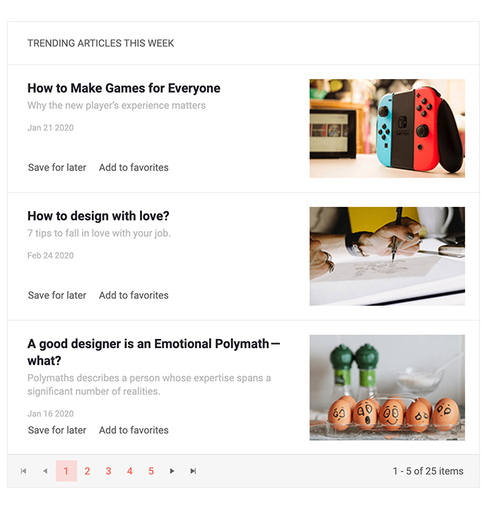
New Component: ListView

One of the top-requested components in the Kendo UI for Angular feedback portal has been the ListView component, and with R3 2020 it has finally arrived!
Some of the folks reading this blog post may be familiar with the ListView from other Kendo UI flavors, but for those of you not familiar with this type of component the quick summary is that the Kendo UI for Angular ListView allows you to create a custom template to be used for each item in a list and provides additional functionality like paging to help users navigate through all available data. Used in websites like eBay and Etsy, the ListView is an extremely flexible component and ideal to use for lists of items that may not benefit from having the traditional row and column look-and-feel of a data-centric component like the data grid.
Head on over to the Kendo UI for Angular ListView demo page for a better look at what can be accomplished with this new component!
New Component: AppBar

Adding to the list of new components with R3 2020 is the new Kendo UI for Angular AppBar component. The main purpose of this component is to provide a sleek user experience at the top of your application. Everything within the AppBar is customizable and the Angular AppBar provides positioning, content arrangement, and theme coloring. The UI component is extremely flexible and what it contains is completely up to the developer, but layouts like the one provided in the image above can easily be recreated.
To see what the AppBar component can do head on over to the Kendo UI for Angular AppBar demo section.
New Component: Range Slider

While Kendo UI for Angular has had a Slider component for some time, with R3 2020 we are covering even more scenarios for letting users select a value using the sliding action by introducing the Kendo UI for Angular Range Slider component! This new component lets users select a range of values by dragging two separate indicators to represent the floor and the ceiling of a particular range—all with a gorgeous user experience!
To play around with the various sliders head on over to the Kendo UI for Angular Range Slider component demo pages.
New Component: Breadcrumb

Extremely useful in applications where users have to navigate through a deep hierarchy of pages (in say, developer documentation 😉) the new Kendo UI for Angular Breadcrumb component should be a natural addition to many Angular applications out in the wild! The component comes with built-in styling for displaying the current page and previous pages, along with integration with the Angular framework to help navigating through pages as easy as possible.
For more information, the Kendo UI for Angular Breadcrumb demos cover how to add this new component in your apps today.
New Components: Loader

There are often scenarios in our web apps that require users to sit and wait for a while. This could be while loading a page, asynchronously calling for some data, or doing some intensive calculations on the page. Whatever the case may be, we know that our applications shouldn’t just sit there frozen, but we should showcase some sort of loading animation.
This is where the new Kendo UI for Angular Loader component comes in to play. With various built-in styles of animation, some seen in the animated gif above, and configuration options to customize the loading animation and help make them truly unique, the Angular Loader component can be used as a standalone component or as a part of other Kendo UI for Angular components.
To play around with the various loading animations head on over to the Kendo UI for Angular Loader component docs & demos page.
New Components: TextBox

Previously Kendo UI for Angular developers looking to add regular input elements for text input in their applications have relied on the CSS primitives that we offer while using a native HTML element to actually render the input. We realized that Kendo UI for Angular can offer more than this, so with R3 2020 we created the Kendo UI for Angular TextBox component. Beyond ensuring a consistent look-and-feel across all form elements in your Angular applications, the Angular TextBox can add elements, or adornments, before or after the input element. These can provide custom content like icons, buttons, text, and more! Additionally, the Angular TextBox provides built-in validation icons which will render upon valid or invalid entries.
The Angular TextBox component docs and demos page covers exactly how to implement this new component along with the various features we have added on top of just the plain text input capability.
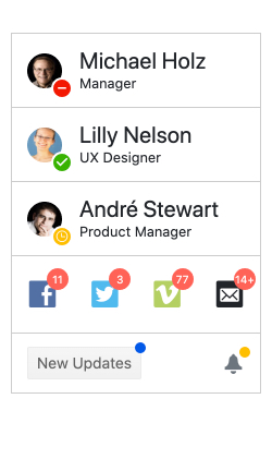
New Components: Badge

Continuing the streak of new Angular UI components, with R3 2020 we have the new Kendo UI for Angular Badge component. As the screenshot above showcases, the uses for this component are pretty endless. Whether it is to showcase that there are unread notifications, the number of unread messages, the status indicator for if a user is online or away, or any myriad of other scenarios that call for a small UI component attached to a HTML element—the Kendo UI for Angular Badge is there for you! This component supports multiple alignment and positioning options, five different shapes and can contain text, icons, be filled with a single color, and more.
For more information, the Kendo UI for Angular Badge component docs is the best place to go.
New Component: Icon & SVGIcon
To wrap up the new UI components added with R3 2020 we have the Kendo UI for Angular Icon and SVGIcon Angular UI components. These components bring functionalities that previously were only available as built-in elements of other Kendo UI for Angular components into standalone UI elements. Between these two components Angular developers have access to all Kendo UI Icons (over 400 of them) and you can control icon color, size, and orientation.
Check out the Kendo UI for Angular Icon documentation section to see the Angular Icon in action.
Expanded Component Features
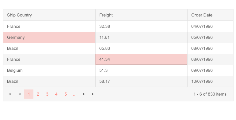
Grid - Cell Selection

While we’ve had a whole slew of improvements across the entire Kendo UI for Angular suite, one of the standout new features is the Kendo UI for Angular Data Grid Cell Selection. With this new selection mode end-users now have the ability to select single or multiple cells through regular clicks and CTRL clicks as well as dragging the mouse over a set of cells in order to select a bigger range of cells at once.
Charts - Plot Band Labels & Legend Titles
With R3 2020 the Kendo UI for Angular team also took a look at potential features to add to our Angular Charts, and specifically the ability to add Plot band Labels and Legend Titles.
Plot bands can be a unique visual added to many of the Kendo UI for Angular Charts and has so far been limited to just the visual style of a band across the chart. Now, thanks to the Plot Band Labels feature each plot band can have an associated label.
For the legend of our Angular Charts developers can now define a Chart Legend Title through a configuration option, giving additional context for users as they view the legend of your charts.
Form Updates Across All Applicable Components
We have already introduced the Angular Forms Guideline; a resource dedicated to building Forms that follow best practices within Angular. If you have not had the chance to read through this document yet I highly recommend it as it covers everything from the overall layout of the form, how to handle validation, hints, and error messages, and even accessibility. All lessons can be applied to any form—even if they do not utilize any Kendo UI for Angular components!
In order to lead by example the Kendo UI for Angular team has gone through existing Kendo UI components and ensured that any built-in form follows the guidelines we have provided. The effect of this may not be felt immediately when updating to the latest version of our packages, but rest assured that any form generated by a Kendo UI for Angular component follows the industry best practices!
Reduced Bundle Size for Many Packages
A hidden little treasure with this release is that the Kendo UI for Angular team has been able to reduce the overall bundle size that is generated when using some of our biggest components (Grid, TreeList, Charts, etc.) thanks to improvements we have done around TreeShaking support throughout the Kendo UI for Angular Drawing and Excel Export packages. These packages are what power our data visualization and export to PDF and Excel features of certain components. Thanks to this updated TreeShaking support we have seen an average reduction of about 15% across generated bundles, with some bundle sizes being reduced by 26%!
Have Some Feedback?
That’s it for the R3 2020 release! Are there any components or features that you need which did not make it for this release? Any new ideas for future UI components? Let us know by submitting feedback in our public feedback portal! All of the above components and features came from customer feedback so make sure your voice is heard by submitting your own feedback items or voting and commenting on existing items!
Register for our Live R3 2020 Webinar & Stream!
Like always, we are hosting a webinar to cover everything mentioned above! However, this year we are doing things a little bit differently and there are some notes that should be highlighted.
On Wednesday, September 30th we are hosting both a webinar and a live Twitch stream where we will dive into the latest content for Angular! We kick things off at 11 AM ET where we will cover what is new with Kendo UI for Angular and Kendo UI for jQuery. Then, at 12:30 PM ET we are starting a Twitch live stream where we will do a deep dive session specifically covering the new components and features available to Angular developers. This session will go beyond what we normally can cover in webinars and we’re excited to be able to host this type of session.
To sign up for either the webinar or live stream, or both if you’re feeling in the spirit, head on over to the our What’s New in Kendo UI for jQuery and Kendo UI for Angular in R3 2020 Webinar Page and reserve your seat!

Carl Bergenhem
Carl Bergenhem was the Product Manager for Kendo UI.
