
What’s New in Kendo UI for Angular with R2 2021

Summarize with AI:
The R2 2021 release of Kendo UI for Angular is here.
With this release, we officially cross the 100 UI component threshold while introducing some highly requested features and UI components that are sure to please any Angular developer out there. Without further ado, let’s jump straight into the latest and greatest in Angular with R2 2021.
Kendo UI for Angular Turns 100!

While we normally may measure how old something is by years, with a UI component library I prefer to measure by total number of components. I’m absolutely thrilled to announce that with R2 2021 Kendo UI for Angular officially has over 100 UI components available to Angular developers out of the box. It’s a huge milestone, and I hope you all join me in wishing Kendo UI for Angular a happy 100+ UI components day! 🥳
New Angular Components
New Component: Angular BottomNavigation

The Angular BottomNavigation component serves as an intuitive navigation element for any web application. Most frequently found in mobile applications, responsive web apps or progressive web apps (PWAs), the BottomNavigation component is displayed at the bottom of the screen, highlighting navigation options for the user.
Individual items can be customized to show just text, icons or a combination of both, and of course with additional CSS or Sass customization can be made to fit any design you may need. This component can integrate with the Angular Router, making the Angular BottomNavigation an intuitive navigation component for any Angular app.
Check out a demo of the BottomNavigation in action right here.
New Component: Angular MultiSelectTree

Continuing the trend of adding more and more scenarios the Kendo UI for Angular DropDowns package can handle, with R2 2021 we are introducing the Angular MultiSelectTree component. At its core, this component combines the hierarchical structure of the TreeView inside a MultiSelect dropdown, which means users can select multiple values from a dropdown that contains a TreeView.
This is similar to the Angular DropDownTree, introduced in our previous release, but the biggest difference is the MultiSelect behavior. Values selected will show up as text or tokens and can be added, modified or removed by just placing the cursor inside the input element of the component.
To see more of the Angular MultiSelectTree, head on over to our online documentation and demos.
New Component: Angular Circular Gauge

The new Angular Circular Gauge component takes the already popular Angular Arc Gauge component and creates a new data visualization that covers a full circle rather than an arbitrary arc. This includes support for a center label, ticks and more to ensure this new data visualization component can fit any design you throw at it.
Head on over to the Angular Circular Gauge demo page for more information.
New Component: Angular Skeleton

With the new Kendo UI for Angular Skeleton component, developers can improve the perceived performance of their applications by creating placeholder elements and shapes that represent the content that is about to be loaded. This gives users the feel of something loading at little to no cost, as this is just HTML and CSS in the shape of whatever is about to be displayed.
For this initial release, we cover a few shapes like lines, rectangles and circles to give Angular developers a solid foundation for creating their own loading elements.
Here’s a quick link to the Angular Skeleton component demos.
Expanded Component Features
Angular Grid: Sticky Columns and Sticky Rows

While the Angular Data Grid has had the ability to lock columns for some time, with R2 2021 we are expanding on top of this functionality to create “sticky” columns and rows. For those unfamiliar, something being “sticky” refers to an item that can be locked at some point but can become a regular column or row after user interactions.
For columns, being sticky means the column, when scrolled by, will persist on the left-hand or right-hand side (wherever other locked columns may be placed, if there are any). If you scroll the other way, the column will unlock and be placed back in its original position.
For rows, we instead look at sticking the row to the top or the bottom of the current view of the Grid, allowing rows to be stuck in an area as users continue to scroll, but it will end up being a normal row once users scroll back over its original position.
With R2 2021, the Kendo UI for Angular Data Grid supports both sticky columns and sticky rows, letting you take advantage of this feature for both horizontal and vertical scrolling.
Check out the Angular Grid sticky columns demo and the Angular Grid sticky rows demo.
Angular Grid: Persist Grouping
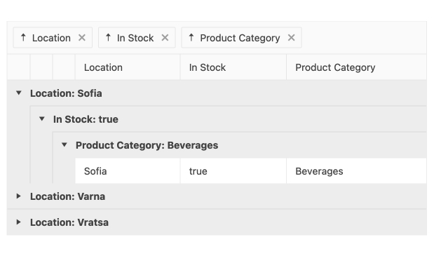 In Stock: true > Product category: Beverages, then 'Sofia | true | Beverages' in three text boxes. Location: Varna and Location: Vratsa are collapsed below." title="Kendo UI for Angular Data Grid - Persist Group State" sfref="[images|OpenAccessDataProvider]2cb19773-ca80-4a7d-8f8b-86410891fe1f">
With R2 2021, we continued to offer more out-of-the-box options for persisting the state of the Angular Grid by letting the expanded or collapsed state of groups be persisted during data operations (paging, sorting, filtering, etc.). While this has previously been possible by manually keeping track of the state of the groups, this can now be tracked by the Angular data table itself via simple configuration options.
For those interested, here’s the Angular Data Grid persist state demo.
Angular Grid: Improved Accessibility
Another effort that we went through with R2 2021 is to dive deeper into the accessibility compliance of the Angular Data Grid. As accessibility compliance is one of the top priorities with Kendo UI for Angular, we want to continue to improve in this area so everyone utilizing our Angular UI components can feel confident in their accessibility requirements.
Specifically, we found improvements that we could add for this release when using the Filter Menu, Filter Row, Column Menu, as well as the Checkbox Column. This includes adding additional support for keyboard navigation in both the Filter Menu and the Column Menu. Beyond this, we have also taken care of several bug reports around accessibility issues for a general improvement of accessibility across the board.
For other accessibility-related items, you can head on over to the Kendo UI for Angular Accessibility section of the docs.
Angular Editor: ProseMirror Plugin Support

While we continue to add our own tools and features to the Kendo UI for Angular Editor, we do also want our developers to be able to extend on top of what we have already built, or find third-party plugins to add to their implementations. As the Kendo UI for Angular Editor is based on ProseMirror, with R2 2021 we added the ability to integrate any ProseMirror plugin into the Kendo UI for Angular Editor.
For more information on how you can add in your own ProseMirror plugins, here’s the appropriate Kendo U for Angular Editor demo section.
Angular Editor: Placeholder Support
Speaking of Editor features, we also added in support for the placeholder attribute within the Kendo UI for Angular Editor. This lets developers set an initial stylized message in the Editor content when a user has yet to provide their own text, giving the user context as to what is expected in the Editor content area.
See the Angular Editor getting started docs for more information.
All Angular DropDowns: Various Improvements

Continuing the trend of adding sought-after features in existing components, we also went through and provided some improvements across all Angular DropDowns. This includes:
- Post open and close events
- Child object binding
- Group checkbox selection
- Programmatic focus on items
As this covers seven components in total, the easiest way to check out all of these improvements is to head on over to the Kendo UI for Angular DropDowns package demo section and navigate to the applicable DropDowns that you are using today.
Angular PDF Generator: Export Any SVG
While the Kendo UI for Angular PDF Generator has been able to export some SVG elements so far, primarily our own Angular Charts, with R2 2021 we have added the ability to export any generic SVG element as a part of the PDF generation. This means that if your HTML includes any custom SVG element, it will be present and displayed in the exported PDF file just like any other HTML element.
To see how you can export SVG elements to PDF, check out this section in the Angular PDF Generator documentation.
Angular Calendar: Multiple Date Selection

With R2 2021, the Angular Calendar now supports various modes of selecting multiple dates. This can be done over a range, or through selecting multiple individual days across the Kendo UI for Angular Calendar interface.
Head on over to the Angular Calendar demos to play around with the new multiple date selection feature.
Angular TreeView: Check/Uncheck Directive for Child Nodes and Delay the nodeDrag Event

The Kendo UI for Angular TreeView also received some attention with this release. With R2 2021, we added the check/uncheck directive to help select or deselect child nodes before their parent is expanded according to the parent’s state.
We also added the ability to delay the nodeDrag event to help customize the experience when dragging and dropping nodes.
For more information, you can refer to the Kendo UI for Angular TreeView docs and demos.
Angular DateInputs: Support for Two-Digit Years & Accessibility Improvements

To wrap up the release, the Angular DateInputs package received some updates as well. One of the bigger quality-of-life improvements is support for typing two-digit years. This lets users type in “21” and have it automatically translated to “2021”. You can actually customize the century which the DateInputs will default to too. So, if you’re writing an application about the various Norman invasions or the activities of the Byzantine Empire during the 11th century, you can have the DateInputs default to “10XX”.
This affects all DateInput components, so navigate over to the Kendo UI for Angular DateInputs package docs and demos section to see this in action with your favorite Angular DateInput component.
Telerik and Kendo UI Community Forums Revamp
And last but not least, we revamped one of the favorite places that developers love hanging out—the Telerik and Kendo UI Community Forums. Check out the complete story of why and what in the dedicated blog post.

Got Feedback?
That’s a whole lot of new components and features packed into a single release. We’re already hard at work with the next release, but now is your chance to have your voice heard. If we missed a component or feature you’ve been waiting for, let us know by heading over to the Kendo UI for Angular Feedback Portal and vote for your favorite piece of feedback or submit your own.
Kendo UI for Angular has grown to 100+ components thanks to the continuous feedback of our customers, and we want to continue to provide the best possible library for you and your teams—and we use the feedback we hear from you to drive all of our releases.
Webinars and Live Streams
Want to see everything I mentioned above live and in action? Well, do I have good news for you. On Thursday, May 20, at 11 am ET we are hosting the Kendo UI R2 2021 release webinar. This session will cover everything I mentioned here plus information about jQuery, React and Vue.
On top of this, we will also have a Twitch live stream diving in deeper in to Kendo UI for Angular and KendoReact on Tuesday, May 18, from 9:00 – 10:30 am ET and Wednesday, May 19, from 1:30 – 3:00 pm ET.
Tons of fun will be had, so head on over to the Kendo UI R2 2021 webinar registration page to reserve your seat and join in on the festivities.

Carl Bergenhem
Carl Bergenhem was the Product Manager for Kendo UI.