
Validation Without Tears Using Telerik ASP.NET Core Form Component

Summarize with AI:
A key feature of the Telerik UI for ASP.NET Core Form is how easy it is add functionality. And if you’re willing to go a little bit further, you can also add your own custom validation.
Question: Where do bugs come from? Answer: Users. Take users out of the system, and not one of your applications will have another bug. That’s not an option, of course, so you have to take time to add validation to prevent bad data from creeping into your system … and that code is just another potential source of bugs. Plus, of course, you’ve got to arrange to tell your users when they’ve done wrong. All of that is going to be pretty time-consuming and, potentially, painful.
Progress Telerik UI for ASP.NET Core Form component speeds up creating forms for accepting input, allows you to implement validation more easily, and lets you do that declaratively (rather than through code) to reduce the chances of introducing more bugs.
A Default Form
As a case study, imagine a form that an HR department uses to onboard a new employee. That form is going to have a variety of input controls: textboxes, checkboxes, date controls, email addresses, text areas, among others—all of which will require some level of validation.
The model class for an Employee and its related classes might look something like this:
class Employee
{
        public int Id { get; set; }
         [Required]
        public string FirstName { get; set; } = string.Empty;
         [Display(Prompt = "Last Name")]
         [Required]
        public string LastName { get; set; } = string.Empty;
         [EmailAddress]
        public string Email { get; set; } = string.Empty;
        public DateTime HireDate { get; set; }
        public int Age {get; set; }
        public string? Notes { get; set; } = string.Empty;
        public bool ImmediatelyAvailable {  get; set; }
        public int Department { get; set;}
}
Setting up an ASP.NET Core project to use Telerik controls is straightforward so I won’t review it here. Setting up a Razor Page to use that Employee class as its Model object could be as simple as this (and using that Employee class as a Model object passed to an MVC View would be as simple):
public class IndexModel : PageModel
{
  public Employee employee { get; set; }
Even setting up a Telerik Form component in that Page or View is straightforward:
- Add a kendo-form element to your page.
- Set the kendo-form’s
nameattribute to some string. - Tie the kendo-form to your Model through the form’s
form-dataattribute (for my Razor Page, that’s my employee property; for an MVC View, it would be the View’s Model property). - Within that kendo-form element, add a forms-item element to get a default form.
That means this minimal markup:
<h1> Add New Employee </h1>
<div style="width:50%">
<kendo-form name="AddEmployee"
                            form-data="@Model.employee">
    <forms-item/>
</kendo-form>
</div>
will give you this default form (some boring properties omitted), complete with Submit and Clear buttons:
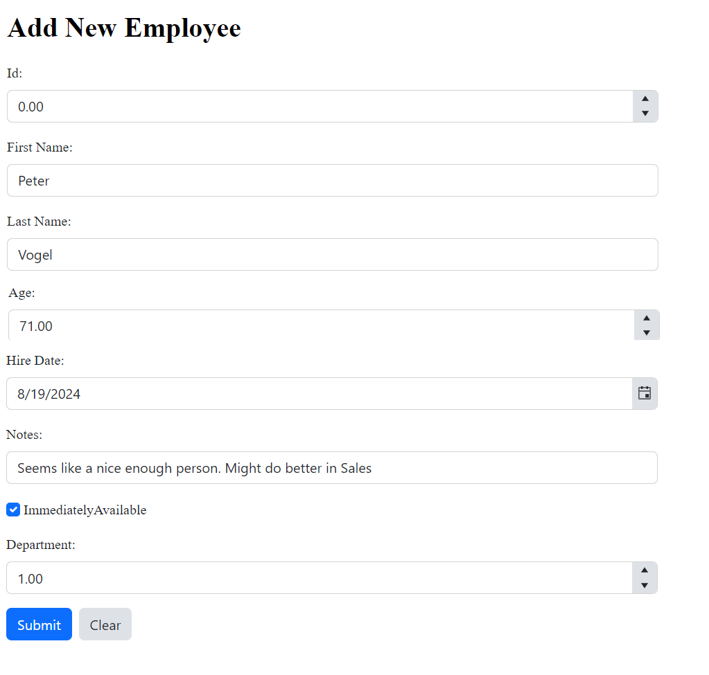
If you look closely at that screenshot, you can see that this default form has already given you some validation against bad data: Age is using a numeric selector and Hire Date has a date picker.
Adding Data Controls
But while that’s very convenient (and a quick way to generate a demo page that you can use in discussions with your end users), it’s also not going to be good enough for production. In real life, you’ll want to exercise some more control over both what’s displayed in your form and how the user’s input is validated.
For this example, that can range from just hiding the employee Id field to enhancing validation for some of your input controls. You control that by adding form-item elements inside the kendo-form’s form-items element.
For example, while the FirstName property is being displayed on my default form, the [Required] data annotation attribute that I have on the property in my Employee class is ignored.
To get the kendo-form to apply that attribute (or any other of the data annotation attributes), I just need to add a form-item element tied to the FirstName property (that’s done by setting the form-item’s field attribute). As soon as you start using form-item elements explicitly, the kendo-form stops autogenerating HTML for your Model’s properties, which effectively hides my employee Id field. Now, I’m in control.
That means that this markup:
<form-items>
      <form-item field="FirstName"/>
both gives me more control over what’s on my form and invokes the [Required] data annotation on my FirstName. Now, if the user leaves the FirstName textbox blank, the form displays a default message and won’t let the user submit the form:
I can use additional elements within the form-item element to manage the property. For example, adding an item-label element lets me take control of the label used to prompt the user to enter the right data. I might enhance the LastName property like this:
<form-item field="LastName">
  <item-label text="Family Name:" />
</form-item>
Another control that needs add additional validation is the Age textbox—the default editor is allowing the user to enter any number, including negative numbers. You can prevent that by adding a form-item for the Age property and inserting a numerictextbox-editor inside that form-item (the kendo-form currently supports over two dozen editors). With a numeric-editor in place, you can set its min and max values to control what data the user can enter.
This example restricts the user to a reasonable range of ages and sets the format of the number to suppress displaying decimals (it would only encourage users to try to enter a decimal value):
<form-item field="Age">
  <numerictextbox-editor min="18"
    max="80"
    format="#"/>
  </numerictextbox-editor>
</form-item>
By default, the numerictextbox-editor and the datepicker-editor will automatically fix up any out-of-bounds entries—in my Age field, if the user enters 81 as an age, it will automatically be corrected to 80 without displaying an error message. If you’d prefer to turn that off and have the user get the message, you can set the auto-adjust attribute to false, like this:
<form-item field="Age">
  <numerictextbox-editor min="18"
    max="80"
	auto-adjust="false"
    format="#"/>
  </numerictextbox-editor>
</form-item>
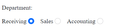
As another example, the default control for Department really isn’t satisfactory for two reasons: First, it’s displaying the DepartmentId rather than the DepartmentName and, second, it’s not restricting the user to selecting valid departments.
That’s easy to address by adding a form-item tied to the Department property and putting a radiogroup-editor inside it to limit the user to the approved list of departments:
<form-items>
<form-item field="Department">
        <radiogroup-editor label-position="RadioGroupLabelPosition.Before"
                                                  layout="RadioGroupLayout.Horizontal">
            <kendo-radiogroup-items>
                <kendo-radiogroup-item label="Receiving" value="1" />
                <kendo-radiogroup-item label="Sales" value="2" />
                <kendo-radiogroup-item label="Accounting" value="3" />
            </kendo-radiogroup-items>
        </radiogroup-editor>
</form-item>
Now my department entry area looks like this:
And I could have used the editor’s datasource attribute to pull the data from a web service rather than hardcoding the values as I did here.
As a side benefit, these controls maintain their appearance and behavior across browsers and platform, so you’ll also be giving your users a consistent experience as they move from one browser or device to another.
Configuring Validation
After addressing the controls you want to enhance (adding a textbox-editor for the Notes property would be another good idea), you can also configure how validation is performed at the form level using the kendo-form’s validatable element.
By default, for example, the kendo-form validates the contents of your controls when the user leaves the control (i.e., on the control’s blur event) and then again when the user clicks the form’s submit button. The validatable element lets you turn off validation as the user leaves the control and just have your validation applied when the user submits the form.
You can also use the validatable element to turn on a summary of all of the form’s validation errors. By default, this is displayed at the top of the form.
This markup does both of those:
<validatable validate-on-blur="false"
             validation-summary="true"  />
The default validation summary will look something like this:
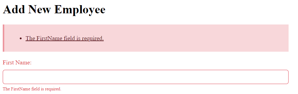
By the way: The user can click on the error messages in the validation summary to be automatically taken to the control with the error in the form.
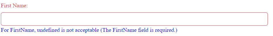
The validatable element also has an error-template attribute that lets you customize the error messages displayed under each control and how those messages are displayed. The template is passed several parameters that you can integrate into your customized message, including the default error message (message) and the Model property. That Model property itself has two useful properties: the user’s entry (the value property) and the Model property’s name (the field property).
This example generates a custom error message to be used with all the form’s controls and also changes the message’s font color:
<validatable validate-on-blur="true"
              validation-summary="true"
              error-template=
                      "<span style='color: blue'>For #=data.field#, #=data.value# is not acceptable (#=message#)" />
Now my message for a missing name looks like this:
The validatable element also lets you take control of where and how the validation summary is displayed.
There’s just two steps to doing that:
- Add an element to your page where you want the summary to be displayed, setting that element’s id and style/class attributes.
- Add a validation-summary element inside the
validatableelement that references your new validation summary element by that id attribute.
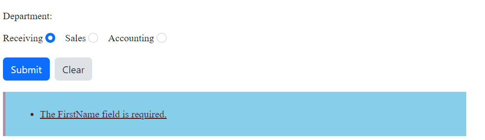
This example puts the validation summary after the end of the kendo-form (i.e., closer to the submit button) and sets its background color to a light blue:
    <validatable validate-on-blur="false"
                 validation-summary="true">
                   <validation-summary container="#errorList"/>
   </validatable>
</kendo-form>

<div id="errorList"
         style="background-color:skyblue"/>
The result would look like this:
All of these options let you both prevent your users from entering bad data and tell your users where they’ve gone wrong … and all without writing a line of code. You’ve got to like that (well, unless you’re being paid by the hour—then maybe you’d rather do it all by yourself).
See the ASP.NET Core Form demo, and try it all out for yourself, free for 30 days:

Peter Vogel
Peter Vogel is both the author of the Coding Azure series and the instructor for Coding Azure in the Classroom. Peter’s company provides full-stack development from UX design through object modeling to database design. Peter holds multiple certifications in Azure administration, architecture, development and security and is a Microsoft Certified Trainer.
Related Posts
Comments
All articles
Topics
Web MobileMobile
Desktop
Design
Productivity
People
