
Summarize with AI:
Even though there isn’t a native Svelte Kendo UI library, you can still use one of the Kendo UI component libraries with Svelte.
Progress Kendo UI does not have a Svelte version by default. It specializes in Angular, Vue, React and jQuery. However, that does not mean you Svelte fans out there are out of luck! JavaScript is just JavaScript, and there are work arounds to meet different needs.
TL;DR
You can use Kendo UI for jQuery in any JavaScript framework, or you can use Astro to mix components from multiple frameworks (React, Vue, Angular). The jQuery version is not perfect for server-side rendering, but it can work in pure Svelte, while Astro can work wonders with any framework component.
✔️ Svelte with Kendo UI for jQuery
Svelte allows you to import any JS you want. It is just JavaScript.
Create a New SvelteKit Project
npx sv create my-app
Install Tailwind and any other SvelteKit options you need.
Install Packages
npm i @progress/kendo-theme-meridian @progress/kendo-ui @progress/kendo-data-query @progress/kendo-date-math @progress/kendo-licensing @progress/kendo-popup-common jquery
with types:
npm install -D @types/jquery @types/node
Activate Kendo UI
npx kendo-ui-license activate
Get your key ready and follow any other activation instructions.
Create a jQuery Declaration File
Put it in lib/types/kendo-ui-module.d.ts or wherever makes sense.
/// <reference types="@progress/kendo-ui" />

declare module '@progress/kendo-ui' {
	export {};
}

declare module '@progress/kendo-ui/kendo.all.js' {
	export {};
}

declare global {
	interface Window {
		jQuery: JQueryStatic;
		$: JQueryStatic;
	}
}

export {};
jQuerytypes do not work as expected on the client without it.
Dynamically Import jQuery on the Browser
export async function loadKendoUi() {
	// @ts-expect-error Kendo UI exposes this runtime entry but ships global-only typings.
	await import('@progress/kendo-ui/kendo.all.js');
}
This allows you to load Kendo UI dynamically. Kendo UI for jQuery cannot run on the server, as it needs window objects, etc.
Handle CSS
@import 'tailwindcss';
@import '@progress/kendo-theme-meridian/dist/meridian-main.css';
Make sure your global layout.css or app.css file contains tailwind and the correct Progress theme CSS.
Load a Grid Element
<script lang="ts">
	import { loadKendoUi } from '$lib/kendo-ui';
	import { onMount, tick } from 'svelte';
	import ProductGridSkeleton from './ProductGridSkeleton.svelte';

	let gridEl = $state<HTMLDivElement>();
	let isGridLoading = $state(true);

	const products = [
		{ ProductName: 'Chai', UnitPrice: 18, UnitsInStock: 39, Discontinued: false },
		{ ProductName: 'Chang', UnitPrice: 19, UnitsInStock: 17, Discontinued: false },
		{ ProductName: 'Aniseed Syrup', UnitPrice: 10, UnitsInStock: 13, Discontinued: false }
	];

	onMount(() => {
		let mounted = true;
		let jquery: JQueryStatic | undefined;

		(async () => {
			const jqueryModule = await import('jquery');

			jquery = jqueryModule.default;

			window.jQuery = jquery;
			window.$ = jquery;

			await loadKendoUi();

			if (!mounted) return;

			isGridLoading = false;
			await tick();

			if (!mounted || !gridEl) return;

			jquery(gridEl).kendoGrid({
				dataSource: {
					data: products,
					pageSize: 20
				},
				height: 550,
				scrollable: true,
				sortable: true,
				filterable: true,
				pageable: {
					input: true,
					numeric: false
				},
				columns: [
					{ field: 'ProductName' },
					{ field: 'UnitPrice', title: 'Unit Price', format: '{0:c}', width: 130 },
					{ field: 'UnitsInStock', title: 'Units In Stock', width: 130 },
					{ field: 'Discontinued', width: 130 }
				]
			});
		})();

		return () => {
			mounted = false;

			if (!jquery || !gridEl) return;

			jquery(gridEl).data('kendoGrid')?.destroy();
			jquery(gridEl).empty();
		};
	});
</script>

<main class="flex items-center justify-center p-6">
	<section class="w-full max-w-5xl overflow-hidden rounded-lg border border-gray-200 bg-white shadow-sm">
		{#if isGridLoading}
			<ProductGridSkeleton />
		{:else}
			<div bind:this={gridEl}></div>
		{/if}
	</section>
</main>
- We load Kendo UI in
onMountso that it won’t have problems loading on the server. - We use a
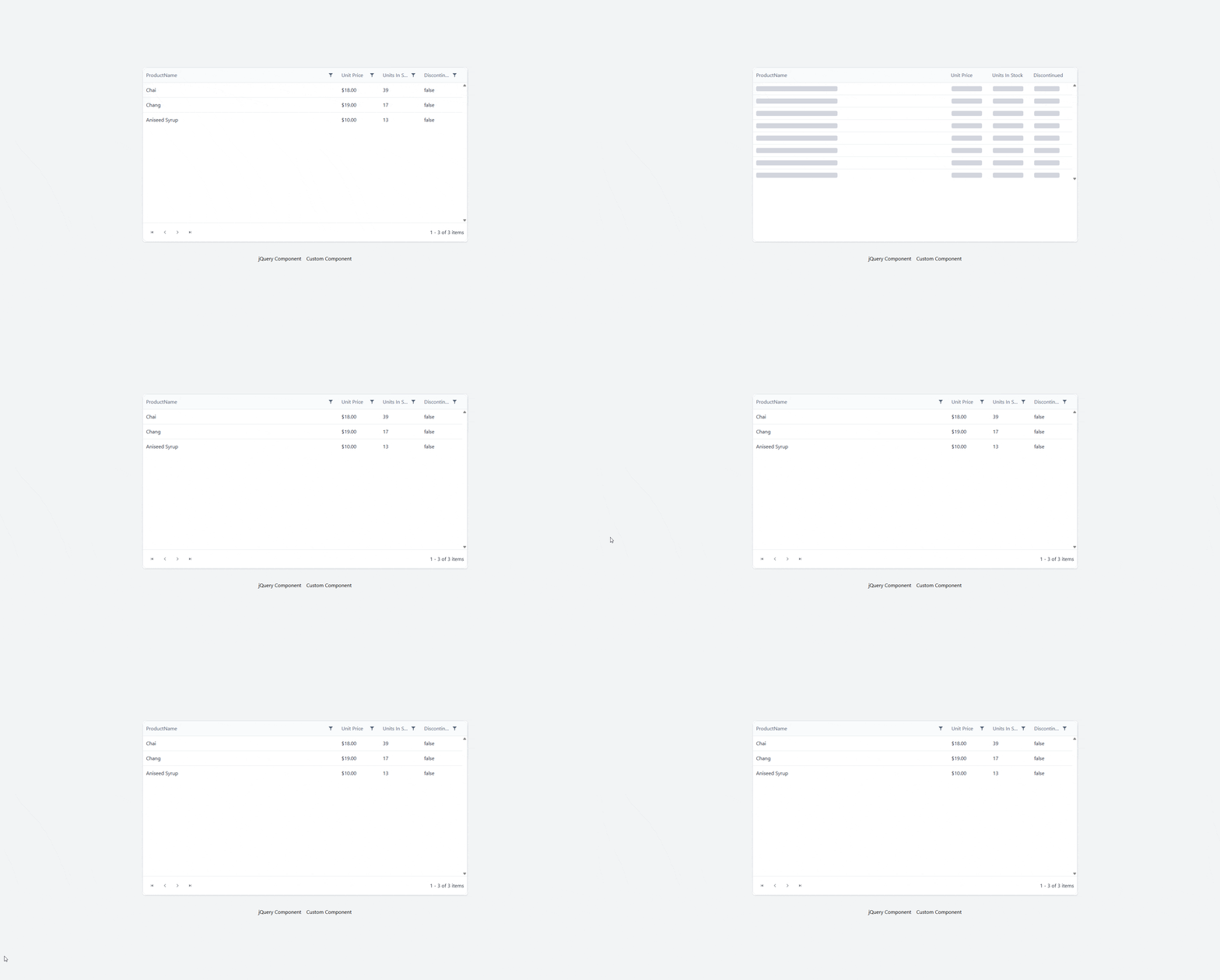
$statesignal to show a loading skeleton. jQueryandkendoGridare dynamically loaded, and then the products are added to the grid.
Create a Loader
Since the component takes a second to load, we want to show a loading skeleton in the interim. Notice we use kendo style classes to match our grid.
<script lang="ts">
	const skeletonRows = Array.from({ length: 8 }, (_, index) => index);
</script>

<div class="k-grid k-grid-md k-grid-display-block h-137.5" aria-label="Loading product grid">
	<div class="k-grid-header">
		<div class="k-grid-header-wrap">
			<table class="k-grid-header-table k-table k-table-md">
				<colgroup>
					<col />
					<col class="w-32.5" />
					<col class="w-32.5" />
					<col class="w-32.5" />
				</colgroup>
				<thead class="k-table-thead">
					<tr class="k-table-row">
						<th class="k-header k-table-th" scope="col">
							<span class="k-cell-inner">
								<span class="k-link">
									<span class="k-column-title">ProductName</span>
								</span>
							</span>
						</th>
						<th class="k-header k-table-th" scope="col">
							<span class="k-cell-inner">
								<span class="k-link">
									<span class="k-column-title">Unit Price</span>
								</span>
							</span>
						</th>
						<th class="k-header k-table-th" scope="col">
							<span class="k-cell-inner">
								<span class="k-link">
									<span class="k-column-title">Units In Stock</span>
								</span>
							</span>
						</th>
						<th class="k-header k-table-th" scope="col">
							<span class="k-cell-inner">
								<span class="k-link">
									<span class="k-column-title">Discontinued</span>
								</span>
							</span>
						</th>
					</tr>
				</thead>
			</table>
		</div>
	</div>

	<div class="k-grid-container">
		<div class="k-grid-content k-auto-scrollable">
			<table class="k-grid-table k-table k-table-md">
				<colgroup>
					<col />
					<col class="w-32.5" />
					<col class="w-32.5" />
					<col class="w-32.5" />
				</colgroup>
				<tbody class="k-table-tbody">
					{#each skeletonRows as row (row)}
						<tr class="k-table-row">
							<td class="k-table-td">
								<span class="block h-4 w-64 max-w-full animate-pulse rounded bg-gray-300 text-transparent">
									Loading product
								</span>
							</td>
							<td class="k-table-td">
								<span class="block h-4 w-24 animate-pulse rounded bg-gray-300 text-transparent">
									0.00
								</span>
							</td>
							<td class="k-table-td">
								<span class="block h-4 w-24 animate-pulse rounded bg-gray-300 text-transparent">
									000
								</span>
							</td>
							<td class="k-table-td">
								<span class="block h-4 w-20 animate-pulse rounded bg-gray-300 text-transparent">
									False
								</span>
							</td>
						</tr>
					{/each}
				</tbody>
			</table>
		</div>
	</div>
</div>
We could equally have used a spinner.
✔️ Kendo UI in Astro
Using Astro is by far the best approach. You are not building in Svelte, but you can use any other framework with Astro, and have everything else built with Svelte.
Install Astro
Create a new Astro project.
npm create astro@latest
- Don’t forget to add Tailwind.
Choose Your Kendo UI Framework
Install the Svelte Astro Plugin:
Install the proper Astro plugin:
For this demo, I chose Vue and I copied all the Kendo UI for Vue grid components in Astro.
Install Dependencies
npm i @progress/kendo-data-query @progress/kendo-drawing @progress/kendo-licensing @progress/kendo-svg-icons @progress/kendo-theme-default @progress/kendo-vue-animation @progress/kendo-vue-buttons @progress/kendo-vue-charts @progress/kendo-vue-data-tools @progress/kendo-vue-dateinputs @progress/kendo-vue-dropdowns @progress/kendo-vue-grid @progress/kendo-vue-excel-export @progress/kendo-vue-inputs @progress/kendo-vue-intl @progress/kendo-vue-pdf @progress/kendo-vue-popup @progress/kendo-vue-treeview
Configure CSS
@import "tailwindcss";
@import '@progress/kendo-theme-default/dist/all.css';
Put in styles/global.css.
Activate Your Kendo UI License
npx kendo-ui-license activate
📝 You can also use more than one or all of them with Astro! (Progress offers a DevCraft bundle, if you code in more than one framework.)
Create Svelte Component
We want to mix our components, so we create a Svelte Component that can accept any other component as a child.
<script lang="ts">
  let { children } = $props();

  let count = $state(0);
</script>

<section
  class="mx-auto mt-5 w-full max-w-4xl rounded-3xl border border-pink-200 bg-linear-to-br from-pink-50 via-yellow-50 to-sky-50 p-6 shadow-[0_20px_60px_rgba(244,114,182,0.18)] ring-1 ring-white/70 sm:p-8"
>
  <div class="mb-5 flex items-center justify-between gap-3">
    <div class="flex items-center gap-3">
      <div
        class="flex h-12 w-12 items-center justify-center rounded-2xl bg-linear-to-br from-pink-500 to-rose-400 text-2xl shadow-lg shadow-pink-200/60"
      >
        ⭐
      </div>

      <div>
        <p
          class="text-xs font-semibold uppercase tracking-[0.32em] text-pink-500"
        >
          For kids
        </p>
        <h2 class="text-2xl font-bold text-slate-800 sm:text-3xl">
          Fun learning card
        </h2>
      </div>
    </div>

    <button
      type="button"
      class="inline-flex items-center gap-2 rounded-full bg-sky-500 px-4 py-2 text-sm font-semibold text-white shadow-md shadow-sky-200 transition hover:-translate-y-0.5 hover:bg-sky-600 active:translate-y-0"
      onclick={() => (count += 1)}
      aria-label="Increase counter"
    >
      Count <span class="min-w-5 text-center">{count}</span>
    </button>
  </div>

  <div
    class="rounded-2xl bg-white/80 p-4 shadow-inner shadow-white/60 ring-1 ring-pink-100 sm:p-6"
  >
    {@render children?.()}
  </div>

  <div class="mt-5 flex items-center justify-between text-sm text-slate-500">
    <span>Made for bright ideas and happy moments.</span>
    <span
      class="rounded-full bg-yellow-200 px-3 py-1 font-medium text-yellow-900"
      >New</span
    >
  </div>
</section>
This component has a simple button counter that uses Runes.
Create our Grid Component
<script setup>
import { ref, computed } from 'vue';
import Grid from './grid/Grid.vue';
import {
    load,
    LocalizationProvider,
    IntlProvider,
    loadMessages,
} from '@progress/kendo-vue-intl';

import { enComponentMessages, enCustomMessages } from './grid/en-US';
import { esComponentMessages, esCustomMessages } from './grid/es';
import { frComponentMessages, frCustomMessages } from './grid/fr';

import likelySubtags from 'cldr-core/supplemental/likelySubtags.json';
import currencyData from 'cldr-core/supplemental/currencyData.json';
import weekData from 'cldr-core/supplemental/weekData.json';

import numbers from 'cldr-numbers-full/main/es/numbers.json';
import caGregorian from 'cldr-dates-full/main/es/ca-gregorian.json';
import dateFields from 'cldr-dates-full/main/es/dateFields.json';
import timeZoneNames from 'cldr-dates-full/main/es/timeZoneNames.json';
import esNumbers from 'cldr-numbers-full/main/es/numbers.json';
import esCurrencies from 'cldr-numbers-full/main/es/currencies.json';

import frNumbers from 'cldr-numbers-full/main/fr/numbers.json';
import frCaGregorian from 'cldr-dates-full/main/fr/ca-gregorian.json';
import frDateFields from 'cldr-dates-full/main/fr/dateFields.json';
import frTimeZoneNames from 'cldr-dates-full/main/fr/timeZoneNames.json';
import frCurrencies from 'cldr-numbers-full/main/fr/currencies.json';

load(
    likelySubtags,
    currencyData,
    weekData,
    numbers,
    caGregorian,
    dateFields,
    timeZoneNames,
    esNumbers,
    esCurrencies,
    frNumbers,
    frCaGregorian,
    frDateFields,
    frTimeZoneNames,
    frCurrencies
);

loadMessages(enCustomMessages, 'English');
loadMessages(enComponentMessages, 'English');
loadMessages(esCustomMessages, 'Spanish');
loadMessages(esComponentMessages, 'Spanish');
loadMessages(frCustomMessages, 'French');
loadMessages(frComponentMessages, 'French');

const localizationLanguage = ref('English');
const locale = computed(() => {
    if (localizationLanguage.value === 'Spanish') return 'es';
    if (localizationLanguage.value === 'French') return 'fr';
    return 'en';
});

const onLocalizationLanguageChange = (e) => {
    localizationLanguage.value = e;
};
</script>

<template>
  <div>
    <LocalizationProvider :language="localizationLanguage">
      <IntlProvider :locale="locale">
        <Grid @localizationLanguageChange="onLocalizationLanguageChange" />
      </IntlProvider>
    </LocalizationProvider>
  </div>
</template>
The Grid component is broken up in several files and is copied directly from the Grid Demo.
Load Vue with Svelte
We create our Astro page under pages/index.astro.
---
import Panel from "../components/Panel.svelte";
import Grid from "../components/kendo-grid.vue";
import "../styles/global.css";
---

<html lang="en">
  <head>
    <meta charset="utf-8" />
    <link rel="icon" type="image/svg+xml" href="/favicon.svg" />
    <link rel="icon" href="/favicon.ico" />
    <meta name="viewport" content="width=device-width" />
    <meta name="generator" content={Astro.generator} />
    <title>Astro</title>
  </head>
  <body>
    <Panel client:load>
      <Grid client:load />
    </Panel>
  </body>
</html>
- Notice we are importing both a
.svelteand a.vuecomponent in the same file! - We use
client:loadto show that the component is dynamic. Gridis a child ofPanel.
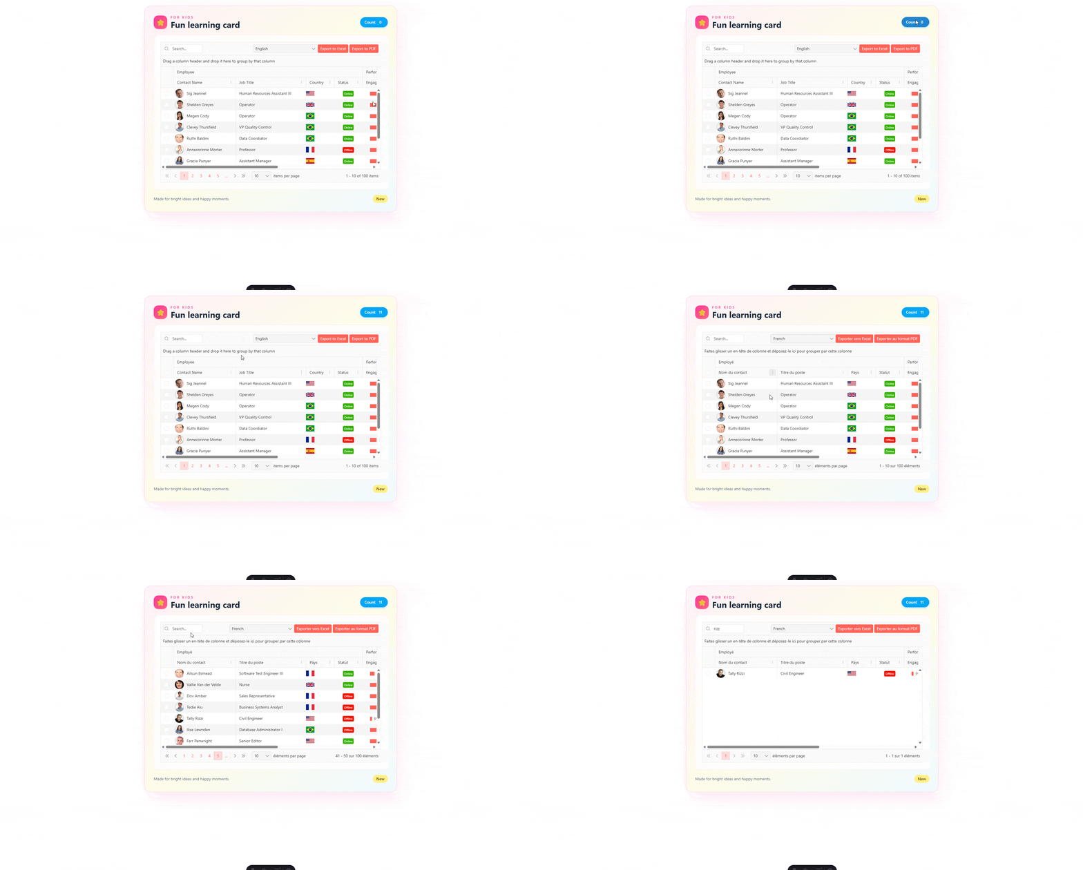
And we have Kendo UI for Vue and a Svelte Component in one!
Resources
Try Kendo UI
All the Progress Kendo UI component libraries come with a free 30-day trial so you can explore them yourself.

Jonathan Gamble
Jonathan Gamble has been an avid web programmer for more than 20 years. He has been building web applications as a hobby since he was 16 years old, and he received a post-bachelor’s in Computer Science from Oregon State. His real passions are language learning and playing rock piano, but he never gets away from coding. Read more from him at https://code.build/.
Related Posts
Comments
All articles
Topics
Web MobileMobile
Desktop
Design
Productivity
People