Turn the Lights Off. Hot New Dark Themes in UI for WPF!

Summarize with AI:
Come see the brand-new built-in Dark color variations of two of Telerik UI for WPF’s most popular themes—Material and the Visual Studio 2019! Make all your desktop WPF apps even more gorgeous.
Welcome to the dark side, people. We have cookies … and brand-new (yes, built-in 🤘) Dark color variations of two of Telerik UI for WPF’s most popular themes—Material and Visual Studio 2019! No need to look for titles like “10 desktop apps with gorgeous dark themes.” No need to crave inspiration from the dark side of UI design—we already took care of that. Now all your desktop WPF apps can become even more gorgeous.
Shall we turn the lights off and let our walk in the dark begin? Sure, but first let us discuss why even bother using a dark theme.
The Wellness of Darkness
I like to do my research first. Guess what is the most common quote that I read—“Everyone can relate to being in a room where the lights are turned down and you’ve got this white screen blinding you.” This was said by Sameer Samat, Google’s VP of product during an interview at Google I/O.
I admit, he is a hundred percent right.
When we are surrounded by darkness 👻 and we are reading on a bright screen, it can often feel like more strain is put on our eyes. We cannot usually perceive it but monitors flicker (very fast) to produce the images and text on our screens. Over time, this flickering creates glare that stresses our eye muscles and can cause digital eye strain. Common symptoms include eye strain, neck and shoulder pain, dry eyes, headache and blurred vision.
To put it short, dark mode is best for low-light environments where it can help to make the contrast between a screen and its surroundings less jarring. But this is not necessarily a one-size-fits-all solution.
Well, enough for health and well-being. Dark UI is also proven to spare some battery life. That’s it. There is no need for additional explanation here. Just enjoy the facts. 😁
And if all the above is not enough, I will share the most intrinsic reason (to me) for choosing a dark theme over a light one. It is simply a-w-e-s-o-m-e. Colors seem to just pop up better on backgrounds. My whole interaction with content when using dark mode is a lot different, like a powerful explosion. Sure there is some research that explores the correlation between the retention of users and using dark mode. It doesn’t sound that complex—eyes get less tired (particularly at night), so basically human beings are able to consume the content for longer periods (=increased productivity).
The Dark Principles
Since we know that some people prefer dark themes because they work at night (or in low light), or need it for accessibility purposes (i.e., visual impairments, migraines or other visual disorders), or simply because it is cool, let us pay attention to the most important principles behind designing such themes.
My favorite guidelines are those at the “Dark theme” article at material.io. I will briefly walk you through them.
Darken With Gray
A dark theme’s design is recommended to use dark gray rather than black—this is to express elevation and space in an environment with a wider range of depth.
Color With Accents
Dark theme UIs should apply limited color accents, so most of the space is dedicated to dark surfaces.
Conserve Energy
In products that require efficiency (such as devices with OLED screens), battery life can be conserved by reducing the use of light pixels.
Enhance Accessibility
An essential part of designing a dark theme is meeting accessibility color contrast standards. Believe me, this is a crucial for accommodating regular dark theme users (such as those with low vision). A dark theme should avoid using saturated colors, as they do not pass WCAG’s accessibility standard of at least 4.5:1 for body text against dark surfaces. Saturated colors also produce optical vibrations against a dark background, which can induce eye strain. Instead, desaturated colors can be used as a more legible alternative.
Both this section and the previous are essential to me so that you can gain better understanding of the dark themes while at the same time also appreciate the hard work of our awesome team to deliver more than expected with our latest theme gems 💎—the Material Dark and Visual Studio 2019 dark themes.
Material Darkness
It is high time that I lifted the curtain to reveal the first masterpiece of this show. Ta-da!
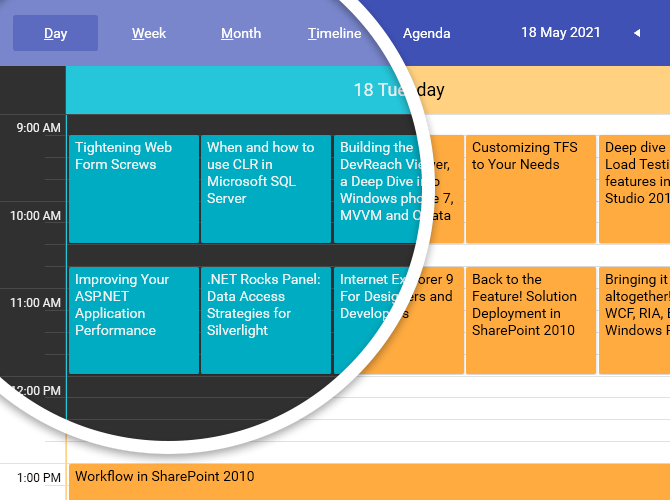
Since the R2 2021 release of the UI for WPF suite, the Material theme offers two color variations. Both correspond to the Material Design color palettes. The Light remains the default one and is based on the Indigo and Amber colors, and the new Dark is based on the Indigo and Cyan colors.
In addition to the Dark variation, the Material theme palette got expanded with a couple of new brushes—the DialogBackgroundBrush and the SelectedUnfocusedBrush. The DialogBackgroundBrush, as the name implies, is used for the background of the window and dialog elements. And the SelectedUnfocusedBrush is used for the background color of the elements in their selected, not focused state (e.g., the GridViewRow, TreeListViewRow and the TreeViewItem).
How do you apply Material Dark to your WPF app? Just add the following line before the InitializeComponent:
MaterialPalette.LoadPreset(MaterialPalette.ColorVariation.Dark);
Visual Studio Darkness
The awesome R2 2021 also brought the Dark color variation of the Visual Studio 2019 theme! Let me show it to you:
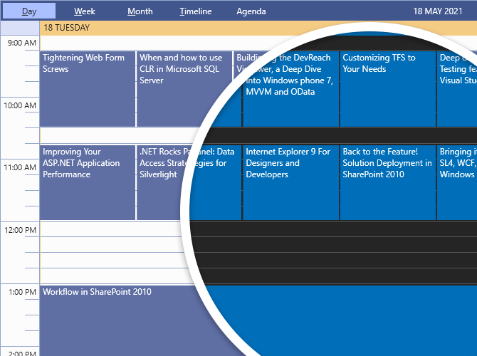
Its brushes collection also got expanded by the AccentForegroundBrush and the DockingBackgroundBrush. Again, both brushes are available for both theme variations. The AccentForegorundBrush is a variation of the AccentBrush that is used for the foreground of some elements that need to stand out—e.g., the headers of the Spreadsheet control's dialogs. The DockingBackgroundBrush is a special brush used for the background of the Docking control—one of the most specific UI controls for the look and feel of the theme (and the Visual Studio 2019 IDE).
Okay, in the previous section I showed you how to apply the Material theme’s Dark variation to your WPF app. Can you guess how to do the same for the Visual Studio 2019 theme? Again, just add the following line before the InitializeComponent:
VisualStudio2019Palette.LoadPreset(VisualStudio2019Palette.ColorVariation.Dark);
Lighter or Darker Darkness
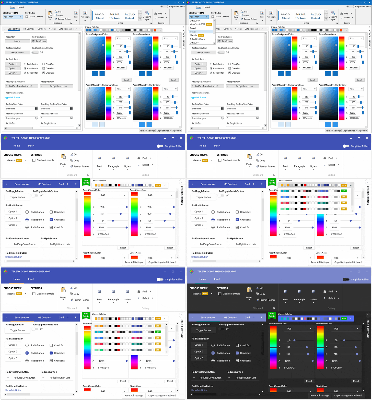
If the darkness that we offer with the new color variations for the Material and Visual Studio 2019 themes is too much … or not enough … feel free to adjust each bit of it with the Color Theme Generator sample app—it already contains the new color variations.
Oh, by the way, the Color Theme Generator got a little boost—it now provides statuses for easier identification of the new goodies. See the following GIF for a reference. The themes menu contains colorful rectangles with the status text and a badge for a new palette is visualized next to the color palettes menu on the right.
Grab yourselves the goodies:
Also, do not forget to check the help articles for both the Material and VisualStudio2019 themes in case I missed something (I am only human after all 🤷♀️).
Dark Reports
I have mentioned some time ago in my blogs that you can deliver reports with any Telerik UI for WPF theme and the Telerik ReportViewer. If there is still someone that is not familiar with this awesomeness, we have Telerik .NET ReportViewer Controls. They are responsible for delivering interactive reports directly to your desktop (or web) applications. All reports can be viewed in WPF in dark mode, too, with the latest color variations that I have talking about the last few minutes. Find an exquisite preview of the WPF’s ReportViewer with them below:
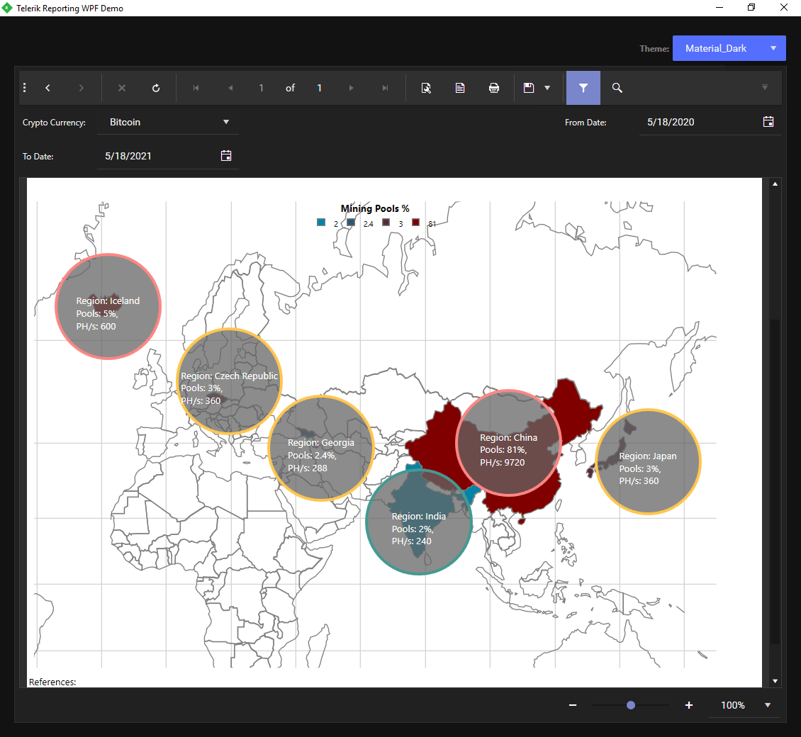
Previewing reports with the Material Dark theme
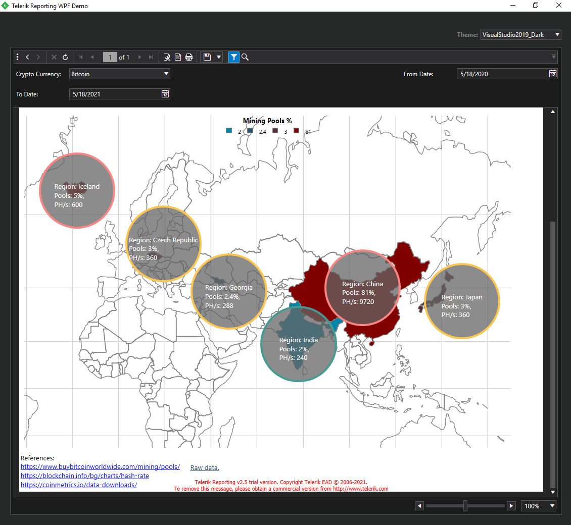
Previewing reports with the Visual Studio 2019 Dark theme
Get the latest version of the Telerik ReportViewer here.
Time for Gratitude and Feedback
Thanks to all who have taken their time to read my blog! I hope it left you eager to start using the dark color variations of the Material and Visual Studio 2019 themes by:
There are many more R2 2021 wonders to explore, so when you try them out as well, please take a minute or two to share your honest feedback in the comment section below, or head to our Feedback Portal.

Viktoria Grozdancheva
Viktoria is a Senior Front-end Developer with 5+ years of experience designing and building modern UI for desktop and mobile platforms on Microsoft/Telerik technology stacks. Her spare time is dedicated to friends and family and discovering new pieces of the world. Find her on Twitter and LinkedIn.
