Three Ways to Implement Form Dropdowns in Angular Using Kendo UI

Summarize with AI:
Installing the Kendo UI Dropdown package in your Angular application will give you access to other components like the Autocomplete, Combobox, Dropdown Select, etc. In this article, we’ll see how we can work with these components in our Angular application.
Kendo UI is a library used for building applications at a faster pace. It provides UI components for libraries like jQuery, Angular, React and Vue, and it comes packed with over 20 components for creating charts, data tables and drag-and-drop pages. The library is easily customizable and provides a set of themes for Material UI, Bootstrap, etc.
Kendo UI components are distributed as multiple npm packages so there’s no fear of bloating your application with unnecessary components and increasing your build bundle. It offers components for managing large data sets and for easy data visualization.
The Dropdown components provided by Kendo UI are useful for implementing autocomplete fields and more sophisticated versions of the native select element. Installing the Dropdown package in your Angular application will give you access to other components like the Autocomplete, Combobox, Dropdown Select, etc. In this article, we’ll see how we can work with these components in our Angular application.
To follow this tutorial, a basic understanding of Angular is required. Also, ensure you have Node installed on your personal computer. If you have no prior knowledge of Angular, kindly follow the official tutorial here and download Node for your PC here if you haven’t already.
We’ll be using these tools to build our application:
Initializing Application and Installing Dependencies
To get started, we will use the CLI (command line interface) provided by the Angular team to initialize our project.
First, install the CLI by running npm install -g @angular/cli. npm is a package manager used for installing packages. It will be available on your PC if you have Node installed; if not, download Node here.
To create a new Angular project using the CLI, open a terminal and run:
ng new kendo-dropdowns --style=scss
This command is used to initialize a new Angular project; the project will be using SCSS as the pre-processor.
Next, run the following command in the root folder of the project to install dependencies:
ng add @progress/kendo-angular-dropdowns
Open a terminal inside the project folder and start the application by running ng serve. If you open your browser and visit the link http://localhost:4200, you should see the screenshot below if everything went well.
AutoComplete Component
This component is great for handling input with a lot of options. It provides an input field where the user types in a search value and the component brings up a list of suggestions that are similar to the search value. This component supports grouping, filtering, data binding and more. To get started, open the app.component.html file within your project and replace the contents with the snippet below:
<kendo-autocomplete placeholder="Enter a name... "></kendo-autocomplete>
This will render a simple AutoComplete component. If you navigate to http://localhost:4200, you should see it in full flow.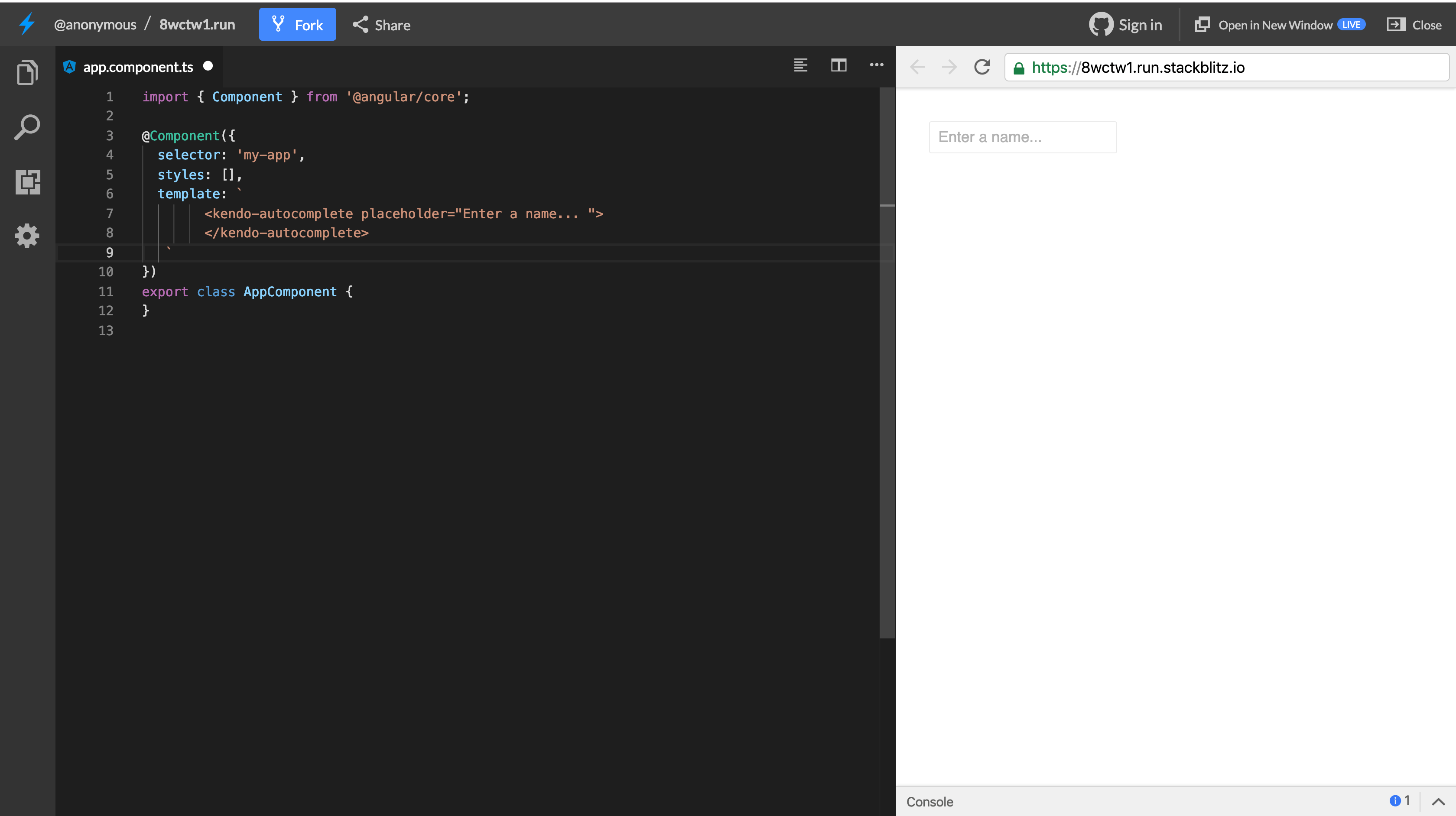
The component won’t really do much in its current state. We wish to pass data values to the component and get the user’s selection in the component. To achieve this, we’ll make use of bindings. You can pass a value to the component’s value binding and the component will display the bound value.
Update the app.component.ts file to create a new property to be bound to the date picker component. Open the file and create a property called today:
    // src/app/app.component.ts

    import { Component } from '@angular/core';
    @Component({
      selector: 'app-root',
      templateUrl: './app.component.html',
      styleUrls: ['./app.component.scss'],
    })
    export class AppComponent {
      name = 'Peter'
    }
Then, update the template file to use the value on the AutoComplete component. Open the app.component.html file and update it to add a value binding to the date picker:
<kendo-autocomplete placeholder="Enter a name... " [value]="name"></kendo-autocomplete>
AutoComplete components were built to provide a user with suggestions as they type. We don’t necessarily have a large dataset to suggest to the user, but we can provide the component with a list of names to filter through. The names array will be bound to the component’s data input binding.
Update the component file to create the names array. Open the app.component.ts file and copy the content below into it:
    // src/app/app.component.ts

    import { Component } from '@angular/core';
    @Component({
      selector: 'app-root',
      templateUrl: './app.component.html',
      styleUrls: ['./app.component.scss'],
    })
    export class AppComponent {
      name = 'Peter';
      names = [
        'John',
        'Mary',
        'Hannah',
        'Richard',
        'Rosy',
        'Peter',
      ]
    }
Then attach the data binding on the AutoComplete element. Open the app.component.html file and update the contents to be similar to the snippet below:
<kendo-autocomplete placeholder="Enter a name... " [value]="name" [data]="names"></kendo-autocomplete>
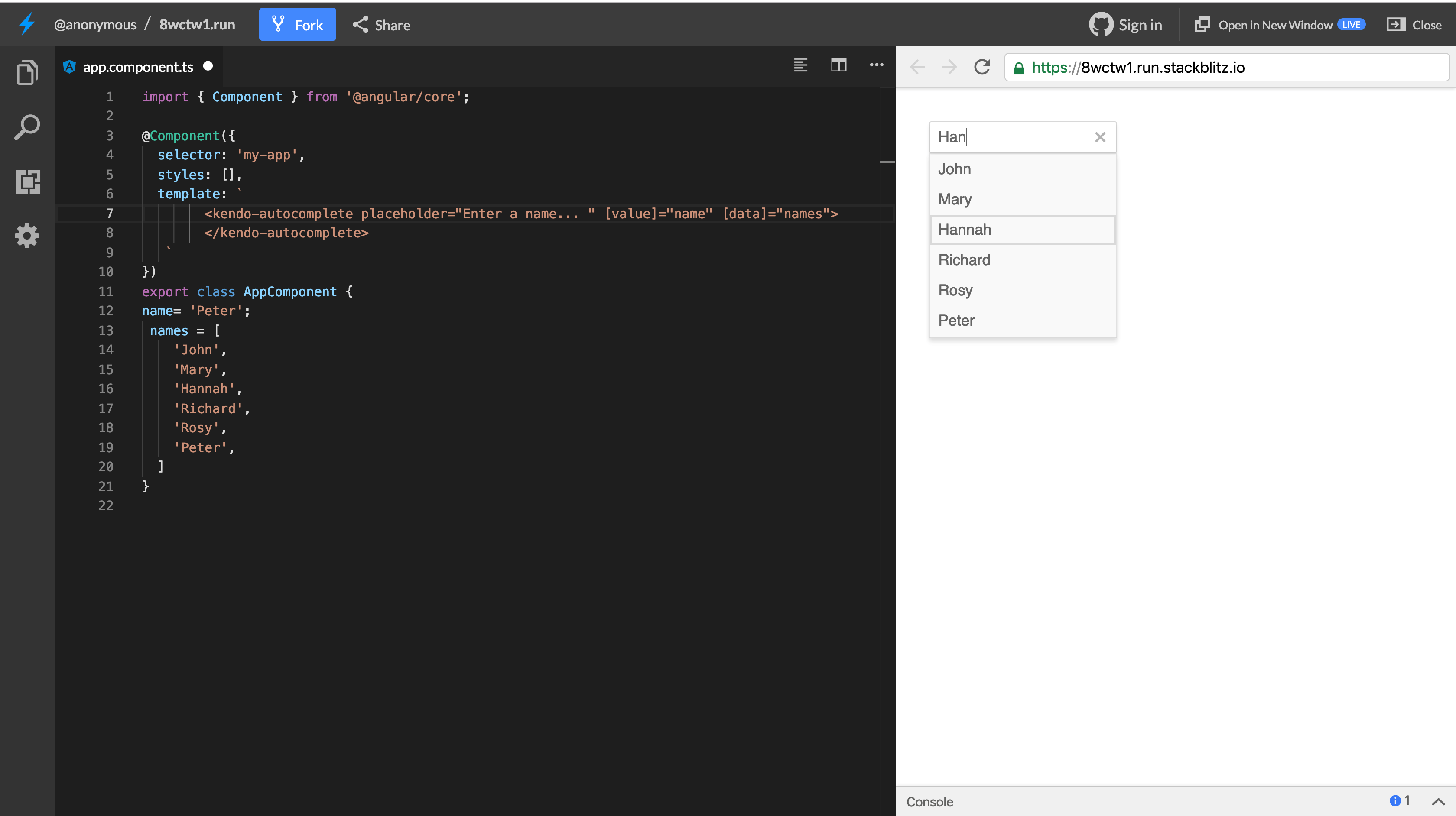
With this update, we can pass values from the component file to the template, but a user’s entry won’t be updated because we used one-way binding. To pass values from component to the view and vice versa, we’ll have to update the value binding.
Update the app.component.html file to use two-way binding:
<kendo-autocomplete placeholder="Enter a name... " [(value)]="name" [data]="names"></kendo-autocomplete>
We can also use Reactive Forms with the AutoComplete component. Create a FormGroup to manage the name FormControl value and assign the name property to a FormControl. Update the app.component.html file to be similar to the snippet below:
    // app.component.html
    <form [formGroup]="form" (submit)="onSubmit()">
      <kendo-autocomplete placeholder="Enter a name... " formControlName="name" [data]="names"></kendo-autocomplete>
      <button type="submit">log</button>
    </form>
In the snippet above, we’re using the Reactive Forms approach by creating a FormGroup to manage form controls. This model-driven approach will ensure that values are synced between the view and component.
Update the app.component.ts file to create the FormGroup property:
    import { Component } from '@angular/core';
    import {FormControl, FormGroup} from '@angular/forms';
    @Component({
      selector: 'app-root',
      templateUrl: './app.component.html',
      styleUrls: ['./app.component.scss'],
    })
    export class AppComponent {
      name = "Peter";
      names = [
        'John',
        'Mary',
        'Hannah',
        'Richard',
        'Rosy',
        'Peter',
      ]
      form = new FormGroup({
        name: new FormControl(this.name)
      })
      onSubmit(){
        console.log(this.form.value)
      }
    }
To use the Reactive Forms, you have to import the ReactiveFormsModule into the app.module.ts file:
    //src/app/app.module.ts

    import { BrowserModule } from '@angular/platform-browser';
    // ... other imports

    import { ReactiveFormsModule } from '@angular/forms';

    @NgModule({
      declarations: [
        // ...
      ],
      imports: [
        // ...
        ReactiveFormsModule,
      ],
      providers: [],
      bootstrap: [AppComponent],
    })
    export class AppModule {}
After this update, you can click the submit button after updating the date picker to log the updated values to the console.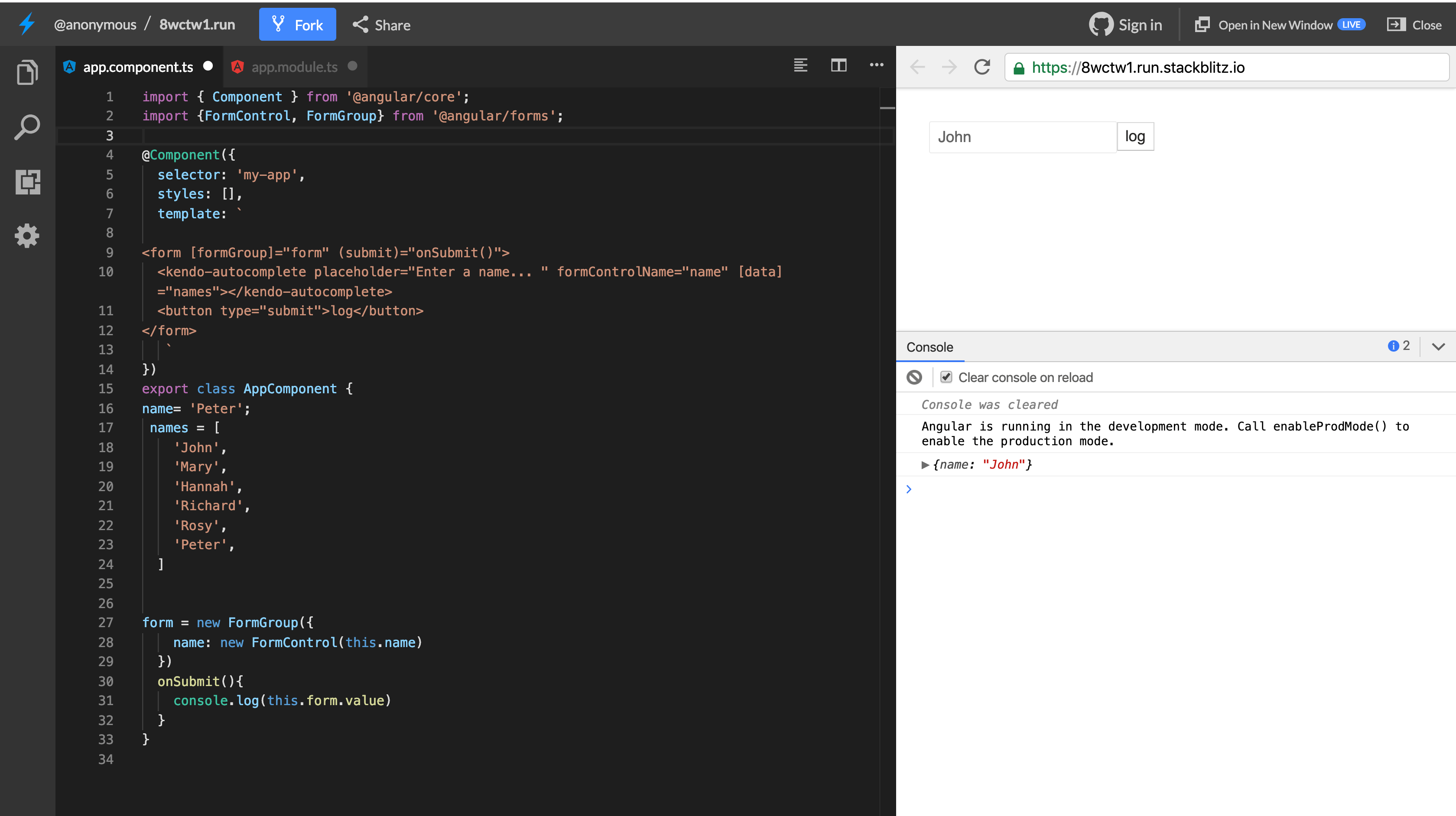
Filtering Data
The AutoComplete component provides a filterChange method that is triggered whenever the search value changes. Using the trigger, you can set up a custom handler to dynamically fetch the data from your data source. Let’s see how we can make use of this output binding to fetch data from an external source.
In the app.component.ts file, we’ll implement a simple search query to the RestCountries API to fetch the countries that contain letters matching the search query:
    import { Component } from '@angular/core';
    import {FormControl, FormGroup} from '@angular/forms';
    @Component({
      selector: 'app-root',
      templateUrl: './app.component.html',
      styleUrls: ['./app.component.scss'],
    })
    export class AppComponent {
      name = '';
      apiUrl = 'https://restcountries.eu/rest/v2/name/';
      countries = [
      ]
      handleFilter(value) {
        this.http.get(`${this.apiUrl}${value}`).subscribe((res: any) => {
          const results = res.map(country => country.name);
          this.countries = results;
        })
      }
      form = new FormGroup({
        name: new FormControl(this.name)
      })
      onSubmit() {
        console.log(this.form.value)
      }
    }
Here, we listen for the filterChange trigger, and then we’ll query the endpoint using the value entered by a user. When the response is returned, we’ll map through the data to create an array of country names. After the map, the array will be set to the countries.
Then update the template to listen for the filterChange event and also to set the filterable value to true which will enable this functionality:
    <form [formGroup]="form" (submit)="onSubmit()">
      <kendo-autocomplete placeholder="Enter a name... " formControlName="name" [data]="countries" (filterChange)="handleFilter($event)"[filterable]="true"></kendo-autocomplete>
      <button type="submit">log</button>
    </form>
Then update the app.module.ts file to include the HttpClientModule:
    //src/app/app.module.ts

    import { BrowserModule } from '@angular/platform-browser';
    // ... other imports
    import { HttpClientModule } from '@angular/common/http';

    @NgModule({
      declarations: [
        // ...
      ],
      imports: [
        // ...
        HttpClientModule,
      ],
      providers: [],
      bootstrap: [AppComponent],
    })
    export class AppModule {}
After this change, you can visit http://localhost:4200 to view the latest changes: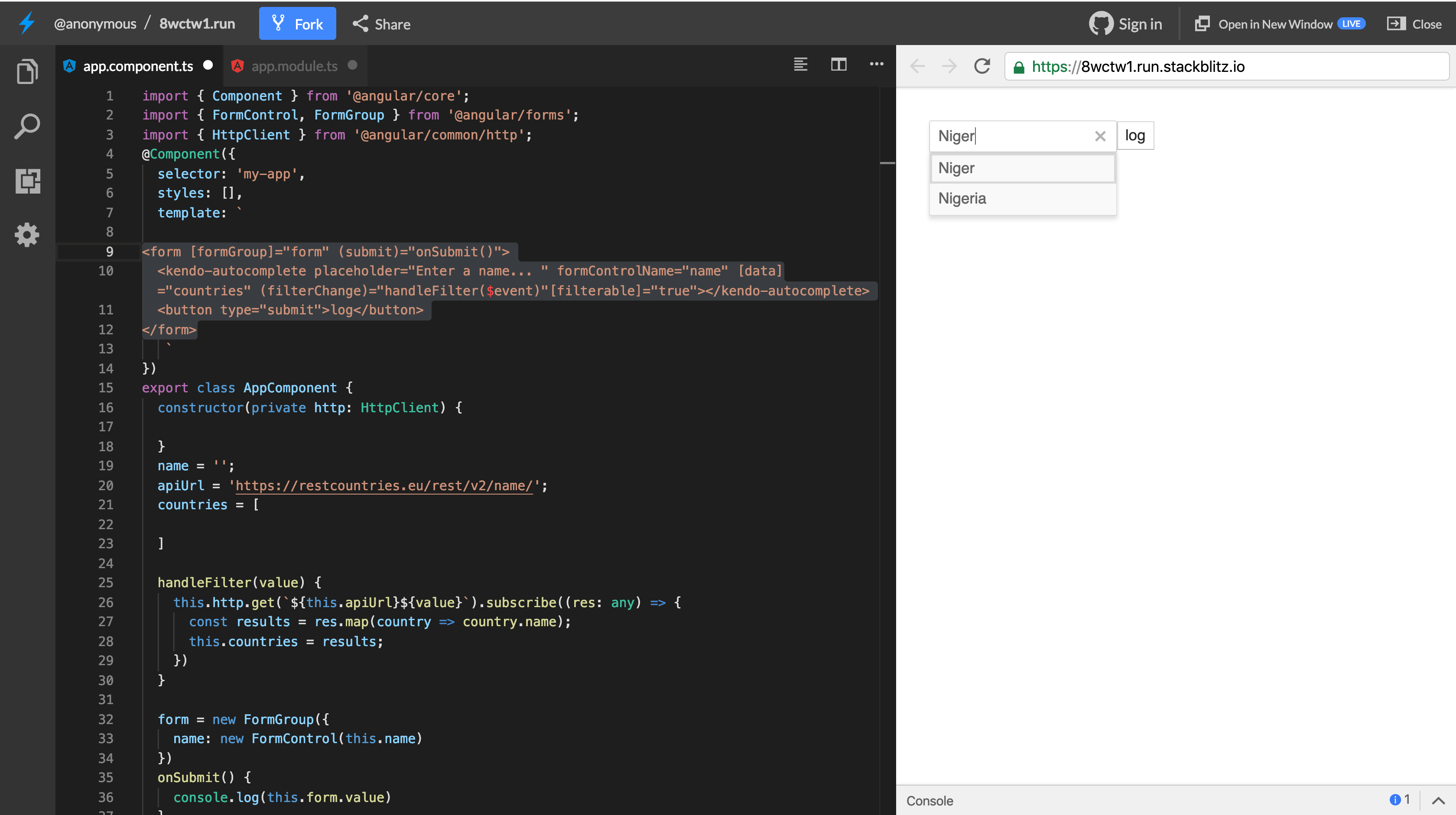
Grouping Data
The component can also take grouped data. You can create grouped data using the groupBy function provided by Kendo UI. Update the component file to group the results returned from the API by continent.
    import { Component } from '@angular/core';
    import { FormControl, FormGroup } from '@angular/forms';
    import { HttpClient } from '@angular/common/http';
    import { DataResult, groupBy } from '@progress/kendo-data-query';
    @Component({
      ..
    })
    export class AppComponent {
      ...
      countries: DataResult[];
      handleFilter(value) {
        this.http.get(`${this.apiUrl}${value}`).subscribe((res: any) => {
          const results = res.map(country => ({name: country.name, continent: country.region}));
          this.countries = groupBy(results, [{field: "continent"}]);
        })
      }
     ...
    }
Next, update the app.component.html file to display the required valueField. Now that the array contains objects, we’ll need to tell the component which field within the object to display. Open the app.component.html file and update it like below:
    <form [formGroup]="form" (submit)="onSubmit()">
      <kendo-autocomplete placeholder="Enter a name... " formControlName="name" [data]="countries" (filterChange)="handleFilter($event)"[filterable]="true" [valueField]="'name'"></kendo-autocomplete>
      <button type="submit">log</button>
    </form>
If you’ve noticed, we added a valueField binding to render the proper object field. When you visit http://localhost:4200, you can see how the countries are grouped by continents: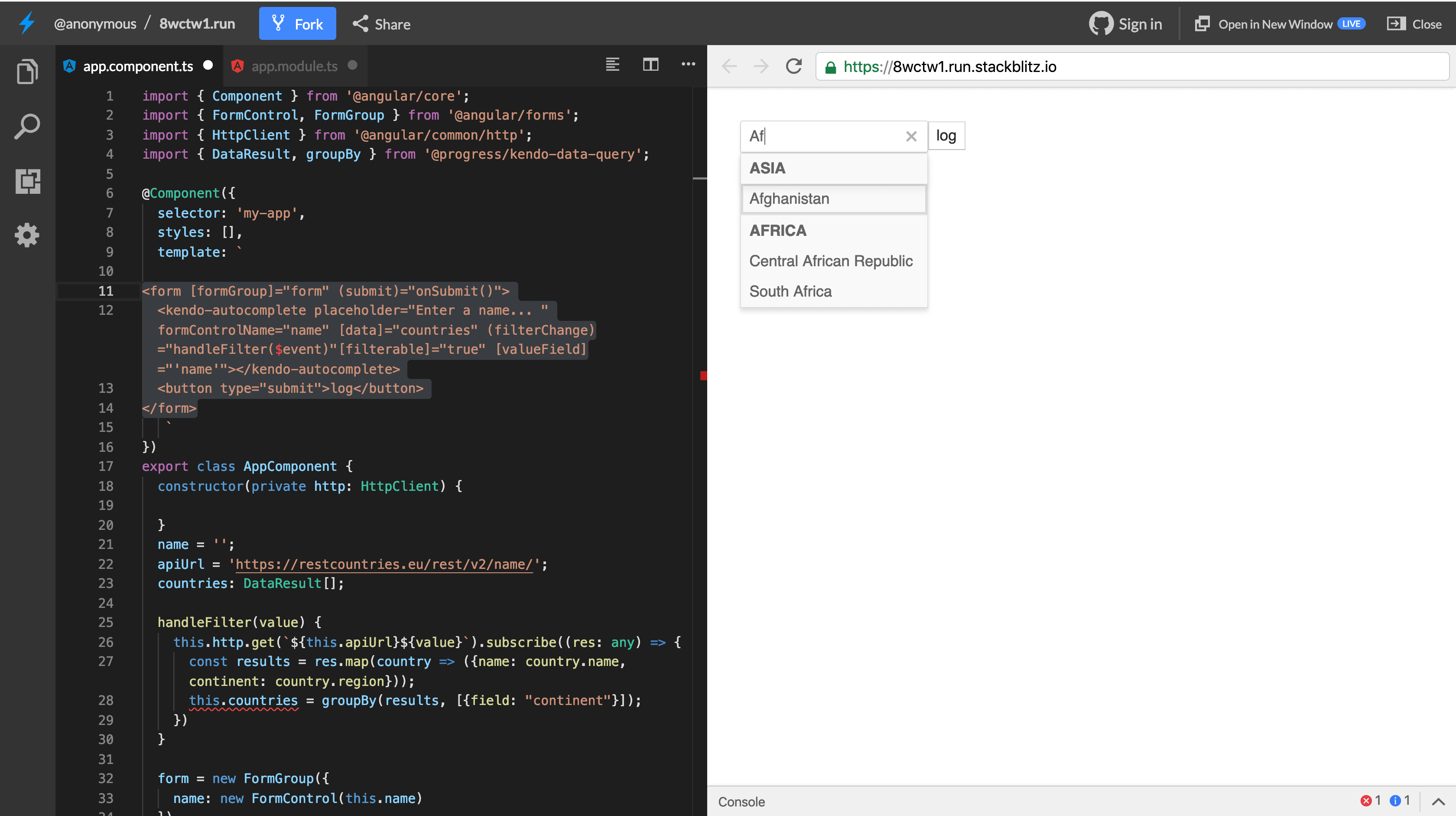
You can visit the official documentation for the AutoComplete component here. Next, we’ll look into the ComboBox component.
ComboBox Component
The ComboBox component is simply used for searching and selecting from a list of options. It’s like an advanced version of the native select element with support for filtering, data binding and entering of custom values.
Open the app.component.html file and update it to render the ComboBox component. You can comment out the previous component for now:
<kendo-combobox></kendo-combobox>
Similar to the AutoComplete component, the ComboBox component works with a data input that receives a dataset. Also, ComboBox can be assigned an initial value. Let’s update the component to take a list of data and an initial value:
<kendo-combobox [data]="names"></kendo-combobox>
Update the app.component.ts file to create the list of names property being used in the template:
    import { Component } from '@angular/core';
    import {FormControl, FormGroup} from '@angular/forms';
    @Component({
      selector: 'app-root',
      templateUrl: './app.component.html',
      styleUrls: ['./app.component.scss'],
    })
    export class AppComponent {
      ...
      names = [
        'John',
        'Mary',
        'Hannah',
        'Richard',
        'Rosy',
        'Peter',
      ]
    }
After this update, when you navigate to http://localhost:4200, you can see ComboBox component in full flight. We can both admit that it looks really similar to the AutoComplete component: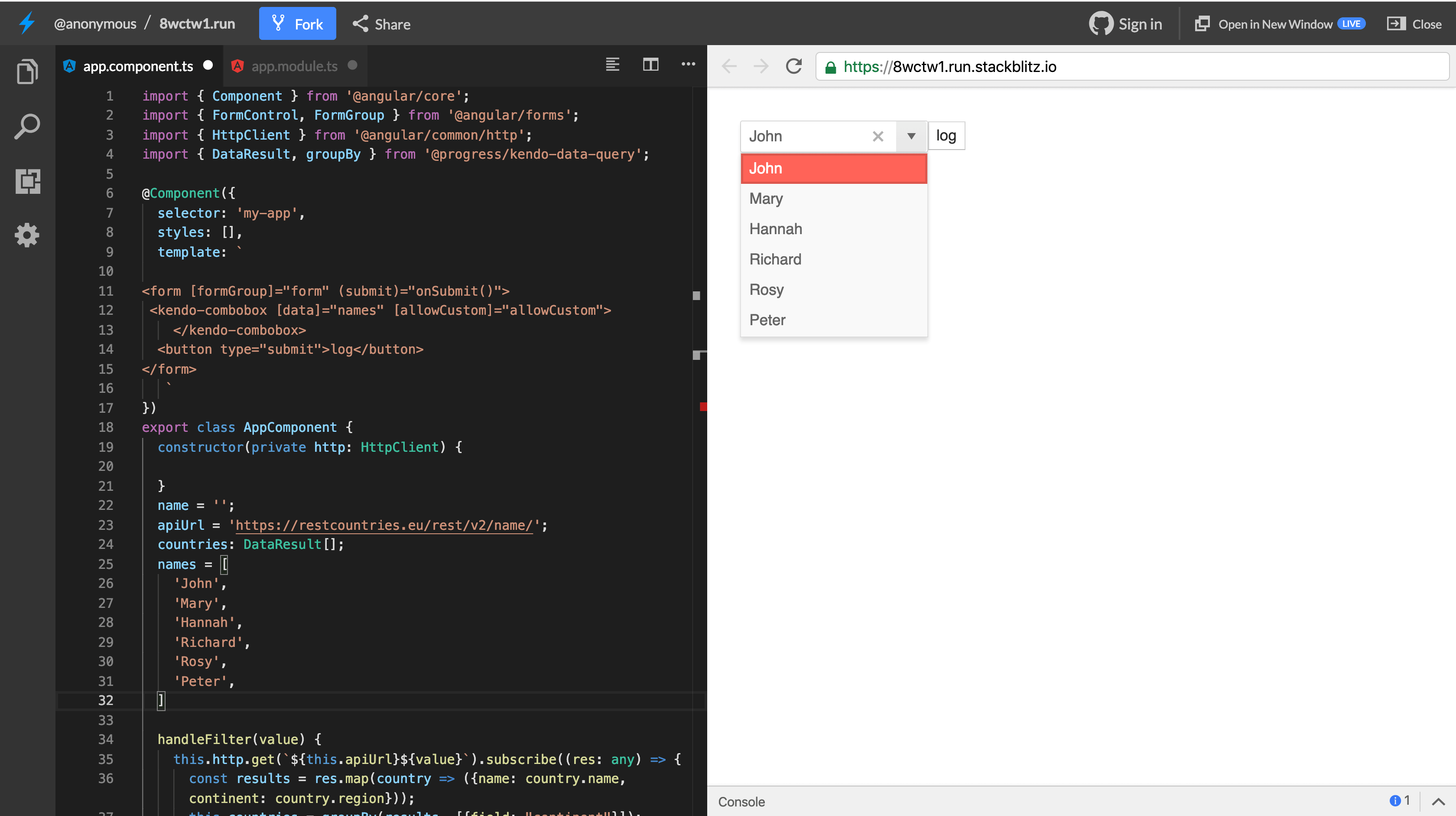
For data-binding, the ComboBox supports two-way binding using the value attribute and the Reactive Forms approach using FormGroup and FormControls. We can update the component to render it in a form and make use of form controls to get the value of the component.
    // app.component.html
    <form [formGroup]="form" (submit)="onSubmit()">
     <kendo-combobox [data]="names" [suggest]="true" formControlName="name"></kendo-combobox>
      <button type="submit">log</button>
    </form>
In the snippet above, we’re using the Reactive Forms approach by creating a FormGroup to manage form controls. This model-driven approach will ensure that values are synced between the view and component.
You can also handle the auto-suggestion of values to fill in a result related to the user’s current entry. The component takes a suggest attribute that can be set to true to achieve this: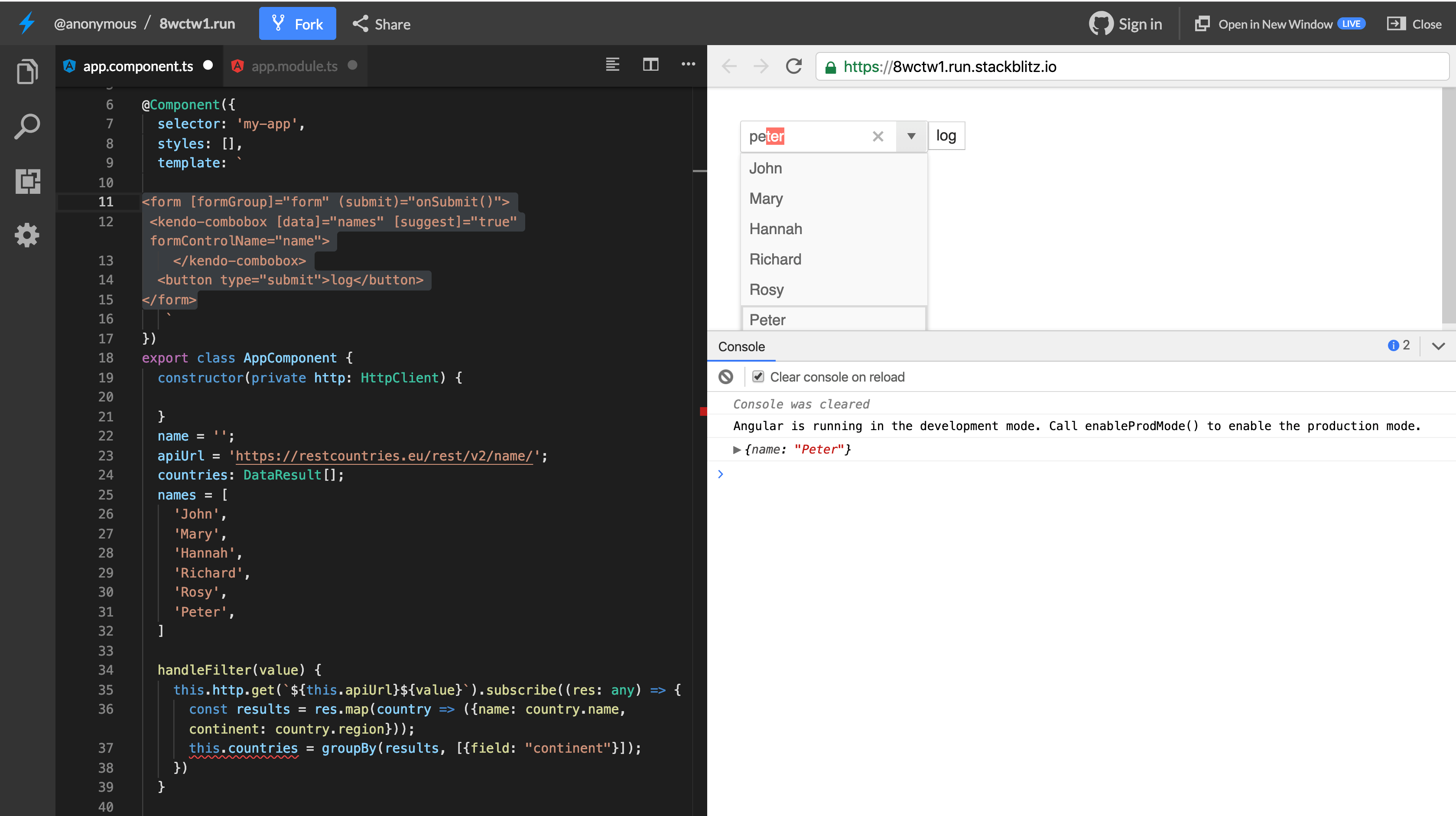
To handle custom filtering, the ComboBox uses a similar style to the AutoComplete component by triggering an event filterChange when filterable is set to true on the component. You can read more on the features of the ComboBox component here. Next, we’ll look at the MultiSelect component, which is very similar to the default select element on the browser.
MultiSelect Component
The MultiSelect component is useful for searching through a list of data and selecting multiple values. It is a richer version of the native select element that lets the user make multiple selections.
Again, update the app.component.html file to render the calendar to the component. Copy the snippet below into the file:
<kendo-multiselect [data]="names"></kendo-multiselect
It’s as simple as that. This renders a simple select view where multiple values can be selected: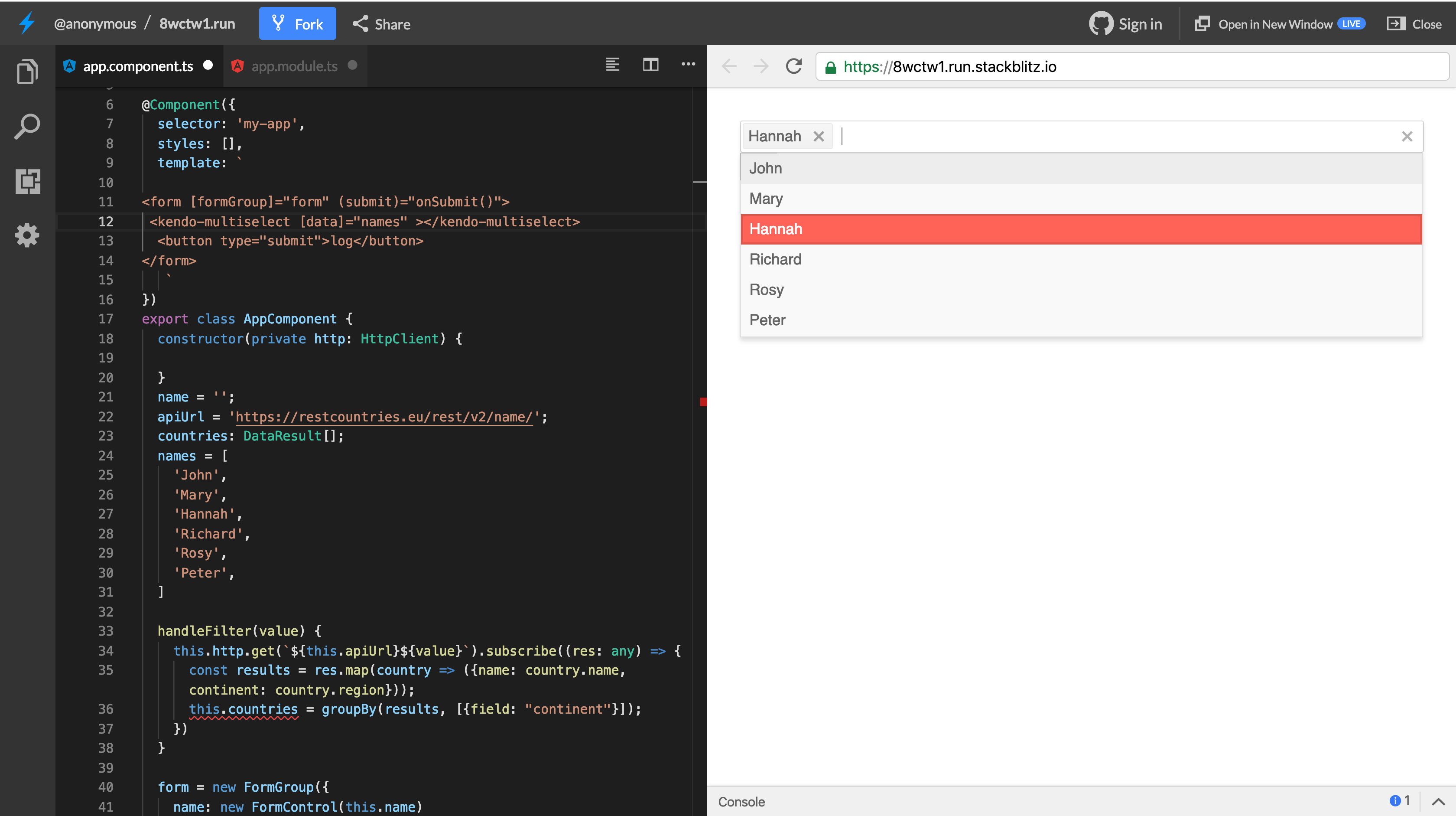
To get the values from the component, we can use two-way binding to attach and get the value from the component. Update the component to take a value binding:
<kendo-multiselect [data]="names" [(value)]="selectedNames"></kendo-multiselect>
With this update, whenever values are selected, the new value will be attached to the selectedNames property in the template and the component.
Update the component file to create the selectedNames property:
    import { Component } from '@angular/core';
    import {FormControl, FormGroup} from '@angular/forms';
    @Component({
      selector: 'app-root',
      templateUrl: './app.component.html',
      styleUrls: ['./app.component.scss'],
    })
    export class AppComponent {
      ...
      selectedNames = [];
    }
Every newly selected value is added to the selectedNames array. We can log this to the console to see how this works: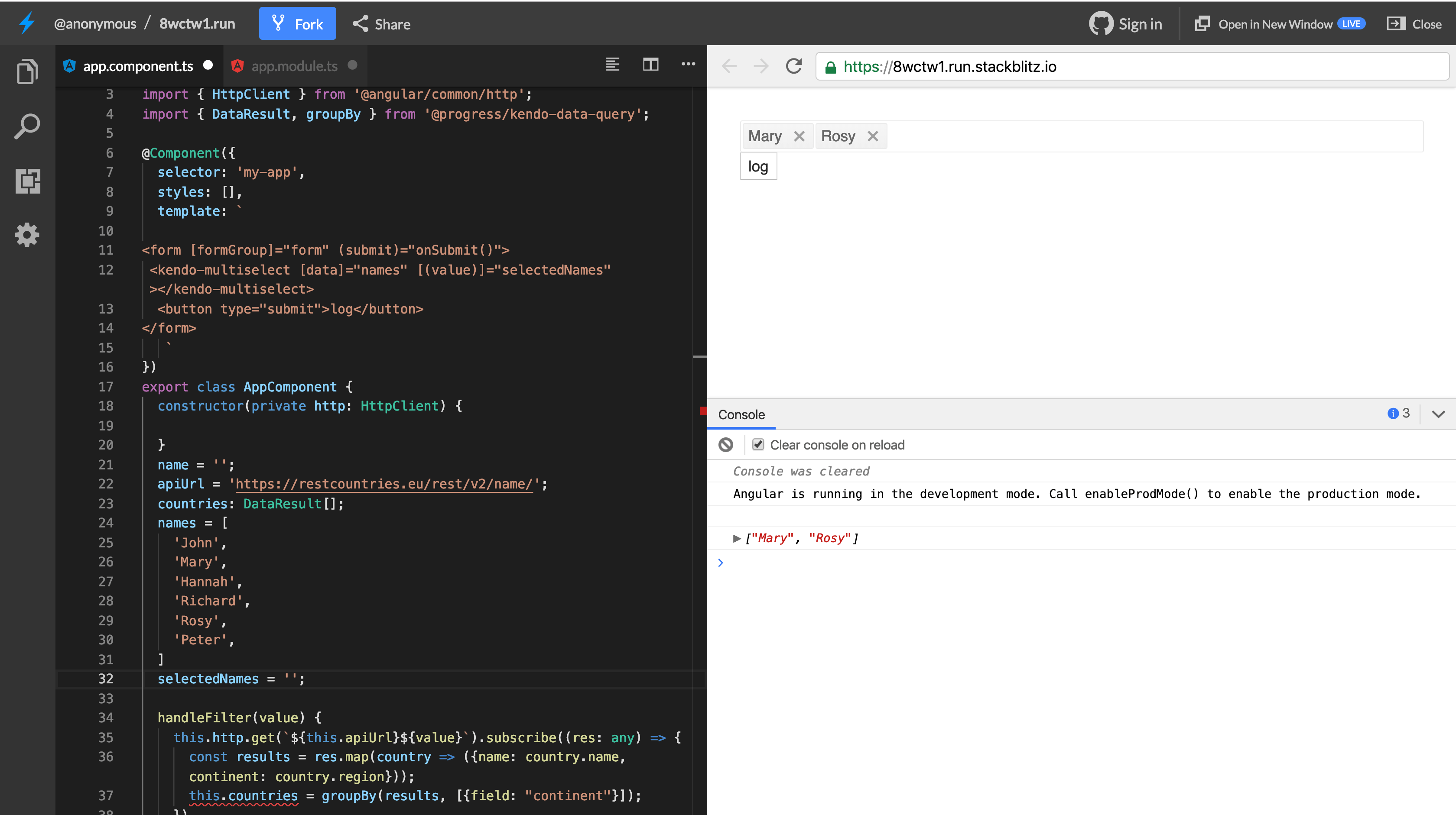
The multiselect component can also be used in combination with FormGroup and FormControl to handle user input.
The MultiSelect component handles filtering and grouping the same as the AutoComplete component, by triggering an event filterChange when filterable is set to true on the component.
This component is a vital tool when working with fields that require multiple values, and Kendo UI’s implementation of the MultiSelect value allows for seamless integration into forms and for low-level access to the component’s events and triggers. You can read more on the features of the MultiSelect component here.
Conclusion
Kendo UI has a range of components in its arsenal, and the dropdown components are useful for selecting values from a list of options. We’ve seen how to pass and receive values from the AutoComplete, ComboBox and Multiselect components. We also saw how we can use the Reactive Forms approach when working with these components within forms using FormGroup and FormControl. You can visit the documentation on the Dropdown components here.

Christian Nwamba
Chris Nwamba is a Senior Developer Advocate at AWS focusing on AWS Amplify. He is also a teacher with years of experience building products and communities.
