
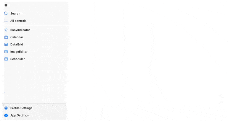
Telerik UI for .NET MAUI NavigationView—Achieve Adaptive Layout in a Cross-Platform Application

Summarize with AI:
The key to a cross-platform app is an adaptable navigation menu. See how the Telerik UI for .NET MAUI NavigationView component makes hamburger menu buttons to navigation drawers a breeze.
Hamburger menu, navigation drawer, navigation view—no matter what this component is called, its main purpose is to have the menu as the top-level navigation within your app and have all the content arranged in separate items.
You can see this method of organizing an app all the way from phones to tablets to desktop to web apps as this is the way to deliver an adaptive layout.
On phone screens, it can be just a button that when clicked displays the menu as an overlay over the content and goes away when not needed. On slightly bigger screens, it can be a sliver on the side that can be expanded when needed. And on the big screens that desktop applications offer, it can stay expanded all the time.
So now this component is part of Progress Telerik UI for .NET MAUI to enable you achieving adaptive layout in cross-platform applications, no matter whether you are targeting Windows, iOS, Android or macOS.
Telerik for .NET MAUI NavigationView comes with:
- Three display modes and a rich API to control the modes
- Customizable header, footer and navigation button
- Selection
- Events and Commands
- Rich styling capabilities
Let’s Start and Add It to the .NET MAUI Application
As with any of the other UI components from the Telerik UI for .NET MAUI suite, adding Telerik NavigationView is simple and can be done in three steps:
- Download and install Telerik UI for .NET MAUI.
- Call the
UseTelerik()method inside the Maui Program.cs file of your .NET MAUI project. This is needed for all Telerik UI for .NET MAUI components asUseTelerik()registers all built-in or additionally created handlers to the Telerik components. - Define the component:
<telerik:RadNavigationView  x:Name="navigationView">
</telerik:RadNavigationView>
Add and Configure Navigation Items
Then to achieve the desired navigation we can add as many navigation items as we need:
<telerik:RadNavigationView  x:Name="navigationView">
  <telerik:RadNavigationView.Items>
    <telerik:NavigationViewItem  Text="Item 1"  />
    <telerik:NavigationViewItem  Text="Item 2"  />
    <telerik:NavigationViewItem  Text="Item 3"  />
    <telerik:NavigationViewItem  Text="Item 4"  />
    <telerik:NavigationViewItem  Text="Item 5"  />
  </telerik:RadNavigationView.Items>
</telerik:RadNavigationView>
We can add them directly to the Items collection as shown above or use DataBinding and bind them to the ItemsSource property. You can find more about data binding the Telerik NavigationView and full example in the Data Binding article.
But at this stage, nothing will be in the heart of the component. That is why we need to place the content too.
<telerik:RadNavigationView.Content>
  <Label  HorizontalOptions="Center"
      VerticalOptions="Center"
      Text="{Binding SelectedItem.Text, Source={x:Reference navigationView}}"  />
</telerik:RadNavigationView.Content>
Now, more about the navigation items. The NavigationViewItem offer the following properties to modify:
- Text – The text to be displayed
- IsSelected – Shows whether the navigation is selected
- ImageSource – Gives us the ability to add an image
- IsSelectable – By default True, we can specify it to False to disable the end user from selecting the item but still allow them to click on it
- IsEnabled – Disables it completely from end user’s gesture
- Position – By default every navigation item is part of the “Content” which means it’s rendered as a regular navigation item, but this value allows it to be set to Header and Footer
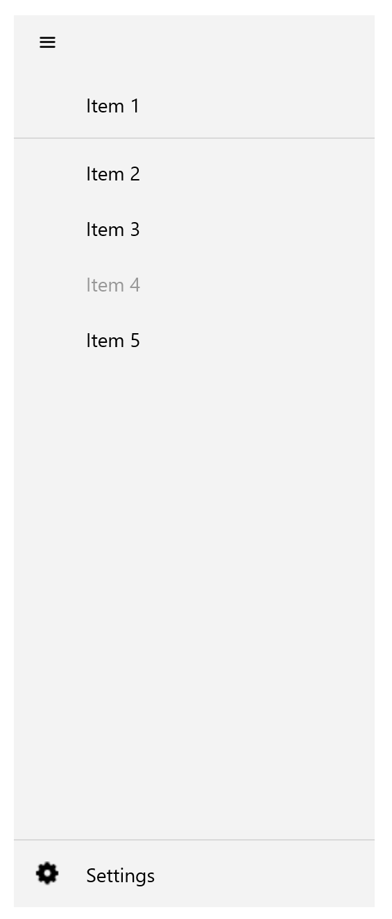
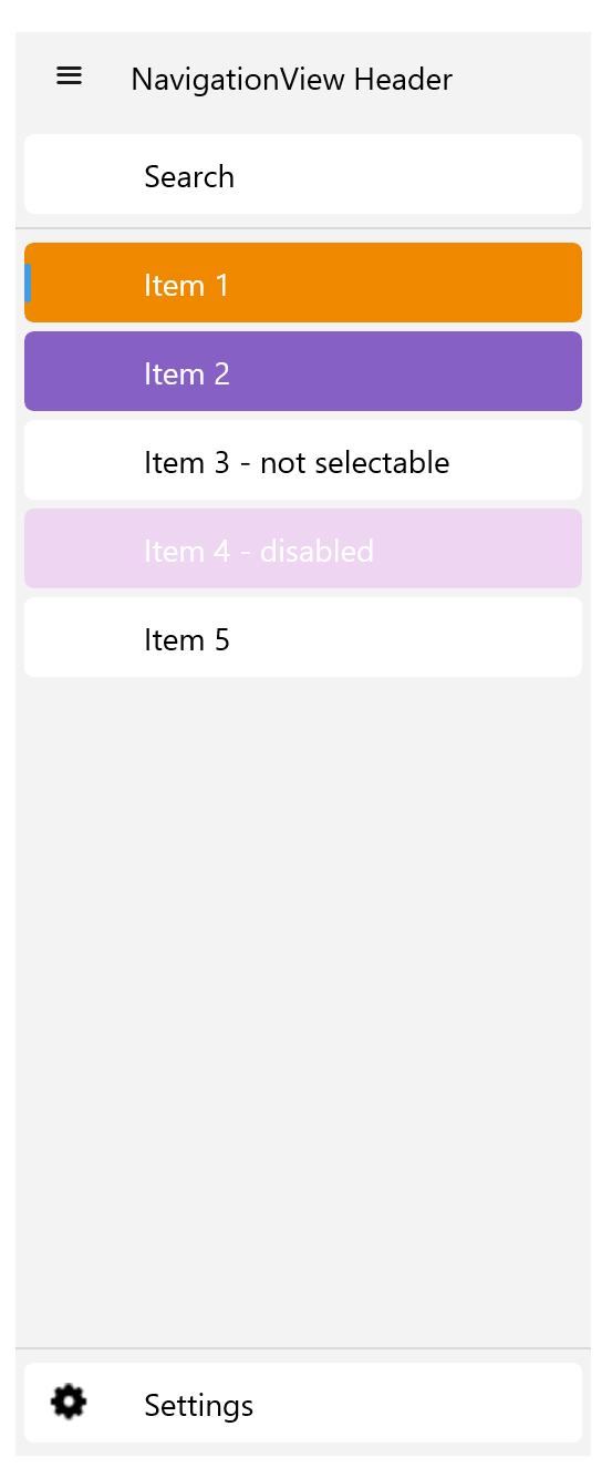
Let’s play with them. For example, let’s add an image to the last item and set its position to the Footer; then move the first item to the Header; and change the third’s IsEnabled and the fourth’s IsSelectable. The only item that is not modified is the second item, Item 2.
<telerik:RadNavigationView x:Name="navigationView">
  <telerik:RadNavigationView.Items>
    <telerik:NavigationViewItem Text="Item 1"
        Position="Header"
        IsSelectable="False">
    </telerik:NavigationViewItem>
    <telerik:NavigationViewItem Text="Item 2" />
    <telerik:NavigationViewItem Text="Item 3" />
    <telerik:NavigationViewItem Text="Item 4" IsEnabled=”False”/>
    <telerik:NavigationViewItem Text="Item 5" />
      <telerik:NavigationViewItem Text="Settings"
          Position="Footer"
          IsSelectable="False">
        <telerik:NavigationViewItem.ImageSource>
          <FontImageSource Glyph="{x:Static telerik:TelerikFont.IconMore}"
              FontFamily="{x:Static telerik:TelerikFont.Name}"
              Size="16" />
        </telerik:NavigationViewItem.ImageSource>
    </telerik:NavigationViewItem>
  </telerik:RadNavigationView.Items>
  <Label HorizontalOptions="Center"
      VerticalOptions="Center"
      Text="{Binding SelectedItem.Text, Source={x:Reference navigationView}}" />
</telerik:RadNavigationView>
And here it is the result:
Find a full example and details in the Getting Started documentation article.
Configure the Display Modes
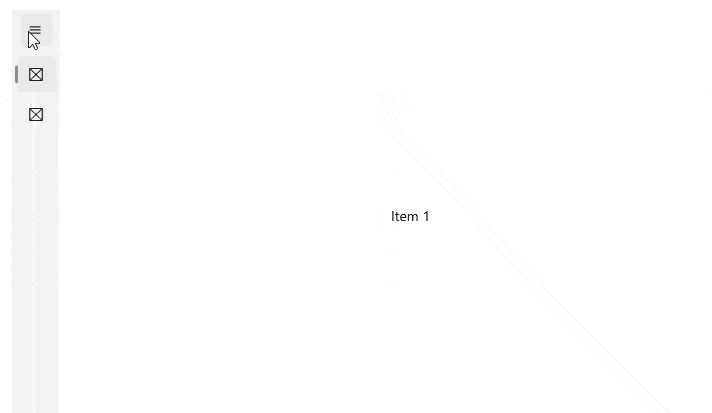
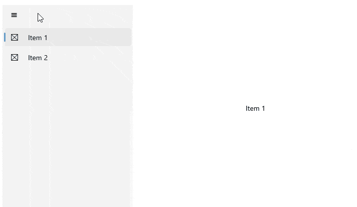
By default, the Telerik NavigationView for .NET MAUI automatically changes its DisplayMode depending on the amount of available size. It has three display modes—minimal, compact and expanded.
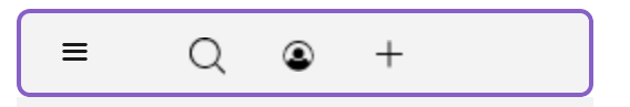
Compact mode – Displays only the images of the items:
Expanded – Expands the items to their full size, showing both image and text:
Minimal – Just a button that, when clicked, displays the menu, as you’d expect a hamburger button to work:
By default, the control changes its DisplayMode when its size passes certain thresholds. The CompactModeThresholdWidth and ExpandedModeThresholdWidth properties specify the breakpoints at which the display mode changes. The default value for the compact one is 641, and the default value for the expanded is 1008. You can modify these values to customize the adaptive display mode behavior.
If you want to control this adaptive behavior, you can do that. The important thing that you need to do is set the AutoChangeDisplayMode property to False and then use the properties to configure it.
For example, you can set the DisplayMode to Compact like this:
DisplayMode="Compact"
AutoChangeDisplayMode="False"
CompactModeThresholdWidth="20"
Customization & Styling
Now, let’s play with the look and feel more. You can define custom styles for:
- Header
- Navigation button
- Pane (the area containing the navigation items)
- Navigation items
Styling the Header
Let’s start with the Header. We can use the HeaderText, HeaderTemplate and HeaderStyle targeting TargetType="telerik:NavigationViewHeader" to achieve the desire look and feel.
For example here how we can use HeaderTemplate and HeaderStyle to add Telerik ToolBar to the header:
<ResourceDictionary>
  <!-- >> navigationview-headertemplate -->
  <DataTemplate x:Key="headerTemplate">
    <telerik:RadBorder BackgroundColor=
        {TemplateBinding BackgroundColor}"
        Background="{TemplateBinding Background}"
        BorderColor="{TemplateBinding BorderColor}"
        BorderBrush="{TemplateBinding BorderBrush}"
        BorderThickness="{TemplateBinding BorderThickness}"
        CornerRadius="{TemplateBinding CornerRadius}">
      <Grid ColumnDefinitions="Auto, *"
          ColumnSpacing="{OnPlatform WinUI=4}">
        <Grid WidthRequest="{TemplateBinding CompactWidth}"
            IsVisible="{TemplateBinding IsHeaderButtonVisible}">
          <telerik:RadToolbar BorderThickness="0">
            <telerik:ButtonToolbarItem >
              <telerik:ButtonToolbarItem.ImageSource>
                <FontImageSource Glyph="{x:Static telerik:TelerikFont.IconSearch}"
                    FontFamily="{x:Static telerik:TelerikFont.Name}"
                    Size="16" />
              </telerik:ButtonToolbarItem.ImageSource>
            </telerik:ButtonToolbarItem>
            <telerik:ButtonToolbarItem >
              <telerik:ButtonToolbarItem.ImageSource>
                <FontImageSource Glyph="{x:Static telerik:TelerikFont.IconAuthor}"
                    FontFamily="{x:Static telerik:TelerikFont.Name}"
                    Size="16" />
              </telerik:ButtonToolbarItem.ImageSource>
            </telerik:ButtonToolbarItem>
            <telerik:ButtonToolbarItem>
              <telerik:ButtonToolbarItem.ImageSource>
                <FontImageSource Glyph="{x:Static telerik:TelerikFont.IconAdd}"
                    FontFamily="{x:Static telerik:TelerikFont.Name}"
                    Size="16" />
              </telerik:ButtonToolbarItem.ImageSource>
            </telerik:ButtonToolbarItem>
          </telerik:RadToolbar>
        </Grid>
      </Grid>
    </telerik:RadBorder>
  </DataTemplate>
  <!-- << navigationview-headertemplate -->
  <Style TargetType="telerik:NavigationViewHeader" x:Key="headerStyle">
      <Setter Property="FontSize" Value="15"/>
      <Setter Property="BorderColor" Value="#8660C5"/>
      <Setter Property="BorderThickness" Value="2"/>
      <Setter Property="CornerRadius" Value="5"/>
      <Setter Property="FontAttributes" Value="Italic"/>
  </Style>
</ResourceDictionary>
Customize or Hide the Navigation View Button
The Header offers several more properties whose mission is to configure the Navigation View Button.
The button offers the properties to hide it—with IsHeaderButtonVisible (bool)—or change its visual appearance—with HeaderButtonStyle (styled with a target type of NavigationViewToggleButton).
For example, the following code will make it appear as three dots:
<!-- >> navigationview-togglebutton-styling -->
  <Style TargetType="telerik:NavigationViewToggleButton" x:Key="NavigationViewToggleButtonStyle">
      <Setter Property="ImageSource" Value="{x:Null}"/>
      <Setter Property="Text" Value="{x:Static telerik:TelerikFont.IconDots3}"/>
      <Setter Property="FontFamily" Value="{x:Static telerik:TelerikFont.Name}"/>
      <Setter Property="BorderThickness" Value="1" />
      <Setter Property="BorderColor" Value="LightGray" />
      <Setter Property="BackgroundColor" Value="LightBlue" />
      <Setter Property="FontSize" Value="16"/>
      <Setter Property="TextColor" Value="Black" />
      <Setter Property="VisualStateManager.VisualStateGroups">
        <VisualStateGroupList>
          <VisualStateGroup x:Name="CommonStates">
            <VisualState x:Name="Normal" />
            <VisualState x:Name="Disabled">
              <VisualState.Setters>
                <Setter Property="TextColor" Value="LightGray" />
              </VisualState.Setters>
            </VisualState>
            <VisualState x:Name="ToggledDisabled">
              <VisualState.Setters>
                <Setter Property="TextColor" Value="LightGray"/>
              </VisualState.Setters>
            </VisualState>
            <VisualState x:Name="Toggled">
              <VisualState.Setters>
                <Setter Property="TextColor" Value="Black"/>
              </VisualState.Setters>
            </VisualState>
          </VisualStateGroup>
        </VisualStateGroupList>
      </Setter>
  </Style>
<!-- << navigationview-togglebutton-styling -->
Style the Pane
To style the whole pane area, the NavigationView Pane for .NET MAUI provides a styling mechanism for customizing its look, as well as the look of its header and footer.
To use it, set the PaneStyle property of the control with a target type NavigationViewPane.
The pane offers a lot of properties to style as distance between navigation items: ItemsSpace, Footer Template, ScrollBarVisibility and more. Find the full list in the Pane Styling article.
Style the Navigation Items
Style the navigation items by setting the Style property to the NavigationViewItem or using an implicit style to have result like this below:
Find full details about styling capabilities in the Styling documentation article.
Events and Commands for Advanced Scenarios
As we already mentioned, every navigation item can be configured to be selectable or not with the IsSelectable property, and we can also detect whether it is selected or do it programmatically with the IsSelected property.
On top of that, Telerik NavigationView offers the SelectionChanged event, which you can subscribe to and execute any custom logic there.
Three more events are fired when and item is clicked or the pane is opened or closed.
The events you can use to achieve your scenarios are:
SelectionChanged– Raised when the currently selected NavigationView item has changedItemClicked– Raised when the NavigationView item is clickedPaneOpened– Raised when the Pane opening animation completesPaneClosed– Raised when the Pane closing animation completed
Commands for Navigation
The .NET MAUI NavigationView provides commands that allow you to initiate open or close actions for the pane and toggle its state.
The available commands are:
OpenPaneCommand– Gets the command which opens the paneClosePaneCommand– Gets the command which closes the paneTogglePaneCommand– Gets the command which opens and closes the pane
See It in Action
The Telerik SDK and Telerik Controls Samples Application contain running demos of all of the features of Telerik Navigation View.
You can download Telerik UI for .NET MAUI for free now, play with it and, if there is anything you need, share your feedback and ideas with the Progress Telerik team on teh Telerik Feedback Portal or Telerik Forums.

Rossitza Fakalieva
Rossitza Fakalieva is a Technical Manager, Microsoft MVP in Developer Technologies and a Director of the Bulgarian chapter of the global Women Who Code organization. She previously worked on the Telerik engineering team and defines herself as .NET enthusiast. She loves to empower others to grow in their career and in the tech field—by teaching, by delivering courses and presentations, and as part of her daily job.
Related Posts
Comments
All articles
Topics
Web MobileMobile
Desktop
Design
Productivity
People
