Telerik UI for Blazor 2.1.0 – ASP.NET Core 3.0 Compatibility, Scatter, Scatter Line and Bubble Charts!

Summarize with AI:
Telerik UI for Blazor 2.1.0 is here and we are excited to share with you what’s new in the world of Blazor and UI for Blazor. A week ago, with the 2.0.0 release we announced Grid Hierarchy and DateTimePicker component, and this week we are extending the visual capabilities of the Telerik UI for Blazor suite with a refreshed Blazor demos page, three new chart series - Scatter, Scatter Line and Bubble Charts, and compatibility with the official release of .NET Core 3.0.
Blazing Fast Compatibility with ASP.NET Core 3.0 Official Release!
On September 23 Microsoft announced that .NET Core 3.0 is ready for use in production, and a couple of days later we were happy to announce that Telerik UI for Blazor is fully compatible with the official release of ASP.NET Core 3.0.
New Blazor Chart Components
Data is power and apps need compelling data visualization components to bring meaning and enable decision making for those that consume it. That’s why we made an effort to expand the data visualization options with three additional chart series – Scatter, Scatter Line and Bubble.
To create any of the charts described below, just follow these three easy steps:
- Add a ChartSeries to the ChartSeriesItems collection
- Set its Type property to ChartSeriesType.Scatter, ChartSeriesType.ScatterLine, or ChartSeriesType.Bubble depending on your selected visualization
- Provide a data collection to its Data property, which contains numerical data for the X and Y axes (and, if applicable, for the bubble size)
*If you are new to UI for Blazor chart components, we suggest you head over to chart basics and data binding first.
New Blazor Scatter Chart
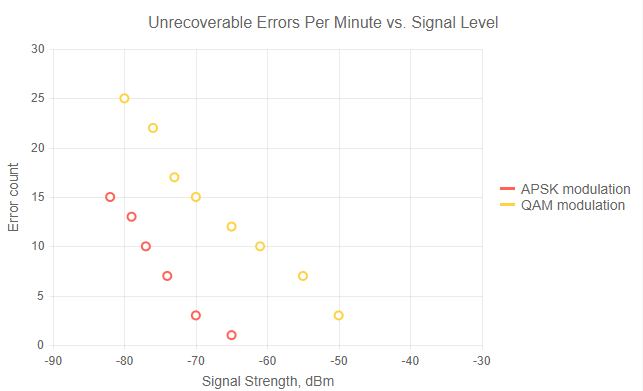
In its base form the Blazor Scatter chart is a two-dimensional data visualization that uses dots to represent the values of two different correlated variables - one plotted along the x-axis and the other plotted along the y-axis.
The code below produces a chart that shows the correlation of data between signal strength and errors per minute.
<TelerikChart> <ChartTitle Text="Unrecoverable Errors Per Minute vs. Signal Level"></ChartTitle> <ChartSeriesItems> <ChartSeries Type="ChartSeriesType.Scatter" Data="@Series1Data" Name="APSK modulation" XField="@nameof(ModelData.Strength)" YField="@nameof(ModelData.Errors)"> </ChartSeries> <ChartSeries Type="ChartSeriesType.Scatter" Data="@Series2Data" Name="QAM modulation" XField="@nameof(ModelData.Strength)" YField="@nameof(ModelData.Errors)"> </ChartSeries> </ChartSeriesItems> <ChartXAxes> <ChartXAxis Max="-30" AxisCrossingValue="@(new object[] { -100 })"> <ChartXAxisTitle Text="Signal Strength, dBm"></ChartXAxisTitle> </ChartXAxis> </ChartXAxes> <ChartYAxes> <ChartYAxis> <ChartYAxisTitle Text="Error count"></ChartYAxisTitle> </ChartYAxis> </ChartYAxes></TelerikChart>

Telerik UI for Blazor Scatter Chart
There are multiple scenarios with correlated values that can be represented using Scatter chart, for example:
- Investments – compound interest
- Income amount – expense amount
- Hours of practice on an instrument – level of proficiency
- Event exercise intensity – calories burned
New Blazor Scatter Line Charts
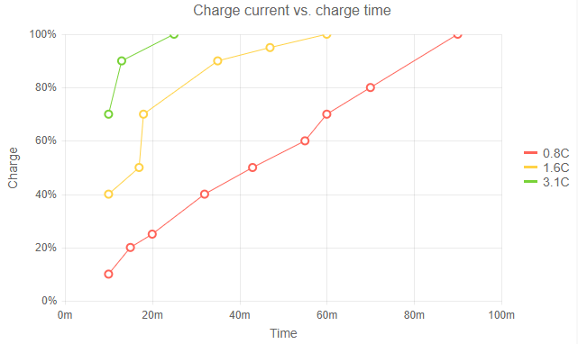
The Scatter Line chart is very similar to the Scatter chart - it adds a line which connects data points together. In this way, you can handle missing values, provide better visualization of the changes from point-to-point as well as good overall trend clarity of your data.

Telerik UI for Blazor Scatter Line Chart
New Blazor Bubble Charts
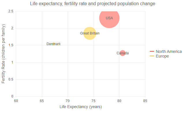
In case you need to include a third dimension in your data visualization you can use the Blazor Bubble chart. By utilizing different sizes, colors and opacity you can allow deeper analysis and interpretation of your data.

Telerik UI for Blazor Bubble Chart
New Telerik UI for Blazor Demo Page
Head over to our refreshed Telerik UI for Blazor demos page and browse through the numerous examples, customize the look and feel of your app with the Theme Builder or download the sample solution and see UI for Blazor in action.
Download Telerik UI for Blazor 2.1.0
We encourage you to visit the Telerik UI for Blazor overview page and download the latest version of the Telerik suite of native Blazor components!
Share Your Feedback!
Share your feedback and which components you would like to see next at the official Telerik UI for Blazor feedback portal. We value your ideas and we consider them when creating the 2020 product roadmap and beyond!
Happy Blazor Coding!

Maria Ivanova
Maria Ivanova is a Manager of Product Management at Progress, for Telerik and Kendo UI components and developer tooling. She joined the company in 2019 as a Product Manager for Telerik UI web components and is passionate about developing impactful and innovative software products. Maria believes that to create great products, it's important to challenge the status quo, closely collaborate with customers, and embrace a spirit of experimentation.
