Telerik UI for Blazor 2.11.0: New Grid Features, Scheduler Improvements, Wasm 3.2.0 Preview 4 and More!

Summarize with AI:
The second release for April of Telerik UI for Blazor is here and brings multiple new Blazor Grid features, Scheduler enhancements, WebAssembly 3.2.0 Preview 4 compatibility and much more.
Let’s dive into the new 2.11.0 release of Telerik UI for Blazor. We'll cover all the latest updates, and review in detail Grid Column Virtualization, Grid Nested Models and Grid Automatically generated columns that you can quickly enable in your Blazor apps!
Telerik UI for Blazor Now Supports Blazor WebAssembly 3.2.0 Preview 4
The preview 4 of Blazor WebAssembly is out and it comes with many anticipated features such as Logging, Brotli precompression, Globalization and Localization and more!
As always Telerik UI for Blazor releases go hand in hand with the preview versions released by Microsoft. We are happy to announce that the latest Telerik UI for Blazor 2.11.0 release is compatible with preview 4 version of Blazor WebAssembly 3.2.0.
Blazor Grid Column Virtualization
Overview of Grid Column Virtualization
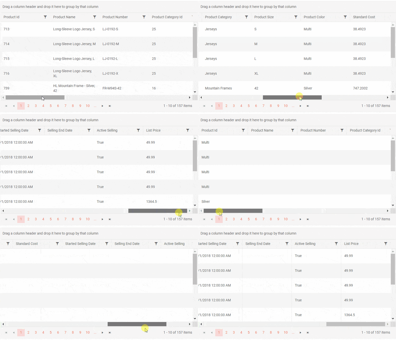
Grid column virtualization is a great addition for all of you that need to deal with large number of columns in Blazor data grid and look for ways to optimize both user experience and performance.

Telerik UI for Blazor Grid Column Virtualization
Enable Grid Virtual Columns
To enable virtualization, set the Grid ColumnVirtualization property to true, enable horizontal scrollbar and apply settings to the Grid Width, Height and RowHeight as shown in the example below:
<TelerikGrid Data="@MyData" Width="800px" Height="400px" RowHeight="65"
             ColumnVirtualization="true" Pageable="true" PageSize="5">
Combining Grid Virtual Columns and Rows
You can easily combine Gird Virtualized Columns and Virtualized Rows together by setting the ScrollMode="GridScrollMode.Virtual" and ColumnVirtualization="true".
Check out an example of how to combine Grid Virtualized Columns and Rows in Blazor.
Grid AutoGenerated Virtualized Columns
Grid Column virtualization works well together with automatically generated columns in Blazor Grid. As the AutoGenerateColumns is a new Grid feature you can find out more about it in the section below.
Check out an example of how to enable auto generated virtualized columns in Blazor Grid.
Blazor Grid Automatically Generated Columns
Overview of Grid AutoGenerateColumns
For cases when you want to display a list of columns in a Grid that are an exact match to your data model, you can now use the new Grid parameter AutoGenerateColumns. Set it to “true” and use the super simple code snippet to generate a Blazor Grid (as shown in the example below):
<TelerikGrid Data="@GridData" AutoGenerateColumns="true"
             Pageable="true" PageSize="10">
</TelerikGrid>
This simplifies column definition of the Grid and automatically generates a column for each public property of its model rather than defining each column manually. If you don't need explicitly declared columns (such as a command column or frozen columns) the <GridColumns> tag is not required.
Customizations with Grid AutoGenerateColumns
The Grid columns settings can be adapted using the multiple customization attributes available that let you specify alternative column titles, specific column order, a width differing from the one generated in the <GridAutoGeneratedColumns> tag and more.
You can use data annotation attributes to set the column titles, ban or hide grid field editing, validate the data and more. Check out the sample code demonstrating the behavior of auto-generated columns using custom attributes.
Blazor Grid Nested Models
The data that you bind to the grid may have complex objects in its model, not only primitive types, and the Grid component can now show complex (nested, navigation) properties out-of-the-box as of 2.11.0.
An example on how to use complex models with navigation properties in the Grid without flattening the model can be found in the dedicated article.
Blazor Scheduler Month View
Another favorite component that was enhanced with this release is the Blazor Scheduler. Along with the existing Scheduler views – Day, MultiDay and Week, we added the Scheduler Month view.

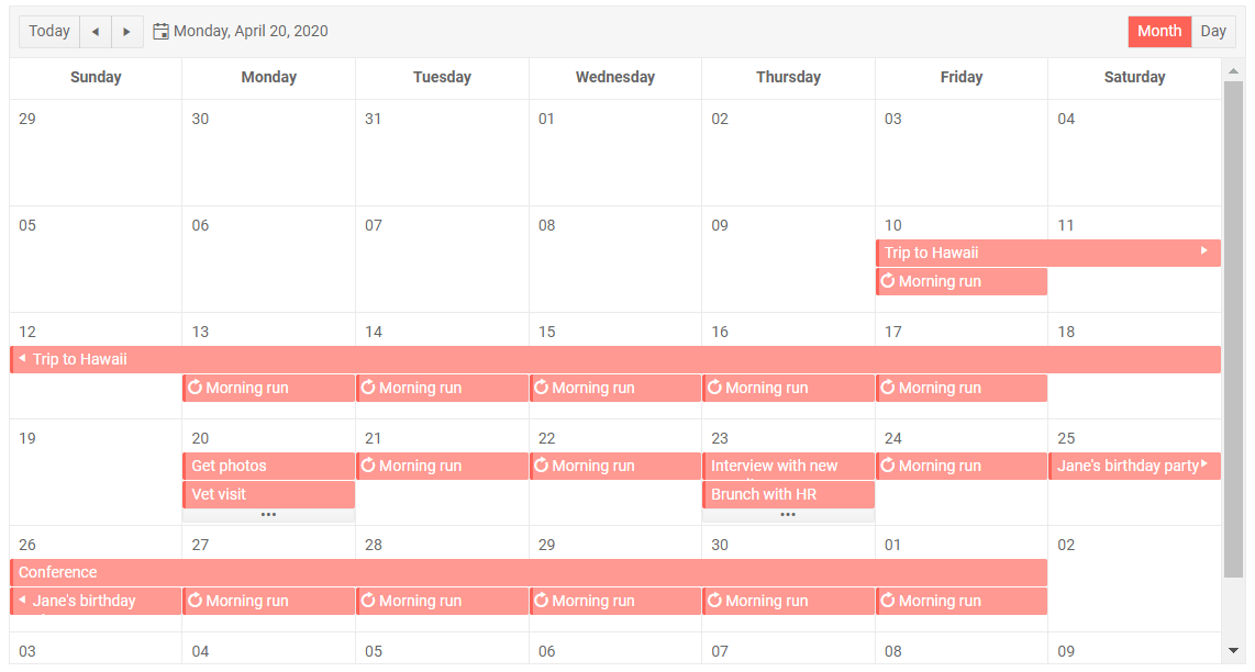
Telerik UI for Blazor Scheduler Month View
The Month view of the Scheduler for Blazor shows the entire month to the user. To keep the month view well organized, each day slot shows up to two events. For cases when there are more than two appointments per day, an ellipsis button provides access to the detailed DayView for the specific day.
You can enable multiple views simultaneously, so that your users can easily switch to the preferred way events are visualized in the Scheduler, as shown in the example below.
<TelerikScheduler Data="@Appointments" @bind-Date="@StartDate" @bind-View="@selectedView" Height="600px">
    <SchedulerViews>
        <SchedulerMonthView></SchedulerMonthView>
        <SchedulerDayView StartTime="@( new DateTime(2000, 1, 1, 7, 0, 0) )"></SchedulerDayView>
    </SchedulerViews>
</TelerikScheduler>
Download Telerik UI for Blazor 2.11.0
Head over to the Telerik UI for Blazor page, download the 2.11.0 version of Telerik UI for Blazor and spice up your Blazor Data Grid. Keep telling us what’s working well, what needs to change and what you’d like to see next in the dedicated Blazor feedback portal or in the comment section below!
If you want to learn more about the Telerik UI for Blazor Grid, visit our documentation, demos and overview Grid page.
Thank You!
As always, all of us on your Telerik Blazor Team at Progress are thankful to you for being involved and helping us grow and making Telerik UI for Blazor bigger and better!

Maria Ivanova
Maria Ivanova is a Manager of Product Management at Progress, for Telerik and Kendo UI components and developer tooling. She joined the company in 2019 as a Product Manager for Telerik UI web components and is passionate about developing impactful and innovative software products. Maria believes that to create great products, it's important to challenge the status quo, closely collaborate with customers, and embrace a spirit of experimentation.
