Telerik UI for Blazor 1.6.0—Menu, TimePicker and Grid Enhancements

Summarize with AI:
In the latest release of Telerik UI for Blazor, we've got new controls for you as well as major upgrades to the Grid, Preview 8 compatibility and more. Check it out to see what's new.
With the version 1.6.0 release of Telerik UI for Blazor, our offering is expanding with two new controls in the Menu and TimePicker, as well as major enhancements in the Grid! In this blog post we will reveal more details about the latest additions to the Telerik UI for Blazor component family and how you can use them to enhance your Blazor application.
We also have some exciting news for all of you planning to attend one of the major .NET conferences in September - BASTA.
New Blazor Components
With the 1.6.0 release we are introducing two new essential components: Say hello to the <TelerikMenu> and <TelerikTimePicker> tags!
New Blazor Component: Menu
Blazor apps can now have a stylish menu and built-in navigation effortlessly. Simply add the TelerikMenu tag and provide a collection of models to its Data property.
<TelerikMenu Data="@MenuItems"> </TelerikMenu>For each Blazor Menu Item you can control the structure, look and feel, as well as the behavior using the following fields in their data binding: id, ParentId, HasChildren, Items, Text, Icon, URL and the OnSelected event.
The Blazor Menu component can be bound to data and display flat or hierarchical information.
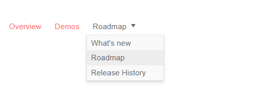
Telerik UI for Blazor Menu (Flat Data)
We know that data models may have properties that do not map to the same name as the fields found in the Telerik UI for Blazor components, which is why we allow for you to simply define your own fields in the configuration of the menu component. You need to provide the relationship between the menu item properties and the model field to which the menu is bound. To achieve this in flat data binding, use the properties in the main TelerikMenu tag like in the example below:
- IdField => Id
- ParentIdField => ParentId
- TextField => Text
@using Telerik.Blazor.Components.Menu
<TelerikMenu Data="@MenuItems"
             ParentIdField="@nameof(MenuItem.ParentId)"
             IdField="@nameof(MenuItem.Id)"
             TextField="@nameof(MenuItem.Text)">
</TelerikMenu>
For more information on how to achieve data binding to hierarchical data in the Menu component, check out the details in our Blazor documentation.
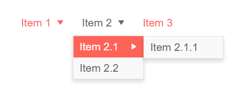
Telerik UI for Blazor Menu (Hierarchical Data)
To enable navigation in the Telerik Blazor Menu you are equipped with two options:
- As a straightforward approach you can use the built-in property UrlField to populate the URLs in the anchors
- For a more custom and fine-tuned approach you can use a Template to generate the desired links which gives you more control over customizing the look and feel of each menu item
Considering that menus can be used in various scenarios and layouts we have enabled horizontal and vertical orientation to suit all application scenarios.
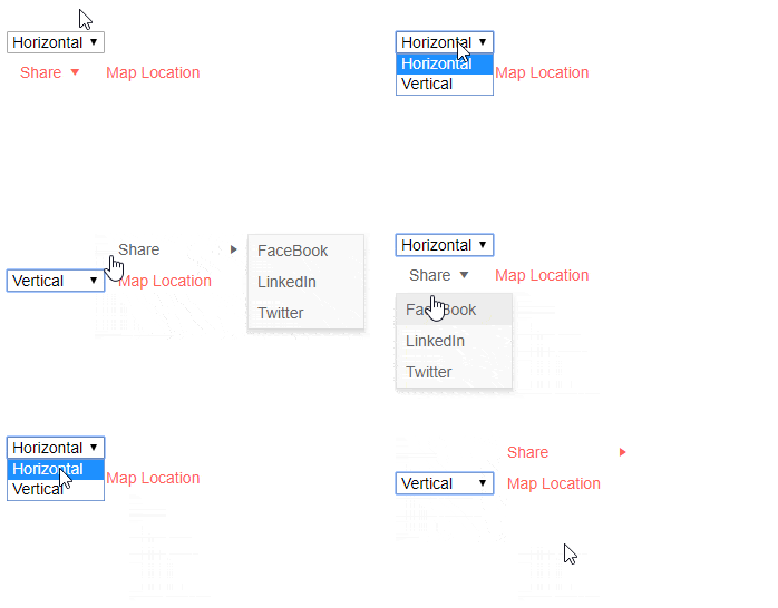
Telerik UI for Blazor Menu (Horizontal and Vertical Orientation)
And because with Menus we always want to be able to execute some custom code when clicking on an item, in the Telerik Menu for Blazor we have exposed the OnClick event. When a user clicks/taps on a menu item, the OnClick event is fired, passing along the underlying data item as an argument. Depending on your use case you can then load some different content, or respond with any other particular logic.
New Blazor Component: TimePicker
With our 1.2.0 release we introduced the Blazor DatePicker component, and with this release we are enriching the suite with time preference control. The Blazor TimePicker component allows for the selection of time from a visual list in a dropdown, or typing into a date input that accepts only DateTime values.
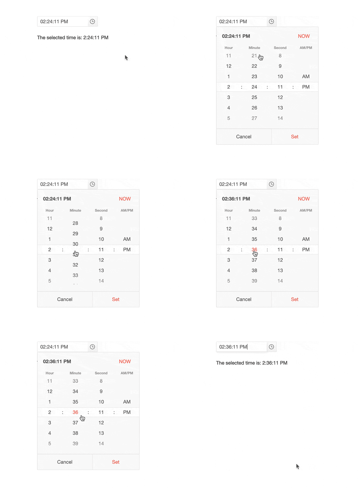 Telerik UI for Blazor TimePicker
You can use the standard datetime format:
<TelerikTimePicker Format="t" @bind-Value="@DateTime.Now" Width="100%"></TelerikTimePicker>
Or customize the format based on the application needs:
<TelerikTimePicker Format="HH:mm:ss tt" @bind-Value="@ DateTime.Now" Width="100%"></TelerikTimePicker>
There are multiple properties that you can configure to further adapt the usage of the component such as: Min, Max, Value and Width.
If you need to handle with specific logic the changes in the input such as keyboard stroke, Set or Now buttons in the dropdown you can use the ValueChangedEvent.
@code {string result;private void ChangedValueHandler (DateTime userInput){result = string.Format("The user entered: {0}", userInput);}
Blazor Grid Enhancements
With every release, the Telerik UI for Blazor Team makes sure that the most significant and desired Blazor UI component – the Grid – gets better and richer in functionality too.
Grid Grouping
In the 1.6.0 release we focused our efforts on ensuring that grouping in Telerik Blazor Grid component is breezy – just set the Groupable property to "True". This will enable your users to simply drag one or more column headers to the group panel and the Grid will visualize the grouped data.
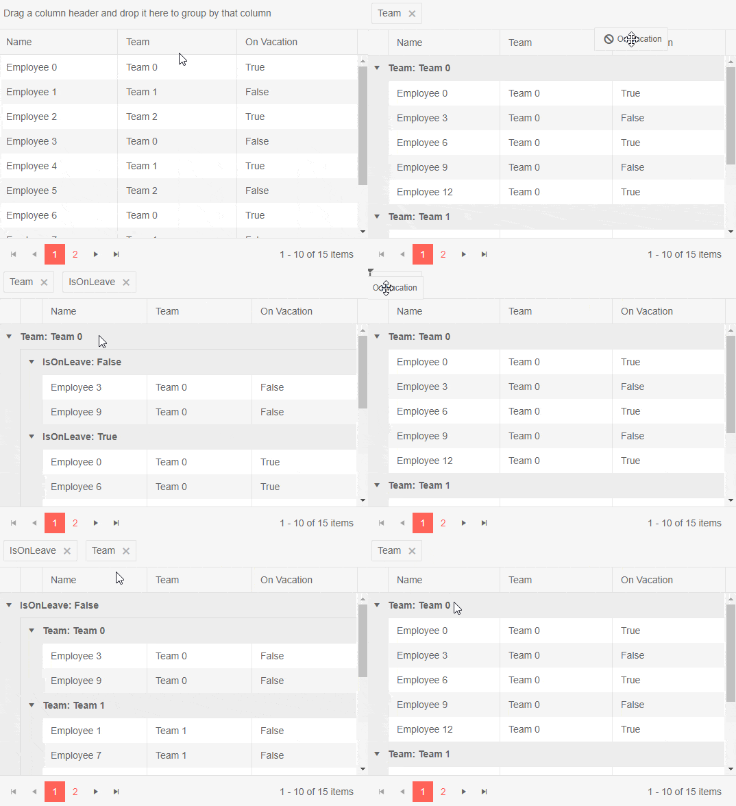
Telerik UI for Blazor Grid Grouping
To remove a group setting, click the [x] button on its indicator in the group panel and the corresponding data will no longer be associated with that group.
For more complex scenarios you can also nest groups and reorder selected groups in a desired position, all of which happens with a simple drag of a column header.
Grid Rows Selection
Grid rows now support single and multiple selection options which can be configured by setting the SelectionMode to SelectionMode="GridSelectionMode.Single" or SelectionMode="GridSelectionMode.Multiple" (or disable Selection by setting SelectionMode=”GridSelectionMode.None”)
To track user selection in your applications you can use two-way binding through the SelectedItems property, or SelectedItemsChanged event.
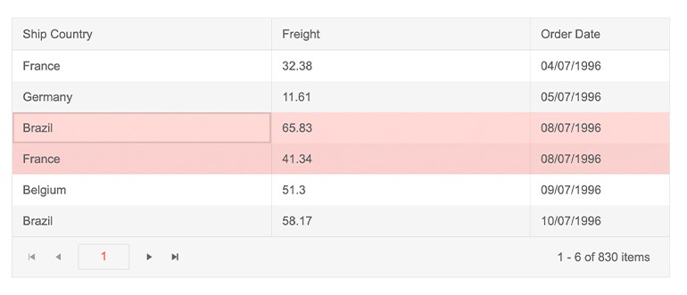 Telerik UI for Blazor Grid Row Selection
The Grid also supports an option for row selection via a checkbox column. To define it, add a TelerikGridCheckboxColumn in the TelerikGridColumns collection of the grid.
@using Telerik.Blazor.Components.Grid
<TelerikGrid Data=@GridData
             SelectionMode="GridSelectionMode.Multiple"
             Pageable="true"
             PageSize="10">
    <TelerikGridColumns>
        <TelerikGridCheckboxColumn SelectAll="true"></TelerikGridCheckboxColumn>
        <TelerikGridColumn Field=@nameof(Product.Id) />
        <TelerikGridColumn Field=@nameof(Product.Name) Title="Product Name" />
        <TelerikGridColumn Field=@nameof(Product.Price) Title="Unit Price" />
    </TelerikGridColumns>
</TelerikGrid>
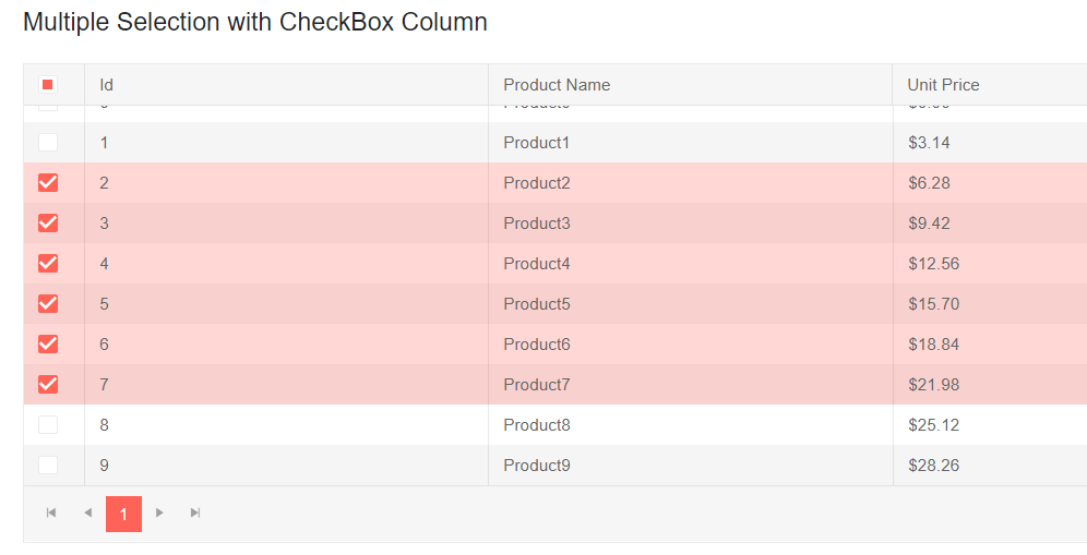 Telerik UI for Blazor GridRow Selection via Checkboxes
In Multiple SelectionMode, selection can be made using the following approaches:
- Select the checkbox of each desired row
- Press and hold Ctrl, and click the desired rows
- For range selection, you could use the Shift key and click the row you want to be the last in the range
Preview 8 Compatibility
Looking ahead to the official release of ASP.NET Core 3.0 next month, we are aiming at continuously providing you with interim versions of our Blazor components compatible with each official preview by Microsoft.
Last week we announced that we are fully compatible with the latest changes included in ASP.NET Core 3.0 Preview 8.
Let’s Meet at BASTA
For those of you who plan to be in Mainz at end of September, the Telerik UI for Blazor Team will be part of the BASTA conference. Come meet our team at the Progress Telerik booth to chat about the future of Blazor and participate in our “Code for Charity” game.
We encourage you to attend the engaging and provocative keynote speech by our Manager of Software Engineering, Pavlina Hadzhieva: Goodbye, Client-side JavaScript – Hello, Blazor.
Experience Telerik UI for Blazor 1.6.0
If you are new to Blazor, visit the Telerik UI for Blazor overview page and sign up for a trial experience - it’s as easy as a single button click! Then, just follow the Blazor demos and documentation.
Share Your Feedback!
We encourage all our early adopters and fans to continue providing valuable feedback! If there are features you are missing, or components you need, please head over to the official Telerik UI for Blazor feedback portal and submit your ideas.
Happy Blazor Coding from the Telerik Blazor Team at Progress!

Maria Ivanova
Maria Ivanova is a Manager of Product Management at Progress, for Telerik and Kendo UI components and developer tooling. She joined the company in 2019 as a Product Manager for Telerik UI web components and is passionate about developing impactful and innovative software products. Maria believes that to create great products, it's important to challenge the status quo, closely collaborate with customers, and embrace a spirit of experimentation.
