Suggested for You—The Brand-New RadAutoSuggestBox for WPF

Summarize with AI:
Telerik UI for WPF's R3 2020 release is available now and it's inviting you to try one of its charms—the RadAutoSuggestBox. An input control used for making suggestions based on typed-in text, which are displayed in a drop-down list. Let's check it out together.
The R3 2020 release for Telerik UI for WPF is out and available for you to try it (if you haven’t already). And it brought a nice suggestion to complement your WPF applications—the RadAutoSuggestBox! This text-input control makes suggestions based on the typed-in text which are displayed in a drop-down.
So far so good, and where to now? Any suggestions? Anybody? Okay, I’ll start with the difference between two similar species—autocomplete and autosuggest.
Autocomplete vs Autosuggest
The chances of getting these two totally wrong are high. Gladly, Merriam-Webster Inc. (one of America's leading and trusted providers of language information) has taken great care to avoid confusing these two. Let’s peek at their wonderful definition:
“Autocomplete, as the name suggests, is the feature that completes a partial search query by matching the character string that the user types. Autosuggest is the clever little feature that makes it seem like Google is nesting in your brain, predicting what you want to search seemingly before you even know it yourself.”
Now that we cleared it up, I think we’re ready for the next section where I’ll make sure to cover all important stuff related to the RadAutoSuggestBox control. We do have RadAutoCompleteBox, so stay focused and don’t mix them up.
Action is always better than words, so shall we start with setting up an application with the RadAutoSuggestBox? Yes? Ok.
Setting up RadAutoSuggestBox
The happy news is, we only need to reference the Telerik.Windows.Controls and Telerik.Windows.Controls.Input assemblies in an empty WPF application. And declare the RadAutoSuggestBox, of course. As a bonus, I’ll create a sample data provider, too—let’s start with it.
public static class CountryDataProvider
{
    private static List<CountryInfo> CountriesThatINeverGetToVisitThisYear { get; set; }

    static CountryDataProvider()
    {
        CountriesThatINeverGetToVisitThisYear = newList<CountryInfo>();
        var cultures = CultureInfo.GetCultures(CultureTypes.SpecificCultures);
        foreach (CultureInfo culture in cultures)
        {
            var regionInfo = new RegionInfo(culture.LCID);
            if (!CountriesThatINeverGetToVisitThisYear.Any(x => x.Name.Equals(regionInfo.EnglishName)))
            {
                CountriesThatINeverGetToVisitThisYear.Add(newCountryInfo() { Name = regionInfo.EnglishName });
            }
        }
    }

    public static List<CountryInfo> GetCountriesByText(stringsearchText)
    {
        var result = new List<CountryInfo>();
        var lowerText = searchText.ToLowerInvariant();
        return CountriesThatINeverGetToVisitThisYear.Where(x => x.Name.ToLowerInvariant().Contains(lowerText)).ToList();
    }
}


public class CountryInfo
{
    public string Name { get; set; }
}
Now, let’s define our auto-suggest box:
<telerik:RadAutoSuggestBox
    x:Name="radAutoSuggestBox"
    TextChanged="OnRadAutoSuggestBoxTextChanged"
    DisplayMemberPath="Name"
    TextMemberPath="Name"
    WatermarkContent="Where did you want to go this year?"
    NoResultsContent="Whoa, there is no such place on Earth!" />
It’ll be mean to keep the handling of TextChanged just to myself, so here it goes:
private void OnRadAutoSuggestBoxTextChanged(object sender, Telerik.Windows.Controls.AutoSuggestBox.TextChangedEventArgs e)
{
    if (e.Reason == TextChangeReason.UserInput)
    {
        this.radAutoSuggestBox.ItemsSource = CountryDataProvider.GetCountriesByText(this.radAutoSuggestBox.Text);
    }
}
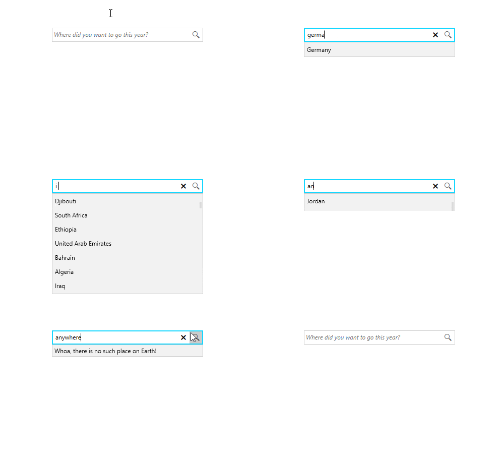
So much cooking, and yet no single bit of our RadAutoSuggestBox. It’s time to taste it (virtually, of course, so you can remove your 😷):

Yeaaah, this example contains some of my personal places-to-explore, yet the most visited ones this year are… surprise-surprise… my bed, my couch, my office-chair 😅. But that’s not what we’ve gathered here for, so let’s jump to the next section.
Examining RadAutoSuggestBox
In the following sub-sections, I’ll cover the key features of the RadAutoSuggestBox, the events that occur when interacting with it and its customization capabilities.
Key Features
The RadAutoSuggestBox may seem teeny-tiny, yet it has a rich set of features.
- It provides built-in support for several keyboard keys
- Its drop-down list has a built-in UI virtualization—containers for the items are generated only for those in the viewport (= improved performance for larger amount of data)
- The search and clear actions are implemented via commands that can be customized or replaced
- It allows for grouping via the grouping feature of ICollectionView
What happens when no search results are present? Well, then the No Results ContentPresenter is shown. In fact, we saw it in the above getting started guide.
How will your users know what to type in the box? By specifying the WatermarkContent, of course. You can totally control the WatermarkBehavior and create a fancy WatermarkTemplate.
Featured Events
The events that the auto suggest box exposes are TextChanged, QuerySubmitted and SuggestionChosen. Three is a happy number, just like the amount of the goldfish wishes—just enough to make the most of it. The TextChanged happens for a reason, which is available to you through the TextChangeReason property—helpful for identifying whether the text was changed programmatically, as a result of the user’s input or because a suggestion was chosen. I believe the next two are self-explanatory. Well, if they are not, please head to the control’s detailed documentation.
Customization Capabilities
I already covered some of the customization points in the key features section, I could not help myself… But in this section, we will examine other possible ways for customizing the appearance of the control.
Similar to the other controls from Telerik UI for WPF, this one also comes with the complete set of pre-defined themes. You have the absolute right to completely re-design it, depending on your needs.
If you only need to change the content of the clear and query buttons, you can do so by using the corresponding property (ClearButtonContent / QueryButtonContent). One thing to know is that their default template contains a RadGlyph, which means you can pick a glyph code from our handy cheat-sheet and you are all set. By glyph code I mean the last column of the cheat-sheet. If by some chance you are not happy with the RadGlyphs, you can always predefine the QueryButtonContentTemplate or the ClearButtonContentTemplate to get rid of the default content templates. Last thing here—you are the one in control of the visibility of both buttons. The ClearButtonVisibility is a little more special—if it is set to Auto (which is the default behavior), the button will only show when the control is focused, and a text is present.
The UI of the items shown in the drop-down list is fully customizable, too, via the ItemTemplate and ItemTemplateSelector properties of the RadAutoSuggestBox. There is a really nice example in the online documentation of the control for that—I recommend you check it out.
Oh, there is also a TextBoxStyle property to control the appearance of the textbox part—use it wisely and watch out for its TargetType, RadWatermarkTextBox.
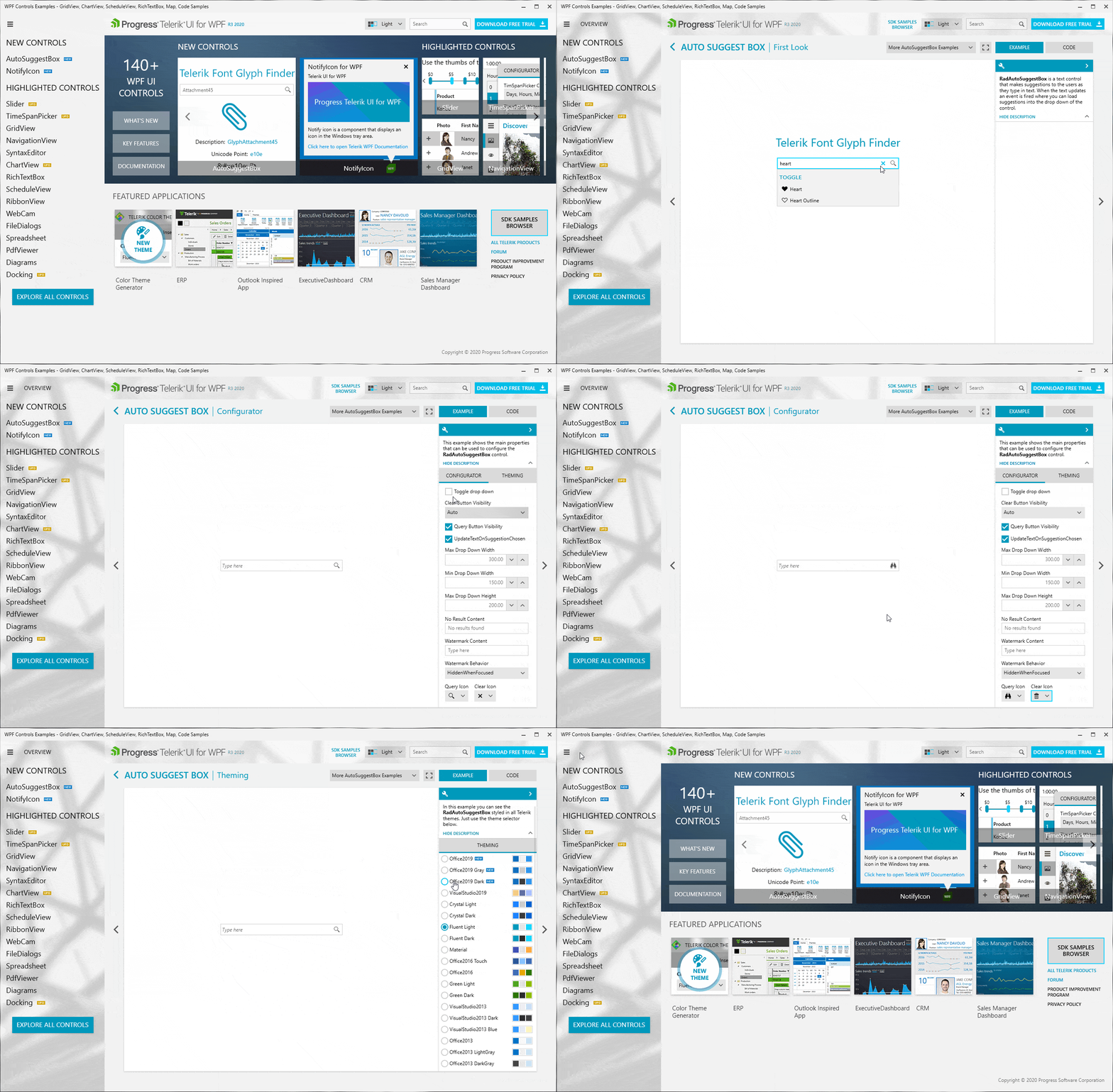
Commercial slot 🔥! Make sure to explore all the wonderful demos that my teammates prepared:
 Source: Telerik UI for WPF Controls Demo application. Go on, download and install it!
Sharing = Caring
We’d love to hear from you. I’ll never get tired of reminding you that your honest and direct feedback is the most efficient way for us to improve. Drop your thoughts in the comment section below and share your suggestions in our feedback portal.
Try out the latest version of Telerik UI for WPF and enjoy it!

Viktoria Grozdancheva
Viktoria is a Senior Front-end Developer with 5+ years of experience designing and building modern UI for desktop and mobile platforms on Microsoft/Telerik technology stacks. Her spare time is dedicated to friends and family and discovering new pieces of the world. Find her on Twitter and LinkedIn.
