
Server Side Responsive Layouts in ASP.NET AJAX

Summarize with AI:
If you are developing a web site, one question that is very prevalent in today is, "Is it Responsive?" Pretty much any web developer you ask would rate this as a top priority when developing a modern web site. So what is responsive anyway?
Well it turns out that the meaning is pretty simple. A Responsive Web Page/app is one which has the capability to adapt itself to the client device. When I say client device, I am talking about the three main screens or form factors we know: the desktop browser; the mobile browser; and the tablet browser.
Designing Responsive Web Pages
First question about being responsive is how we do it. Well there are two primary ways you can make an element on a web page responsive: resize the content placeholder or hide it. For example, assume a layout with a header, content, two sidebars and a footer. It might make sense to show all these parts when viewed on a desktop browser, but on a mobile or tablet browser, you may hide the sidebars and resize the content. Typically, this is done on the client side using CSS Media Queries to alter the vidual display properties of HTML elements.
Server Side Responsive Web Pages
Most of the CSS frameworks that are there work on the concept of hiding the content. But it is important to emphasize that you push everything irrespective of the device - the content of the page is sent in full and the portions are hidden on the client.
What’s the problem you ask? Well we are unnecessarily pushing down content to a mobile browser that will eventually be hidden, meaning we are forcing users to download bytes that they will likely never need.
So why send the content in the first place? If we send only that portion of the content which will eventually be shown on the browser, we can cut down on the bandwidth that will be used to load the content on the mobile device or the tablet device.
While there is no control in the vanilla ASP.NET AJAX controls toolkit, as part of our "UI for ASP.NET AJAX" product line, Telerik has released a brand new control called RadPageLayout that is designed to help you achieve the server-side responsive web pages with ease.
Let's take a closer look at this control.
Introduction to RadPageLayout
RadPageLayout is a simple and lightweight server-side control that can help you create a page layout based upon an intuitive grid system. Since this is a server side control, we can configure the page layout completely on the server unlike other layout systems like Bootstrap which do it on the client side.
The grid system has only two elements: rows and columns. Rows are containers for columns and columns are containers for the content to be shown.
Let’s take a look a RadPageLayout in action. Here is a code snippet to create a simple layout:
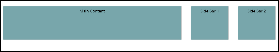
<telerik:RadPageLayout runat="server" GridType="Fluid">
<Rows>
        <telerik:LayoutRow>
                <Columns>
                    <telerik:LayoutColumn Span="8" >
                    <div class="col">
                            Main Content
</div>
</telerik:LayoutColumn>
                   <telerik:LayoutColumn  Span="2" >
                    <div class="col">
                            Side Bar 1
</div>
</telerik:LayoutColumn>
                   <telerik:LayoutColumn Span="2">
                    <div class="col">
                            Side Bar 2
</div>
</telerik:LayoutColumn>
</Columns>
</telerik:LayoutRow>
</Rows>
</telerik:RadPageLayout>
Page Layout Control Structure
The RadPageLayout control is basically composed of 3 things: a container, rows and columns. Let’s take a look at each one of them closely.
Container
This is the outermost element that the page layout control will be rendered within. By default this is rendered as HTML div element. The properties supported by the container are as follows:
GridType- This is the layout type being eitherStatic,FixedorFluid.ShowGrid- This property is used to display or hide visual grid guides.
Below is the mark up with all the properties set on the container:
<telerik:RadPageLayout ID="RadPageLayout1" runat="server"
    ShowGrid="true"
    GridType="Fluid">
</telerik:RadPageLayout>
Rows
As mentioned earlier, Rows are simple containers for columns and each row is represented by the LayoutRow object within the markup. Here is a code snippet that shows the usage of rows:
<telerik:RadPageLayout ID="RadPageLayout1" runat="server" GridType="Fluid">
    <Rows>
        <telerik:LayoutRow>
            <Content>
                <div class="header">Header</div>
            </Content>
        </telerik:LayoutRow>
    </Rows>
</telerik:RadPageLayout>
Columns
A Column is a structural unit of the layout design and where you will show your content that needs to be rendered. Each column is represented as a LayoutColumn within the markup, which is analogous to a table cell in the HTML world. Here is a code snippet which shows the usage:
<telerik:RadPageLayout ID="RadPageLayout2" runat="server">
    <Rows>
        <telerik:LayoutRow>
            <Columns>
                <telerik:LayoutColumn Span="8">
                    Main content here
                </telerik:LayoutColumn>
                <telerik:LayoutColumn Span="4">
                    Sidebar here
                </telerik:LayoutColumn>
            </Columns>
        </telerik:LayoutRow>
    </Rows>
</telerik:RadPageLayout>
Supported Layout Types
The RadPageLayout control, having being modelled around the grid-based layout system, supports three layout types:
- Fixed - If this layout type is used, the page layout control will respond to viewport changes & sets the grid column width to a value that corresponds to current viewport size.
- Fluid – If this layout type is used, the page layout control will respond fluidly to the viewport changes and will set the height of the grid rows to fit the available space.
- Static – as the name says, when this layout type is uses, the grid does not react to viewport changes. The type of the layout we need for our page is set using the "GridType" property of page layout control.
Reducing Bandwidth for Mobile Broswers
RadPageLayout being a server side control give you one great flexibility feature: we can actually control the content we intend to send to client based on things like the screen size. If we see that a request came from a small screen size (i.e. less than 600 pixels), we can hide the sidebars and send only the main content.
In order to detect the screen size, we use a framework called the Device Detection Framework (DDF). DDF is part of the "UI for ASP.NET AJAX" product suite, which includes a Device Detection Framework API. The DDF API can inform you of the screen size of the user making the request. Out of the box, DDF includes a set of default screen sizes:
- Small – Upto 600 CSS pixels
- Medium – 601-1024 CSS pixels
- Large – 1025-1366 CSS pixels
- ExtraLarge – over 1366 CSS pixels
The following code snippet illustrates how to hide content by making use of Device Detection Framework:
protected void Page_Load(object sender, EventArgs e)
{
    DeviceScreenSize screenSize = Detector.GetScreenSize(Request.UserAgent);
    if (screenSize == DeviceScreenSize.Small)
    {
        //Hide Sidebar if it is a mobile device
        SideBar1.Visible = false;
        SideBar2.Visible = false;
    }
}
Conclusion
Modern web sites must be consider responsive design, but, as we've discussed, some techniques for responsive design overload the user with content that they will never see. However, through the usage of RadPageLayout, you can quickly create a responsive layout for your WebForms without any hassle and with only simple steps. Since it is a service side control, you can program against it on the server side before response is sent to the client. RadPageLayout coupled with the Device Detection Framework will help you reduce your bandwidth while serving a mobile browser.

The Telerik Team