Introducing Compact Mode: Optimize Available Screen Space with Blazor DataGrid

Summarize with AI:
See how you can optimize the available view port with the Telerik UI for Blazor DataGrid using the new compact mode option.
Imagine the following: You request a detailed summary of your bill from your mobile carrier, and instead of visualizing the data through a data table, they send a report in plain text. This would be a nightmare to go through, right?
Displaying data in a tabular manner has practically become the norm in many industries, and, as such, one should go thoroughly over its configuration—making sure it is optimized for the purpose it will serve and the data it will display.
If you have such a task at hand, Andrew Coyle has a great article where he covers various techniques and patterns to design better data tables.
One such optimization is the ability to display large data sets in a more squeezed, dense look, without sacrificing any of the already available features a DataGrid provides. This is why we are happy to announce the Compact Mode of the Progress Telerik UI for Blazor DataGrid—a handy option to scale down the sizing throughout your tables, providing a more condensed interface.
In Compact Mode, introduced in R1 2023, the Blazor DataGrid is optimized for space, making it ideal for multiple use cases, such as displaying financial data, or when the screen real estate is premium, and it is crucial to fit everything important in the view port. This includes smaller screens such as mobile phones and laptops, where a traditional data grid may not fit on the entire screen.
But Compact Mode isn’t just about saving space—it also makes it easier to quickly scan and find the information you need, even in large datasets.
In this blog post, we will cover how to enable the Compact Mode of the Telerik UI for Blazor DataTable, what it does, how you can tweak it to fit your needs, as well as various grid settings you can turn on or off to optimize the available space even further.
Configuring Your Blazor Grid
Changing the grid sizing is rather straightforward—you need to provide a value to a single parameter, named Size. To avoid large markup with unnecessary and/or optional declarations, I am providing an exemplary Grid markup:
<TelerikGrid Size="@ThemeConstants.Grid.Size.Small"
             Data="@Data">
    <!-- columns fragment -->
</TelerikGrid>
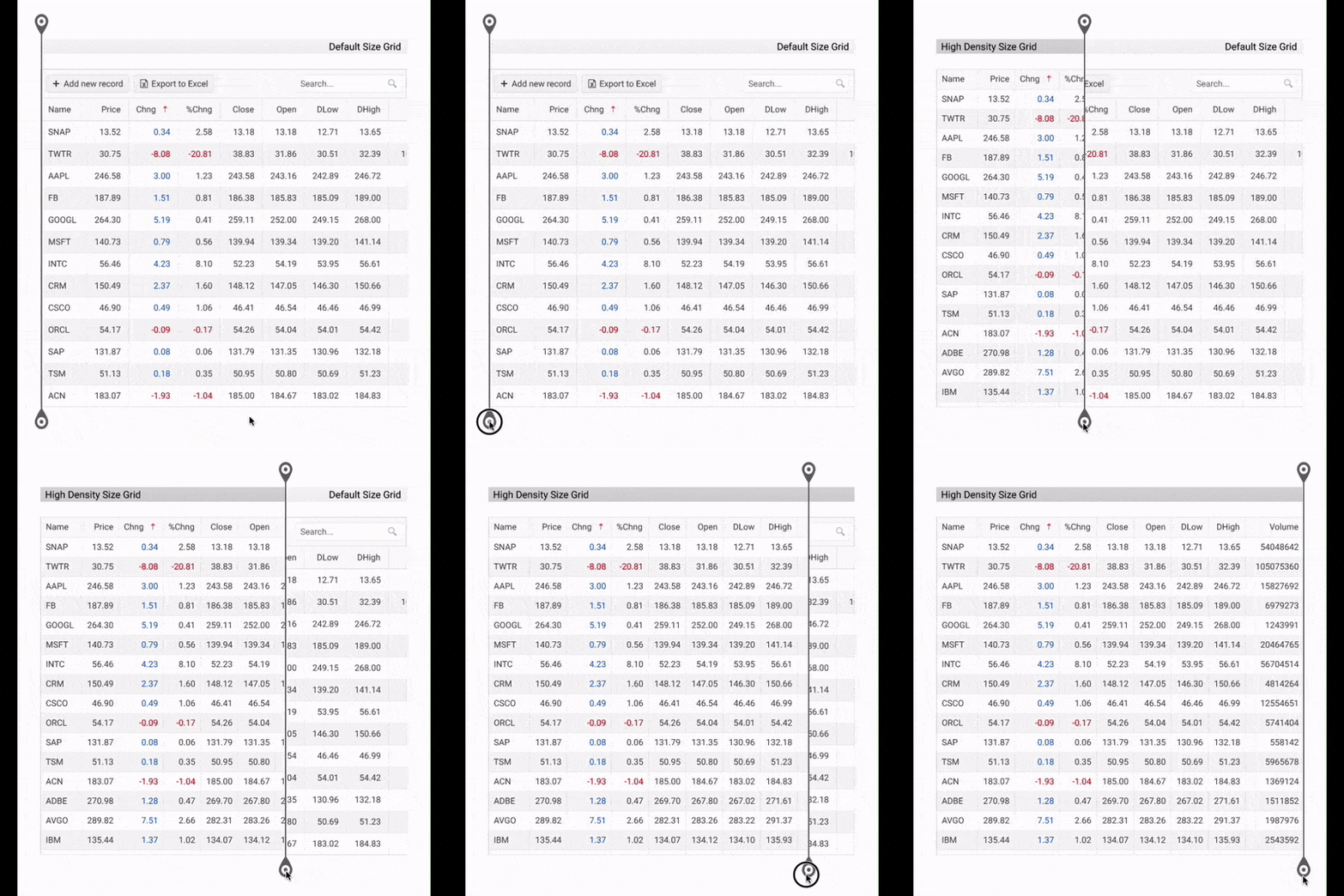
Setting the above is enough to result in a more condensed layout for your data. But instead of looking at the output directly, we better compare it with our current Grid. To do so, I will be using Kendo’s default theme, but the results are similar in the rest of the themes:

There is an obvious change but let’s look into the details. The individual table row height has changed from 36px to 28px, while the padding of each table cell has shrunk from 8px top/bottom and 12px left/right to 4px and 8px respectively. This alone results in about 20-25% more data displayed vertically. As for horizontally, given the smaller paddings, this would mean that the more data (columns), the more space is “saved.”
Besides the contents of the data table itself, when enabling the high-density mode of the Blazor DataGrid, most building blocks also shrink down, such as the ToolBar, FilterRow, Pager and all Editors. Note that you should explicitly set the Size (ideally aligning it with the Size of the Grid, but not required) to any arbitrary content you put within the Grid’s templates.
For example, any content within the ToolBar itself, a CommandButton or custom markup should have its Size set:
<TelerikGrid Size="@ThemeConstants.Grid.Size.Small"
             Data="@Data">
    <GridToolBarTemplate>
        <GridCommandButton Command="ExcelExport" Size="@ThemeConstants.Button.Size.Small">Export</GridCommandButton>
    </GridToolBarTemplate>
    <!-- columns fragment -->
</TelerikGrid>
To tweak this even further, do check out our Telerik and Kendo UI ThemeBuilder—it allows you to style everything, from an entire component or primary color to atomic customizations, like the above-mentioned padding.
However, some might say that the above example illustrates what is essentially a perfect demo example made for a specific purpose—data nicely aligning, no long text/numbers, short column names, etc.—and they would most certainly be right. When it comes to data visualization, there is no one-size-fits-all (pun intended). This is why it is important to enable the features you require and then apply the necessary customization to facilitate your individual needs.
Further Customization
This will be in no way a full list, but I will try to cover a few ideas through which you can optimize the available space even further.
Toggle Column Menu
Sometimes users might not need or want to browse through all the data points. Instead, they might be interested only in a few columns that are relevant for them. By enabling the Column Menu of the Blazor DataGrid, clients have the option to hide and show columns, achieving just that. To toggle the Column Menu, use the ShowColumnMenu parameter, like so:
<TelerikGrid ShowColumnMenu="true"
             Data="@Data">
    <!-- columns fragment -->
</TelerikGrid>
The Column Menu can be configured and customized even further, so I recommend checking its dedicated documentation article.
Group Multiple Related Fields Through a Cell Template
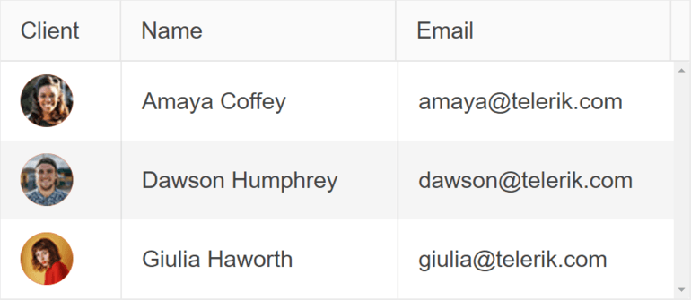
Instead of defining a table column for each field in your model, think whether there are any fields that could be grouped and displayed in a single column. This could not only save some space but make the navigation and looking up data easier. With such a change, you can go from this:
<GridColumns>
    <GridColumn Title="Client">
        <Template>
            @{
                var item = (Record)context;
            }

                <TelerikAvatar Type="@AvatarType.Image">
                    <img src="@($"./images/{item.ExecutedBy.ImageUrl}")" />
                </TelerikAvatar>
        </Template>
    </GridColumn>
    <GridColumn Title="Name" Field="ExecutedBy.Name"></GridColumn>
    <GridColumn Title="Email" Field="ExecutedBy.Email"></GridColumn>
</GridColumns>

to this, where multiple related fields are nested within a single cell template:
<GridColumn Field="@nameof(Record.ExecutedBy)" Title="Client">
    <Template>
        @{
            var item = (Record)context;
        }

        <div>
            <TelerikAvatar Type="@AvatarType.Image">
                <img src="@($"./images/{item.ExecutedBy.ImageUrl}")" />
            </TelerikAvatar>
            <div>
                <span>@item.ExecutedBy.Name</span>
                <span>@item.ExecutedBy.Email</span>
            </div>
        </div>
    </Template>
</GridColumn>

Utilize Detail Template to Show Additional Information
Sometimes a portion of the data related to a given record might only be necessary after certain filtering has been done. In such a case, optional values could be omitted from the main table, and instead moved to an optional pane, such as a collapsible section in the DataGrid or a modal window. Such an approach could greatly reduce the data in the table itself, which in turn would allow both to fit more data, as well as to make browsing through it easier. Here is an example of the DetailTemplate in action:
Opt Out of Unnecessary Labels
While this one does look rather obvious, it deserves to be mentioned given simply how much space one could save without adding certain texts and labels. For example, not adding any visible text to your buttons, replacing them with icon buttons.
Command buttons are great candidates for such a change, where the purpose they serve could easily be replaced with an icon instead. One could easily go from this:

to this:

An important note when making such a change is to ensure your buttons remain accessible, as their accompanying text is no longer there. You can achieve this by setting a value to the aria-label attribute of the button, making sure the purpose of the button will be announced for anyone using screen readers. The TelerikButton exposes an AriaLabel parameter for just that.
Wrap-up
These are just some of the ways you can customize the Telerik UI for Blazor DataGrid. At the end of the day, it comes down to research, implementation and customization, making sure the table is optimized for the purpose it will serve.
Try out Compact Mode today and see how it can help you work more efficiently and effectively with your data. We’re excited to hear your feedback and we look forward to continuously improving the feature to better serve you and your clients.

Radko Stanev
Radko Stanev is a Software Engineer at Progress, working on Telerik UI for Blazor. He is passionate about new technology and clean code. Outside work, Radko is a geek at heart who loves fantasy and Dungeons & Dragons.

