How to Use a jQuery DropDownList UI Component in Your Web App

Summarize with AI:
Learn what you can do with a dropdown list, and how you can use one in your web app to help your users easily choose from a list of options and more.
Recently we've been talking about the splitter component and the grid component. In the next few posts, we will review components used for making selections and taking input. The first will be the dropdown list.
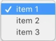
A dropdown list lets users select one option from a list of options. The list appears when the user clicks on the element or triggers it another way. The currently selected option will always be shown in the element. Dropdown lists can be used in online stores to choose the size, color, or quantity of an item. They are also used in toolbars to select different actions like changing the font or page zoom. Coming up, you will see a comparison of how to create a dropdown list using just HTML and how to create one using the Kendo UI jQuery DropDownList component.
HTML Dropdown List
A plain dropdown list can be created using the <select> element. You define the items in your list by adding <option> elements within the <select> element. The text or template that is visible to the user is the content between the <option> elements. The value attribute of the <option> element is the data that will be sent with a form submission or that you can extract directly. Because a select element is a kind of form element, it supports form events like the onchange event. This is the markup for a dropdown list with three items:
<select id="dropdown">
  <option value="1">item 1</option>
  <option value="2">item 2</option>
  <option value="3">item 3</option>
</select>

If you wanted to get the value of the selected option you could add this using plain JavaScript:
const dropdown = document.getElementById('dropdown');
console.log(dropdown.value);
This would print 1 to the console. Alternatively, if you wanted to get the value of the option when it has been selected, you can add an event listener to the select element. We will attach an onchange event listener that can capture the selected option and give us its value.
dropdown.onchange = function(event) {
  console.log(event.target.value);
}
Kendo UI DropDownList
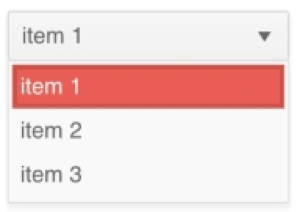
To transform this HTML dropdownlist into a Kendo UI DropDownList widget we just need to call $('#dropdown').kendoDropDownList(). Doing this styles the component to match the rest of your theme. Additionally, you will have access to different configuration options that will make it easier for you to customize the element. For example, you can use the dataSource attribute to define your list of options or retrieve them from a URL. This is a complete example that refactors our dropdown to use an array of items to define the options:
<select id="dropdown"></select>
<script>
  $(document).ready(function(){
    $('#dropdown').kendoDropDownList({
      dataTextField: 'text',
      dataValueField: 'value',
      dataSource: [
        { text: 'item 1', value: 1 },
        { text: 'item 2', value: 2 },
        { text: 'item 3', value: 3 }
      ]
    });
  });
</script>

If we want to bind a change event to the component, we can add a change field to our initialization code and set it equal to an event handler. Similar to our HTML example, this example prints the value of our option to the console when a new selection has been made:
change: function(e) {
  console.log(this.value());
}
Summary
The dropdown list we have used here may appear similar to the dropdowns we have used in our jQuery menu component. The key difference with the dropdown list component is that the currently selected item is always exposed and the purpose is to indicate that the user can toggle between options. In a menu, the purpose of a dropdown is to navigate you to a different area of your application. And a dropdown used in a context menu only becomes exposed when the user clicks on the target. A dropdown list is, however, similar in functionality to a split button that is included with the toolbar component. Except the dropdown list can stand alone or be included in other components.
There is also much more you can do with dropdown list that what was shown. You can add a search bar to your dropdown to filter the list of options. This is useful when you have a long list of options and the user would have to scroll to see them all. You can also create cascading dropdown lists where the options in the child dropdown list are changed based on the selection of the parent dropdown list. A common use for this is selecting locations. One dropdown might contain a list of states, and the next dropdown will contain the cities for that list of states.
In the next lesson, we will take a look at the multiselect component. This component is similar to a dropdown list, but it gives us the ability to select more than one option from a list.
Try out the DropDownList for Yourself
Want to start taking advantage of the Kendo UI jQuery DropDownList, or any of the other 70+ ready-made Kendo UI components, like Grid or Scheduler? You can begin a free trial of Kendo UI today and start developing your apps faster.
Angular, React and Vue Versions
Looking for UI component to support specific frameworks? Check out the DropDownList for Angular, the DropDownList for React, or the DropDownList for Vue.
Resources

Alberta Williams
Alberta is a software developer and writer from New Orleans. Learn more about Alberta at github.com/albertaw.
