
How To Evaluate Then Improve a Website’s Network Performance
 by Eve Turzillo

Summarize with AI:
Not sure where to start when it comes to improving your website’s performance? Learn tested techniques listed in this blog, complete with video.
When it comes to evaluating website performance techniques, you can use Fiddler Everywhere for the job. Our Fiddler Everywhere Ninja, Robert Boedigheimer shares in this video how he responds when asked to give an opinion on how to improve a website’s performance. Here is the transcript of the video that walks you through Robert’s process, techniques and tooling.
What is the first step when you are asked to look at a website?
The first thing I like to do is open Fiddler Everywhere and look at various pieces of it where I can see whether they’re using specific techniques. So, we’ll go over what the techniques are and how you can tell if the site is using them using Fiddler Everywhere.
To do that, we’re going to look at our travel page again and I’ve got a Before and After version. The Before is just an easy implementation using Bootstrap—not a lot of thought was put into performance at all. The second one is using a lot of the techniques we’re going to talk about during this talk. We see that they look visually the same. This is the Before version and if I click on the After, you’ll see that visually I have not lost any quality. It looks the same, but the performance metrics are much better on this than the one before. Let’s start to compare these two.
How do you review HTTP/S network traffic requests?
Here we’ve got Fiddler Everywhere open, and we’ve requested the performance before. We’re going to select all the requests on the left-hand side, and we want to look at the Overview. Here are a couple of things that are interesting. You can see that there are 13 requests made and if you look at the body received that’s about 2.8 MB. So pretty large. A typical webpage today is somewhere in that range, usually, that’s 100 requests or so. And if I scroll down, it gives us more information about the sizes based on the type.
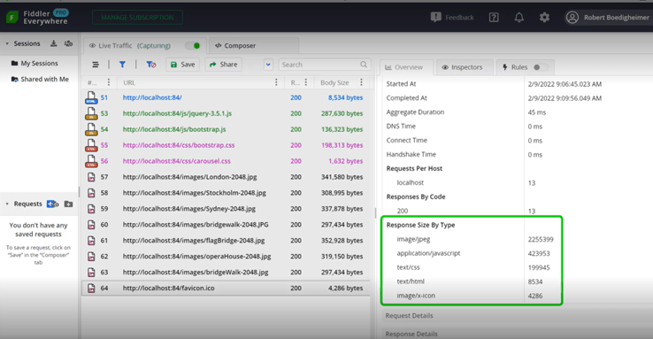
We can see here the image JPEGs are a good portion of the page weight. We’re going to focus on that and see in the After how that has been improved. But the Overview gives us a quick feeling about general performance and where the size might be too large.
We’ll do the same thing with the After version. We’ll just select the requests that were made. And looking at the Overview, we see it was also 13 requests. But we can see the body received is down to about 130K. This reflects that the entire size of that page and all of its resources are smaller than some of the single images were before.
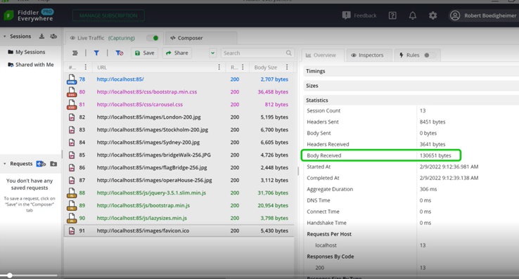
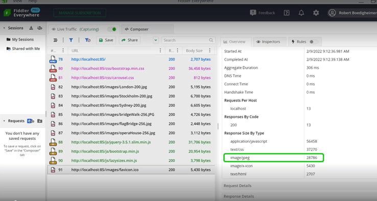
We’ve made a vast improvement to the download time because the file and all the resources are much smaller. And again, if we scroll down by response size, by type, you can see that JPEG is no longer the dominating size. In fact, it’s smaller than the CSS and the JavaScript. This gives us a quick view where we can spot-check and see what fits in for normal metrics for pages, how many requests it’s making, and a rough idea of the size and what’s causing those sizes.
What performance technique can you use to handle HTTP compression?
The first performance technique we’re going to look at is whether the site is using HTTP compression. With compression, if the browser signals with the accept-encoding that it can handle compression, the server will compress the content which, for files like JavaScript, CSS and text-based files like that, compress very well.
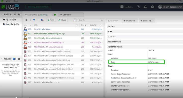
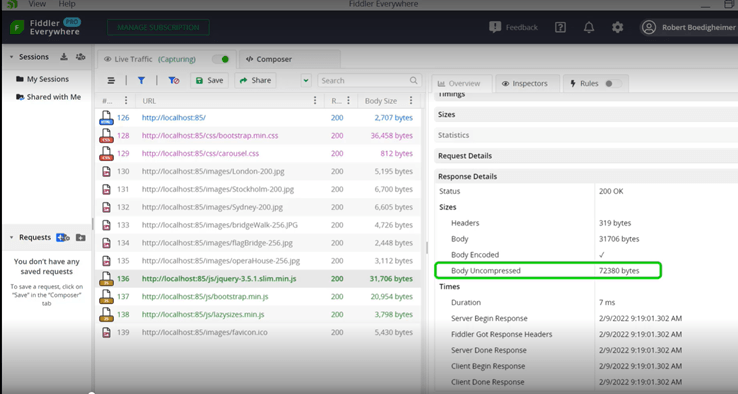
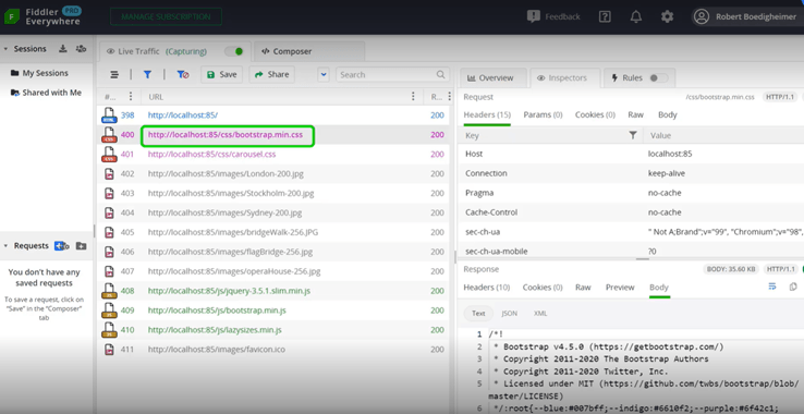
Here I select the jQuery JavaScript file and in the Overview on the right-hand side. I’m looking under sizes and it shows the body size of about 287K. If it were compressed, it would mention compression here. Now let’s look at that same file in the After site. Looking now at the After version, we’ll notice a few things if we look at the jQuery. So first, I chose a jQuery library, the slim version, which made it automatically smaller than the original that we had.
If we look on the right-hand side, in the Overview, you can see the body uncompressed. It shows that the slim version was about 72K. You can see the body for this was about 31K. So, using compression, we can see that it reduced the size by more than half. We just need to set the server setting saying, “We want to compress static content.” Most modern websites do that automatically today, and this is how you can check whether your files are using compression or not.
How do you use Fiddler Everywhere to handle expirations or caching?
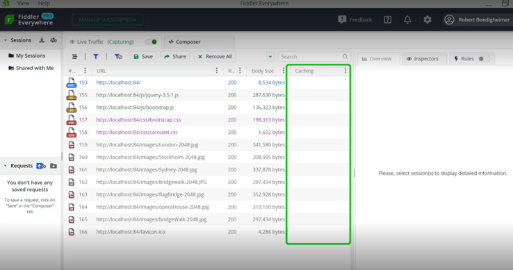
The next technique we’re going to look for is expirations or caching. You will notice here that Fiddler Everywhere shows me there’s no caching sent back from the web server. What that means is, by default, someone comes and requests this page today—if they close their browser and come back tomorrow—they’ll get the HTML even if nothing has changed. If they see all these resources without specific caching directives, the browser’s left to decide if it’s fresh or not.
In other words, it looks at the content that’s in the browser cache and decides whether it should use it or ask the server if it has been refreshed. Once the browser makes that decision, often it will send to the server and say, for instance, “I have this jQuery file. Has it been modified since this time?” and they’ll send what they have in their cache. Then the server-side will look and say, “No, that hasn’t been,” and it’ll send back a 304 Not Modified.
Well, the bad news is that round trip just to ask if it’s been modified is sometimes expensive, especially if you’re in a high-latency network, which just means it takes a long time to send back and forth. Therefore, we want to use caching or expirations where we’re specifically telling the browser, “You can consider this content fresh for this time period.” Then we’ll look at what this looks like in the After version.
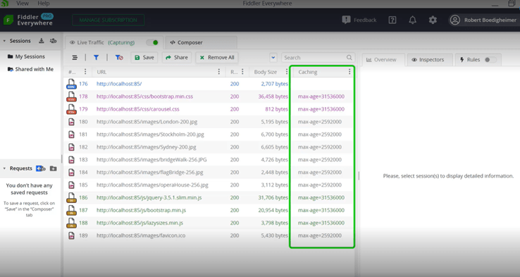
In the After version, you can see that there’s nothing specifically set for the HTML. We wanted to come back and ask for that each time in case something has been changed, but we specifically set how long this content can be considered fresh. The max-age is in seconds. If you look at Bootstrap.min, that is good for a year. And if you look at the images, that happens to be 30 days. So now what you’ve done is instructed the browser, “The day it gets this, mark it to be considered fresh for this time period. Don’t come back to the server and ask for it.”
People often ask, “If you do that, what will happen if you did have to change one of those files?” You just need to make the URL different. You can either use, “People put things on the query string” as an additional parameter, or some way to indicate—you could put a version number into the actual file name itself. But by changing that, then the browser, even though it has a cached copy, if I called it bootstrap.min.2.css or I tacked on a “?v=” for some sort of version, the browser will see that that’s not already cached and go back to the server for it.
Ultimately, this saves a lot of back and forth, and it’s going to pull all those resources off the local browser cache, which is much faster than talking to the server and getting things over again. You want to set expirations or caching directives in your web server and specify the time periods for when you consider various types of content to be fresh.
How does reducing the number of hosts and using a CDN play into website performance?
The next thing I’m going to check is whether the site uses a CDN, or a content delivery network. The idea with the CDN is it’s a service that has CDN servers much nearer to my customers. If someone were to come to my website, they need to visit the original site where I have that hosted, but I want it to pull all of the resources, the CSS, JavaScript, images and fonts—it’d be ideal if those were pulled from a server that’s closer to them, so the network latency is a lot shorter.
To spot-check this, I will look first in the Overview. I happen to see that it’s named CDN, and I also notice that this is indeed using another host. All this I can see here I’ve derived by the naming.
I also like to look at the overview and check the number of hosts. You can see the request per host, so the idea is I don’t want to have to create connections to a lot of different hosts. Even using HTTP/2, it needs a different connection for each specific host. What I’m trading off here is the connection time to access a CDN, but then being able to pull the files from that closer server.
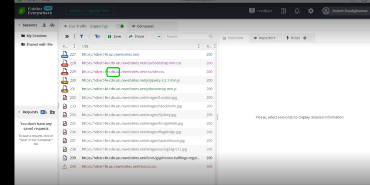
Next, I want to look at two things. Again, look to see if it’s using a CDN, and if there is at least another host, they often name them CDN. But also, I look at the request per host because I don’t want to have a whole lot of different hosts. I could have pulled jQuery from any number of sites that host that file. Instead, I choose to download the version I want and put it on my specific server to avoid connections out to another host.
And the same with fonts. I’m using a Google Font, and I’ve chosen to host that in-site. Now I only need connections open to two separate hosts. These are both things you want to look at to improve your performance—reducing the number of hosts and using a content delivery network.
What impact do minified files have on website performance?
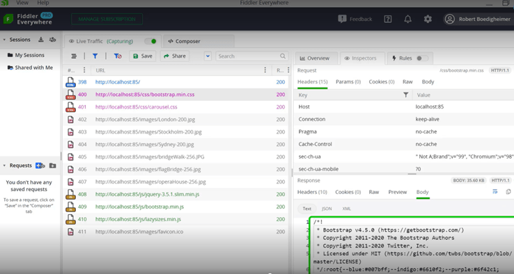
The next technique I’m searching for is whether the site uses what’s called minified files. If we look at this example, we have bootstrap.min.CSS. So often that’s part of the actual name where they add the dot min to indicate that this is a minified file. And the idea with minified files is you’re removing the extra line breaks, often most of the comments, are the new lines. You’re making it just a very compact version of that file.
The good news is on the client, I’m also using it for jQuery. It will minimize it, but through the use of either source maps or if I want to use Dev Tools, you can do a pretty print. Typically, it sends it to the client because most times your customers don’t care what your CSS and JavaScript files look like. By minimizing them, it helps to minimize and compress them. You’ve greatly reduced the size of the download for those files. And again, if a developer needs to do client-side JavaScript debugging, it’s possible to get back from the minified version to the original so that you can still troubleshoot and walk through the source code on the client.
So again, a spot-check by looking is it called dot min. If we look at the Inspector on the right, as we scroll down, you’ll see that it’s taken out all of the line breaks and the spacing and the tabbing and everything else to greatly reduce the size of that download. We do this as part of our build process. Typically, as you get ready to release, the build process will make those files minimized, which greatly reduces the size and improves the performance.
How do you reduce the size of images without impacting image quality?
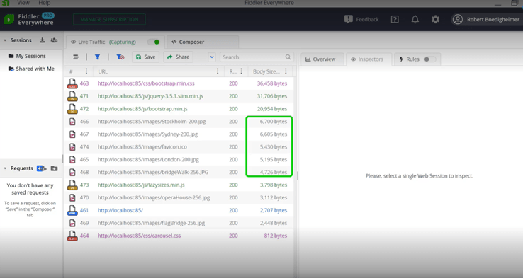
The next area we’re going to focus on is the images. We noticed in the Before version that some of the sizes were rather large. I typically will sort by body size, and I can see that there are a lot of JPEGs at the top that are around 300K. After you’ve worked on websites for a while, you get a feeling for how big images should be based on how they look on the site and approximately what their size should be. By knowing what my site looks like, I can tell that these are larger than I probably need.
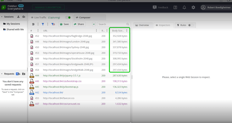
You can use any common image editing tool that you like to open those JPEGs. Often the tool will have a side-by-side version where I have the original and I can choose a compression factor for that image. Here, I’m trading off quality and size. With JPEGs, it’s fairly common that I can greatly reduce the size without impacting the image quality. I can just pull that slider, look at the two of them, and save. Now we can look at the Before version of these images and then we’ll look at the After.
Looking at the After version, we can see the body size and we notice our images went from about 300K to about 6K, which is a huge improvement. This is where we got most of the size reductions with the Before and After. We’ve taken each individual JPEG file and pulled it up and avoided that quality trade-off. And, again, if we were to compare the two, we can see that the quality is not diminished, yet we’ve had a great reduction in the size.
How do you spot-check for responsive images?
The next area to review is whether the site is using what’s called responsive images. So a lot of sites use a responsive design where it’s set up to look good at various breakpoints, so on a phone, tablet or desktop, it uses the width of the device to determine how things should look.
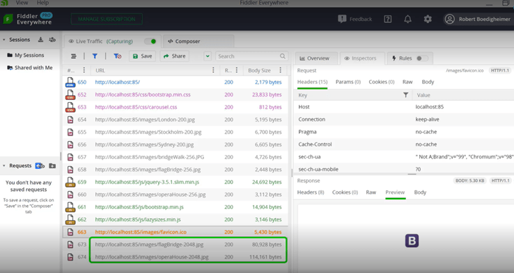
In this case, this is our desktop view of After for our large breakpoint. And we can see there are a couple of images at the bottom. I like to use the width of the image in the actual file name because it helps us when we look at things like this. As I open up the After site and scroll down, and you’ll see that on the large breakpoint, some of the images are 2048 for width because that’s what was needed to show them at that large breakpoint.
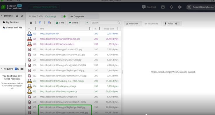
We’re going to then look at what it would look like coming from a smaller breakpoint device. I’m just going to use Dev Tools and device emulation to look like a phone and we’ll see how that looks in Fiddler Everywhere for comparison. In the After version, when we’re in the small breakpoint if we look at the bottom, it only needed the 1024 version to look good at that breakpoint for the width of the screen where it’s going to be displayed. Here, I happen to srcset in this example and image with a srcset attribute. I just need to create images in a lot of various sizes.
And using the srcset, it’s telling the client you made the right choice. You know the size of the image that needs to be displayed. You know the pixel density of the device and its chosen different image widths based on the situation. This is a good way to spot-check and see if a site is using responsive image techniques or not because, especially on a small device, we don’t want the huge image that we would use for a large breakpoint on a phone that might not have a great connection. That’s the benefit of using responsive image techniques like srcset or the picture element.
What can you accomplish with lazy loading?
The next technique we’re going to look for is what’s called lazy loading. I like to emphasize the rendering of the main viewport and I want to make that as fast as possible. I know there are other images that are lower on the page. I don’t need those to load up front because that might slow down the initial rendering. Lazy loading is a technique where you say I don’t want these to load initially, but as the browser is scrolled, I want those images to be selected and downloaded.
Here’s the After version. Again, we’re just looking at the top of the page. We’ll see what the Fiddler Everywhere request look like. So this is what we’ve seen throughout the talk. I’m going to right-click on the last one and mark it in orange so we can remember where we were. If I go back to the browser, as I scroll down, these images are coming into view, and those are some of the larger images. We can see that there were additional requests for those images.
Again, lazy loading just gives me the ability to say those don’t need to be loaded initially but only when you scroll down. There are various ways to do this. Here I am using a JavaScript file called lazysizes. This has also been added natively to some of the modern browsers using the loading attribute. Either way, it works.
The loading attribute is not supported for all the clients; therefore, I continue to use JavaScript. But I just need to indicate on the image that I don’t want it to load right away. And then the browser or the JavaScript will take care of it. When it’s about to come into view, it will automatically download that particular image. Again, I’m emphasizing the main rendering of the page. It’s possible that the person may not even scroll down, so why download those unless they need them? That’s what lazy loading lets me do.
Why should I pay attention to TLS versioning?
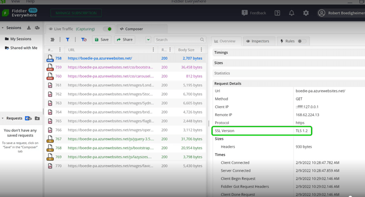
Another thing to look for is the version of TLS that’s being used for HTTPS. Keep in mind that you should be using HTTPS for all your websites. TLS is the actual encrypted tunnel that’s used. There are various versions of that. The most recent is TLS 1.3. The advantage over 1.2 is it uses fewer handshakes at the beginning. So instead of, in the world of TLS 1.2, it needing to go back and forth two times to set up the TLS, it only needs to do that once in 1.3. I’ve worked on a site where going to TLS 1.3 was 20% faster. By setting a newer version of TLS that’s supported by most modern browsers, you get, first, better security. But there are fewer handshakes which also helps in the connection creation, and you could see some performance benefits.
The way you can tell the version, here I clicked on the HTML page. In the overall and the request details, you can see that it lists the version of TLS. In this case, it’s 1.2. But that’s where you can check. And if you’re able to use TLS 1.3, it will be more secure and should perform better for you as well.
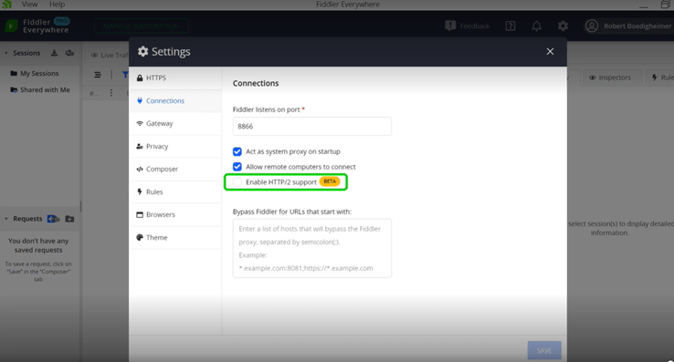
How does Fiddler Everywhere support HTTP/2 network traffic?
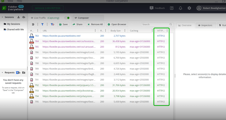
The last thing we’re going to check in this video is whether the site uses HTTP/2 or not. A great new addition to Fiddler Everywhere is the ability to use HTTP/2 as a protocol. I first need to make sure that I have it configured. Presently, it’s still a beta feature. I’m going to go into the Settings, and go to Connections. In the Settings in Connection, I’m going to enable HTTP/2 support in Fiddler Everywhere. I’ve added the column for the HTTP version. And we can see that it’s using HTTP/2. The advantage of HTTP/2 is it will only use a single connection to each host.
In the past when browsers wanted to connect with HTTP 1.1, the spec said they could open two connections per host. Eventually, browser vendors found they could do more things in parallel. And most of them were opening six separate connections to each host. Each TCP/TLS connection needs to do some handshakes to be set up and they start slow. We don’t want to go through that multiple times if that’s not necessary and HTTP/2 did away with that. Instead, it’s going to use one single connection per host. It just multiplexes the requests and responses on that same connection. This is how I can tell if that site supports HTTP/2 or not, which brings along some performance benefits.
As we talked about with connections, it’s nice that Fiddler Everywhere now supports HTTP/2 and that we can see that that’s how this site was requested. Throughout this video, we’ve seen several performance techniques. We did not dive into how to configure all of those, but we were focusing on how Fiddler Everywhere allows me to look at a particular site and look for certain techniques to make sure those are in place so that we have the best performance we can expect for the site.
In the next video, we’re going to look at how we can troubleshoot for other devices. Specifically, how I can run Fiddler Everywhere on my laptop yet want to see traffic from phones, tablets, or even potentially another laptop. Even if I don’t want to install anything on their machine. We’ll look at how we can configure Fiddler Everywhere to accept those requests and how we can configure a client to point to our instance of Fiddler Everywhere so we can do the tracing. We’ll also see how we can export the HTTPS certificates so that can be used on the clients so that we can decrypt the HTTPS traffic.
To watch the video on demand, head on over to: https://www.telerik.com/videos/fiddler/how-to-evaluate-a-site's-web-performance-techniques-using-fiddler-everywhere
Eve Turzillo
Eve Turzillo is a Developer Advocate at Progress, with a passion for all things related to digital experience. For close to 20 years, Eve has been bridging the gap between technologies and community, starting with .NET and now with managed file transfer. Her experience spans various technical ecosystems, yet fostering community engagement and developing initiatives that align with both organizational goals and community needs has always been at the core of what she does.
Related Posts
Comments
All articles
Topics
Web MobileMobile
Desktop
Design
Productivity
People
