
How to Build a Reporting Dashboard for Tracking KPIs

Summarize with AI:
See how easy Telerik Reporting makes it to build out a dashboard with charts and gauges to measure your KPIs at a glance.
Creating a dashboard to display Key Performance Indicators (KPIs) is now easier than ever with the Progress Telerik Reporting Radial and Linear Gauges.
The Radial Gauge and brand-new Linear Gauge are two components that make displaying any numerical ranged data super simple. The configuration couldn’t be easier with a small collection of properties to control the ranges, labels, ticks and scales. When combined with powerhouse Table and Chart components, and just a little bit of slick design, you can create a truly enterprise-scale dashboard ready for the boardroom.
We’re going to build a KPI dashboard report together one piece at a time. If you just want to play with the final project, the complete solution is available in this GitHub repo.
Note: This guide is written assuming you have some familiarity with Telerik Reporting. If you’ve never used Telerik Reporting before, I recommend taking our Virtual Classroom course before continuing.
The steps in this tutorial are written with the Telerik Reporting Standalone Report Designer in mind. You may opt to use the Web Report Designer, but the exact steps will differ slightly.
Step 1: Create a Basic Layout
All reports are inherently page-based and must conform to the boundaries of fixed page dimensions. For a dashboard, you have a bit more flexibility in terms of layout, but we still want to be able to print our KPI dashboard. For this reason, we will use a standard 8.5 x 11 letter page in landscape orientation. Here are the settings I used.
- PageSettings:
◦ Landscape: True
◦ Margins: 0.5in
◦ Paperkind: Letter - Width: 10in
Also, disable all PageHeader, PageFooter, ReportHeader and ReportFooter sections. This leaves only the DetailSection for our layout. I recommend giving the DetailSection a subtle background color, such as MintCream.
You can see the current state of our dashboard in the KPI_Dashboard_1.trdp report
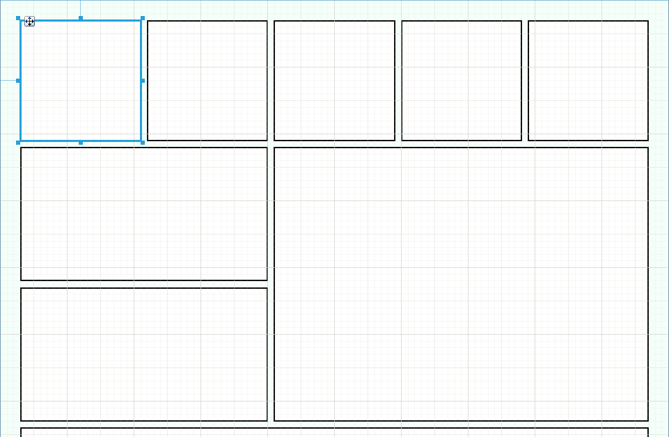
Step 2: Define Your Tiles
I like the look of tiles for a dashboard. This is easily achievable in Telerik Reporting, and it allows you to plan the layout of your KPI report early. Simply drag a single Panel item into the page anywhere and apply the following settings.
- Appearance
◦ Style
» BackgroundColor: White
» BorderStyle: Solid
» BorderWidth: 1pt
Now, you can resize and reposition your panel wherever you want.
Pro Tip 1: Save time by duplicating this panel as many times as needed instead of creating new panels. All the style and size properties will also be duplicated.
Pro Tip 2: Use the “Show Grid” and “Snap to Grid” options for perfect alignment.
You can see the current state of our dashboard in the KPI_Dashboard_2.trdp report.
Step 3: Add Some Data
In the sample project, I create random mocked data that is delivered via a REST web service. You may have dissimilar data, but if you have numerical indicators, you can build a KPI dashboard on it.
If you are using a REST service, you can create a WebServiceDataSource like I did. You may also pull your data directly from a database with a SqlDataSource. You can review our DataSource Component Overview for additional options.
Step 4: Add Your Radial Gauges
Here is where the fun begins! Let’s create a Multi-range Radial Gauge. Pick one of your tiles (Panels) and left-click on it to highlight it. Now, select the gauge from the menu. The Report Designer will automatically insert the gauge into the panel.
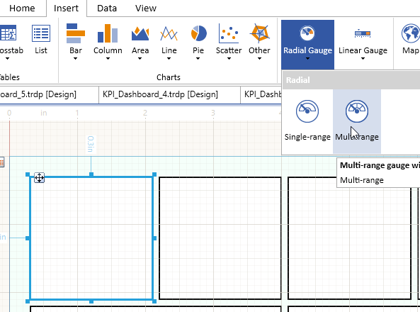
The Radial Gauge is a data-bound item, so you must start by setting the DataSource property to the data source created in Step 3. Next, you’ll want to configure the Ranges, Labels and Ticks properties for the Multi-range Gauge.
Set for each RadialGaugeRange:
- Start
- End
- Style
◦ BackGroundColor
You can adjust the Ticks, Labels and Needle as needed to get the perfect gauge. Finally, you’ll set the Value property to control the position of the needle. You’ll likely use an aggregate function here to perform an operation over your data.
Take advantage of the Expression Builder by clicking the small ellipse button in the value field.
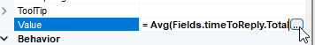
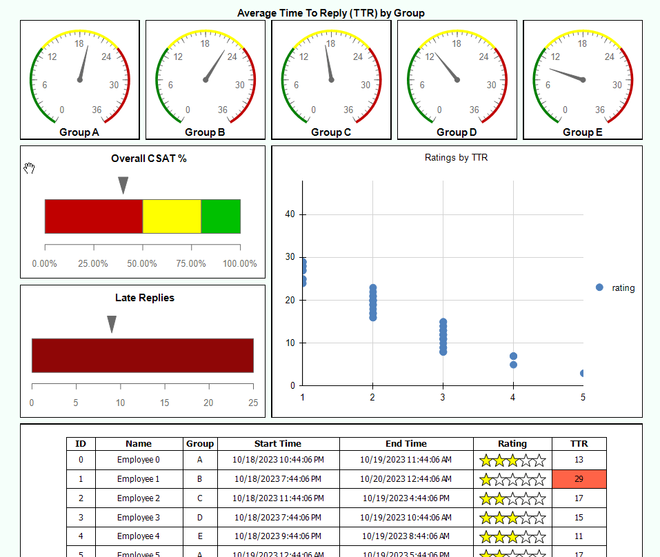
Here is an example expression: = Avg(Fields.timeToReply.TotalHours)
Once you have your Multi-range Radial Gauge looking perfect, you can employ the same trick we did with the panel. Duplicate the gauge and drop the copy into a different panel. You can adjust the measures, values or filters as needed.
Note: If you are using the Web Report Designer, setting up a gauge is even easer thanks to the Radial and Linear Gauge Wizard. (Coming soon to the Standalone Report Designer.)
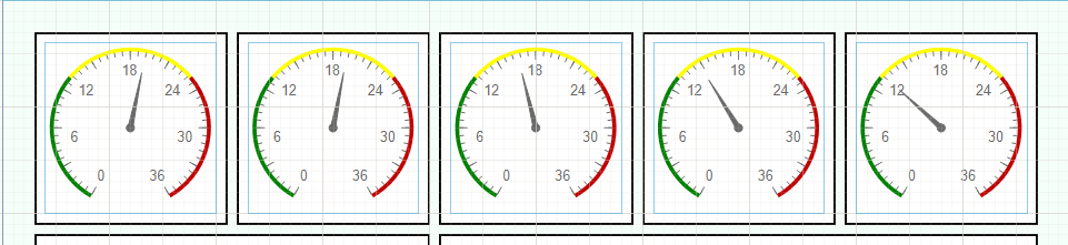
You can see the current state of our dashboard in the KPI_Dashboard_3.trdp report.
Step 5: Add Your Linear Gauges
Now we can add some Linear Gauges to the dashboard for some enhanced visual appeal. We’ll use one Multi-Range Linear Gauge and one Single-Range Linear Gauge. You can repeat the same process you followed above for setting up these two gauges.
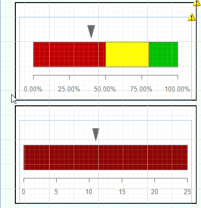
You can see the current state of our dashboard in the KPI_Dashboard_4.trdp report.
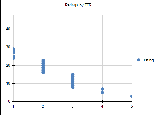
Step 6: Add Your Charts and Tables
In this next section, you can add detailed information to the dashboard to complement the summarized information provided by the gauges. Think about what you would like to show with your data. It might be a trend line, a pattern or a distribution of values. The chart is what provides insight to the gauges.
In my example, I used a scatter plot to show the relationship between response times and customer ratings. This can be an important visual that isn’t captured by a single aggregate and help unveil additional meaning behind your statistics.
The exact setup of the Chart will differ based on your data and the chart type selected. The various wizards make this process easier. Simply select your datasource on the first page of the wizard, and drag the fields into the respective boxes, and click “Finish” to preview the chart. If the chart doesn’t look like you expect, simply delete it and start over.
The wizard is so quick to use that you can iterate rapidly and try six different chart configurations in under a minute!
Now, for the Table, you can display the raw data for review. Again, I recommend using the Table wizard. Select the datasource and the fields you want to display. Each field becomes a data-driven column in the table. You can also select a table theme from the wizard to give your display a little razzle-dazzle.
If you wish, you may add static or conditional styling to the table too. In my example, the TTR column uses conditional formatting to change the cell backgroundColor when a case was answered in greater than 24 hours
(which is considered a late reply.)
I also used five shape items in the rating column combined with conditional formatting to create a quick 5-star visual for the rating, which is much more user-friendly than a 1-5 numerical.
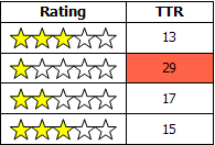
You can see the current state of our dashboard in the KPI_Dashboard_5.trdp report.
Step 7: Final Touches
Finish up by checking your color schemes and labels, and making any final small adjustments to positions and sizes of the report items. This is the right time to fuss over the details and make everything as perfect as you want.
Many of the labels I used are TextBox items that are placed on top of the gauge items. This will cause a warning icon in the designer, but if you’re careful with placement you can ignore the warning.
Note: If your label isn’t visible in the finished report, you can use the “Send to Front” option to adjust the z-position of the label.
You can see the final state of our dashboard in the KPI_Dashboard_Final.trdp report.
Congratulations! You have created a Telerik Reporting dashboard!
Want to Try Telerik Reporting?
Telerik Reporting is a complete, easy-to-use and powerful .NET embedded reporting tool for web and desktop applications that supports: Blazor, ASP.NET Core, ASP.NET MVC, ASP.NET AJAX, HTML5/JS, Angular, React, Vue, WPF, WinForms and UWP.
Also available as a part of our Telerik DevCraft bundle, Telerik Reporting allows you to create, style, view, and export rich, interactive and reusable reports to attractively present analytical and any business data. Add reports to any business application through report viewer controls. Export the ready reports to more than 15 formats.
If you still have not tried it, you can start a free trial to take a closer look. We also provide a support service we are proud of and resources that will help you along the way.

Rick Hellwege
Rick Hellwege is a software engineer, maker, and Principal Sales Engineer at Progress. Rick has a passion for experimenting with the latest technologies and frameworks, and constantly finding out how things work. When not writing code and driving demos, he can either be found on the most remote peaks of New England’s White Mountains, covered in sawdust in his workshop, or digging the earth in his garden.
Related Posts
Comments
All articles
Topics
Web MobileMobile
Desktop
Design
Productivity
People
