Win With the WinUI Report Viewer for Desktop in Telerik Reporting

Summarize with AI:
The Progress Telerik Reporting family has grown since R3 2021—a new WinUI Report Viewer that can be embedded in WinUI3 desktop applications is now available.
I am sure that you have heard about the Telerik day-zero support for WinUI. This is a long story written by our great developers that started more than a year ago. The first family member was the DataGrid for WinUI component. After it, bit by bit, adding a component after component, the Telerik UI for WinUI family has grown together with the Microsoft WinUI Library. Get to know it by downloading the Telerik WinUI demos.
Having a stable and extensive set of Telerik UI for WinUI controls for UWP and Desktop, what is the next logical step? If you thought about a WinUI Report Viewer, you are right! Delivering a Report Viewer for WinUI seemed an easy task, having in mind all the various Telerik Report Viewers we have already. The list of supported platforms is broad—ASP.NET Core, Blazor, Angular, WPF, Winforms, etc. And here is a little secret from the kitchen—they all share the same engine below the surface.
Wanna know the story of delivering a WinUI Report Viewer? Sure, let’s start. But, oh, two little things you should know first—it was introduced with the R3 2021 release. And tooltips over a report’s content were freshly added with the R3 2021’s Service Pack.
Introduction to WinUI
If this is the first time you are hearing about WinUI or you get confused about its versions, here is a brief intro.
The Windows UI Library is a native UX framework for both Windows desktop and UWP applications. It is based on the Fluent Design System. There are two generations of WinUI under active development—WinUI 2 and WinUI 3. While WinUI 2.x is a control library on top of UWP shipped as a standalone NuGet package, WinUI 3.0 is an entirely new framework that aims to replace the UI and application framework of UWP. WinUI 3.0 is shipped with the Windows App SDK (formerly known as Project Reunion).
Telerik WinUI products aim to target the latest stable version of Windows App SDK.
Telerik Report Viewer for WinUI—The Beginning
It all started with the UI.
The designers followed the outstanding UX experience that we deliver with our other report viewers. First, we created the “skeleton” with the following parts—navigation, document map, report area, parameters area and zooming bar.
Part 1: Navigation
What is a report viewer without a navigation bar?!
Having such, you can navigate through the pages of the report or the history of the visited reports. You can also customize the page settings, print or export the report, and toggle whether the document map and the parameters area are visible.
For the needs of our report viewer, we used the MS CommandBar with custom content for the AppBarButtons and AppBarToggleButtons to be left-aligned. Also, a new set of path icons was provided by the designers, as some of the needed icons were missing in the predefined WinUI symbol icons set and in the Segoe MDL2 Assets icons.
Part 2: Report Area
The MS TreeView has an attractive design fitted very well for the document map, whereas the parameters area is a custom control—ReportParametersControl—which changes its template depending on the type of the parameter.
The report area has two views—an interactive template and a print preview template. Switching between the logical and the physical page rendering happens by toggling the print preview button in the command bar.
Below the report, there is a zoom which together with the drill-down and the drill-through functionalities makes the report interactive. The zooming feature was developed with the Telerik LayoutTransformControl and the Telerik RangeSlider, which both could be of great help to a developer.
A small, yet crucial Telerik component was used to lay out all these parts of the report area—the GridSplitter.
Part 3: Finishing Touches
No look seems finished without a little spark.
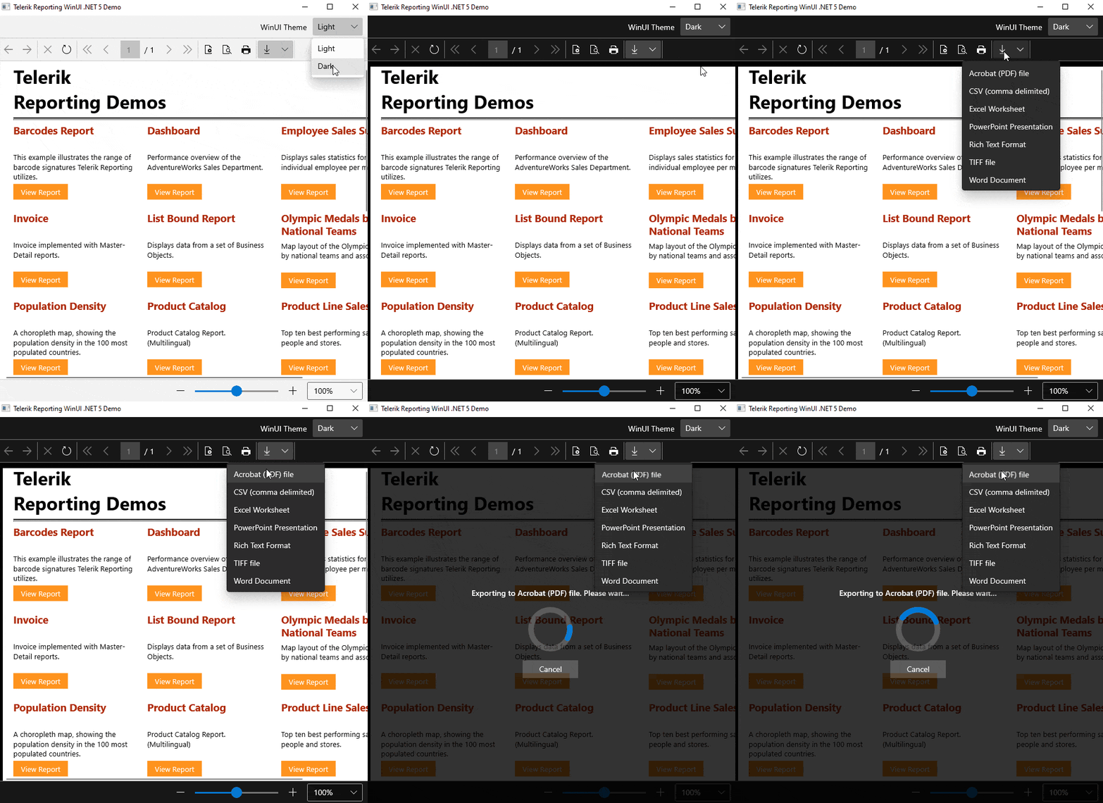
In the scope of the report viewer’s UX, these were the overlays with informative messages and tooltips over the buttons and inside the reports.
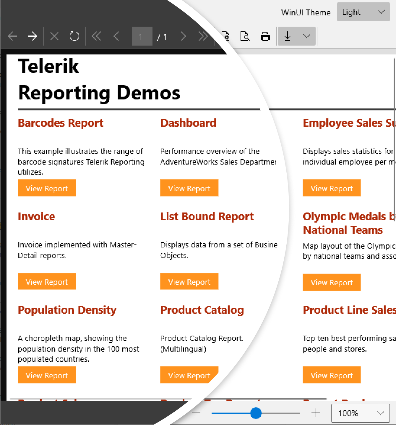
I think here is the part where I tell you that the report viewer supports all six built-in themes – Light, Dark and four High Contrast themes (High Contrast #1, High Contrast #2, High Contrast Light and High Contrast Black).
What Is in the Back
As mentioned earlier, our Report Viewer is built with both Microsoft and Telerik UI for WinUI components.
The binaries that come with the viewer are:
- one for the functional part (Telerik.ReportViewer.WinUI.dll)
- one for the theming (Telerik.ReportViewer.WinUI.Themes.dll)
The functional part depends on the Reporting engine for rendering the reports. Reports are rendered as standard XAML controls through the Telerik Reporting XAML rendering mechanism, adjusted for the specifics of WinUI.
The WinUI Report Viewer can utilize the report generation engine in several ways:
- as an embedded report engine (in the WinUI application itself)
- by hosting it remotely utilizing the REST reports service
- by using the Report Server—a server-based platform that provides storage for reports and enhances their management
A side note is that the WinUI framework is in active development, and we will continue to add features along with the framework advancement.
What To Expect Next?
Depending on the demand of our customers, we will cover all functionalities that we already have for the other platforms. A search engine with results highlighting and tooltips client-side events are some of the features that will come next.
Theme It as You Need It
The Telerik Report Viewer for WinUI benefits from the UserThemeResources markup extension provided by Telerik. Its aim is to allow the developers to easily override the resources used in the default themes.
It exposes three static properties—DarkResourcePath, LightResourcePath and HighContrastResourcePath. All refer to the URI path to the resource dictionary containing the theme resource definitions for the respective theme. If no value is set for either, the default Dark theme will be used. Eager to try it? Let’s do it together.
Step 1: Open the Demo Solution
Since R3 2021 SP1 we ship a dedicated solution containing two WinUI projects—a project containing the demo code and a separate Windows Application Packaging Project that is configured to build the app into an MSIX package.
It can be found under the following path:
C:\Program Files (x86)\Progress\Telerik Reporting R3 2021\Examples\CSharp
Make sure to set the package project as a startup one.
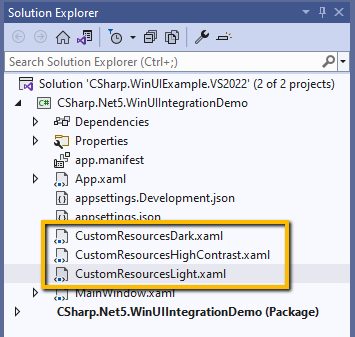
Step 2: Add Custom Resource Dictionaries for Each Theme

We will mimic the three Office2019 palettes from the Telerik UI for WPF suite—Light, Dark and High Contrast. How? By adding custom values of the following brushes in each of the resource dictionaries.
CustomResourcesDark.xaml:
<ResourceDictionary xmlns:x="http://schemas.microsoft.com/winfx/2006/xaml"> <SolidColorBrush x:Key="TelerikReportViewer_Background" Color="#FF0F0F0F"/> <SolidColorBrush x:Key="TelerikReportViewer_BorderBrush" Color="#FF606060"/> <SolidColorBrush x:Key="TelerikReportViewer_CommandBarBackground" Color="#FF3C3C3C" /></ResourceDictionary>CustomResourcesLight.xaml:
<ResourceDictionary xmlns:x="http://schemas.microsoft.com/winfx/2006/xaml"> <SolidColorBrush x:Key="TelerikReportViewer_Background" Color="#FFDFDFDF"/> <SolidColorBrush x:Key="TelerikReportViewer_BorderBrush" Color="#FFACACAC"/> <SolidColorBrush x:Key="TelerikReportViewer_CommandBarBackground" Color="#FFF1F1F1" /></ResourceDictionary>CustomResourcesHighContrast.xaml:
<ResourceDictionary xmlns:x="http://schemas.microsoft.com/winfx/2006/xaml"> <SolidColorBrush x:Key="TelerikReportViewer_Background" Color="#FF000000"/> <SolidColorBrush x:Key="TelerikReportViewer_BorderBrush" Color="#FFFFFFFF"/> <SolidColorBrush x:Key="TelerikReportViewer_CommandBarBackground" Color="#FF000000" /></ResourceDictionary>Step 3: Plug the UserThemeResources Resource
Add the UserThemeResources definition in the application resources and customize the demo’s background:
<ResourceDictionary> <telerik:UserThemeResources x:Key="themeResourceInitializer" DarkResourcesPath="ms-appx:///CustomResourcesDark.xaml" LightResourcesPath="ms-appx:///CustomResourcesLight.xaml" HighContrastResourcesPath="ms-appx:///CustomResourcesHighContrast.xaml" /> <ResourceDictionary.ThemeDictionaries> <!-- Default or Dark --> <ResourceDictionary x:Key="Default"> <SolidColorBrush x:Key="DemoBackgroundBrush" Color="#FF3C3C3C" /> </ResourceDictionary> <!-- Light --> <ResourceDictionary x:Key="Light"> <SolidColorBrush x:Key="DemoBackgroundBrush" Color="#FFF1F1F1" /> </ResourceDictionary> <!-- HighContrast is used in all high contrast themes --> <ResourceDictionary x:Key="HighContrast"> <SolidColorBrush x:Key="DemoBackgroundBrush" Color="#FF000000" /> </ResourceDictionary> </ResourceDictionary.ThemeDictionaries> <ResourceDictionary.MergedDictionaries> <XamlControlsResources xmlns="using:Microsoft.UI.Xaml.Controls" /> <!-- Telerik dictionaries here --> <ResourceDictionary Source="ms-appx:///Telerik.WinUI.Controls/Themes/Generic.xaml"/> <ResourceDictionary Source="ms-appx:///Telerik.ReportViewer.WinUI.Themes/Themes/Generic.xaml"/> </ResourceDictionary.MergedDictionaries></ResourceDictionary>Ta-da! We Have a Custom Theme for the Report Viewer
Try It & Share Your Feedback
New to Telerik Reporting and/or Telerik UI for WinUI? No worries. You can learn more via the Telerik UI for WinUI and Telerik Reporting product pages. Do not wait to try them out—get a free trial now:
The Telerik UI for WinUI controls are already production-ready for Win32 applications. Telerik Reporting is a complete and mature .NET embedding tool for web and desktop applications.
One last thing to keep in mind—the licenses about Telerik UI for WinUI and Telerik Reporting are different individual products. You can purchase both with one of our two best product bundles—DevCraft Complete or DevCraft Ultimate.
We would love to hear what you think, so should you have any questions and/or comments, please share them below.

Sia Aleksieva
Sia was a frontend developer in the XAML team located in Sofia, Bulgaria.


