Mask It to Perfection With WinUI in Action

Summarize with AI:
Stop making your users guess an input field’s accepted format. Use the new MaskedInput controls for WinUI. Flexible enough to cover your bravest expectations.
There are as many opinions as there are people. And then there are probably millions of forms out there that must be filled. At least one a day. 😂 When it comes to form-filling, people often try to use various formats in the provided input fields. Each user has their unique practices. You know that this leads to even more unique types of issues, right?
Not everybody is able to predict an input field’s accepted format while typing. Using masked inputs helps a lot to avoid almost all types of issues. But not any masked input. There is a particular set of inputs that I can guarantee are flexible enough to cover your bravest expectations.
Born with the Telerik UI for WinUI 1.0, the MaskedInput controls are here and ready to conquer your hearts (or code editors). Let me introduce you.
Understanding Input Masking First
In user experience design, an input mask refers to a string template that is created based on a specific input format to prevent transcription errors. If the user tries to enter an invalid character, the masked input element blocks the invalid keystroke. For example, users will not be able to enter letters in a masked phone number field.
The input masking concept is suitable for capturing user inputs with a specific, standard format, such as IP addresses, credit card numbers, product codes, ID card numbers, among others.
Input masks aim to motivate users to easily enter clean, correct inputs. To do so, such controls need to be flexible, customizable and intuitive enough.
Got It All Covered With RadMaskedInput
As mentioned at the previous section’s finale, flexibility matters. Covering a rich collection of use-case scenarios is a must here—and not only that, but covering them the right way.
Want to restrict characters?
Sure.
Want the input to be transformed to uppercase letters automatically?
Got it.
Want to allow the users to spread their creativeness in the input field, but a regex to throw away the unallowed characters discretely? Plus updating the user’s property regardless of the invalid UI?
Check.
Want to have advanced validation—be it direct (character by character), or on a regex level over the full text, or when the ValueChanging event is fired and the application logic is triggered?
All your choice.
The great power is in your hands. Aim for the best RadMaskedInputBase inheritor or combine several to build your masterpiece. I will run out of paper if I try to list it all here, so be sure to explore the Mask Types section and the links to each of them in the documentation article of the control.
A Pinch of Masked Input
I will keep it brief here (in this section).
The RadMaskedInput controls are not playing hard to get. Each type is accessible through an alias pointing to the Telerik.UI.Xaml.Controls.Input namespace (xmlns:input="using:Telerik.UI.Xaml.Controls.Input"). And it only takes a single line of XAML (or C#) code to instantiate it:
<input:RadMaskedTextInput Mask="###" />
Mask It Right—Any Time, Day and Night
If you assume that you can mask a DateTime or TimeSpan input with the RadMaskedInput for WinUI—you are correct. So what? Nothing special.
I am kidding! These mask types especially are neat and treat.
They expose various additional properties with which the customization capabilities of the RadMaskedInput control are brought even to the level after the next level. 🚀 If you are a control freak, I believe you will enjoy it.
Define the min, the max, the default (DateTime/TimeSpan). Control the navigation to the sections with the arrow keys and determine whether the next part should be automatically selected. Tune the spin steps in each section.
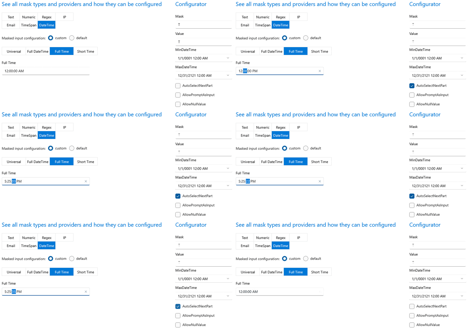
About the above GIF—after I enabled the AutoSelectNextPart, I almost stopped using my 🖱. I used the up and down keys of my ⌨️ and after I filled the 25 minutes, the control automatically selected the seconds part. And then I started spinning, not my head, but the seconds in the input. 🤪
Find the full set of the properties MaskeDateTimeInput and MaskedTimeSpanInput section of the documentation.
If you sense the ease of use of the DateTime mask type, I guess you will love the power of one very special property — the IsFreeForm. Many users tend to like input masking but are frustrated when trying to type stuff the “correct” way and panic when they see a red border or an error indicator. Wouldn’t it be nice to let the user input whatever they want, and you do the masking all behind the scenes? Different cultures, different datetime formats—not a problem anymore. Let your users hit that Enter button whenever they feel ready, and the control will try its best to recognize their free-form string and convert it to a valid date.
Feature Richness Sneak Peek
Moving on from the DateTime, TimeSpan and the free form variation of the first. After all, I would not want to miss the opportunity to give you hints of the control’s feature richness.
I have mentioned some of the goodies above.
Formatting the Value
Since the RadMaskedInput is an input control (duh!), you may guess it has a Value property. By default, this value trims the prompt characters and the literals defined in the mask. Some mask scenarios, however, may require different formatting of the result value. This is where the ValueFormat property comes in handy. It is applicable for the MaskedTextInput and MaskedIPInput controls and is an enumeration of type MaskFormat.
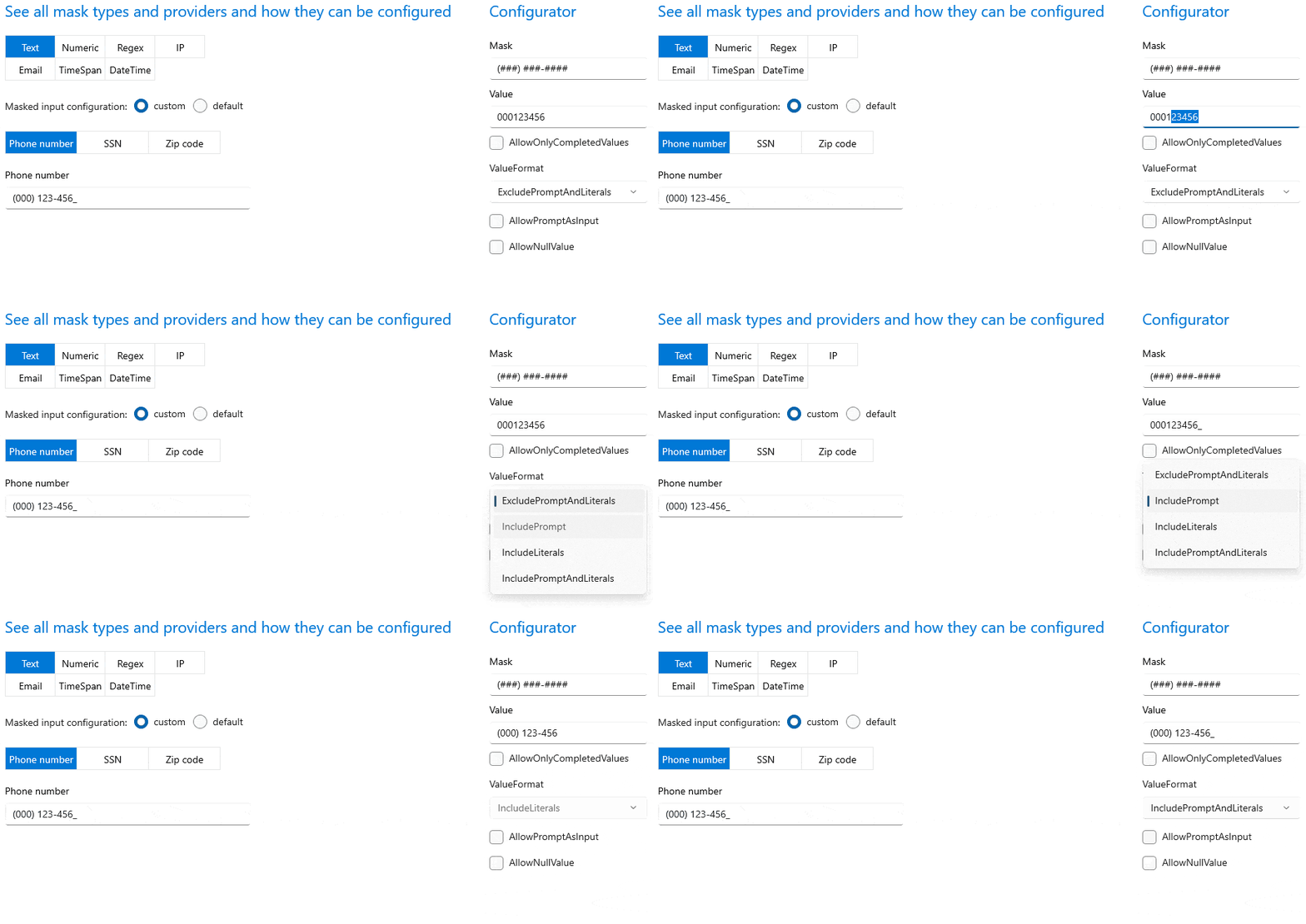
See? I have previously changed the default prompt char to # and I did not fill all empty slots. And then started experimenting with the ValueFormat options in the configurator part on the right. Let us observe the value together:
- With ExcludePromptAndLiterals the value resulted in digits only (all prompt characters and literals were removed).
- With IncludePrompt the value resulted in digits + the default placeholder "_" (all literals—the braces, the dash and the whitespace were removed).
- With IncludeLiterals the value resulted in digits + literals (braces, dashes, whitespace) without the default prompt char.
- With IncludePromptAndLiterals the value resulted in all the literals and the prompts for the non-filled positions being included (practically everything).
P.S. The Text property can always be used, too as it includes the content which the user sees in the UI.
Customizing the PromptChar
The tiny underscore from the above GIF is called PromptChar. It exists to represent the absence of user input. You will not see it as part of the Value unless you are not using the default PromptChar, or the ValueMode property is set to IncludePromptAndLiterals or IncludePromptChar. You will, however, see it in the UI if you have non-filled editable positions. Oh, it will be included in the Value property for the Standard mask types when IncludeLiterals or IncludePlaceholdersAndLiterals are set.
How to define your own prompt character? Simple as that:
this.maskedInput.PromptChar = '#';Just like I did in the GIF without telling you. 🤭
Changing the Culture
Writing globalized applications is a must nowadays.
Globalization = Internationalization + Localization
“Internationalization is the design and development of a product, application or document content that enables easy localization for target audiences that vary in culture, region, or language.”
“Localization refers to the adaptation of a product, application or document content to meet the language, cultural and other requirements of a specific target market (a locale).”
— W3C
Understanding the above definitions, you would not want to deliver non-globalized solutions, would you? You also would not want to mask inputs that are not culturally aware. That is why the RadMaskedInput control is designed to provide full globalization support out of the box through the Culture property.
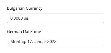
(The code snippets of the preceding image can be found at the Globalization section in the documentation.)
Validating the Input
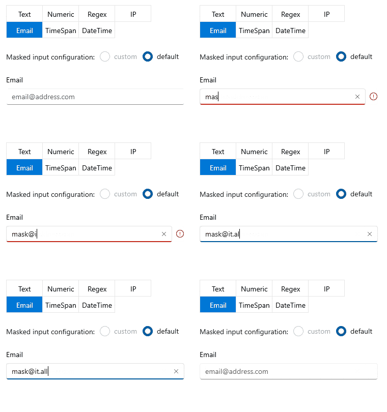
I know I already mentioned the frustration some users feel when they encounter a red border and/or an error indicator. Still, I believe it is far much better to know that something is wrong instead of guessing. See what I am talking about:
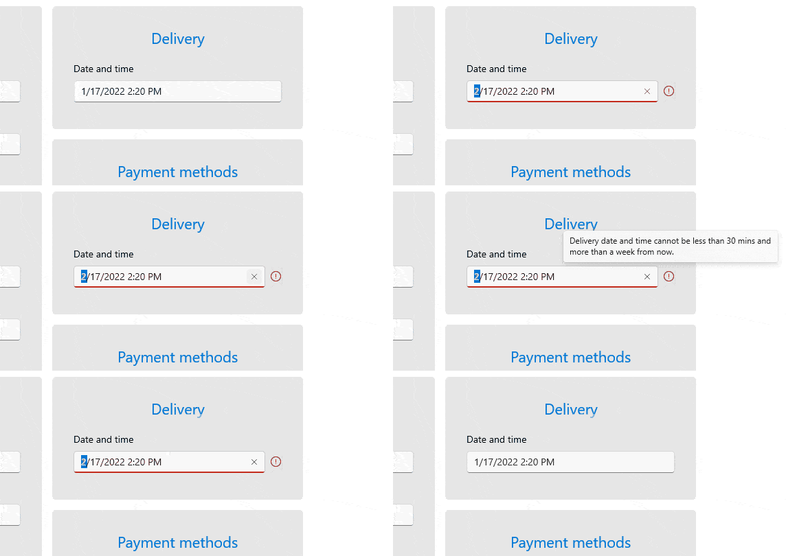
I think I will stop here … But customization capabilities continue. You can customize the Header, HeaderTemplate, Description. Allow/forbid null or invalid values. Determine whether the prompt character should be treated as a valid input and so on and so forth. 😵
It is all written in the stars 🌟, pardon, the documentation. Be sure to pay attention to it.
Give & Get
Give
Feedback is crucial for continuous improvement. I encourage you to share it. And I am sure I have told you many times that your input is valuable. We do listen. So, find your best ride and do not be shy to stop by.
- Get in touch by email—Drop us a line, for anything related to product or just to say hi at TelerikWinUI@progress.com
- Visit the Feedback Portal—Share any feature request (or bug report) that you might have
- Head to the Telerik Forums—Receive any technical help with the product
Get
Hurry up and get the latest bits of Telerik UI for WinUI! There is a lot more to explore.

Viktoria Grozdancheva
Viktoria is a Senior Front-end Developer with 5+ years of experience designing and building modern UI for desktop and mobile platforms on Microsoft/Telerik technology stacks. Her spare time is dedicated to friends and family and discovering new pieces of the world. Find her on Twitter and LinkedIn.
